If you’ve followed my blog for a few years, you’ll know that one of the biggest renovation projects we tackled was our kitchen. Ripping out the entire back of our house, adding a small extension, moving one wall and entirely removing another, adding a large skylight and essentially creating a kitchen where there had only been an old, dilapidated utility room and a scary weird bathroom and all the decisions that came out of that meant that I’d had to make an incredible amount of decisions very quickly.
I’m sure you’ve heard of or experienced ‘decision fatigue’ – it’s that point in a large project where you’ve had to be decisive about so many small details that your brain simply can’t do it anymore. Where once you had a completely clear vision of what you wanted a space to look like, you are now questioning every single small thing.
Kitchens, especially, are hard when it comes to this. You are well aware they are going to be permanent structures, it’s not as easy as simply repainting a room when you’re dealing with where appliances will be located or where switches and sockets will be – changing these at a later date would be costly and inconvenient and so getting them right the first time around is a lot of pressure.
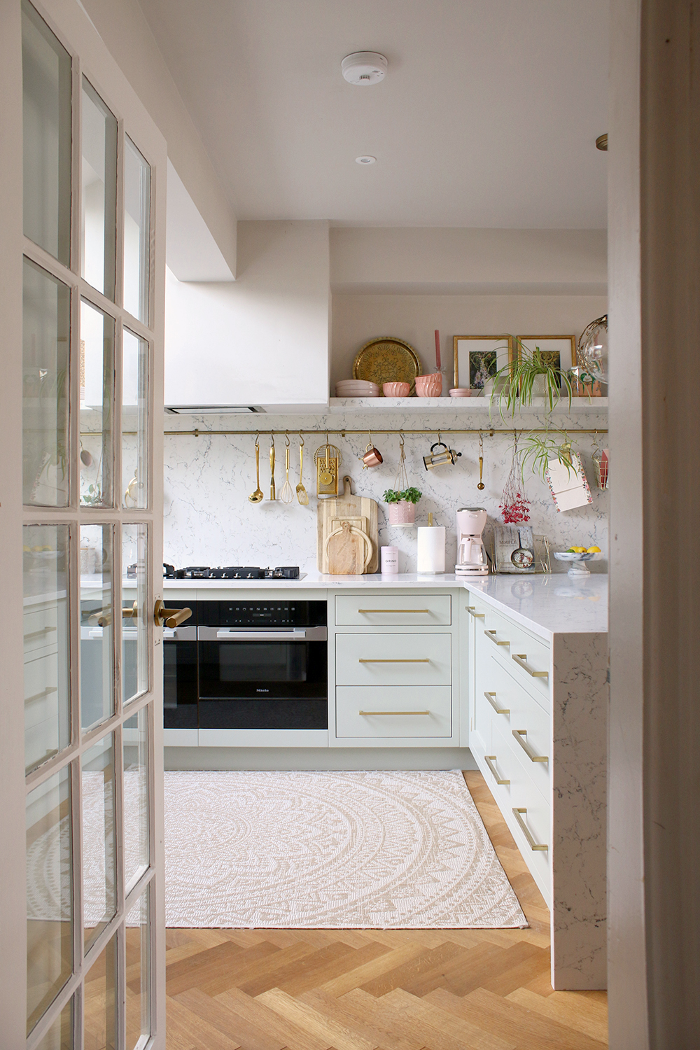
We’ve lived with our kitchen now for the last 2 years and I have to say, I am as in love with it now as I was the day it was finally completed. I worked with John Lewis of Hungerford and Caesarstone and they were able to help me bring my dreams into reality. I couldn’t be more grateful for my kitchen every single day. I have very very few regrets as it functions beautifully for us and has made everyday living just that little bit more enjoyable.
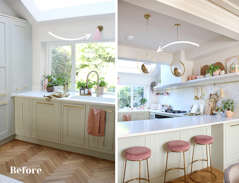
However, I did have a couple of niggling regrets when it came to some smaller details. I loved the lighting when I had first picked it out, long before the kitchen even went in. It was sculptural and contemporary – I thought it was a good foil for the traditional style of the shaker cabinets, that it played well with the more contemporary brass handles I’d picked out. But once everything was in place, it just didn’t feel quite right.
By that point in time, however, we had come so far, decision fatigue had well and truly set in and trying to select something else seemed like an unbearable prospect. So I thought it best to live with my lighting decisions for a little while, perhaps they would grow on me. But the longer things went on, the more I knew the lighting I had chosen just wasn’t right for the space.
I live in a Victorian property (built in 1889) and while I do love the look of more contemporary lighting in other areas of our home, I felt it wasn’t bringing anything into the space. The room itself is a modern construction, obviously, having been just built so the contemporary lighting felt more like an afterthought in this instance. It didn’t tie in with the more traditional elements in the rest of the house. It just wasn’t working for me at all.
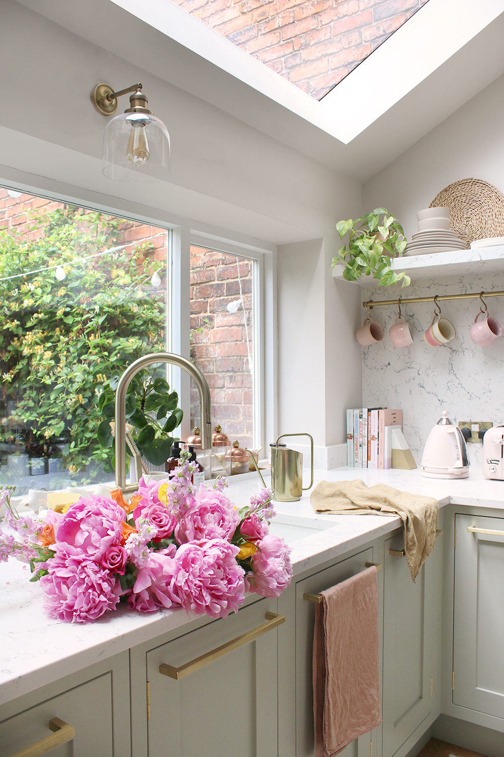
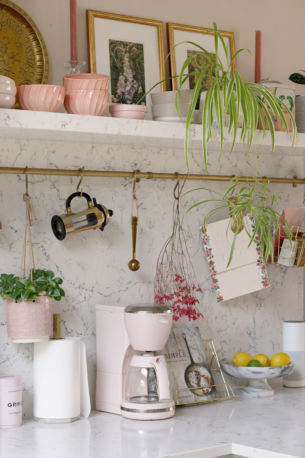
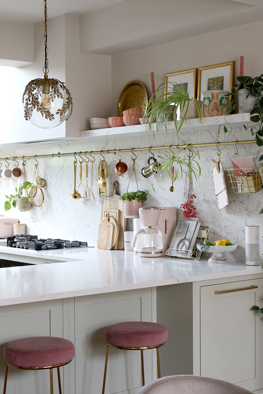
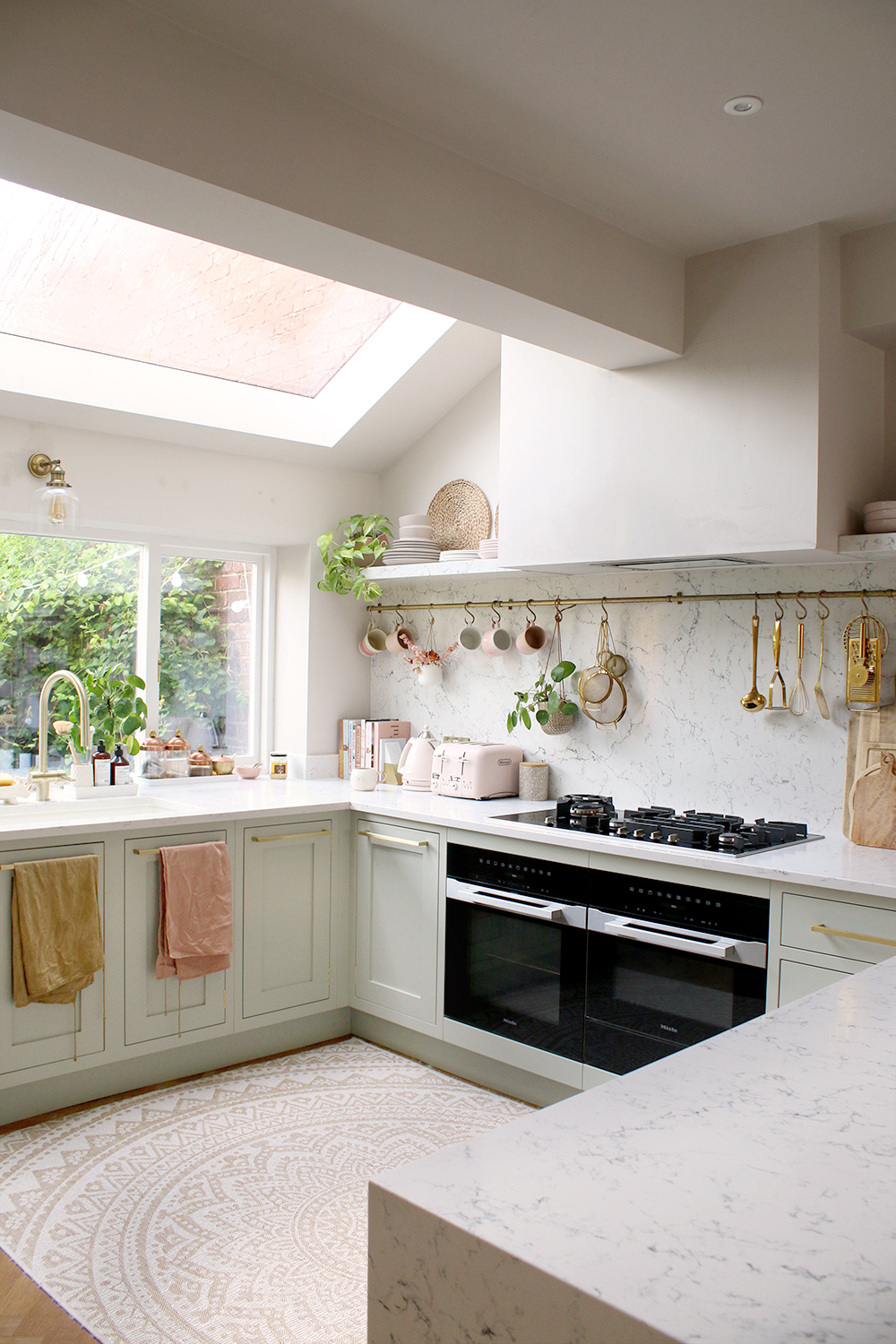
And so, after living with it for a couple of years, I decided it was time to change it. As you can see from these images, I have chosen more traditional lighting for both the pendants above the peninsula as well as above the sink and I can’t express what a difference they’ve made to the whole room, the whole feel of the space.
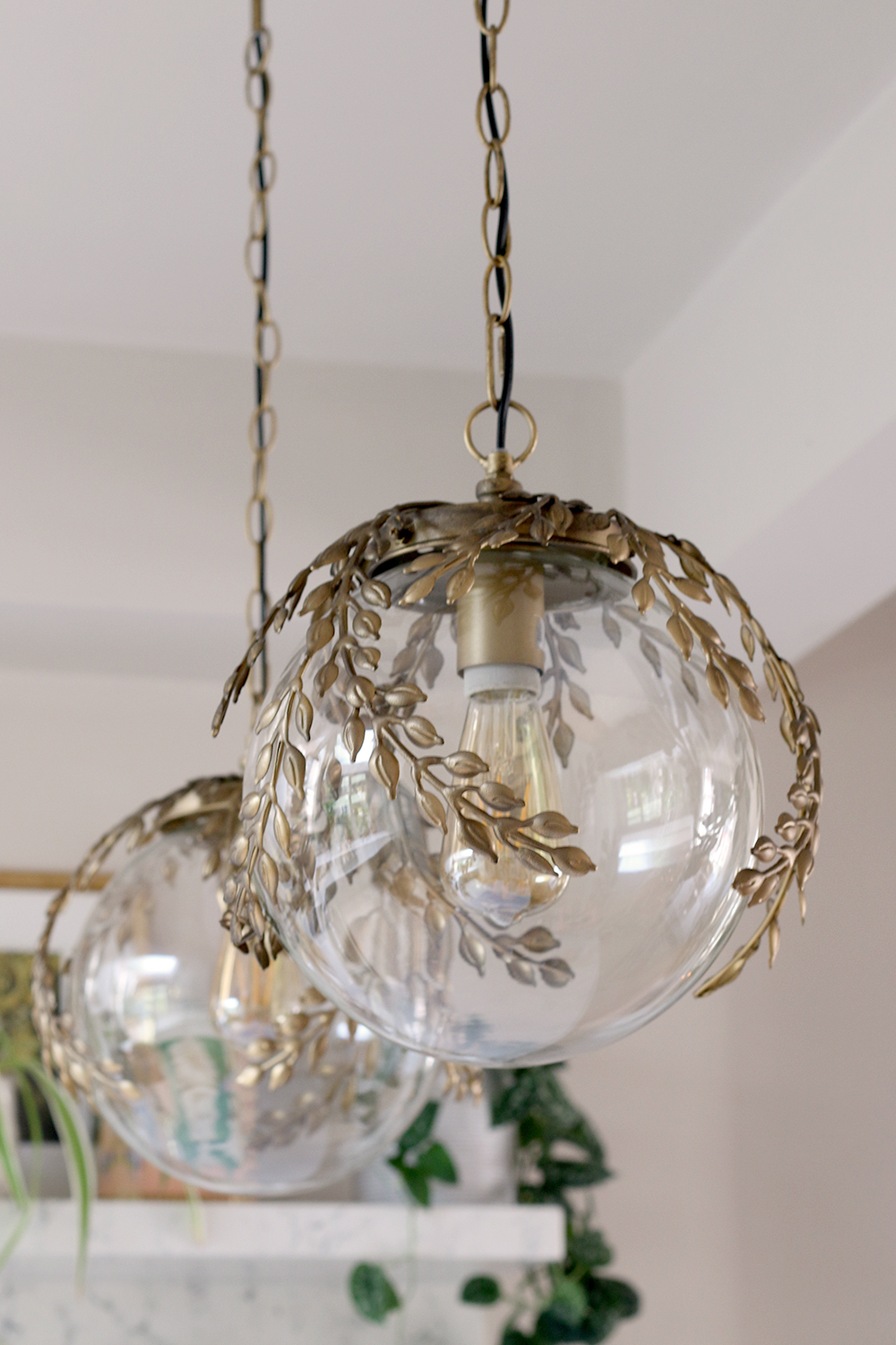
For the peninsula pendant lights, I went back to my Pinterest boards and noticed I had pinned these lights from Rockett St George three different times! You can always tell from your Pinterest boards what really appeals to you when you can see patterns emerging, right? Well, this was a pattern for sure – it was obvious that I loved these lights and so now, decision fatigue lifted, it was so clear these were the lights I should have chosen from the start.
I love that the antique brass finish matches the vintage-style mirror in the dining room next door and the leaf detail around the top leaned towards that bohemian look I have always loved. They were glam, they were bohemian, they were meant to be.
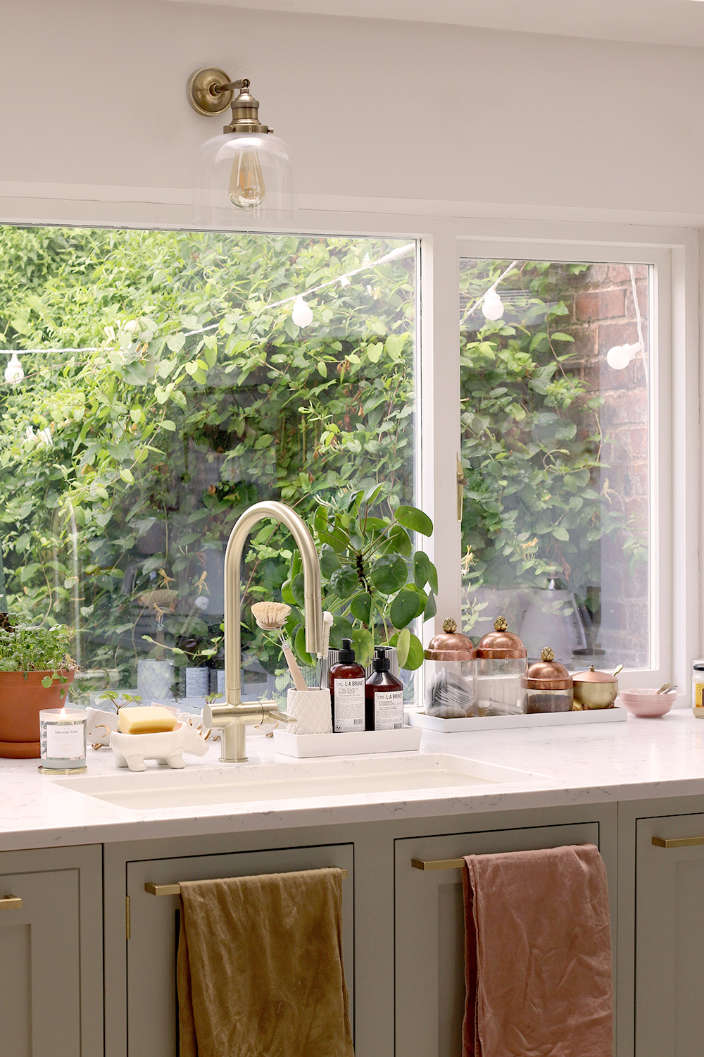
Above the sink, I decided something a little more traditional was needed here. Something that worked seamlessly with the shaker style of the cabinets. I wanted simplicity without being boring and if there’s one brand that does this so well, it’s Cox and Cox. Simple, traditional, beautiful. It didn’t need to shout. The view into the garden was enough wow-factor, I didn’t need the light here to yell but to whisper.
Swapping out the lighting in my kitchen wasn’t a huge costly change (in case there is any doubt, this post is not in any way sponsored, I purchased the lights with my own pennies) and it didn’t take much time. The old lighting went to someone else who loved them. It took an afternoon for Wayne to swap them both out (he’s experienced when it comes to working with electrics, but if you’re not, then please do call in an electrician if you’re doing this yourself!). But the impact the new lighting has had on the whole feel of the room has been enormous.
It just goes to show how important the right lighting can be to your kitchen. I’d always recommend including something alongside any spotlights (which we also have). Pendants are always a great way to add additional interest to a breakfast bar, island or peninsula. Adding a light above the sink can create a lovely moment in your decor and is entirely practical too. I wish we’d had the space to put lighting above the floating shelves but it’s one more area where a bit of additional decorative lighting can really make a big impact.
The style of the lights can make such a difference too. If you love an eclectic look as I do, there’s no reason you can’t mix and match both traditional and more contemporary lighting but I do love a bit of a juxtaposition to make things more interesting. In a really contemporary space like a new build, a vintage light can add that additional layer of history that might otherwise be missing. In an older property, there’s nothing better than an ornate ceiling rose and cornice (if your home is so blessed) with a structural sleek ceiling light sat against it. That mix and match gives your room so much interest so it’s an important area you don’t want to neglect.
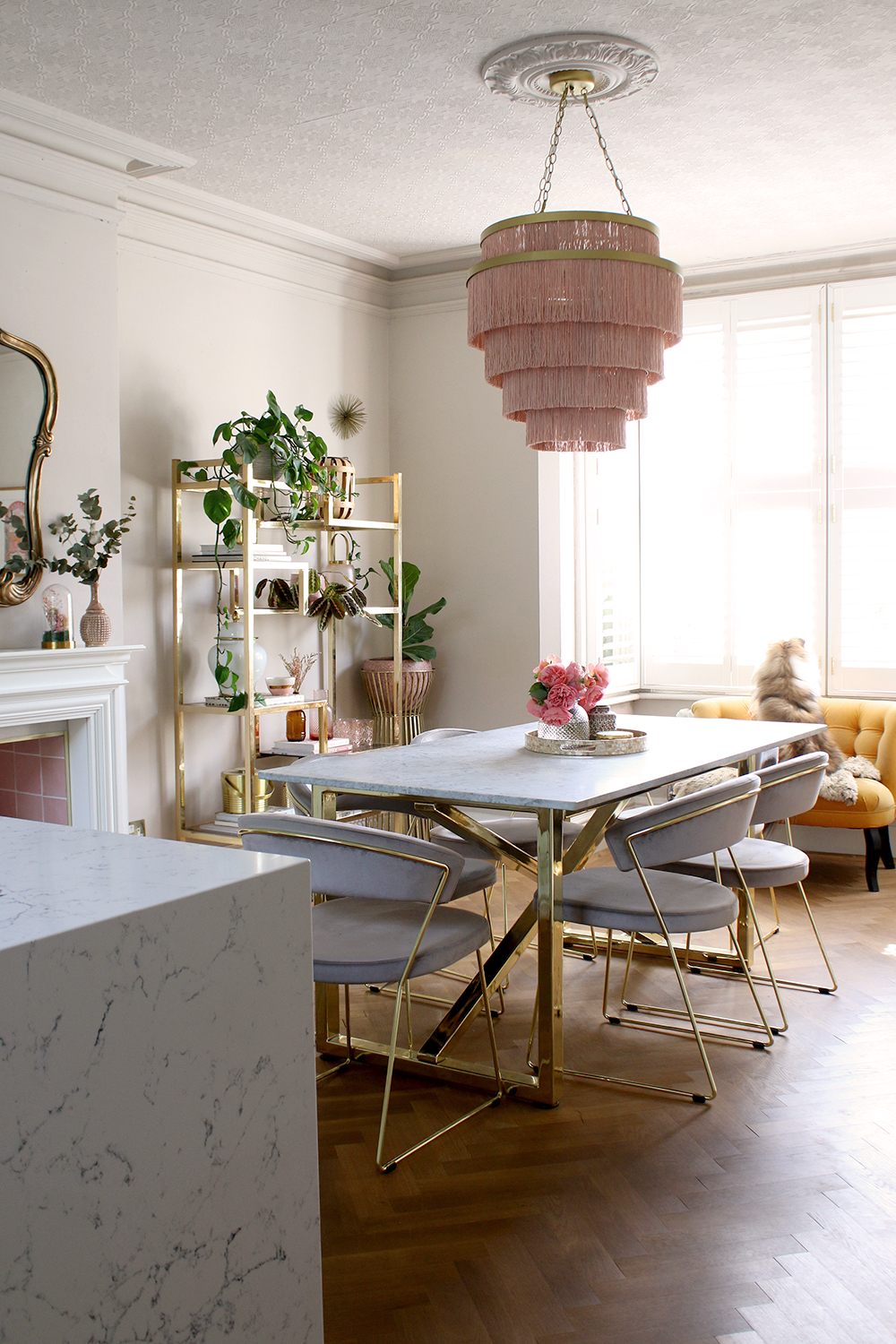
While our kitchen is ultimately in an older property, the room itself has the modernity of a newer build and so I think this is where I went wrong the first time. I needed a touch of vintage to balance it all out and while these lights are new, they are styled on timeless period details that give your home a sense of history.
Next on my hit list are the pink stools although it may just be another 2 years before I get around to changing them! Have you gone back and changed any elements of your home once your renovation was complete? Or have you ever regretted a decorating decision after the fact? Let me know in the comments below.










The pendants are DELIGHTFUL (yes, ALL CAPS). I do like how you decided to just sit with the first choice, to see how you like it over time. I sometimes have actual problems knowing whether I like something or not. Sometimes it’s just new and different and I just don’t know, waiting is a good strategy for me. At least in those cases where I’m not OMG I LOVE IT/OH GOD IT’S HIDEOUS right from the start. :D
Aww thanks love! Oh it’s so hard to know when you first do something when you’re a bit on the fence! More times than not, once your eye gets used to something, it always feels like a good decision but you’ll know eventually either way! :) xx
Luv the new lights!!!! As for the pink stools. They are fabulous.
Aww thank you Brenda! :) xx
I love your new lighting choices! They are the perfect marriage of traditional and modern. Great kitchen jewelry!
Kimberley
I love the new lighting – umm, the contemporary lighting was actually the only element that I didn’t take to when you did the original kitchen reveal! These choices are fantastic. My two penn’orth on the stools: bite the bullet and get new ones now if you have the money. And consider some white oak: another texture and another vibe.
You asked about “what would I change from my renovations?” Two things: first, I have a large en suite bathroom and I wanted to make it smaller to accommodate my washing machine and tumble dryer in the carved-out space. I let the builder talk me out of it. Every time I trudge from the attic to the ground floor, I curse him! When you consider that everything you launder (except tea towels!) lives upstairs if you live in a house (bed linens, towels , clothes, underwear),why do I have a washing machine two floors away?!!
Second regret is painting my small, narrow, depressing hallway dark, dark green (“Malachite” by Fired Earth). Beautiful colour but it actually makes it more depressing, while lots of designers were saying “it will envelop and cocoon in a dark space”. No it bloody doesn’t!
So so sorry for misspelling your name, Kimberly!
You did a perfect job with the kitchen lights!
2 years wait for the bar stools is a long time,
can you sneak in a paint job? I know people
are painting everything, including fabric
furniture, or reupholster the tops to help
with a little change until you purchase
what your heart desires. Just saying. :-)
i would like to say this kitchen is heaven in your house. Love the decor and natural light around the space.
All the lights are amazing, specially love the brass leaf lights, it looks adorable and beautiful. Thanks dear.
We keep a quilt folded at the bottom of our bed and here’s what you do: every night, and I mean every freaking night have your husband kick it off, complain that there’s an extra blanket at the foot of the bed that serves no purpose, then have your dog then bunch it up into a ‘nest’ of sort for a solid 5 minutes then throughout the night go back and forth on whether not it (and the dog) are making your feet and lower legs too hot and eventually kick it to the floor only to beautifully drape it back on the bed in the morning and smile, because it really does make the bed look perfect.
Oh yes I like those! I’m currently thinking about our kitchen redesign (its a few year off yet lol) and I know I want to insall a roof lantern but we’re also haveing a plant wall and I want some wall ligths to sit there, more for mood lighting than anything else.
I admire your aesthetic choices. They seem really elegant. There is a certain feeling it achieves just by looking at the pictures. I’m think they’re magical in person. Amazing! I’m a painter Sydney offers and I want to give you a compliment by following your pattern.
I applaud your creative election Kimberly. When planning a new kitchen, it’s always worth bearing in mind exactly how the lighting will affect kitchen design. A well-planned kitchen lighting scheme can completely transform the look and feel of the space in an instant. Love the decor by you and the natural light around the space.
I love the rug you’ve added in the kitchen, I don’t remember that from the original reveal, where’s it from? It blends in so well! Though I’d probably spill ketchup on it a few days in 🤣
The new lighting is amazing! Thanks for this!
Great post – Thanks for Sharing
i can just say wow. amazing post of your.
i can just say wow. amazing post of your.
I benefited a lot from your article before I designed my house. You’re great, thank you.
I am going to use this idea for my new home kitchen. Nice Post
I am looking for ideas for lighting in the kitchen to arrange them in the project in planner 5d. Maybe someone can tell me some good articles on this topic?
I am looking for ideas for lighting in the kitchen to arrange them in the project in planner 5d.
i can just say wow. amazing post of your.
Great ideas and design look awesome. A well-planned kitchen lighting scheme can completely transform the look and feel of the space in an instant.
What kind of lighting should I use in my kitchen?