Apparently the media and everyone else out there would like you believe the feature wall is dead. Buried, done, finito. Well, I’m here to tell you that they are wrong. Yep, standing on my little internet-style platform to say absolutely that you can still do a feature wall and it can still look amazing and current and trendy and whatever other word you want to attach to it that tells you, yes, you’re okay, you’re allowed to decorate in the way the masses approve of.
Obviously, I stand by the old adage that says, “It’s your home, decorate it the way you damn well please.” because that’s just how I feel. Unless of course you are renter then fair enough, you won’t quite have that freedom but you know what I mean anyway. Your house, your rules. And in my house, I do love a good feature wall.
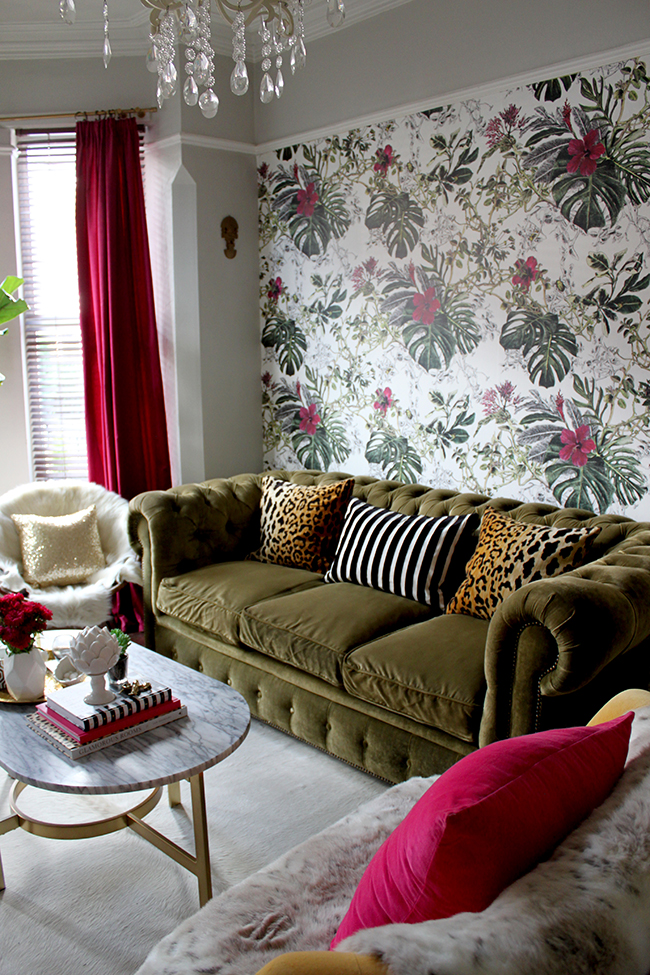
Now, there’s the crux. I specifically said a GOOD feature wall.* What does that mean? You know where I’m going with this, right? Because that is exactly why the media is telling us not to do feature walls. To embrace wallpapering all four walls and make a huge statement in your interiors. And sure, I think certain rooms look really good for using wallpaper on all four walls (in fact, my dressing room is fully wallpapered all on all 4 walls) but that’s not what this is about. This is about using wallpaper on only one wall – thus making it a feature and something eye-catching in your space.
*Obviously, this is just my opinion and opinions are like — okay, I won’t go there but please know, you should just do what makes you happy. And the feature walls I’m talking about are the ones that make me happy. So we’re cool with that, right? Okay, just making sure.
So we know what a bad feature wall looks like. Step into any mid-range hotel decorated in the last decade and you’ll see it. Walk around your neighbourhood, check out the hairdressers and nail salons and they are all doing it. One bold wallpaper design – a huge floral or perhaps a large-scale damask – plastered on one spot and the rest of the space decorated in some insipid colour like magnolia or cream or white.
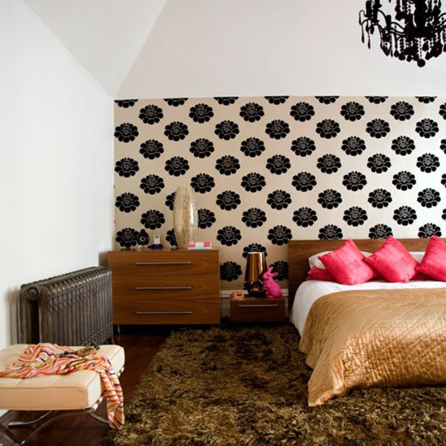
No. Just no. Bad feature wallpaper courtesy of House to Home
Yeah, we don’t want you to do that. I mean, if that really gets you going, then sure, do it, but if you want something that looks like it’s still of this decade, then read on.
The thing about choosing a wallpaper as your feature wall is that it’s gotta be bold. There’s no point in choosing something with very soft details or a totally muted palette for this because it’ll do nothing to catch your eye and make a statement. And good feature walls SHOULD be making a statement. If you fall in love with a soft patterned wallpaper in a muted colour palette, then do all four walls. It’ll be great and it’ll look classy and elegant and it won’t look like you ran out of wallpaper 2 hours into your project and just left it like that.
A perfect example of this is when Emily Henderson decided to use a really beautiful but way-too-subtle patterned wallpaper in her bedroom. She admitted totally that it was a mistake and why (which I admire – see even the really talented peeps out there can get it wrong from time to time). The design was crazy pretty but simply not bold enough to command a single wall. I couldn’t find a picture where she showed the whole room but if you check out the post, you’ll see what I mean.
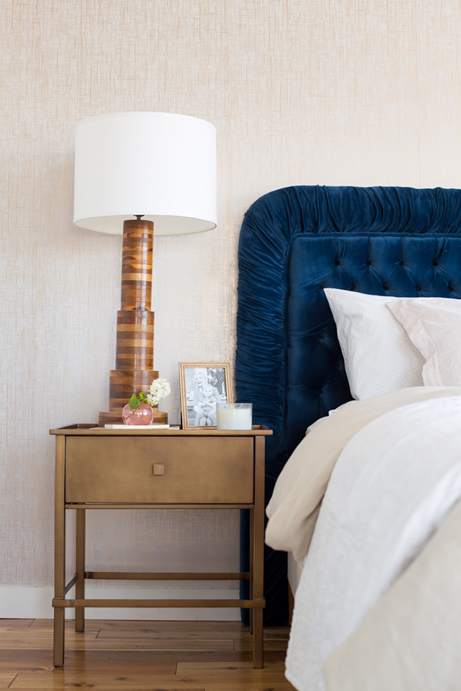
If she’d taken it across all four walls, it would have been a beautifully textural backdrop to the space but on one wall, it simply got lost and then pairing it with white walls made it look like an afterthought even though she’d spent something like a bajillion dollars getting that paper made. Learn from the mistakes of others. A subtle pattern is great on all 4 walls. If you are going with just one wall, make it count.
Here’s where Emily got it totally bang on right. This wallpaper is bold, it commands attention, it ties into the rest of the space beautifully.
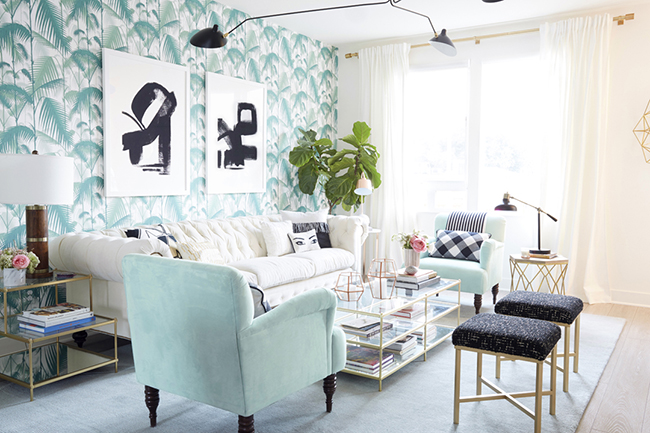
What you are looking for is wallpaper that looks like a large scale artwork. I’m not talking about murals (although those are pretty damn great too), I mean something that catches the eye, adds movement and colour and creates drama in a space.
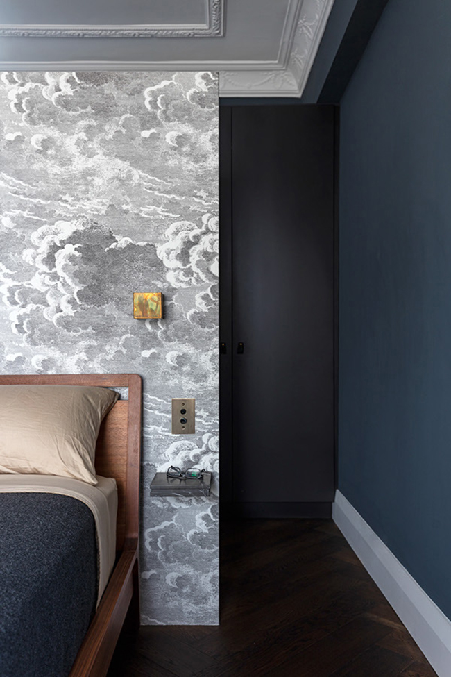
Another great feature wall by TFAD Architects
In my office, the first wall you see when you walk into the room is the chimney breast. So it was here I used a feature wallpaper and made sure that wall was something that grabbed your attention. The rest of the wall colour tied into the paper and the style of the wallpaper was Chinoiserie-inspired, a style that I use in small areas throughout my home.
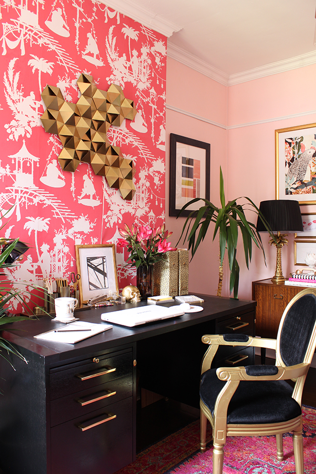
This was no after-thought. I carefully considered an absolute ton of different papers to ensure the entire design was eclectic but also cohesive and the same colours and finishes are used throughout the space making the wallpaper something that tied the room together but also gave the room a focal point.
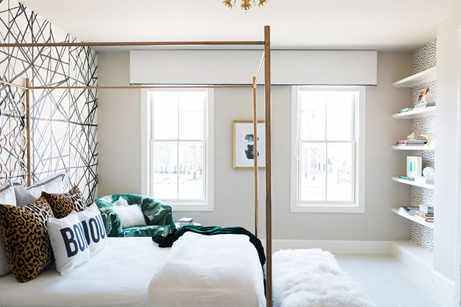
In a bedroom, your bed takes up the most real estate so why not give it some extra punch with a bold design that absolutely BEGS to be looked at? I fell in love with this home in Domino designed by Studio Ten 25.
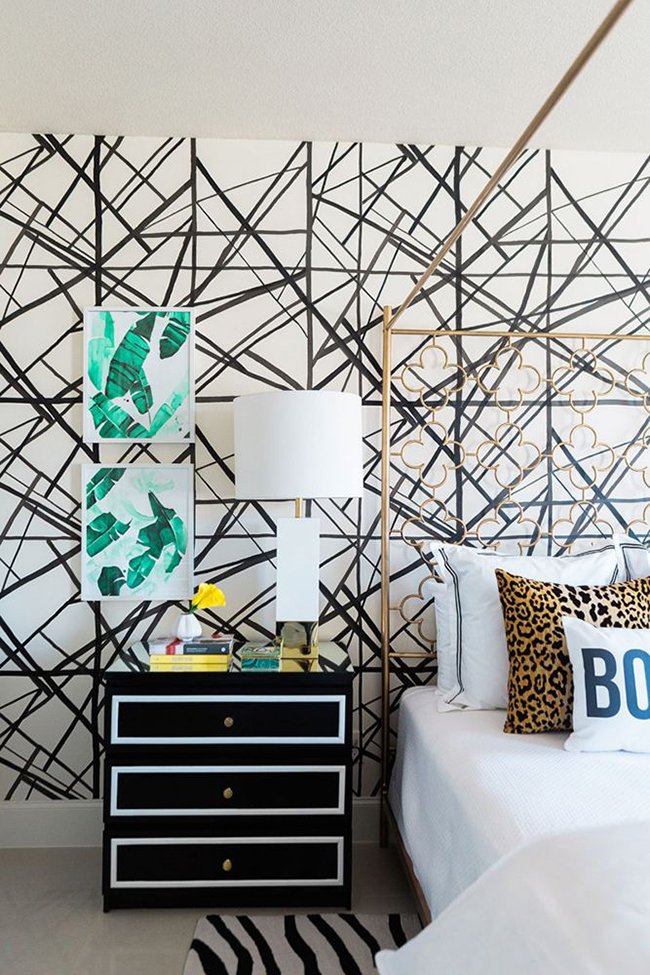
Another great feature wall. Melanie Johnson Photography for Domino
The other thing you need to consider is where it’s actually going to be used. Ideally, it should be placed on whatever wall you want people to see first. Not some random side wall that has nothing else going on on it. This is your first impression of the space. The one place that if people were only going to see that wall and no others, it says HEY LOOK AT HOW FABULOUS I AM!
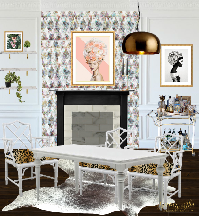
The final room design for my dining room including a feature wall – Check out my post here for more details.
You also need to understand how that feature wall is going to relate to the rest of the room. One of the worst things about bad feature walls is that many times, they have no real relationship to the other four walls. It’s so important that it ties in with the rest of the space and actually makes it look purposeful rather than just something thrown up there because you couldn’t find something better for that area. Tie in the other walls via a paint colour that picks up one of the colours in the wallpaper or choose accessories and furnishings that compliment the style and pattern of the wallpaper. I mean, there’s no point in doing a traditional damask pattern if the rest of your space has mid-century furniture, ya know? Make sure whatever you choose is echoed in the rest of the room to tie it all together.

Can’t WAIT to get this up in the dining room…
So those are my tips on getting a GOOD feature wall. Anything to add? Are you fan of a good feature wall as well or do you think the feature wall has no place in today’s interior designs? Do you have any in your own home? Go on, talk to me.











Such a helpful post! I have feature wall woe right now – I don’t know what to do in my office. I have bought a roll of Laura Ashley paper that I love, I love it with the paint, but the thought of it on the end wall, being almost the main thing people see in that room (it’s opposite the door) makes me feel a bit funny. I don’t think I like it. I want the bold maroon there instead of the pretty but not very high impact wallpaper. In fact, when I think of it on any of the three walls in there (the fourth is going to be built in bookshelves) I feel a bit sad, like it’s a waste of wall, and also my pictures etc won’t stand out like I want them to. But I have bought the roll of wallpaper already! So I should use it, right? I think it is now destined to adorn the back of the bookshelves, to add a little interest to that space, but even thinking about that I am kind of thinking it will detract from whatever is on my shelves. Basically, I don’t think I love it enough, do I? I should just bung it on eBay and be done with it. Decorating is sooo hard! Wish I had your eye! xx
You know what I’m gonna say, right? ;) You clearly don’t love it enough Anna and it’s obviously not bold enough to carry a wall on it’s own or else you wouldn’t be worried about it. Trust your instincts on this one – use it somewhere else in your home or accept it’s not quite right and sell it ;) xxx
Thanks for the reassurance! You’re right, I don’t love it enough. eBay I guess, because I don’t think it will work anywhere else in the house either. Pfft. Ah well, better to know now than having already put it on the wall! :-) xx
Definitely! You can always then recoup some of your costs rather than have wasted it by putting it up and not feeling it was the right choice :) xxx
Fab post! Thanks! I do love a bold feature wall, but you’re so right that it has to be in your face bold if its to have any effect! I am so in love with the grey cloud wallpaper – think its Fornasetti – but who cares, I adore it. I also cannot wait to see yours up on the wall. It’s going to look amaze.
Glad you’re back up on your feet too :)
Jill x
Yes I believe it’s Fornsetti as well and it’s utterly glorious :) Thanks so much darling, definitely finally feeling good again! Yay! Just in time for the weekend :) xxx
I am dying to see your dining room! I know it will be delicious!! xoxo Cheers!
I can’t wait for it to be done! At the moment, we are living on a building site! Ha! Mwah! xxx
Yes murals are damn good too! And you are definitely the best example on how to do the wallpapered feature wall right!
Ahh thanks darling. And hell yeah, I do love a good mural :D xxx
Very informative post, thank you for breaking it down. I have seen so many fabulous feature walls and LOVE them. I have been looking at paper for my dining room so this was perfect timing, Can’t wait to see your finished dining room.
Toni
Oooh exciting! Good luck with your search! xxx
Great post Kimberly. Show homes still seem to use the badly done feature wall never mind dated hotels. I despaired when I was house-hunting. But get it right. As you do. It looks amazing. I’m a sucker for a good feature wall myself.
Oh yes show homes are the worst!! LOL! Aww thanks darling ;) xx
I’m loving that botanical print feature wall. Can’t wait to see your dining room all done up. x
Thank you Geraldine! Me too!! Been working away all weekend ;) xx
Love this post! Only recently I told someone that feature walls are only ok with a very bold wallpaper, beautiful mural or stunning pattern done with paint. I love how you’ve broken it down and even showed the example of how NOT to do it (I cringe every time I see walls like that, even when the amazing Emily Henderson did it in her bedroom). I’m going to save this post to show it to anyone who wants to do a feature wall using a ubiquitous floral damask or dark paint colour!
Yay!! So pleased you liked it! I think when people see bad examples over and over, they can easily get it wrong but I do believe there is still a place for them – you just gotta know what you’re looking for ;) And that’s normally something bold! Definitely on the same page with that ;) xxx
I love a featured wall and Kimberly your dining room is going to look AMAZING and that featured wall paper is to die for and I love the artwork so much! A x
Ahh thank you lovely!! We’re getting there!! xxx
Amazing post. Putting wallpapers on the main wall is in trend now-a-days. I have been searching for some great designs in wallpaper to suit my living room. All the designs here are awesome. Now I’m confused with which one to choose. Thanks for sharing such a nice post.