I think by this time, my love of leopard print is a pretty well-established fact. And yet, I’m well aware that it’s basically the ‘marmite‘ of design (ie., you either love it or you hate it – and for the record, I hate marmite which makes me a very bad Anglophile).
Jenna Lyons, Creative Director and President of J. Crew, famously said, “As far as I’m concerned, leopard print is a neutral” and every leopard print lover out there rejoiced. Because we all went, “OH WOW, SHE’S SO RIGHT.” And this is true not just in fashion but it crosses over to interiors as well.
How can it be said that it’s a neutral? I mean, there is some colour and pattern within the classic print but somehow, it manages to go with everything – brights, neutrals, clean white, black, moody hues, florals, checks – the list goes on. And I’m going to share some of my favourite inspirational images using leopard print to illustrate this point.
I think the issue with it is, you have to treat it delicately. You have to handle leopard print with care. As another food analogy, it’s like over doing it on the spice when you are cooking – just enough and it brings all the other flavours to the fore – too much and it will overpower the entire dish, making it inedible. Or in the case of design, making it just look a mess. Balance is key.
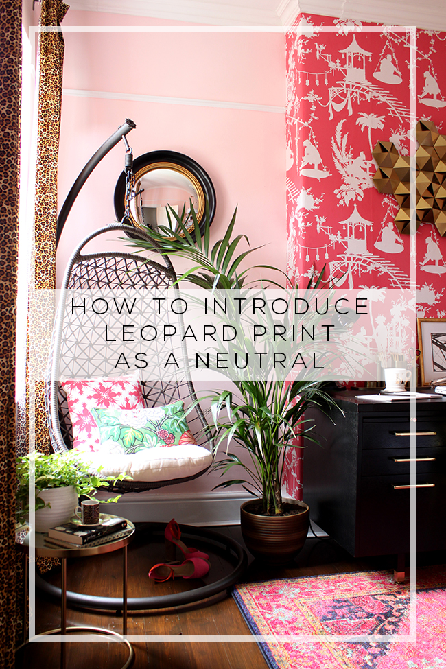
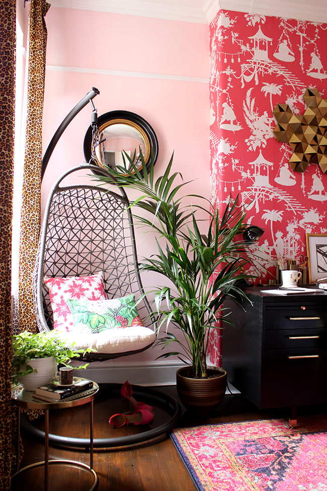
When I designed my office for the One Room Challenge this past Spring, I knew I wanted to introduce a bit of leopard print to the design. I initially considered a leopard print chair but like that spice, I just felt it would fight a bit too much with the other flavours in the room. No, I wanted it to fall into the background, a touch of it was enough. So I introduced it in two smaller ways.
The curtains were just enough to not overwhelm the space. They are not necessarily the first thing you see when you walk into the room (the wallpaper on the chimney breast is probably the first thing to grab your eye) and I used it in this area on purpose. Against a soft pink background, they really do act as a neutral, simply adding a bit of spice to a flavourful room.
I used it again on the desk to pull the pattern more into the middle of the room but just on two magazine files. A dash of it was enough. I didn’t feel the room needed any more than this.
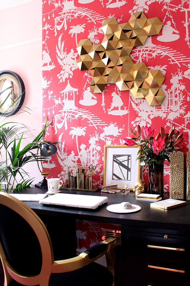
And this is the secret to using leopard print as a neutral. It shouldn’t overwhelm the space. It shouldn’t be the first thing that jumps out at you. Leopard print has a tendency to get LOUD very quickly. Let’s use another analogy – it’s like the base guitar in a band. It supports everything else but it’s not the first instrument you hear. If it starts getting loud and overbearing, you will fail to hear the rest of the instruments. It’s a supporting player, not the star of the show.
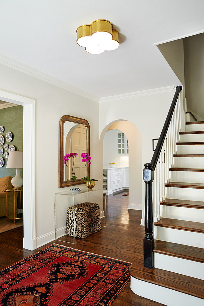
The foyer above perfectly illustrates this. Designer Amie Corley uses it sparingly in a small stool under a lucite table. It marries beautifully to the vintage rug and the gold accents. It doesn’t scream for attention, it’s a subtle accent that goes a long way in creating a bright eclectic space.
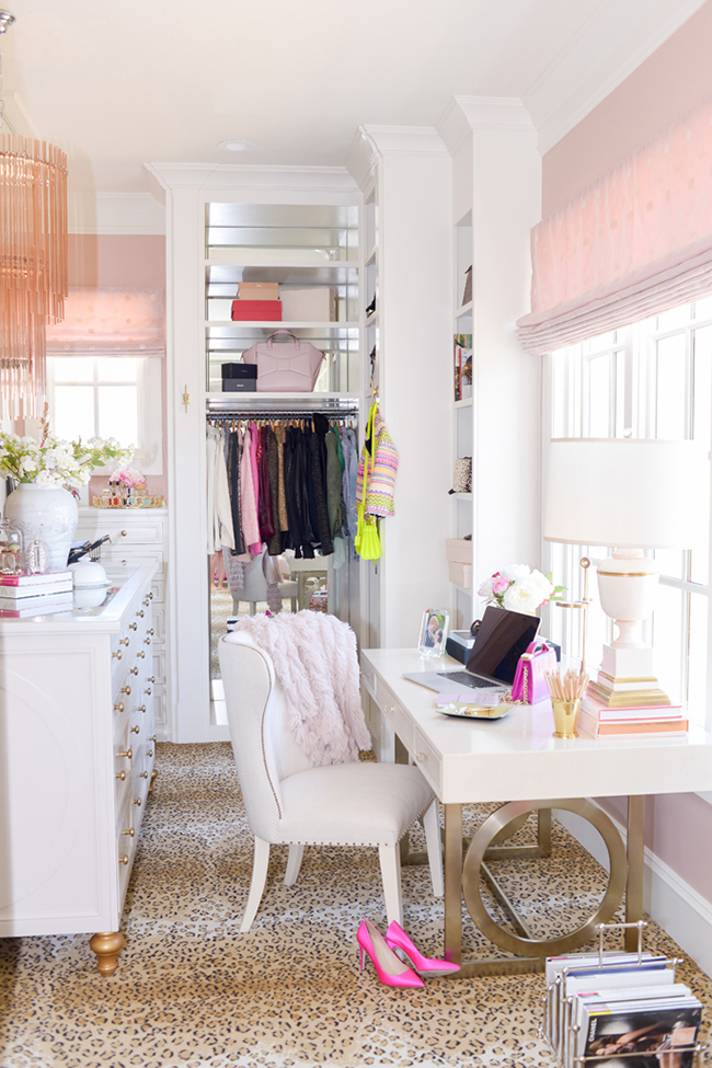
Rachel Parcell of Pink Peonies used a pale leopard print rug in one of my favourite office/dressing room spaces ever. It’s a glorious backdrop that adds glamour but you’ll note it is not a pattern that’s repeated anywhere else. It marries to the other colours in the room – soft gold and white and pink – without fighting for your attention.
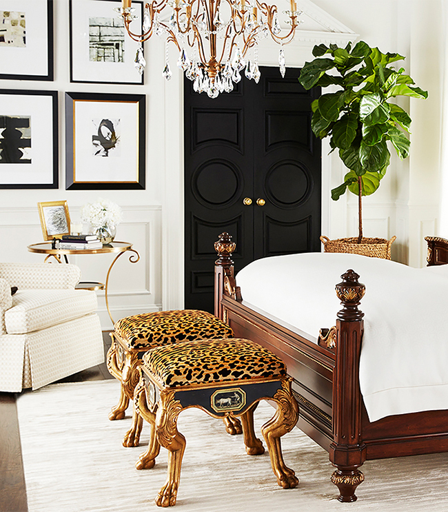
Want full on glamour? Keep the rest of the space in a highly restricted palette as shown here by Horchow (via Domaine). Black, white and gold create a neutral palette but adding in a splash of leopard print in small scale stools gives the whole space wow factor.
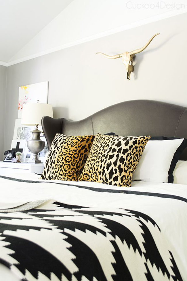
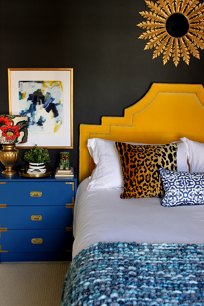
I recently introduced you to Julia from Cuckoo4Design and her bedroom is another great example of using leopard print as a neutral. The bedroom’s soft colour scheme is accented with a pair of leopard print cushions. They add warmth to the space and a touch of drama without overwhelming the senses.

One of my favourite tours on Lonny from a few years ago included this stunningly styled fireplace but it was the upholstered foot rest/coffee table with curvy gold legs that grabbed my heart.
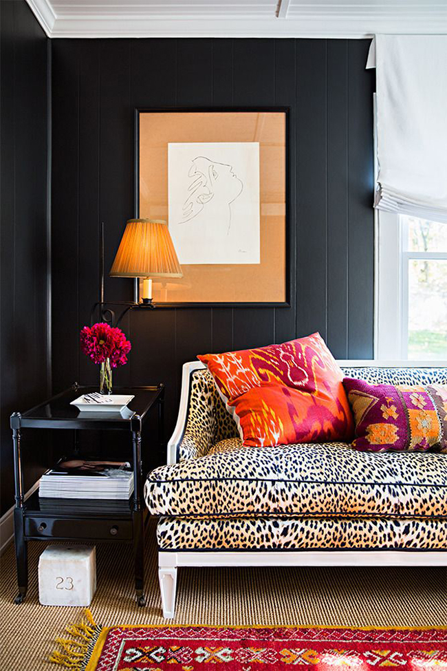
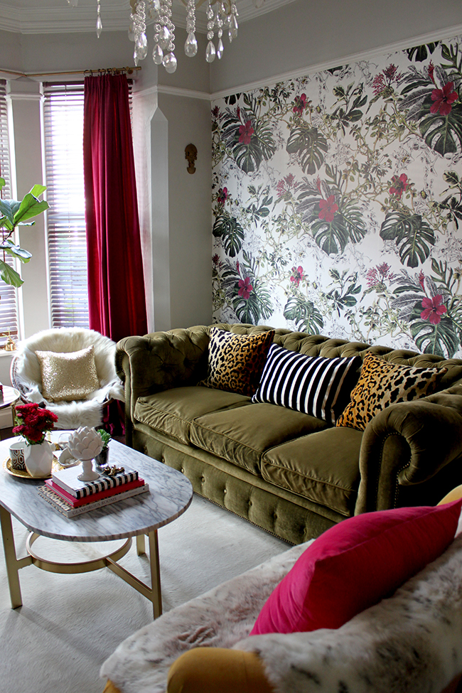
Feeling brave? Yes you can go leopard print on a larger scale as shown on this sofa above (Patrick Mele via Domino). How does this still work? With a black wall colour and the larger pieces around it in neutrals, it reads sophisticated rather than tacky. Bright colours are thrown into the mix which adds some fun. Not a look for everyone but yes, it can still work. If he’d added leopard print cushions or leopard print wallpaper or used it somewhere else – it could have gone wrong but it’s just enough to keep things interesting and exciting.
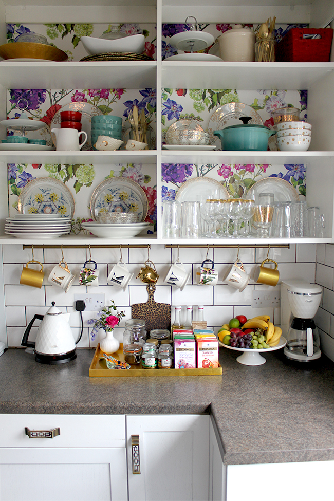
I just had to share my love of leopard one last time. In my kitchen, I have a little leopard print cutting board, purchased a few years ago from Zara Home. I think it’s more a serving platter than something you’d actually want to cut upon but every time I share it, someone asks where it’s from. It works so well with the floral pattern, though, doesn’t it? See? Leopard print really is a neutral.
So tell me… are you a leopard print lover too? Or is it something you could never see yourself using? And if not, why not? I’d love to hear your thoughts on this one.














Thanks so much for sharing my bedroom on this great line-up. This reminds me of the one reader who was kind of angry and told me I was wrong when I said leopard was a neutral ;)
Hahaha! Oh man, what are people like? IT IS A NEUTRAL DAMMIT. Send them my way ;) xx
Oh, yes indeedy! I come from the Jenna Lyons school of thought on this one too and I love what you said about it being a supporting player ;) Leopard is the only pattern I know that can instantly ground a space and I think that is because the colors are earthy and it has enough contrast that it can go with anything. You shared some of my all-time favorite interior shots in this post :) xo
Yes!! That is so true – earthy goodness to the max! Yum yum. xxx
I hate leopard print, I actually talked about it in my post today! Haha but my nine year old daughter loves it. Even though I hate it I can appreciate it and I love how you use it in your home. I don’t think you would be you without leopard print.
Aww I know it certainly divides opinion!! I think you are probably right about it being very me ;) And your daughter has excellent taste by the way :D xxx
Growing up, I was not an animal print fan. I don’t think I had been exposed to GOOD animal print. As we know, there are many tacky ones. Over my adult life, I have come to appreciate them, whether in home decor or fashion. Of course, leopard print has become very prominent in my pillow business. Funny, you and your first two commenters each have leopard velvet pillows from my shop!
Oh yes, there are MANY tacky looking animal prints (I learned this when I was searching for a low-cost wallpaper for my dressing room shelving!) ;) I’m going to be doing a follow up post with some of my favourite leopard print accessories and you KNOW those cushions from your shop are going to be included ;) Love them! xxx
Marmite for me too I’m afraid. Years ago I had a leopard print blouse which I wore once as hubby hated it…not sure Leopard would fit with my existing pieces, I have thought about introducing just one cushion as I have a lot of texture going on in some vintage Turkish rugs…I’m on the fence really, I like it in other spaces and it does suit your style really well, but I’m reluctant to pull the trigger and buy! Undecided! Sharon x
Maybe my post today will help Sharon – it’s really about finding the *right* leopard print because so many can be SO bad ;) Good luck with the search and for the record, I think a single leopard print cushion would be amazing with vintage Turkish rugs – go check out Stuck on Hue (my post today has the link), she’s got beautiful ones! xxx
I definitely am a lover and use it almost in every room. Great post and some fabulous interiors.
Yay!! #teamleopardprint ;) xxx
You picked a perfect topic! I love leopard print and have wanting to incorporate it in my decor. .I usually did vases and small objects. ..but have been wanting to go bolder. .it’s just hard to find the right prints without looking gawdy..the ones you showed are perfect! I just have to keep looking. .thanks for all the inspiration
Oh I think my post today might help you out Jamala! It’s a minefield finding the *right* leopard print and so I’ve given a few tips. Go check it out when you can :D xx
I love leopard print, and I totally agree that it’s basically a neutral…but I would have said that that was dependent on you having a fairly boho/eclectic feel in your home in the first place. However, now that I’ve seen Cuckoo4Design’s fab bedroom I see that I was wrong! *heads off to search for leopard cushions for her own dark grey bedroom*
I do however, think that not all leopard is created equal, there are definitely some that are waaaayyy better than others.
It really does go with everything no matter what your style!! And agree that there is some REALLY bad leopard print out there ;) My post today goes into some more detail about finding the right kind of pattern so perhaps you might find it helpful!! xxx
Kimberly you are a girl after my very heart, I love animal print. Almost every room in my home has a touch of it.In my most recent post I am wearing an animal print dress, imagine that.Have a Great day!
Oh you look FIERCE in your dress! I love it! And there’s no way you are 50!!! You rock it, girl. Oh and I’m wearing a leopard print dress in my profile picture so I’m all about wearing it as well – whoop! ;) xx
How could anyone *not* have leopard print…or another animal print…in their home? In their closet? :) And how did I *not* know about your blog? I promise I haven’t been hiding under a rock but came over yesterday from Julia’s blog.
Your home and blog too = awesome! I love your use of color and your style. Will be a new follower and can’t wait to see more. The photos shared are stunning!
xo
Pat
Yay!! So happy you found me (isn’t Julia just awesome? I love her.) :D Thank you so much and so happy you’re here! #teamleopardprint xxx
Lol love the marmite saying, having said that i have to agree that animal print is a lot better than it used to be. I have a couple of Zebra print pillar candles, and lamp shade and thats about it. I do like leopard print but never seen anything of quality i wanted to buy (yet).
It’s so true that it’s hard to find really beautiful leopard print Pauline!! My new post today might help you out – check it out when you get the chance :D xxx
As a fellow leopard lover, I was obviously all over this post! And it’s brilliant as always. I agree with you and Julia about it being a neutral, as it’s just so grounding, but it’s an interesting neutral instead of being a boring old beige. And I LOVE the way you use it! xx
P.S. My own leopard print post is bubbling away in my head, please don’t think I’m copying (when I eventually post it in 2019!), despite my tremendous stalker tendencies, it’s just that I love it so much myself!! xxx