As you probably know from my last post about my dining room, I’m looking to make a few changes. Now, there are other projects on the go at the moment (namely, both the front and back gardens and no, unfortunately, the weather here, while dry-ish, has been really cold and windy and not great for gardening so I haven’t made the progress I’ve wanted to yet!) and Wayne is actually in the middle of making some big changes to his ‘man cave’. I also want to concentrate on our kitchen and get a few things done there so my dining room is going to have to wait for a bit.
However, that doesn’t mean that I’m not still thinking about what changes I want to make to this room and it doesn’t mean that I’m not taking inspiration from some of the staggeringly gorgeous dining rooms out there that I keep discovering. Swoonworthy indeed.
So I thought I’d share some of my inspiration with you here today and talk about 5 things that in my eyes, makes a dining room swoonworthy…
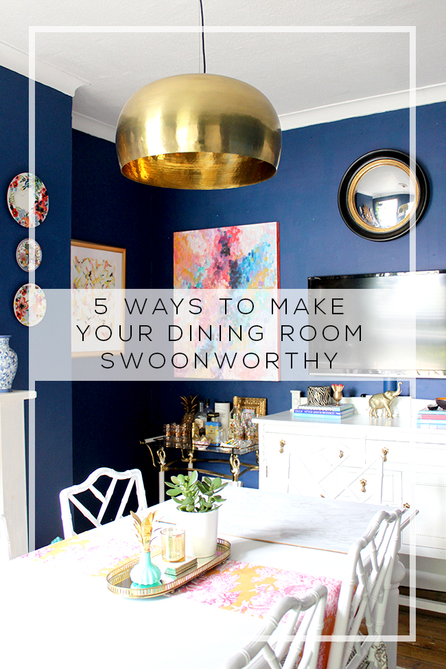
Here so here are my Top 5 elements that keep me coming back for more…
1. Amazing Lighting
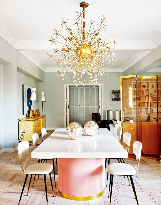
Okay, yes, that blush pink white and gold table is pretty ridiculously gorgeous and yes I totally want to roll around on it naked (TMI?) but that light fixture just gives me the feels. And check out those skinny sexy numbers flanking the console table at the back – I mean REALLY. Now, you know I love a bit of vintage but the lighting here is so unusual, so eye-catching that it makes a really big statement. I think with statement lighting, you can really play with scale a bit and having a teeny tiny light over a big table just looks a bit wrong. So in this case, go big or go home.
2. Contrasts

Now that dining room is not exactly my own style but wow, it’s a good one. Why? Because there are so many contrasts going on. Not just in the black frames against white walls (although I do adore that look, SEXY AF) but also in the materials. Check out how there is glass, metal, wood, linen, faux fur, plant life – all creating this textural orgasm of a room that begs to be touched. Contrasts are good in any room in any style – you need those layers of different materials to really give a room wow factor.
3. Organic Forms
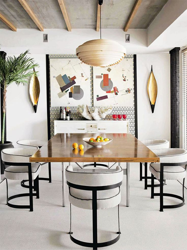
Okay, tear your eyes away for one second from THOSE CURVY CHAIRS (ohmahgawd I know, right?!) BUT I want you to check out the light fixture, the shell on the console, those weird skinny bowl things on the wall, the plant in the corner. All these little organic touches give a room warmth and appeal to that side of us that feels good when we go outside. When everything is straight, strong lines which you will get from your dining furniture a lot of the time, you need these little organic touches to make it feel inviting and to create a softness in a space.
4. Great Art
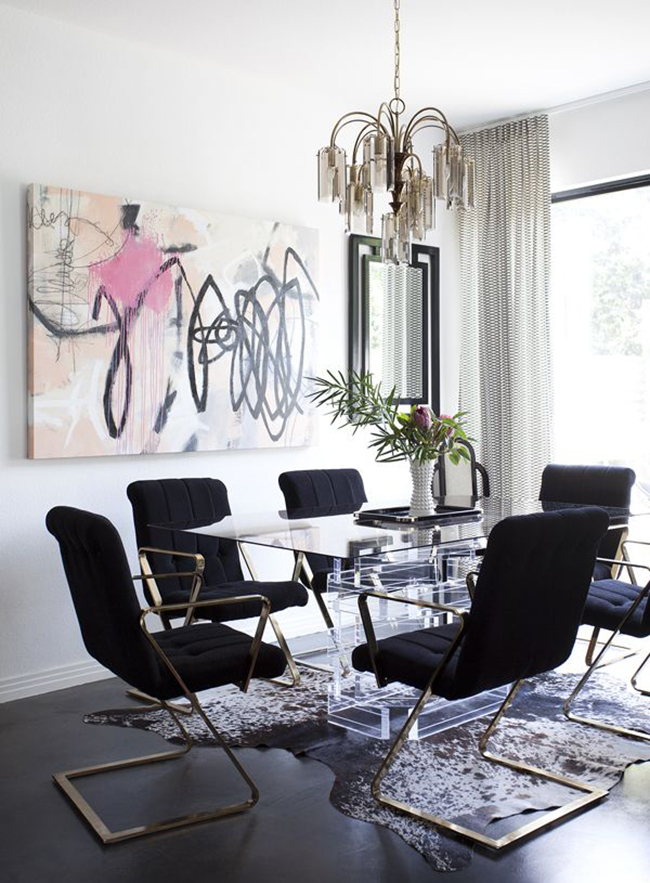
Now I think I’ve tried pinning this dining room about 30 different times. Every time I see it, I’m like PINNINGTHISRIGHTNOW and Pinterest is all like, ‘psst yeah numpty, you’ve pinned this one already like a million times now just stop already because you’re giving me a headache.’ But it’s just gorgeous. From those sexy chairs to that amazing rug and the vintage light fixture and the lucite table, I am all over this one. But I think it’s the artwork here that really just pulls the whole thing together. I do love a good abstract and the colours in this one – that combination of blush pink and black and white creates this cool vibe that works so well with the rest of the space. Your artwork should make a statement and as you probably know, I’m totally into BIG art right now and this one just does it for me.
5. Something Unexpected
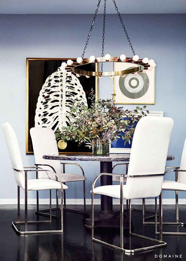
Y’all see that right? It’s a painting OF A RIBCAGE. WHAT. Yeah, exactly. When you throw something into a space that makes you look twice and makes you question your own existence and makes you want to burn your house down and start all over again (I am not advocating this just in case), then you know you’ve hit on something good. What kind of stuff does this? The kind of stuff you’d never expect to see. I think every room needs a little question mark in it, a ‘what is that about?’ object to sort of throw things off a bit. When things are too perfect, too staged, they look cold. You’ve got to throw your personality into a space because we’re all different and we’re all a little weird in our own way so why not share your weirdness in your home?
So I hope you’ve found a little inspiration today for your own dining rooms as I have found for mine. I don’t really know exactly what I’m going for but I know great lighting, working with contrasts, something organic, great art and something unexpected are all elements I’m going to try to incorporate.
Do any of these catch your eye? What do you think makes for a swoon-worthy dining room?
Sources: Nuevo Estilo / Eye Swoon / Unknown / Lonny / Domaine











Yes yes yes to alllll these! Especially the lighting. Im telling you fab lighting is key in a dining room!!
Totally agree! I looked for a fantastic vintage light for my dining room within my budget for 2 YEARS with no luck *sob* so ended up getting something that was new but I still like well enough. Still searching though – if I come across something fabulous, it’s gone! lol xxx
OHMYGOD THOSE CHAIRS!!!! (That’s what I said at pic 3, and then I mentally added one or two or fifteen exclamation marks at pic 4! Love them.
I’m glad I’m not the only one who has Pinterest go all “Yeah, I know, you pinned that ALREADY, AND MORE THAN ONCE!” And that always makes me think “How could I have pinned this and not remember? I’m sure I saw rhis gloriousness for the first time, ever, just now!” Swiftly followed by “Dang, past Alex, you have great taste! Well done, girl!” :D
Are you letting Wayne work on his man cave all by himself?
Hahaha! Your comments always make me laugh!! “Dang, past Alex, you have great taste!” >> LOL!
And yes, would you believe he removed a WALL when I was away in Dublin for the weekend?! I leave him alone for 2 MINUTES and he’s knocking bloody walls down! I’ve left him to it!! *cringe* xxx
Your DIYing, decorating ways probably rubbed off on him! :D
Oh he’s always been like that! It’s really no wonder why we’re together ;) xxx (even if it does do my head in when he pulls stuff like that lol)
Gosh I want that first chandelier.
You and me both, my dear… sigh. xxx
Ok, seriously though, we really are soul sistas! I have pinned image number 4 umpteen times too!! Every factor you described is what draws me to it. And I am with you on thinking about spaces to redesign in my house that won’t be redesigned for quite some time!! Of course we start thinking about those changes months, maybe even a year/years before the actual work can begin. Ha ha!
Ha! Great minds, eh? I can’t stop myself – that picture is just SO GOOD! And hell yeah, I’ve been dreaming/planning of my hallway remodel for 5 years and there’s no way it’s even happening this year ;) Hey it’s good to have a plan right? Even if it DOES keep changing lol xxx
Kimberly…you had me laughing reading this..this morning. I’m lucky my cereal didn’t come shooting out of my nose! (yuck!) Loved your sex(y) statements! You made my day!
That light.. #1 want it! Any idea who carries it? And that artwork on #4..love it! And some of those chairs…you are right! swoon! Have a fantastic day! Amanda
Hahaha! My sincerest apologies for any cereal shooting incidents incurred while reading my post!! ;) No idea where to get a light like that (I imagine 1st dibs would have similar but they’ll be like ££££ *sob*). Have a lovely day my dear! xxx
Wow, definitley some food for thought. Love your dining room and that one with all the windows, how perfect would that be.
I know – I adore all those windows in black frames! Definitely something to think about for my *next*/*dream* house ;) xx
These are all fab tips and I completely agree with all of it. I’m definitely into the question mark objects. Every room needs at least one :) xo
It’s so true, isn’t it? I love it when a room has something in it that just throws everything off! ;) (I totally need more of those in my house!) xxx
oh to have a never ending lighting budget – love your choices! (Those lamps in the first image look a little like those from Delightfull – great lighting, but ££££)
Why, oh, why, was I not born a millionaire? I love the GOLD chandelier in the first shot. But I shocked myself when I saw number three. I loved (almost) everything in that room, including the artwork – no, especially the artwork!! There’s something about the colors in the pieces that I find so pleasing. Of course, the chairs are gorgeous and if I might add a note of practicality, I’ll bet they’re quite comfortable, too.