Oooh controversial!! I know, I know… bear with me here. Gallery walls have been going mega strong for a good few years. And as you probably know if you’ve been following me for any length of time, I’ve embraced it myself. But I’ve been wanting to express my thoughts on them for a while so today I’m gonna just go for it. Don’t hate me, k?
I mean, what’s there not to like about a carefully curated selection of art that beautifully ties in with a room scheme as well as shows off the personality of the creator? Nothing, that’s what.
However… I’m wondering if we’re starting to see a bit of a backlash recently. So yes, everyone and their mother now has a gallery wall in their home. Up the stairs, there’s that familiar ‘family wall’ of black and white portraits in white tee’s and jeans. In the living room, it’s a series of vintage botanical prints downloaded online for free from the archives and lovingly displayed in Ribba frames. Or perhaps it’s a mix of motivational quotes in gold foil for the home office. Is there anything wrong with this? Of course not. It’s your home, do what you like. If you want to express yourself, what better way is there than to create a gallery that reflects you?
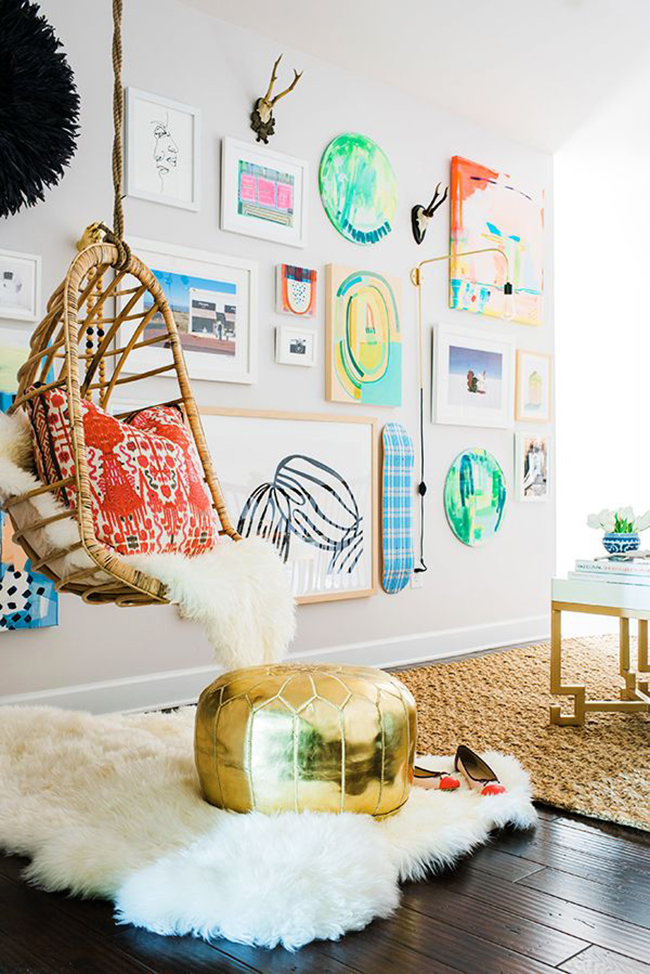
An example of a great gallery wall from Waiting on Martha
So before I get slaughtered in the comments, please know that I don’t necessarily abide by ‘trends’ or think you should get rid of something just because suddenly, it’s been adopted by the masses and yes, it’s YOU that gets to decide whether you love something and want to adopt it for yourself, however it is you see fit. Your home? Your rules. So if you have a gallery wall in your home and you’re sat there thinking “how dare she!” then, yes, of course, I’m all for it and I’m not saying you shouldn’t have one. Okay, we’re clear on that? Good. Let’s move on.
What I want to explore today, however, is how much I’m being both influenced and swayed into the regions of just using one large statement piece instead of a lot of smaller pieces together. I can’t help it – gallery walls have become ubiquitous. I guess I’m just craving change right now.
When I decided on the gallery wall in my new home office, I really battled with whether it was what I wanted. Or whether I should have spent my money on a single strong statement piece instead. I’m still uncertain about my decision as much as I love my office. But for now, it’s pretty and it works and it’s done – so it’s staying.
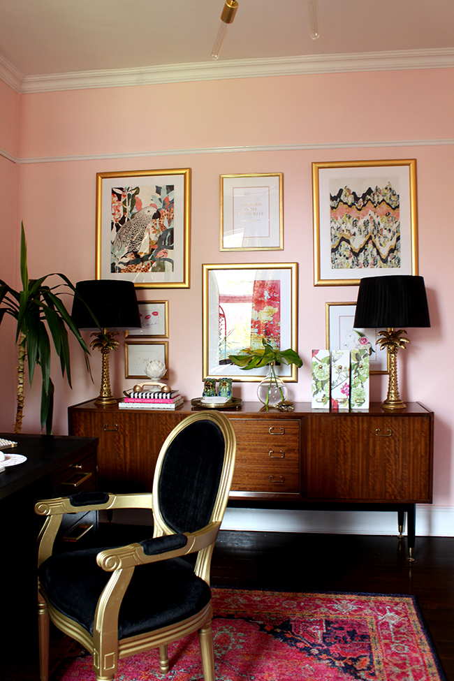
My own office gallery wall – yes, it’s staying.
In the dining room, it’s a different story. I have to be totally honest with you guys because well, I don’t know how NOT to be but I feel like I’m sort of ‘done’ with my gallery wall in here (yes, the one I worked so long to complete and finished 2 years ago and have made changes to ever since). The issue for me is that there are plenty of pieces on it that I’m not actually all that keen on any more. And replacing old art with new art all the time gets spendy. And sometimes it just feels a bit too busy to me. And the pieces I do like, I kind of want to hang elsewhere to allow them to really shine. It’s a statement for sure but is it really still the statement I want to make?
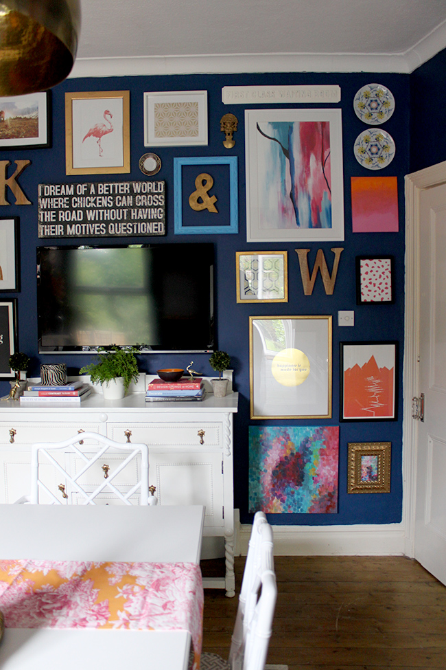
My dining room gallery wall – are its days numbered?
Yes, I have Decorator ADD and yes, I like my rooms to evolve and change – it’s just how I am. So I’m trying to decide whether I want a different look for the wall. The whole reason I did a gallery wall in here was to disguise the fact that we have a TV in our dining room – which for all accounts and purposes, I realise, is bizarre but it works for us and it suits the way we live. So while we will continue to have a TV in this room, it may actually move locations to a different wall.
This then opens up a world of possibilities. I wouldn’t need to ‘hide’ the TV there, I could possibly look at something else, something larger – one big piece? Hmm. Possibly. I love the look but big art is also spendy of course. Could I DIY something? This is another possibility.
Are we seeing a shift from galleries to a single statement piece? Currently, both are sort of living in harmony in the interiors world but for how much longer? Will the single statement piece actually replace the gallery wall soon? Will we all look at gallery walls in 5 years’ time and think, ‘wow, that’s soooo 2014’?
And then I see something like this which I posted to Facebook as soon as I saw it because holy heck, that’s a great gallery wall. And from the reaction, I was not alone in my unadulterated admiration of this space. So maybe I’m full of it and there’s no such thing as gallery walls falling out of favour because when you see a great one, well, it’s hard to resist.
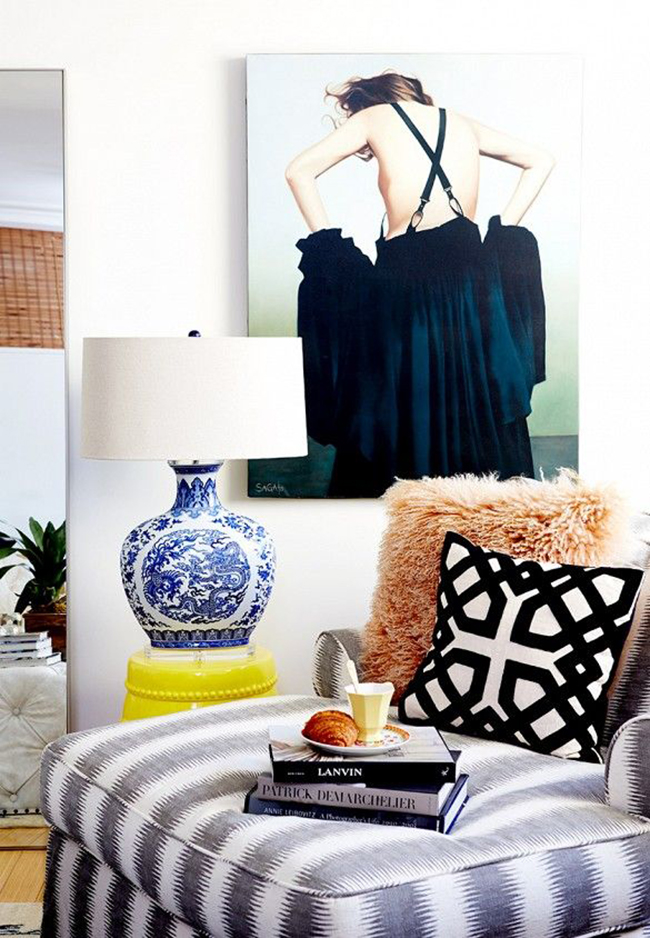
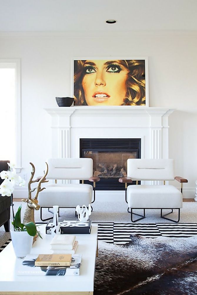
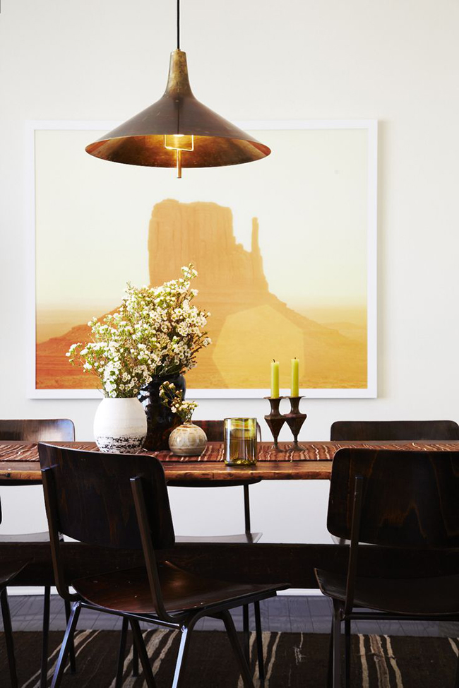
And then I see a great statement piece like this and I want to immediately rip down my gallery and start afresh.
What do you think? Is this really the beginning of the end of the gallery wall or do you think we still have a good few years of this look left? I’d love to hear your thoughts.


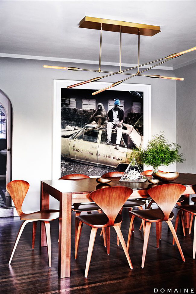





Ha, I just removed my gallery wall in my dining room for my large piece of canvas art. I was sooooo over my gallery wall. But my family photography up the stairs is staying LOL.
I totally get and agree with what you are saying.
i have honestly had some of the same thoughts lately…. for me personally i still love a good gallery wall because i love collecting little pieces and i don’t feel nailed to one statement piece. but i am drawn to spaces with one fab piece, too, so i feel that pull!
I so understand. I did gallery walls for a while in a couple of rooms, now I am loving just one single major impact piece. The room just seemed to open up and breath, or may it was just me.
Anything done well is a contribution, but gallery walls are a difficult way to present art. As with everything popular, it becomes generic and uninspirational after a while. When the novelty wears out true art still stands, but most often gallery walls are more fun and creative than classics. Art need to be presented in a fresh surrounding all the time, unless it is one of those very meaningful ones. Large items got boring the last time with generic posters from ikea with skylines and lamborghinis. You will get tired of your new art as well, but good thing there are second hand markets and auctions right? Better that then the look I am going for, blank walls since I know I will be bored =)
As a bad decision maker I guess I would find it impossible to choose only one piece of art. Which one should it be? There are just too many great images!
And as a clinical “as soon as I have it I don´t like it anymore that much” maniac person I´d be scared to spend on a huge statement piece, cause, well…what if I don´t like it tomorrow any more? :-S
That´s why I wouldn´t say goodbye to gallery walls just yet. Plus why not like and embrace both gallery wall and statement piece? Most houses have more than one room. ;-)
That being sad I totally understand if you wish for change. If you don´t feel like it anymore, then just go for something new. It´s nothing irreversible. ;-) (Unless you are planning to give me all the pictures you remove. Then you wouldn´t see them any more :-P :-D)
Totally depends on the space. I’m like you, I go back and forth so much!
It’s always good to discuss ideas and change can be uncomfy for some. I agree that why not change it up if that’s what floats your boat? I do feel that as you have said if it is done well it is a thing of deep beauty but like anything if not so well curated then it can seem a bit messy. Not yours however as it has inspired many to be brave and do their own. Like anything some people have an eye and some may struggle… I count myself as a bit of a struggler so have moved towards the large piece in my dining room – that said I have a tv in my dining room to but its on a chimney breast and the dark walls disguise it a bit…
I certainly agree with everything you’re saying here. Gallery walls are getting to the point where they’ve been “done,” and I think we have all seen at least one or two that verge on tired and cliche. But like you, I still see a gallery wall now and then that inspires me. Like the one you pictured from Waiting on Martha’s ORC room. The mixture of 3D and unexpected objects keep it fresh for me. Emily Henderson also does an amazing job of putting together gallery walls with real art, and I wouldn’t want her to quit any time soon. It is the generic printables and same old frames you mention that wear it out a little bit.
Finding large art pieces is also difficult. I have two very large pieces, and both were very fortuitous thrift scores. This is some great food for thought, though! I’ve been considering a gallery wall to mask my TV, like you mention in your dining room. I’m going to give it a little more consideration before I make any holes in the wall. :)
I’m actually in the process of doing a half-and-half in our bedroom. I’m going to have one large piece behind our TV followed by a bit of a gallery wall with medium-to-large pieces along the wall leading to our bedroom door. I’m on the fence about really forced or over the top gallery walls. I think if it suits the space, then I’m all for it! But if it makes a space more chaotic, just no. But that’s just my opinion! xx
Ahh, the gallery wall… I haven’t put one up yet because I don’t want to deal with all the holes in the wall after I decide to change it :)
I have been planning on doing a series of black and white prints from our travels but more of 3 by 3 style where all of them are lined up. If I tire of a certain picture I can change it easily without disturbing the balance of the wall.
Decisions decisions…
I still love a good gallery wall, but have always favored a large statement piece of art. Love you’re dining room but like you, I am always changing things up! Happy Wednesday!
I love both and have both in our home. Art should speak to you and if it’s not working for you anymore it’s worth a change :) xo
I don’t tend to like the gallery walls that are too perfect (all the same color frames with all black and white photos) but I still really like a gallery wall that tells a story, something that you look at and it brings back memories or one that a guest can look at and get to know you better but with that being said I seriously love a huge piece of art too!!
I’m from the “no rules” camp when it comes to your own home. If you look at your gallery wall and it makes you happy then that’s fine! I will say though that I am getting tired of seeing the same artwork on everyone’s gallery. You know what I mean: gold foil prints, ampersands, free printables, black and white stroke art, the same Etsy prints over and over, the occasional faux taxidermy, IKEA frames etc. Make your gallery uniquely you. I think Jenny from Little Green Notebook is a master at this.
It’s debatable ….a well curated gallery wall will never go out of fashion if the pieces have been chosen carefully. I think gallery walls can be a bit overwhelming if they are full of too much ‘stuff’ and not enough good pieces to warrant them being on the wall in the first place.On the other hand, one enormous well chosen stunning statement piece will live beyond the trends…in a way it’s not such a good thing to follow ‘trends’ go with your gut and do as you see fit.
I say why make a rule – let’s do whatever works best for us to be happy in our homes.
I loved a good gallery wall in my last home – it was very basic with very little architectural charm. My new home is 100+ years old and has beautiful wood trim. A gallery wall would take away from the home’s beauty. Statement pieces of art work better – plus it’s a bit more era-appropriate.
Whatever works for you, I say. I’ve seen both done beautifully – and not so beautifully.
Great blog post and a very hot topic! My thoughts? I’ve never been a fan of the gallery wall. In my humble opinion, a piece of art should be used as a statement piece in a room and therefore allowed to shine. A greater sense of atmosphere and presence and be achieved with the use of one awesome piece of art that is accentuated with lighting and either underpins the colour palette in the room, or contrasts with it. It’s difficult to achieve a focal point when the focal point is a mismatch of images/frames/themes or sizes.
But hey, that’s just my opinion ;)
Anita x
That’s crazy! Just last week replaced my gallery with two mid size round mirrors. Loved the old black and white portraits from the 50’s I had up but five years in two different homes is long enough. The wall looks fresh and open.
Ha! Yes, yes, yes, the gallery wall is very 2014, but it will always have a place, and I doubt they’ll disappear altogether. I totally agree, big statement pieces on their lonesome will definitely be what we start to see more of, and I’m all for it. X
I’ve never been a fan of gallery walls. While I can appreciate their beauty, I find them busy and cluttered so I’ve never had one in my house. I much prefer a single picture or, at most, a grouping of 2 or 3.
As usual we are on the same page. I love a good gallery wall but have always preferred large statement pieces. Unfortunately the cost has always been the deciding factor. I’ve even thought of painting my own but don’t think I’m up to the task. I always love the large pieces in store displays and wonder what they do with them when they change things up.
Forgot to mention that I love the new gallery wall in your office. It’s perfect but then you have that wonderful statement piece of art/light/sculpture that just hits it out of the park!
Ha! Funny! I’ve just done a post on the evolution of the gallery wall…I had to give you a mention, because I totally get it!! The appeal of that crowded nick nack -gallery wall look is starting to wear thin….but I think there is a new, more modern and fresh approach to it emerging, certainly in Scandinavia…Check it out Kimberley, and tell me what you think…if we still agree to disagree lets fight it out over social media (LOL;)) Great post by the way!!
Oh ….and if you want to make your own XL statement piece, check out the easy tutorial I did on creating some huge abstract art, as a guest post for my Norwegian friend at Room design: http://www.roomdesign.no/2015/04/21/the-big-easy-abstract-art-diy/ ;)
I’m all for a gallery wall as long as it’s original art. I think that is what separates it from the masses of other gallery walls out there. Original art is highly personal and unique. And these days, it’s very affordable as well!
To me there’s a difference between the gallery wall we see everywhere right now, and a great salon wall, which I think is an altogether different thing. The last image you showed is more of what I think of, and that’s a classic. I have one in my dining room and adore it. I have floor-to-ceiling bookshelves and have carefully curated original art and family art. It’s so perfect.
That’s not the same as printing printables and framing them because they’re cute and fun – I’m not criticizing as I’ve done that too, but I tend to think of those walls as trendy and less classic. So yes, I agree that the gallery wall we see on blogs might be leaving. But well curated salon walls? I think they’re timeless.
Love this Kim, and I feel ya friend. Im really starting to lean more toward singular statement art as opposed to a gallery wall. Its just so hard for me, because Im a total maximalist and I love allll the things. I have one that Im just starting now above my desk and its not perfectly constructed and its kinda gappy in areas which I like. It feels like a fresh play on something that quite honestly is getting a tad played out.
I love a good statement piece that captures your attention and won’t let you look away, and I think a good gallery wall can be just as visually interesting. In my mind, it depends on the space and what the designer/stylist is in the mood for–either look can be a hit! Whatever design decisions you make I know will be spectacular, as your taste is impeccable!! Thanks for sharing your dilemma and allowing us to join in on the fun brainstorming session. ;)