Egads, guys, we’re actually HALF WAY THROUGH the One Room Challenge™. I can’t even begin to tell you how quickly this is going and I’m already starting to panic! Eeek!
For those of you who aren’t familiar with the One Room Challenge™, Linda from Calling it Home chooses 20 different bloggers to all makeover one space in 6 short weeks! Every Wednesday, we all share the progress on our rooms so be sure to check all of them out at the end of my post!
Catching up? Start here: Week 1 / Week 2
As you know, we’ve decided to give our very sad and neglected second bedroom a complete and total overhaul from top to bottom and turn it into my home office. We’d successfully torn down the ceiling, removed lining paper, replastered and filled the old walls and replaced all the old floorboards with tongue and groove pine flooring.
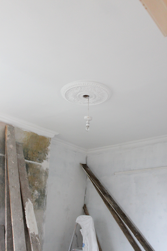
Before we stained and sealed the flooring, it was time to paint. The ceiling, cornicing and ceiling rose all got a couple of coats of Dulux Brilliant White Matt paint. The room instantly looked fresher but of course, we had a lot more painting to do.
We used a white gloss on the skirting boards and on the picture rail and I was desperate to find a pale pink paint that would work with the wallpaper I’d chosen – Thaibut’s South Seas in pink. This is not what I would call a typical pink – there’s a lot of peachy undertones to the colour so finding a pink paint that had those same peachy undertones was absolutely paramount. As much as I love the soft grey and brown blush pinks, it just wouldn’t work with the wallpaper.

That meant immediately, Farrow & Ball’s Calamine and Laura Ashley’s Old Rose were out of the running for being too brown/grey.
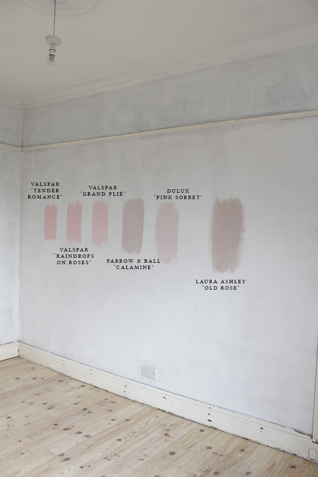
I really wanted something quite pale and while Dulux’s Pink Sorbet was a lovely pale colour, there was a bit too much blue in the undertones to really work with the wallpaper. Another one crossed off the list.
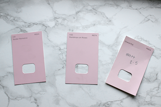
That left me with the 3 Valspar colour choices, all of which were quite similar but with Grand Plié being the palest of the trio and with Wayne (a talented car sprayer who has an excellent eye for colour – yes, he comes in handy!) agreeing the undertones were right, I went and bought a 2.5 litre tin of the Valspar Grand Plié paint at my local B&Q.
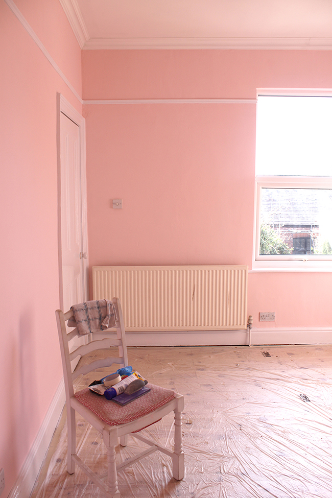
Well, you’d think that’s where it ends but unfortunately, it isn’t. I got to work painting the first coat and panicked. When the light hit it, it was a soft lovely blushy pink but in the shadows, it became a bright, luminous almost NEON pink. Oh noooooo. That’s not the colour I wanted. And let that be a lesson – you really need to paint patches where the light hits the room differently because yes, the colours do change in different light.
Still panicking but aware of the tight timescale I was on, I finished the first coat and then left it for a couple of days to decide my next move. I didn’t even take pictures because I couldn’t really capture JUST how luminous it was with my camera but trust me, it was shocking. Because I didn’t want to have to spend a lot more on paint if I didn’t have to, I ended up diluting the colour with 50% Dulux Brilliant White and tried again.
I was so relieved to see that it was no longer neon with the addition of the white paint and I had a much softer pink! Whoop!
Disaster averted and the walls done, Wayne and I ‘tag teamed’ the floors. We decided to do exactly what we had done for our living room (which still looks pretty great 5 years on) and to keep the flooring consistent: 3 coats of Ronseal ‘Dark Oak’ and 2 coats of Bona Mega silk matt clear coat on top to protect it from scratches and scuffs.
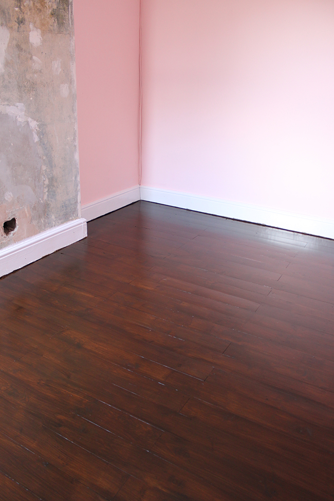
Because of the drying time between coats, I would do one coat during the day and then Wayne would come home from work in the evening and do another coat. We did this for 3 days straight until all the coats were on and dried!
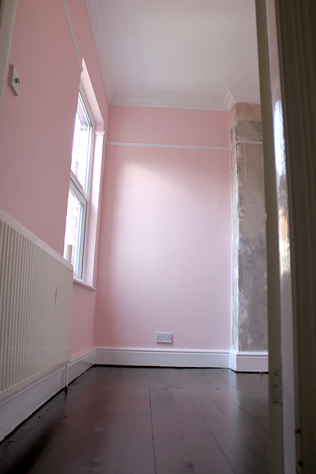
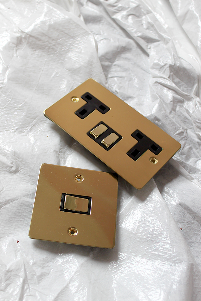
After this, Wayne changed out all the plain plug sockets for brassy gold numbers…
And installed the trim along the skirting board to finish everything off.
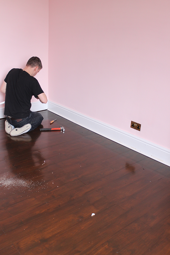
It’s all looking so much more finished now, isn’t it?!
And here’s a little sneak peek of the fabulous mid-century sideboard I got from eBay for £130!!! I can not express how excited I am about this piece. Such a bargain and half the price of the ones I had been swooning over but couldn’t afford! Check out all that brass detail! Yes!!!
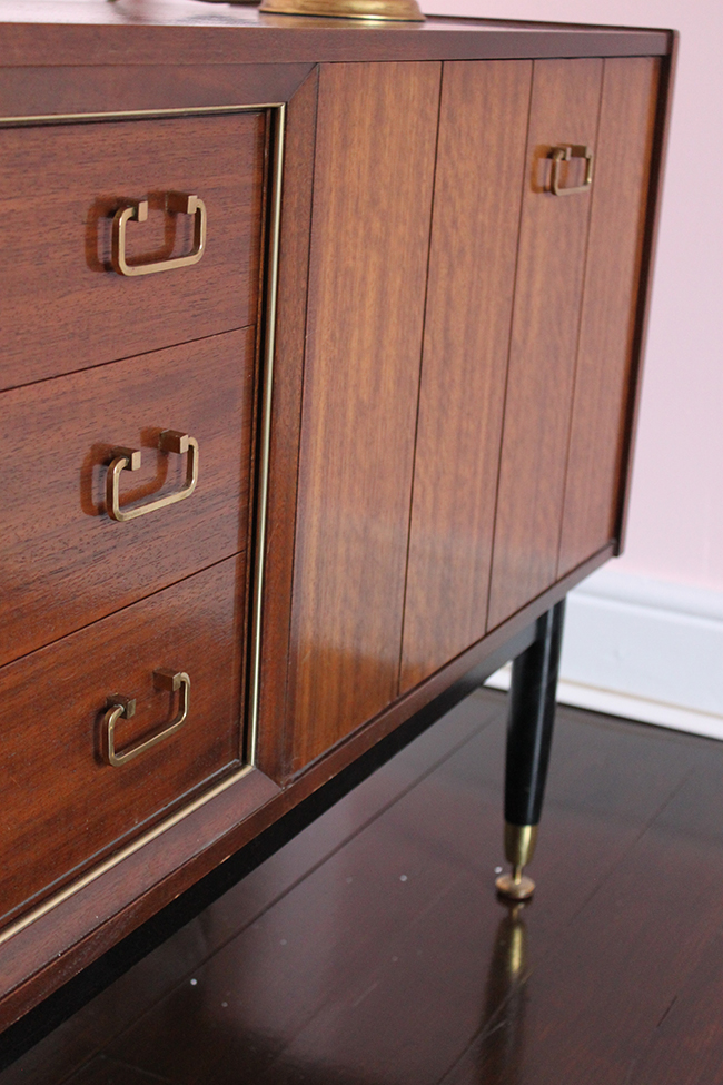
We also got the wallpaper up recently but I’m going to save that until next week’s update because this is already so photo heavy!
The desk is about half way done (the drawers still need their makeover) but it’s looking great already, I’m so excited.
This week, I’m getting my office chair delivered (I changed my mind from the one on the mood board – I can’t WAIT to share with you what I chose). I also need to get all the artwork sorted out and get a few pieces custom framed! There are so many details to work out now about the decor! All our focus has been on getting this room ‘move in ready’ so that I can start getting on with the interior design side of things and of course, I’m now scared I’m not going to get it all done – ack!!
Be sure to come back next week (or subscribe for updates!) to see how far we get… it’s crunch time!!
And now, do you want to see what all the other 19 participants are up to? Of course you do! Check them all out below.














It’ pink! So very, very pink!!! ;-) Love the contrast with the dark floor boards and can’t wait to see the desk in the room. :-) xo
Wayne is SO not a fan of the colour and I think if I had more time I would have tried diluting it even more to go a bit paler but with the tight time frame, this will have to do! lol xxx
Love the sideboard – especially the dansette legs and the colour of the floor is gorgeous.
Thank you my dear! I’m totally in love with that sideboard – so pleased with it! xxx
oh that sideboard! it’s a stunner! and i love love love paper and color! so fabulous!
Love seeing it come together, and those dark floorboards are amazing! They really do make such a beautiful contrast against the pretty pink.
xx
Yay! You’re getting the not so fun foundational things done and moving on to the fun, pretty stuff! It’s already looking fantastic, that sideboard is stunning!
I feel like we’ve been bogged down by the DIY side for too long, I’m ready for pretty dammit!! lol xxx
Nice save with the paint! The color looks great, and the floors are absolutely gorgeous. Looking forward to seeing the wallpaper and the furniture reveal. Hopefully most of the really laborious stuff is done now and you can get to the fun part!
OH my girsh!!!! Kimberly I am digging EVERY SINGLE DETAIL! So girly glam, I love it! I’m going to have to fly you to the states when it comes time to do my office! xo
Like you need MY help! Pah! Thanks my dear, girly glam is definitely what I’m going for ;) xx
So much progress friend. I love that you call outlet covers plug sockets! Love the pink wall color and those gorgeous floors. Also…that sideboard though #fabfind
Pink walls for the win! And I just love that midcentury piece! This is going to be so good! I can’t wait for the next update!!!
Very pink! Probably too much pink for me, but I’m sure it’s going to look amazing like the rest of your house:)
It’s definitely still very pink! LOL! I think if I’d had more time, I might have tried diluting the colour even more but time is of the essence so for now, this pink will do! ;) Wayne, may I just say, is NOT a fan but hopefully the addition of the furniture will up the sexy factor! xx
I believe, Kimberly, you will make this room beautiful, sexy and sophisticated!
Aww thank you Anna!! :D xxx
I love that sideboard! You’re absolutely right about paint in different lights though- it’s makes such a difference. Can’t wait to see next weeks!
Obsessed with the paint color! Such a gorgeous shade! And the floors, hubbba!
I can see this is heading into the direction of perfection. That color and the dresser and hello gold plugs and switches
I’m really interested in the coving, have you got a link to the brand you used? I’ve tried Supercove lightweight polyurethane which is nice enough but too plain and easy to dent especially if you have to apply pressure to cope with uneven walls. Next I tried sculptured high density polyurethane from Screwfix and it’s beautiful but the joins can be quite visible especially with those uneven walls.
P.S. When you pain that amazing dresser could you do a step-by-step with LOTS of pictures????
Oh the sideboard isn’t being painted! It’s in beautiful condition, I wouldn’t dream of covering it with paint ;) xx
Ohhhh – you said in the week 2 update that you were going to spray it black and add new handles.
Oh so sorry! I thought you meant the sideboard above! We are painting the desk as shown in last week’s update ;) I’m hoping we’ll finish that this weekend so yes, I’ll be sure to share the steps! xxx
This is the one we used – we used the same one in the bathroom and in our kitchen as well: http://www.diy.com/departments/bq-colours-fluted-profile-coving-l2m-w110mm-t20mm-pack-of-6/256835_BQ.prd
It’s still a pain because our walls aren’t straight so there’s a lot of bending that is required but they are flexible and strong so it’s not too bad. No problems with denting! But yes, the joins are still visible, it’s difficult to really get them to disappear!
xxx
You really can’t tell from your pictures that the joins are visible or that the walls are uneven. Still, it makes me feel a little better about the visible joins knowing you have some too!
Wow! The pink turned out amazing after the second coat. Can’t wait to see the beautiful wallpaper in the space. And those floors! All so good! Being a major pink lover over here, I am totally envious.
Can’t wait to see the wallpaper. The floors are fantastic!! What a difference. Great job.
Wow, love the pink and love that sideboard, what a steal!
Kimberly!!! You guys have worked so hard, I’m feeling guilty! :) The pink against those fab floors is gorgeous!
DUUUUUUUUDE. that sideboard is everything!!! You are going to kill this, I just know it. Love where you’re going. So much hard work! oxox
I’m drooling over that sideboard and the pink is fab! So excited to see this come together!
I LOVE that paint color! It is so pretty….glad you were able to make it work:) I know this room is going to knock my socks off….looking forward to seeing the Thibaut wallpaper up!
OMG you are knocking this out of the park! Amazing progress and although in my head I’m not a ‘pink person’ I am totally digging the diluted pink you’ve come up with. I know Stell above has asked you about the coving and thank you for providing a link – would I be able to ask the same for the skirting boards? Or have you reused the originals? x
Thank you!! :D So sorry Lucy, yes the skirting boards are original to the house – we just gave them a good sanding and a fresh coat of paint! xxx
LOVE that sideboard. You’ve accomplished so much – can’t wait to see the finish!
The sideboard is amazing! Also very envious of those floors. Very luxurious.
Wow Kimberly! So far so PURDY (pretty)! Obviously I love all you do, but I really love how that sideboard compliments the pink walls. Oh, and the black legs on that sideboard…PERFECT. I cannot wait to see the finish product. Seriously though I am loving that sideboard, such a GREAT find!
The mix of the pink with the sharp white skirting boards with those floors Kimberly. Oh, Kimberly. And the brass sockets! YES! Robert and I were in a hardware store the other day ooo-ing and aw-ing over the different options. Not that we have the option to switch them out, but a gal can dream.
xxxxx
Hi
Love your blog! I actually used night jewel 1 in my living room because of your blog! Love it love it!!
Technical question: how did you find valsper as a paint? Is it too thin? Coverage etc.
Also i am looking for a nice dark emerald green but i want it to be slightly bright not muted. Do you know of any nice ones?
Thanks
Hi Neda,
Oh how cool! Love Night Jewels 1 – such a great colour ;) I bet it looks fab!
Valspar was a nice consistency, I would say it’s very similar to Dulux with really good coverage. I was disappointed by just how much the tone changed in different light – it was shocking how pale it looked in light contrasted to how neon it looked in shadows. I’d never seen anything like it before.
So if you are considering Valspar (which again, I do think is a good quality paint), then PLEASE test it out in different areas of the room to see how the light effects it :)
Funny that you should mention an emerald green – I’ve been considering using that myself! I haven’t done any research yet or swatches though – so sorry that I don’t have any suggestions for you! Good luck!
xxx