I thought this might be a fun little look back. The thing is, I wouldn’t consider myself any kind of an expert when it comes to styling or decor by any means. I mess around with things, try to figure out what looks right and attempt little short cuts and formulas that seem to work. I make plenty of mistakes and I do a lot of trial and error to make sure my home looks it’s best. Sometimes it takes me just a few minutes to get things right, sometimes it takes a lot longer. But I do know that over the years, I have made improvements and this is what we’re concentrating on today.
Ya see, I haven’t always known how to decorate my home and I didn’t always know the little short cuts and secrets that make a good Instagram shot. I have a blog with 7 years worth of content to thank for being able to see the progression of any bit of skill I might have now. It just comes with years of practice, I promise. I know not everyone here is familiar with my entire back catalogue of posts of course, especially for those of you who only recently stumbled upon my little blog in the last weeks or months. So perhaps a little trip down memory lane is in order.
Today, I’m just going to concentrate on my living room and dining room and in a future post, I’ll chat about some other rooms. Ready for a bit of before and after action?
Living Room Sofa & Coffee Table
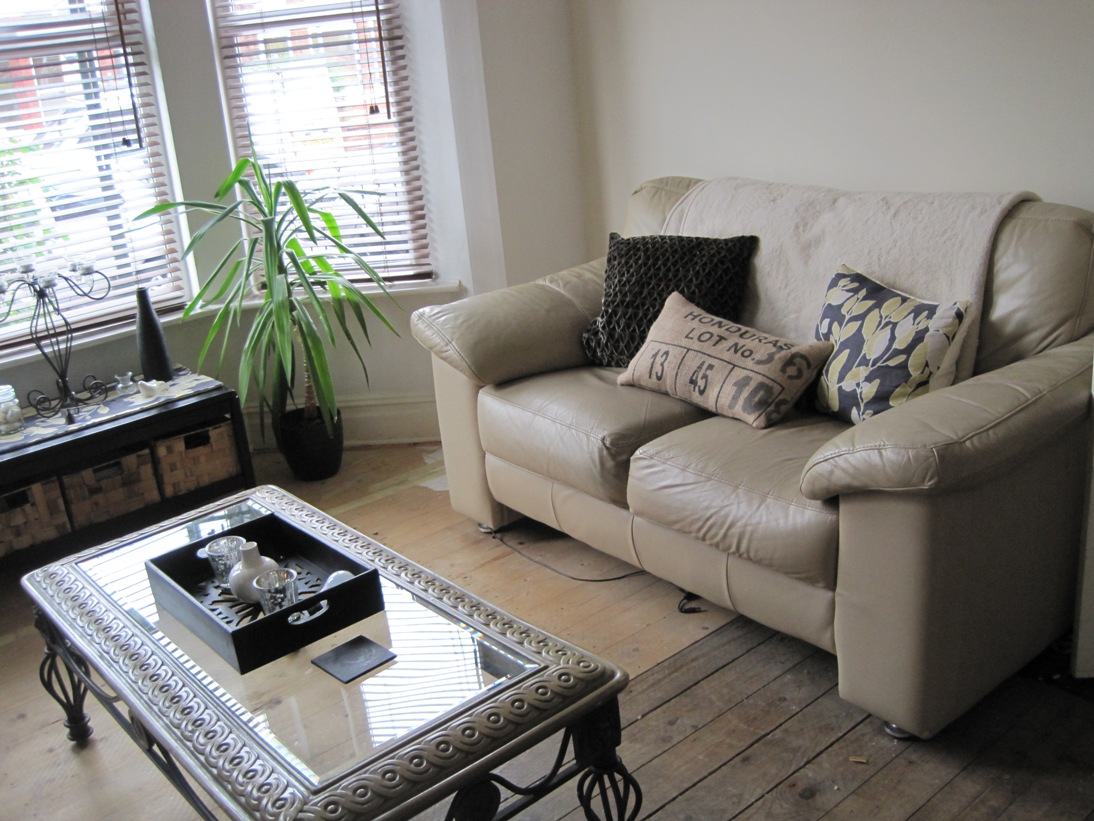
If we go WAY back in time to 2010, this is what my living room looked like when we first moved in. To be fair, I was trying to make the best out of a bad situation with really awful flooring and a sofa I hated as soon as it’s arrival on my doorstep a few years before. But please don’t ask what’s going on there with that coffee table styling. (Can I call it styling? Hmm. Debatable.)! Everything is the same height and everything is tiny. I was clearly going for a bit of symmetry but failing miserably. Perhaps I should just call this exhibition A Study in Brown.
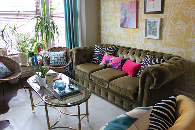
Then we fast forward to 2013 and wow I rebelled on all those neutrals for sure. This was the year when I clearly wanted EVERY POSSIBLE COLOUR going on in my home. This must have been around the time I discovered cushions too because every single surface was covered with a different print, colour or pattern. My coffee table styling improved just a bit although it there was still a lot going on here. I know I loved it at the time but looking at it now makes me feel like I’m going to have heart palpitations any minute.
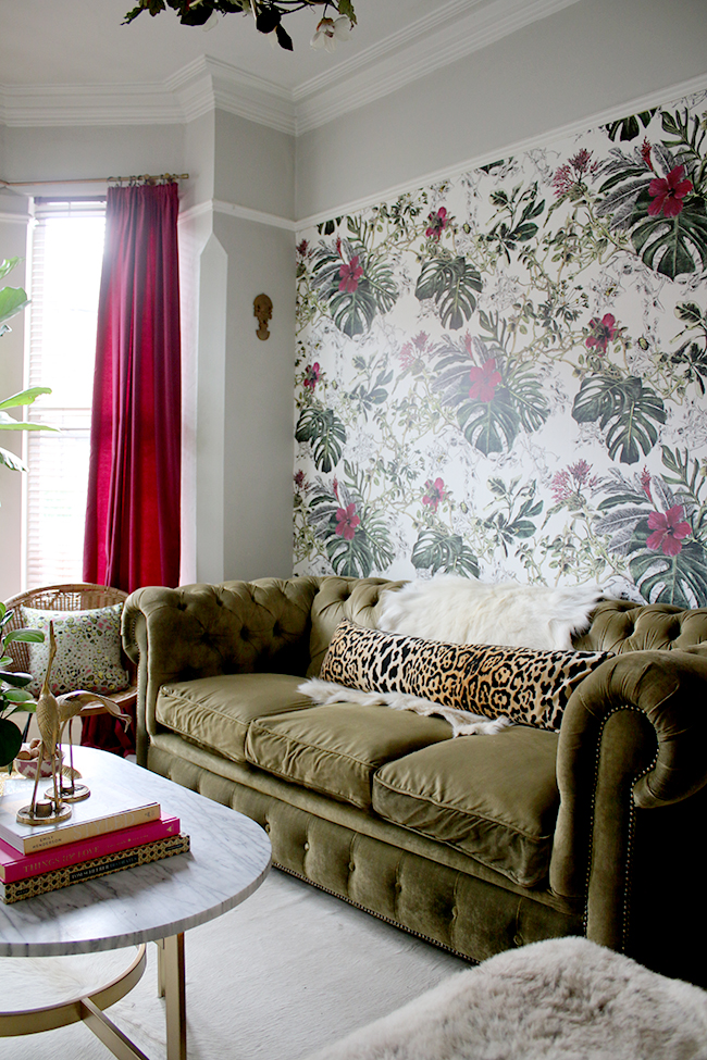
Finally, we get to the present. You can see the cushions have been stripped back and a much more sophisticated colour palette is happening. There’s still pattern mixing of course because it’s something I’ve always loved but it’s much more pulled back now, much more restrained. Annnnnd breathe.
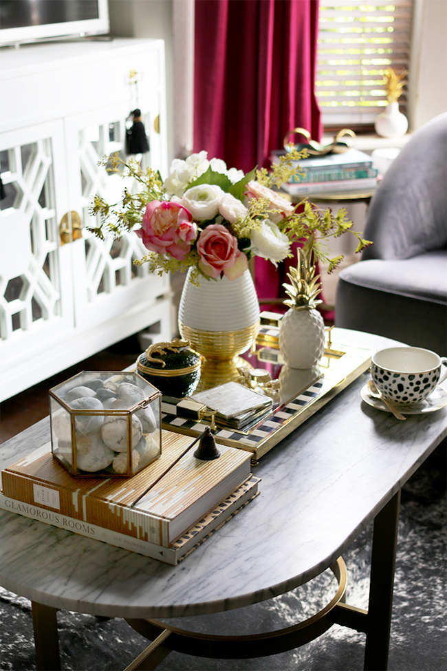
My coffee table styling has come along way as well. Here’s a recent shot I did of what it looks like right now… much better. It’s actually not that hard to create a pleasing coffee table vignette with my little secrets which I’m spilling in this post. (That one has been a favourite on Pinterest for quite some time, racking up nearly 50k repins!)
Living Room Chest of Drawers Styling
I’ve had that little chest of drawers for years and years now too… let’s check out the styling way back when (circa 2011).
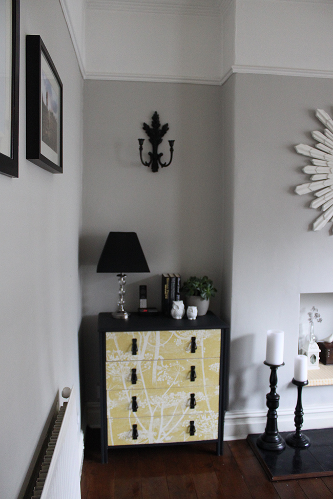
Oh god, it makes me depressed just looking at it. Well, I can see I gave it a go with a plant and some little tchotchkes. But the big blank space above the lamp feels a bit neglected and the whole corner just lacks life and light.
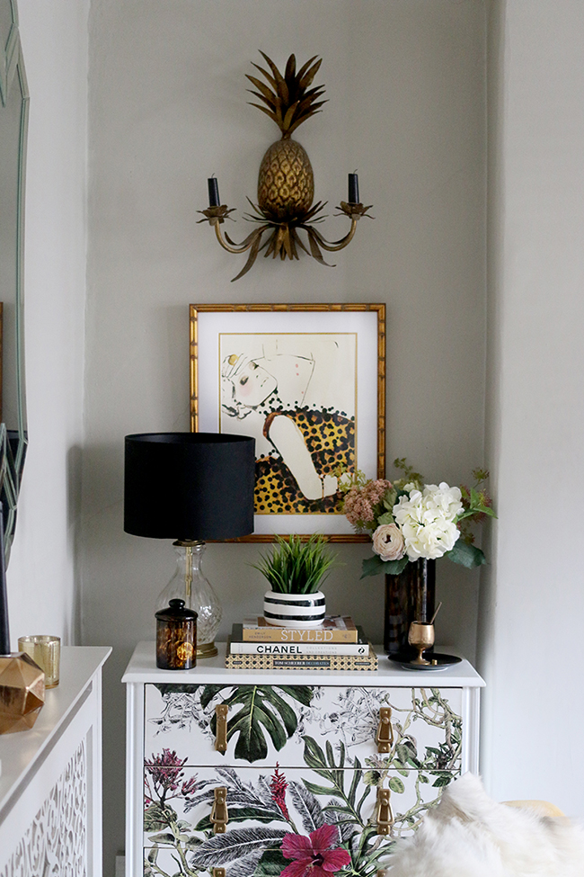
Here it is again in much more recent times… same chest of drawers with a refresh and same basic set up with books, plants (faux because nothing survives here I’ve learned) and a lamp but…. Ahhh. That big blank space has been filled with a print, there’s just more life in the whole vignette and while there is still a bit of black, it’s used as an accent rather than making this little alcove darker than it needs to be.
Dining Room Bar Cart Styling
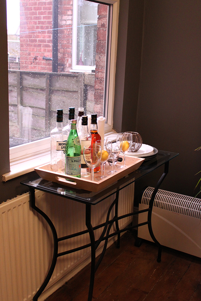
Oh, I just wanna give past Kimberly circa 2011 a little squeeze to tell her it’s going to be okay. However, filling wine glasses with lemons is not okay. Just no. Plus, half the bottles are empty. I still keep some empty bottles on occasion if I really love them but Morgan Spiced? What exactly was I thinking here? Why is one of the bottle caps missing? Why are there two heaters? I have so many questions for 2011 version Kimberly.
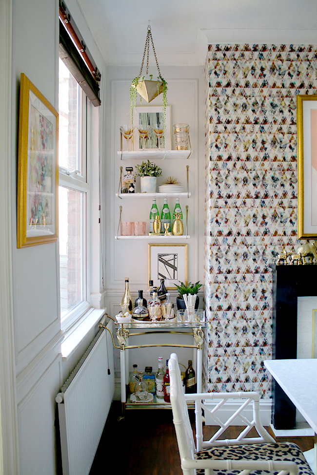
And here it is now… Well, that’s more like it… the whole set up is so much more inviting and everything has a little more sparkle. You’ll notice I no longer store singular lemons in a wine glass so that’s a plus too. I actually figured out a little formula for styling a bar cart which you can find here.
Dining Room Sideboard Styling
At least I was a bit more restrained in the dining room. Again, you can see all the items are pretty much the same height and size which doesn’t make for a particularly interesting vignette. Of course, that ugly television doesn’t help anything. There are just too many squares going on and too many angles, ya see?
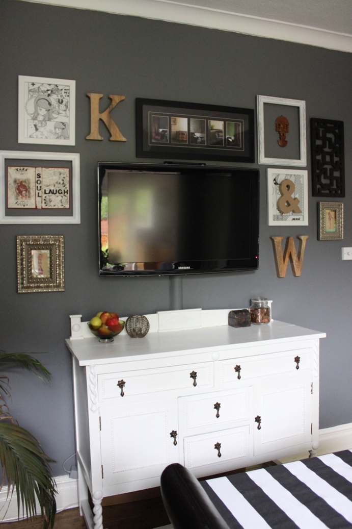
Fast forward to the present and this wall is looking a whole lot different…

Here’s what that same spot looks like now. Of course, I’ve replaced the sideboard with something a little different and there is a good variety in terms of height, size and interest in the objects I’ve chosen. I also chose a round mirror for this wall which really goes far in giving a space a bit more interest, softening all those harsh angles that you can see in the first picture.
Dining Room Mantle Styling
I remember struggling for years with this spot. I realised later that the mirror was just much too high and I really should have lowered it so that I could layer items in front of it. At this point in time, everything had been lined up like little soldiers along the surface. The heights are varied which is a good thing but it lacks any depth, simply because the surface is so narrow.
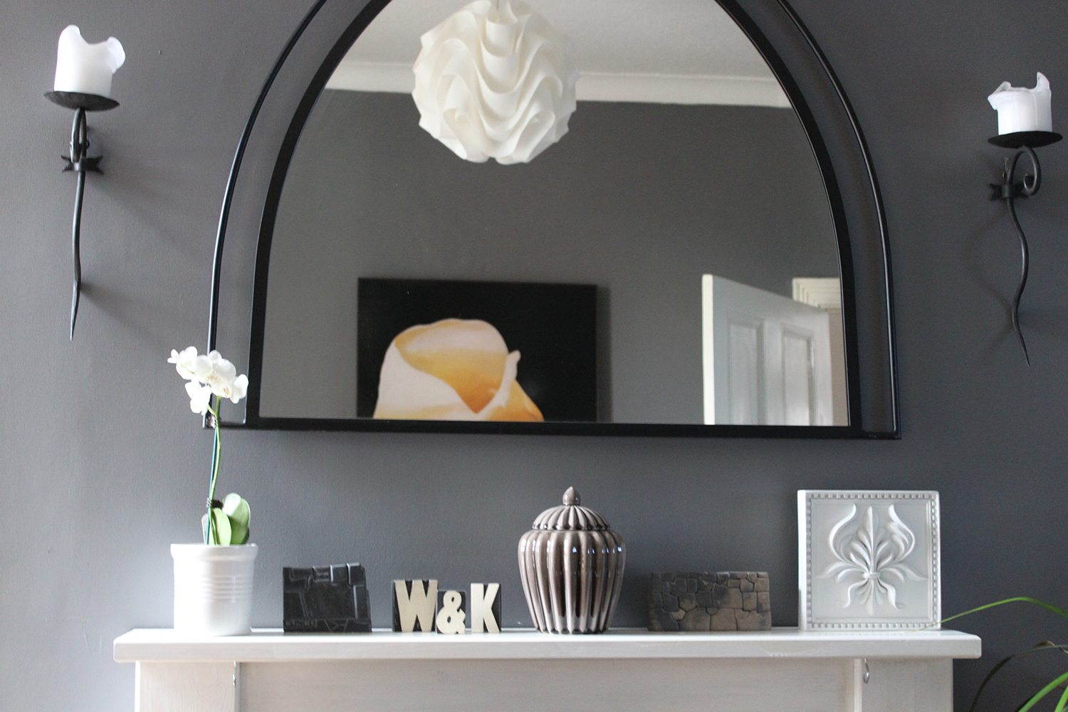
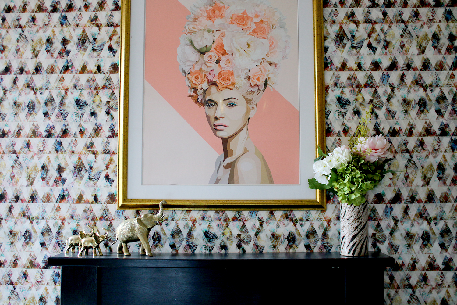
These days, I don’t normally fill the mantle at all. A few choice pieces allow the artwork and wallpaper to shine, add a touch of interest and colour but that’s it. Nothing more is really needed!
Sideboard Styling
I can see that Kimberly circa 2013 was seriously into colour. I mean, I still love colour, don’t get me wrong here. But at that time, I was REALLY into colour – like bright, bold, in-your-face, lets-use-every-colour-of-the-rainbow colour. It was evident in my living room above but here’s another example of my sideboard. The problem was that there was far too many things piled up on here and too many tiny things so it just ends up looking a bit like a cluttered mess. Well, at least the peonies are pretty…?
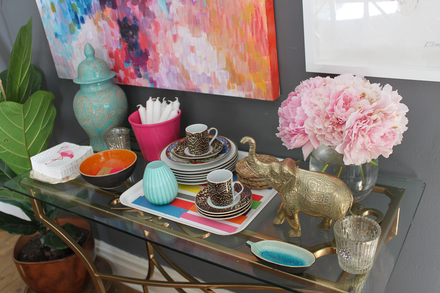
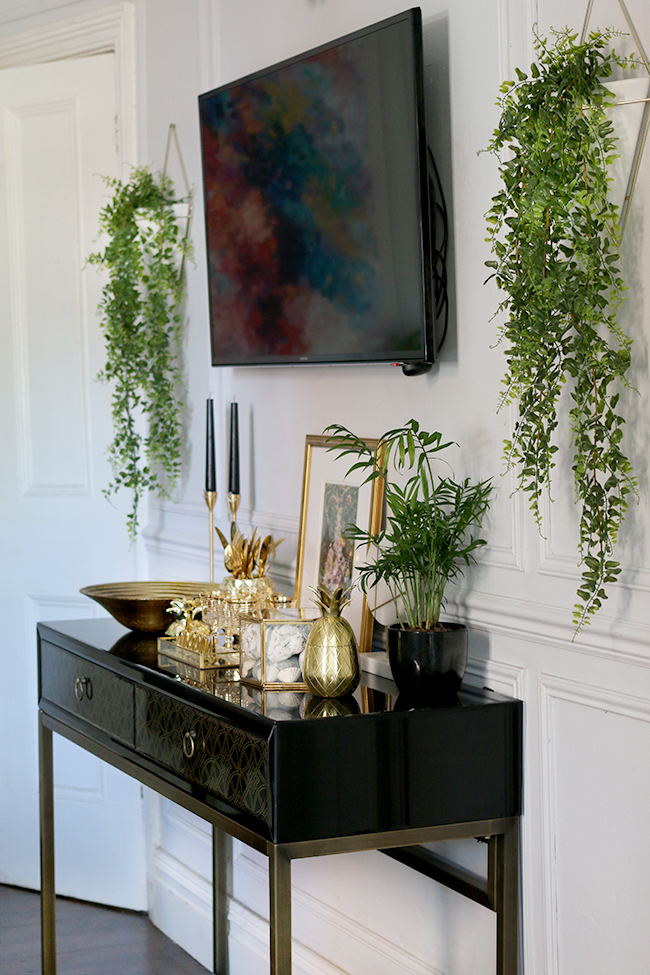
Let’s go to the present now. So as you can see, the TV has been moved to this wall (which, for some reason, causes a lot of shock and horror and general head shaking but well…) but ignoring that fact for the time being, the whole set up is much more pulled together.
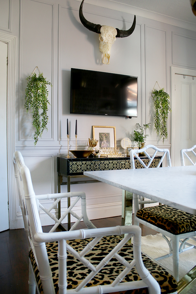
There’s a definite gold theme going on but the only colour is in the plants and the artwork. Everything else is, essentially, neutral. It doesn’t make it boring – at least I don’t think it does – and there’s a much better variety of heights and shapes. From the tall skinny candlesticks to the wide bowl and squat glass tray, everything works together as a much better whole. It’s still ‘busy’ (which I still like – I call it ‘artfully arranged clutter’) but all in, it’s a much more pleasant vignette.
So that’s my little trip down memory lane in terms of my styling for both the living room and dining room! I’ll share some more spaces soon but in the meantime, are you a little shocked at just how bad I used to be at all this?! I’d also love to know if you noticed your styling and tastes have changed over the years? If so, how? Let me know in the comments below!








This was such an interesting and fun post – I love seeing how your decor has progressed! I think it’s such a learning curve. I look back at photos of our home over the years and cringe! x
Jenny | LuxeStyle
Trust me, there was plenty of cringing when I put this post together! Ha! Definitely a learning curve xx
I love the evolution of your design! You’ve really made a 360 degree turn with your style! Everything is just so tastefully done!
Ahh thanks so much Jamala! Mwah! xxx
I love this post! It’s so great looking back at how things have changed! And some of your early stuff show that there is hope for us all – I’m talking about lemons in wine glasses… your commentary on that cracked me up!
I loved all your stuff as I read through it all years ago, but I do see the improvements when you look back at it now, compared to your designs today.
Such a good idea for a post – I’m looking forward to seeing the evolution of the other rooms when you do that post! xx
Fab post! I remember when you bought that bar cart with the swans to do up and how excited you were!!
Ahh I’ve had it so long now too!! Keep thinking of getting something new but can’t bring myself to get rid of it lol xxx
I think this is super useful to show how tastes and skill evolves. It makes me realise that despite being very new to all this I can and will improve – that’s for inspiring me Kimberley with your honesty
Love this! Thank you, it gives me hope. It’s sometimes very hard to imagine that your fave bloggers ever had less than perfect taste, and knowing it has to be learned is very reassuring. And good on you for not hiding your dining room tv, I’m sure plenty of bloggers wouldn’t show that. Can I ask what those gorgeous trailing plants are?
Ahh cheers lovely! I’ve always been really open about the TV in the dining room despite the fact a lot of people hate it! Ha! The trailing plants are from MiaFleur! :) http://www.miafleur.com/home-accessories/artificial-house-plants-and-flowers/artificial-trailing-fern xxx
Isn’t it funny how you can really love what you do to your room, at the time nothing can beat it you tweak till it’s perfect, then as time moves on and you look back you laugh at your self and wonder what the hell was I thinking. I love this post Kimberly, your taste my be changing but your love for interiors still rings true. Xxx
A wonderful post and as I’ve been following you from pretty much the start, it’s a great trip down memory lane :-). It’s so important to allow experimentation in your home to really learn about your style and the results couldn’t be more evident here. Your style now is nothing short of incredible and so inspiring!
really interesting to see the journey you’ve taken, it’s all about trial and error isn’t it! thanks for sharing :)
Love the way you decorate. You bring joy to your rooms and creativity. We all like to decorate for the seasons but our budgets are smaller than our desires so we have to shop smart and rearrange what we have and add new pieces. I always buy myself my own birthday presents since it is in November. I usually buy something for my home and of course myself a new pair of boots or shoes and purse. I like to buy a couple of new pillows and throws and bring some of my plants in (the rest downstairs as I have way too many). As my husband was in the military we have picked up quite a few unique pieces of furniture and rugs. Re-arranging them makes them look fresh and new. Fall is exciting with pumpkins and gourds and mums. Leopard pillows and throws always are in style. I add tree branches to vases with a few new life like silk flowers.Gives a pop of color. You inspire me and I want to thank you!
I know I’m late again to the party but it’s such a fun post. I do them from time to time and it’s nice to see how we evolve.
Love this! Thank you, it gives me hope.Love the way you decorate ,You bring joy to your rooms and creativity.Thanks for the informative post.
It was not shocking to me as even I am also really bad at it but I can see there is so much difference between before and after images and the rooms have been improved a lot and look much better.
Wow, great job there! A Huge transformation that I really really like!
YOUR DINING ROOM MANTLE PIECE BEFORE. I DIDN’T EVEN RECOGNISE IT! Such an insane transformation over the years. I’ve come to realise old design mistakes (those I have plenty of to last 4 lifetimes) are not bad AT ALL! At the very least, they make for epic before and afters ;)