As you know, I thrive on change in my home. It makes a space feel energised and new without even having to pick up and move. I also realised recently that I have started using colour in my home with a little more restraint. So with Autumn here and Winter hot on its heels (cold on its heels?) I decided it was time for the bedroom to transition from the bright colourful palette of Spring and Summer to something decidedly cosier and more neutral for Winter.
I’ve teamed up once again with SwiftCover for their #SwiftHomeHacks campaign to share this little room refresh with you and to show you how easy it is to make these changes without having to start from scratch. Just by swapping over your accessories, bedding and artwork, you can have a totally new look without completely blowing the budget.
SwiftCover are doing a little giveaway of a couple of lovely Desenio prints so check that out at the end of the post!
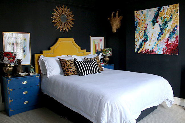
So, just as a reminder, this is what the room looked like before I started. You can see that the bedside tables were a bright blue, contrasting against the yellow headboard, I had brightly coloured artwork on the walls, crisp white bedding and bold yellow curtains.
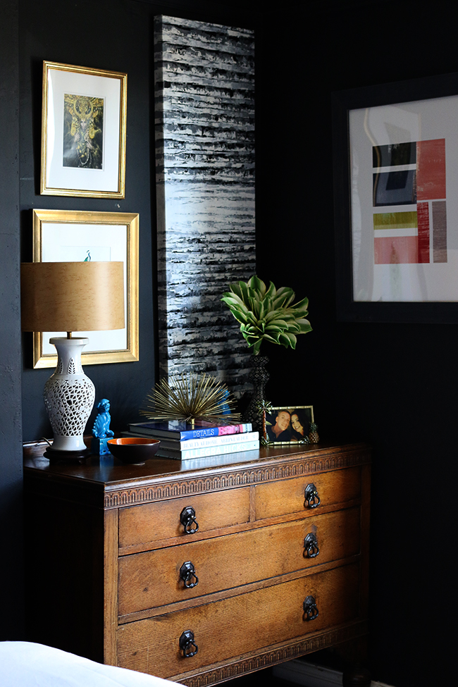
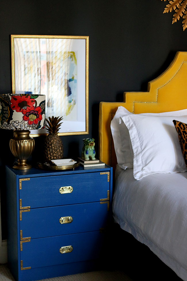
I knew that to take this room back to a cosy neutral vibe, I’d need to change the blue bedside tables. It’d been 3 1/2 years since I painted those so it was time for a change. I used two coats of Rustoleum Painter’s Touch in Satin Black for these. I simply removed all the hardware, went over them with a Scotch pad to rough up the surface a bit and then wiped them down with white spirit.
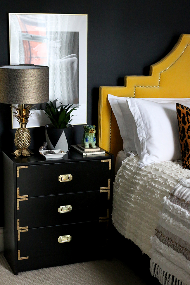
All the painting was complete within a couple of hours and then I just put the hardware back on. The finish looks amazing and has a lovely feel to it. They didn’t need primer because they’d already been painted previously but if you are painting unfinished wood, you’d need to use a primer first! For a mere £10, these had a brand new look I loved.
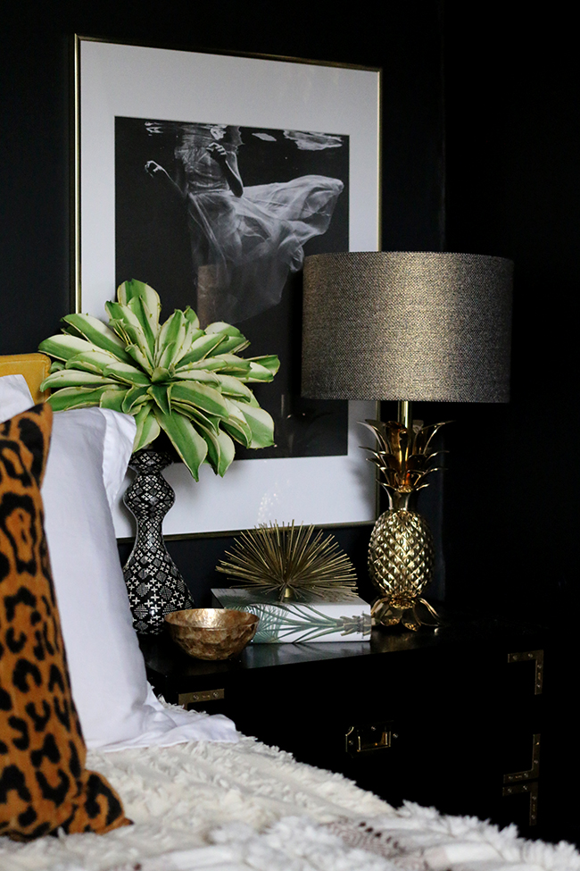
With the artwork, yellow curtains and colourful lamps removed and the bedside tables painted black, I started to panic. It was SCARY seeing the room so stripped back of colour but I carried on, knowing for a colour-lover like me to go for a room of textural neutrals, it was going to feel weird.
Now, I splurged on the lamps so let’s just acknowledge that fact. I had been eyeing these beautiful pineapple lamps for years and decided as I was doing up the rest of the room, I might as well go ahead and replace my £4 each spray painted lamps from eBay. However, if you are on a tighter budget, then simply swapping a colourful lampshade for a simple one in a neutral shade would work just as well to transition the space to Autumn/Winter. The lampshades were less than £15 from my local Homebase!
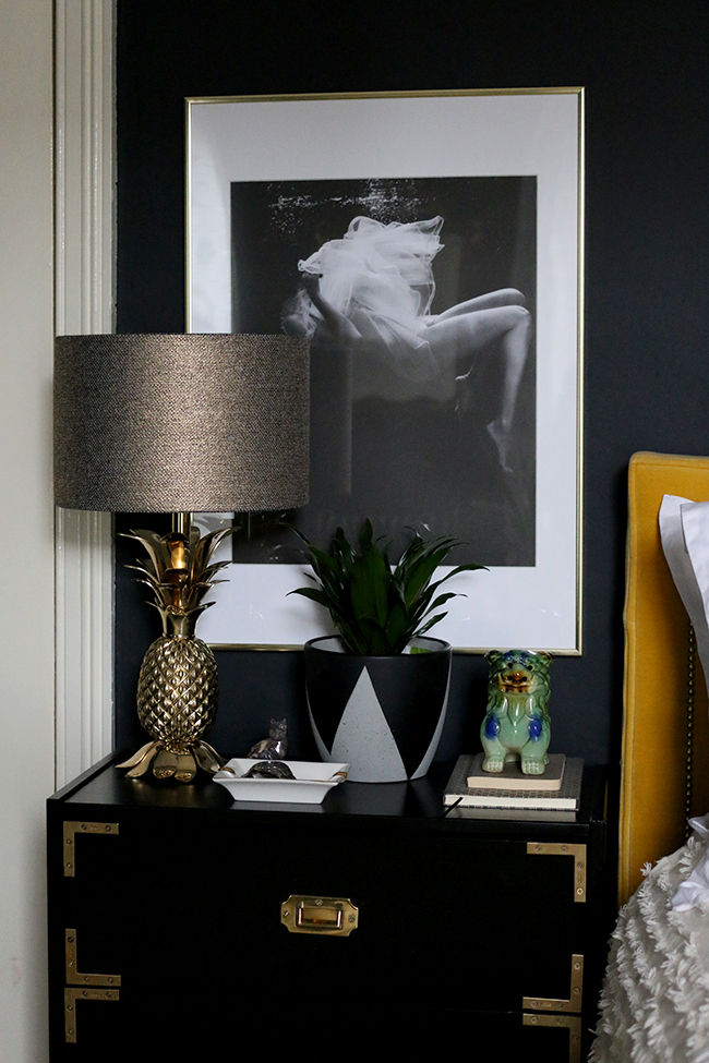
The most important aspect for a successful room sans a lot of colourful accents is always going to be texture and pattern. When you remove colour, you really have to amp up those aspects to create interest. You should be doing this in any space really but it’s just so much more important when using neutrals.
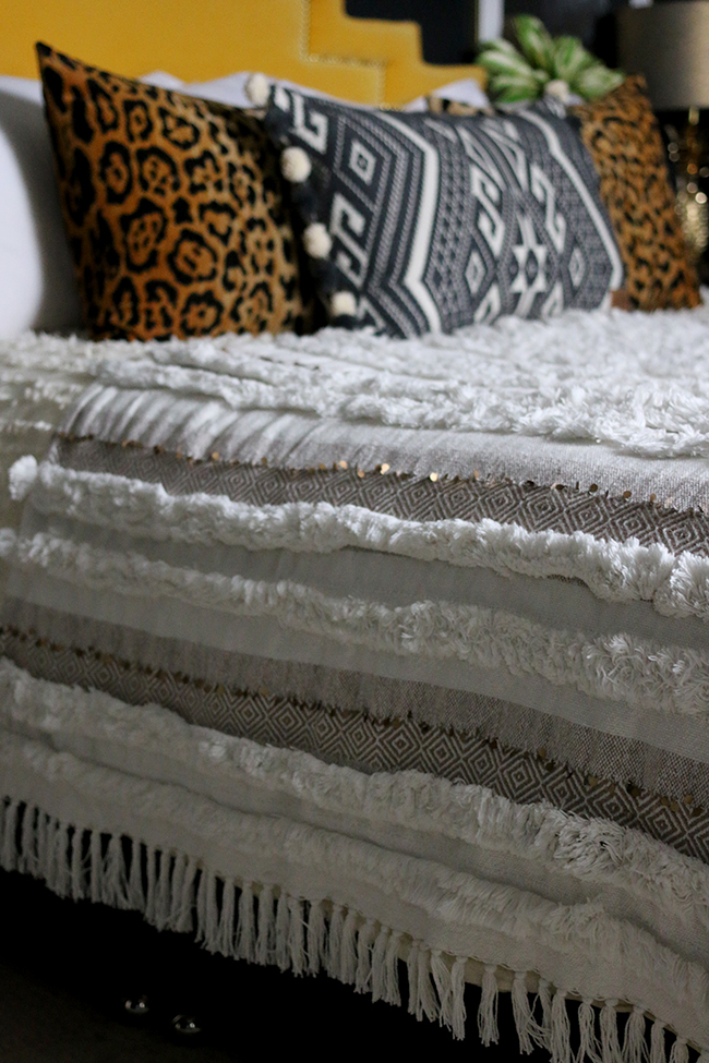
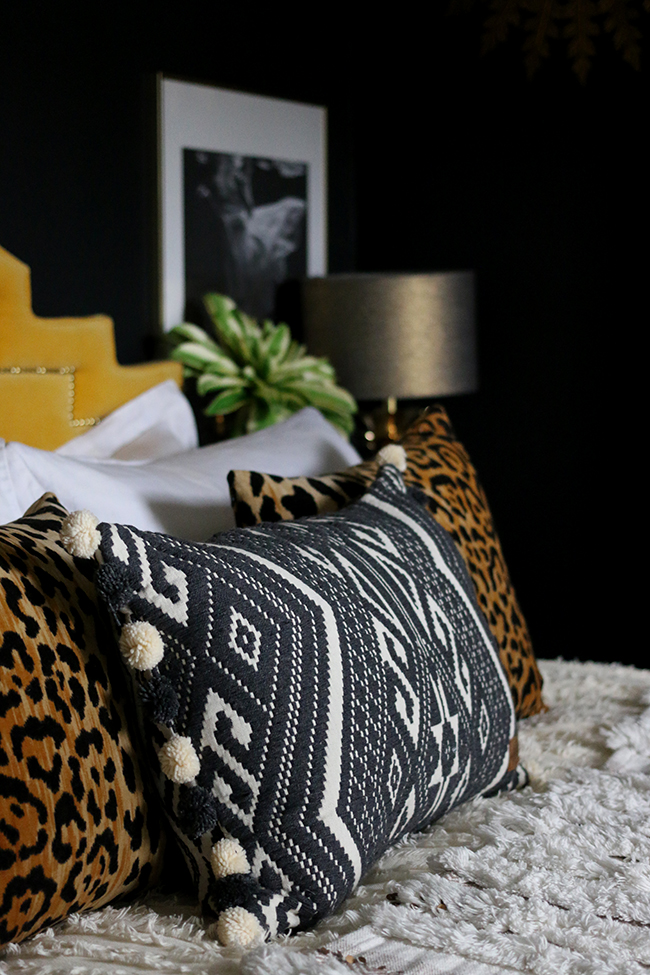
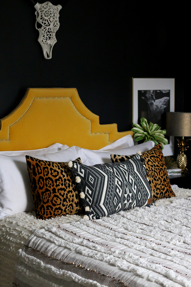
In line with this, I found a gorgeous fringe duvet cover from Urban Outfitters in their clearance section which you can see peeking out from beneath the throw. The stunning textural bedding in ivory was marked down from £110 to £30! Bargain! Over this, I added a throw that looks an awful lot like those expensive and beautiful Moroccan wedding blankets that can easily run to hundreds of pounds. Except this one was from Marks and Spencer for just £69. The final layer was a stunning woven pom pom cushion from Rockett St George in a charcoal and ivory pattern that lifted the whole bed (sadly, no longer in stock). I kept my leopard print cushions there as well – because as we all know, leopard print is a neutral!
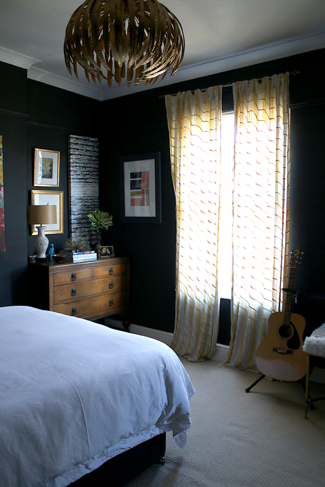
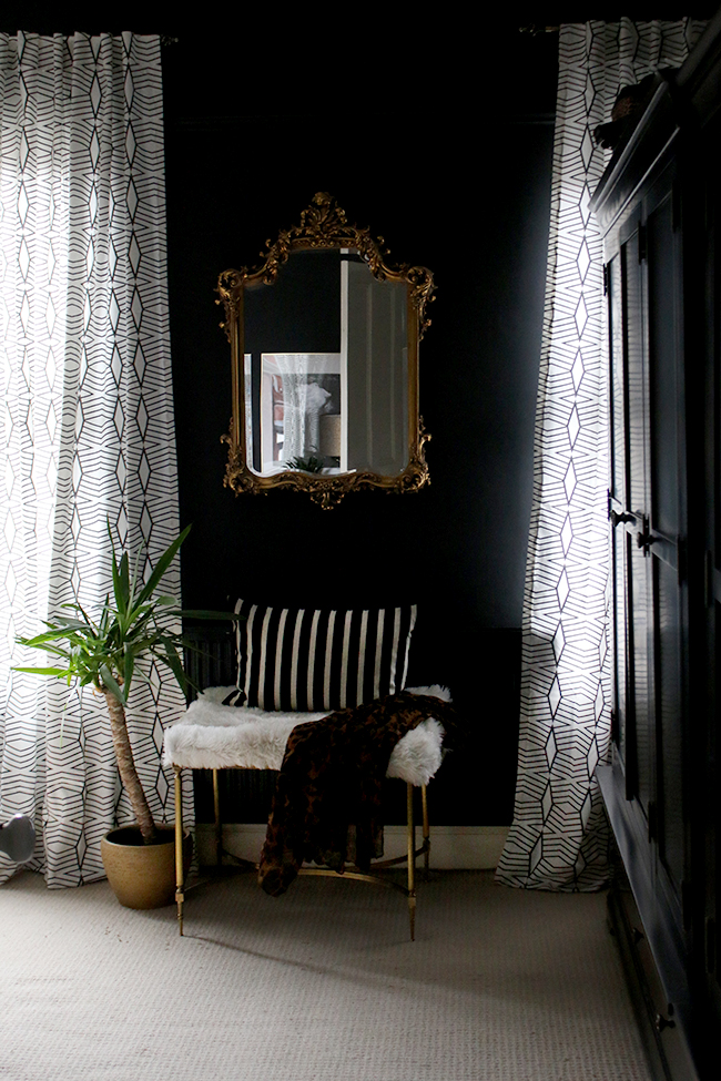
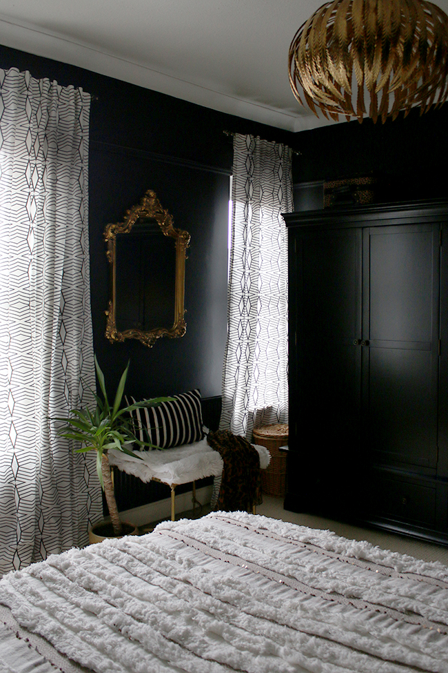
I have to say, the room really came into its own, however, with the addition of these fabulous patterned curtains from West Elm. I’d been desperate to replace my curtains for such a long time, having purchased them years before from Anthropologie. The issue was, they never hung straight, they were far too long (I never got around to hemming them!) and Meisha was always putting her claws into the sheer fabric. Using a large scale pattern against the texture and smaller patterns in the bedding was the game changer. I hung them high and wide and hemmed them to floor level. Suddenly, the room came to life with the mix of patterns going on.
I also changed up the artwork – from bold bright abstracts to simple black and white photography, a few old favourites and a line drawing of a tiger – one of my favourite animals. The new prints are from Desenio as I talked about in my last post and by choosing prints that were a little moodier and a little darker, it changed the tone of the room and it suddenly felt cosier, perfect for winter.
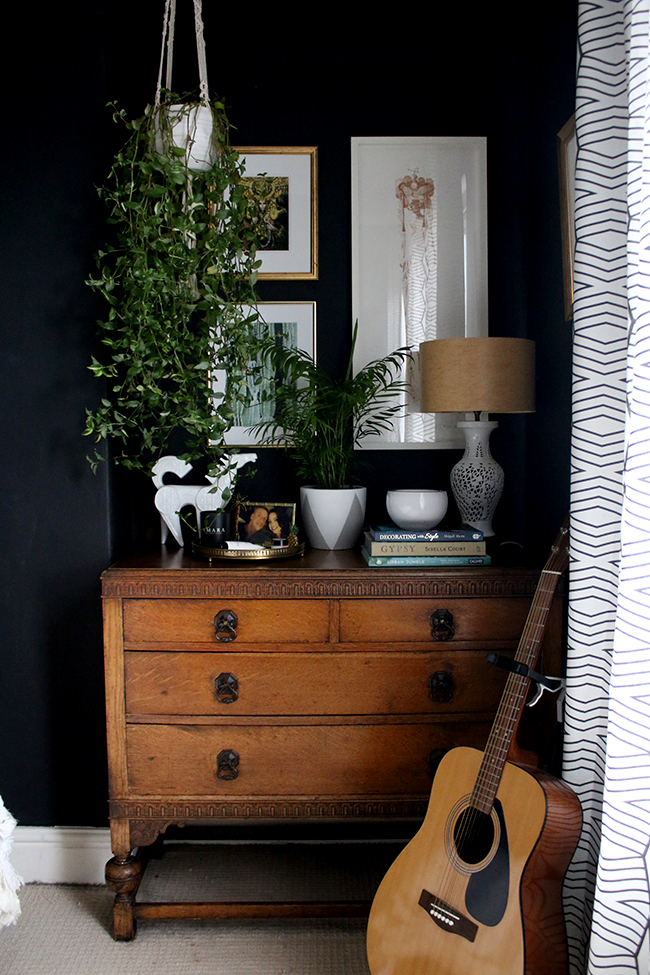

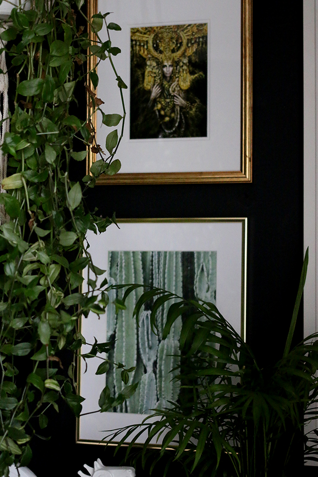
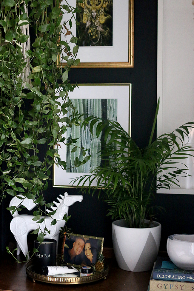
I also decided to move the starburst mirror which has been above my bed practically since we moved in 6 years ago. Moving it to another wall and replacing it for a metal faux skull felt right for the space now, especially as Wayne didn’t like the woven animal head I used to have in here! I always say that shopping your own home and moving things around is a great budget option for giving a room a bit of a shakeup. Most of the items on the chest of drawers were things already in the room or from around the house.
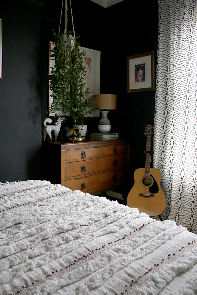
Finally, to give the room more life, I added a few plants. I hung my trailing plant (originally on top of the wardrobes) from a macrame planter to add to the cosy boho vibe. I added a couple of other inexpensive plants to the room as well and that added touch of green satisfied my need for a bit of colour. Houseplants need not be expensive (these were less than £10 each) but they go a long way in providing an organic touch and a bit of life to a space.
So in, conclusion, here are my #SwiftHomeHacks for transitioning a room from Spring/Summer to Autumn Winter:
- Swap brightly coloured artwork for black and white photography or those that use deeper, richer colours
- Swap crisp white bedding for those in softer colours – greys and creams work really well for a softer look
- Layer the texture using chunky throws and cushions. Think woven fabrics, velvet, knits and wool which will add layers of interest and keep things from looking too flat.
- Mix patterns but keep to a limited palette. An easy formula is to use one large scale, one medium scale and one small scale pattern with a few solid colours in warm tones to keep the look calm and considered.
- Shop your home and swap accessories from one room to another. Sometimes just changing an item’s context is enough so you don’t have to feel like you need to go out and buy new things. I talk more about shopping your home in this post if you want more tips.
- And finally, add an organic touch and a bit of life with houseplants to make up for the lack of greenery outdoors!
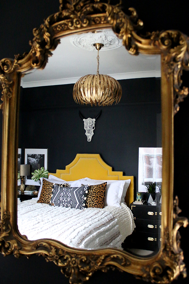
So there it is – my textural neutral eclectic boho glam bedroom for Autumn/Winter. In Spring, if I want to, I’ll add some colour to the space again by doing the same sort of thing except in reverse – swapping out some of the neutral items and adding in a few colourful favourites.
I made a little video as well if you want to get a better idea of how the room is all laid out which you can check out here:
Are you surprised I’ve gone with neutrals for this? I have to admit, I am a bit myself but I am really loving the fresh new look! What do you think of the changes? Do you transition rooms from warmer seasons to cooler?
GIVEAWAY ALERT!
SwiftCover are giving away 2 Desenio Art Prints and gold frames (this one and this one)! All you need to do is follow @SwiftCover on Twitter and using the hashtag #SwiftHomeHacks, tell them your favourite thing about winter! Check out the terms and conditions here.
Disclaimer: This post is in association with SwiftCover but all words, opinions and images are my own. I only work with companies I really like and think you will too! Thanks for supporting the brands that support Swoon Worthy!
Want to see more of my #SwiftHomeHacks? DIY Soy Wax Candles / DIY Natural Fragrance Diffuser with Essential Oils/ DIY Faux Marble Shelf / How to Upcycle Faux Plants






GORGEOUS!!! Love it! Love the textures and the contrast against the black. Plus, I really prefer the cabinets in black now (well, I would) and the lamps are fab – so you! It’s more neutral, but still very much you. Great transformation :-) xo
I told you you’d like this one! Haha! Yes, I prefer the cabinets in black too – I was getting very tired of the blue ;) And yep, it’s definitely still very me! Yay! Pleased you like it hun! xx
It’s gorgeous and so calming and cozy!! You have fabulous taste!
Well done you! That room is absolutely beautiful & so inspirational.
oh i love this version- feels so very sophisticated!
I love how you work with the black walls.. totally fearless decorating at its best!
Oh I love the pretty new neutral look to the room. The throw and those black nightstands are amazing. Gorgeous makeover.
It looks so inviting, the lockers looks really great. And those lamps, I have serious light envy!!
Love all the layers. I’ve been more and more drawn to restrained colour palettes lately (especially for bedrooms), and I love how you’ve pulled it all together in yours but still kept it very much classic ‘Swoonworthy.’ Gorgeous!
I love it! So glam. The bedside tables look amazing black, and I love the new prints and the hanging plant. It looks super cosy as well as stylish! And there’s still colour – black and white count! :-) xx
It looks fantastic! I love the black cabinets soooo much! xx
Absolutely love it! Those black bedside tables look amazing and personally I love them so much better than the blue. I think you’ve managed to still keep your quirkiness but have produced a much more sophisticated space. I’ve got to ask though, how do you sleep at night with such lightweight curtains????
Ahh thank you Kate! I have blackout roller blinds that are brilliant – they hide away quite easily when they are up and you can’t see them ;) xx
BEAUTIFUL! Absolutely love it, Kimberly! It’s serene, cosy, and so chic! Still eclectic, boho and glam, but in a more sophisticated way. This is my favourite iteration of your bedroom design so far! Stunning! ♡
Love love love. Thanks for all the inspiration!!
Beautiful as always. I love the picture of your mirror with the reflection of the room-gorgeous shot. Will admit I will miss the blue nightstand (& I love black furniture)-it always made me smile!
Simply beautiful. I’m in love with the new curtains. They are fab.
Your bedroom looks so elegant and comfortable. Well done”
xx
LOVE the whole room. And thanks for the tip about the faux Moroccan Wedding Blanket from Marks & Spencer. Doing a cowboy boho glam room and this is a perfect budget friendly choice. And as a new customer I got 20% off…score!! Wish I could do the black walls, but I’m in a rental. Till then I’ll drool over your dark and moody bedroom.
Oh, I love it! The room seems to have more depth to it now and, as you said, a more subtle cosiness. The bedding and artwork over the drawers are beautiful, but actually I think it’s the curtains that have made the biggest difference to the room – that little stool and mirror area now stand out and make the room feel bigger (or so it looks in photos, I think).
Love this room update, especially the layering of textures. I always change things about with the seasons too. Fab inspiration, thank you!
I can not believe its been that long since you first painted your bed side cabinets.
Your bedroom as always been my favourite room in the house, and I have to say whole heartedly you’ve made it even better, and I love it. It all just gels together beautifully, Kimberly it’s gorgeous xxx
OMG!!!! This is just divine! I thought I loved your bedroom before, but it’s even more amazing now! Wonderful job, Kimberly!
I didn’t think I could love your bedroom even more but I totally do. It’s so so pretty and even more sophisticated now.
Can I ask where the gold feather main lightshade is from – sorry if I missed this earlier
Hi Jacinta, it’s called the Dar Atticus – if you do a search for it, there are quite a few retailers that sell it! I got mine 2nd hand on eBay however so saved a bit of money :) Maybe worth a search there too! xx
Lovely! Where is the tiger print from?
Hi Lynn, it’s from Desenio! https://desenio.co.uk/ Hope that helps! xx
Very elegant!