So it’s our second reveal of the week but today, it’s the turn of the dining room! If you haven’t yet seen the kitchen reveal, then I’d encourage you to look at that one first. We spent the last 6 months tearing out the back of the house, building a small extension and removing the wall between the kitchen and dining room so the reason for this makeover is directly related to that one!
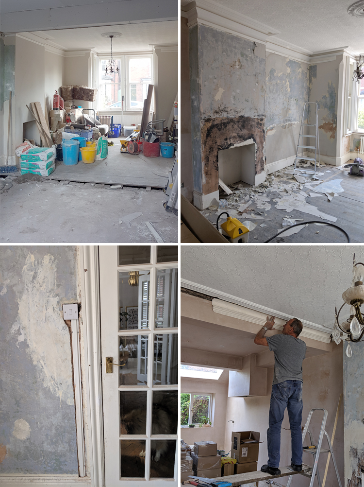
While I’d given this room a fresh coat of paint to make it more liveable, the truth was that it needed a lot more love than just that so we figured with all the work going on for the adjoining kitchen and the sheer amount of abuse it received while the building work was going on (this was the primary area used for storage during the build), it really needed to be stripped back to the basics and completely redone.
We started by ripping out the old, threadbare and stained carpeting before the work even started, updated all the electrics in the room, installed a new radiator, stripped the lining paper and skimmed the walls.
One of the casualties of the building work was the loss of the original cornice along one full wall when the RSJ went in. I was gutted about that but my builder put us in touch with someone locally who was able to make a cast from the remaining cornice and replace it in plaster – essentially using exactly the same process that would have been used when the house was first built in 1889.
Anyway, I’ll continue talking through what we did but I won’t keep you any longer (if you haven’t already scrolled down, not that I would blame you) but I also had Nick create a video for me for the dining room reveal and here it is in all it’s lovely refreshed glory:
And here are a few pictures as well and then I’ll talk through everything else! (This post may contain a few affiliate links)
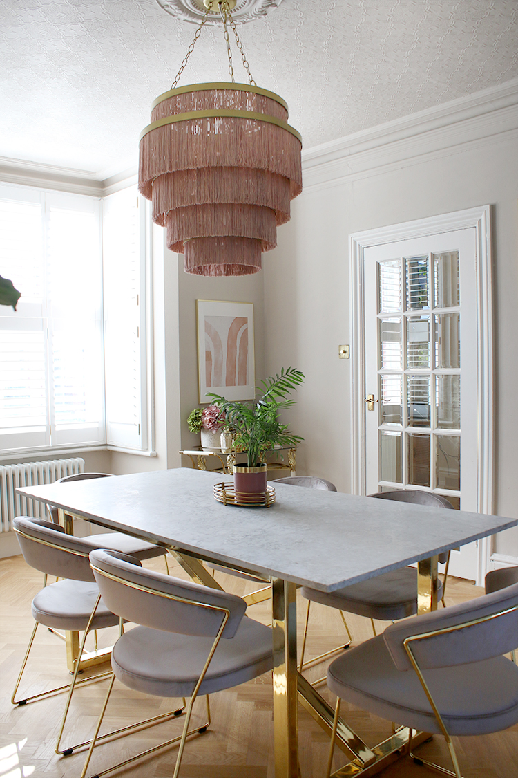
As you may be able to see, the one thing I really wanted to retain was this room’s sense of history. This is a Victorian space and while the kitchen was certainly a modern addition, I wanted to be true to the contrast between the old and new. For instance, it was pricey to restore the cornice but entirely worthwhile and while the anaglypta-papered ceilings are in every likelihood not original, it still gives the room depth and interest and history which I love.
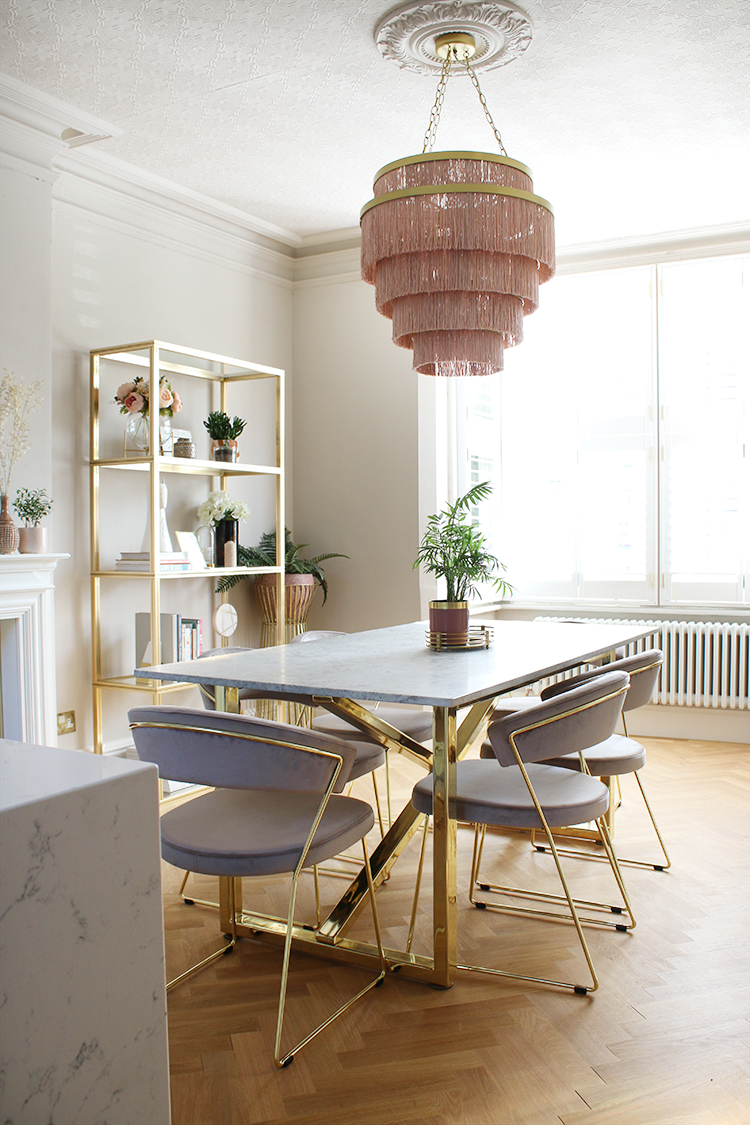
I painted the entire space – including the ceilings which thankfully survived the building work – in Earthborn’s Donkey Ride clay paint and used White Clay Eggshell No 17 for the woodwork. I’m one of Earthborn’s ambassadors this year and I’m utterly in love with the paint finish – it just goes on like a dream. I actually used the same colour for our quickie paint job and I loved it so much that I knew I’d be using it again when it came time for the proper makeover. And that really does count for something because I never ever paint a room the same colour twice! But I made an exception because it’s just my perfect beige-grey. It’s a beautiful shade.
The parquet flooring from Luxury Flooring was another nod to the history of this space. The hallway retains the original parquet and I wanted to carry over that beautiful look into this space as well (more about that here).
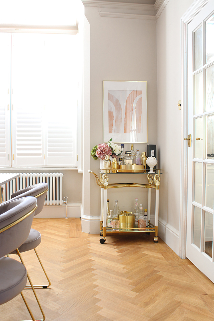
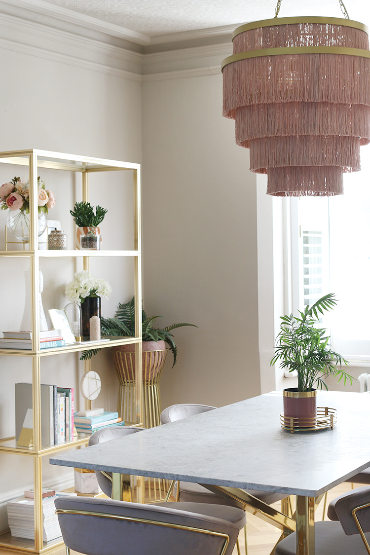
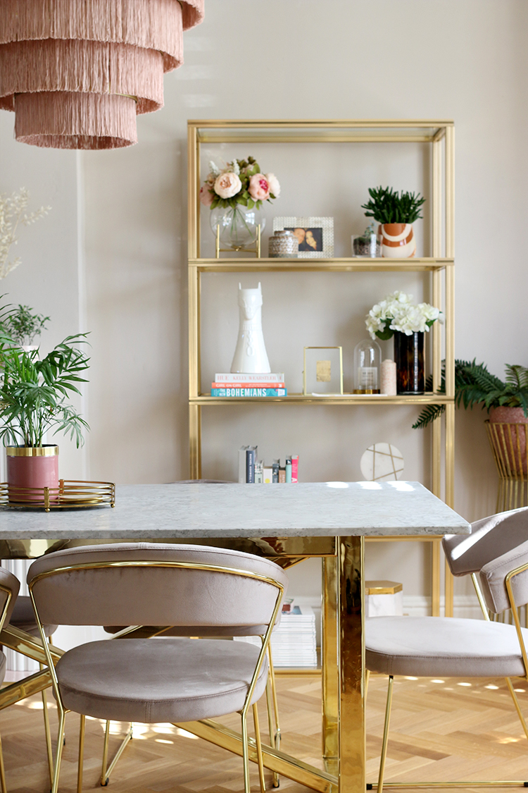
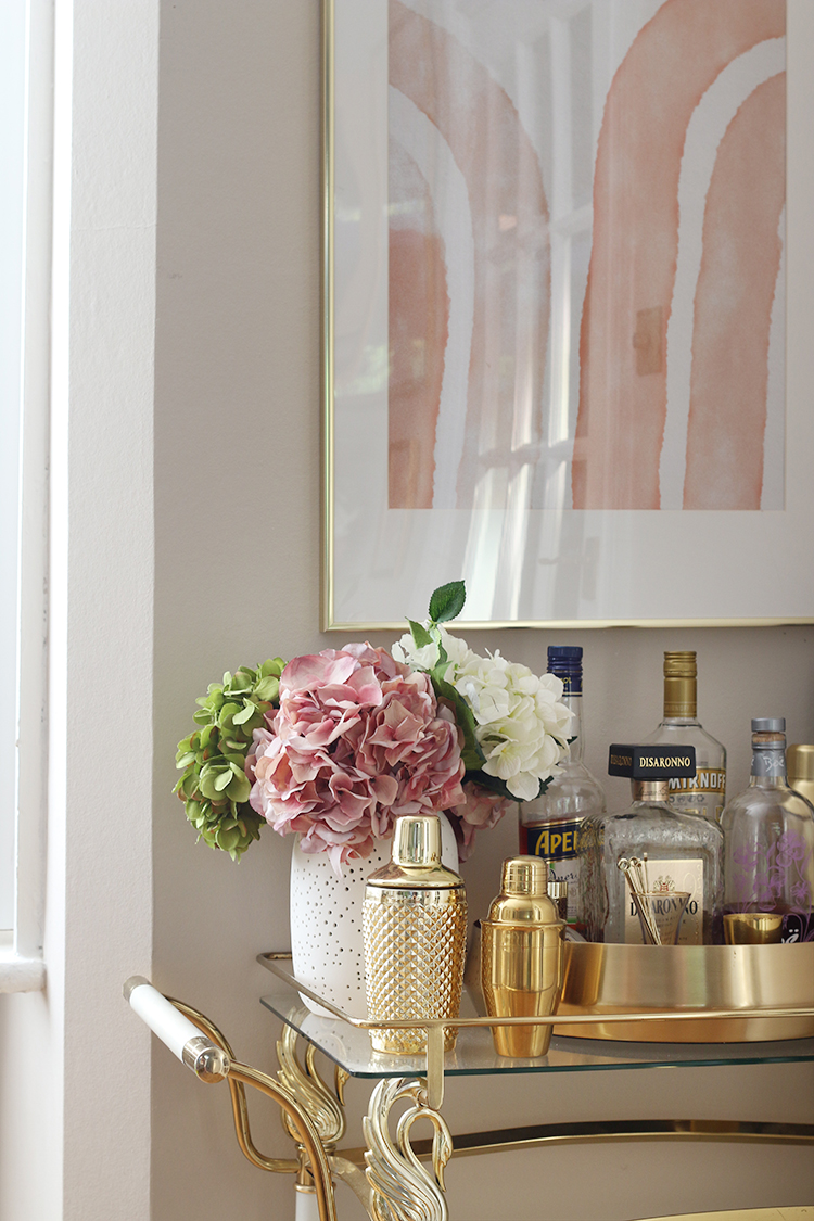
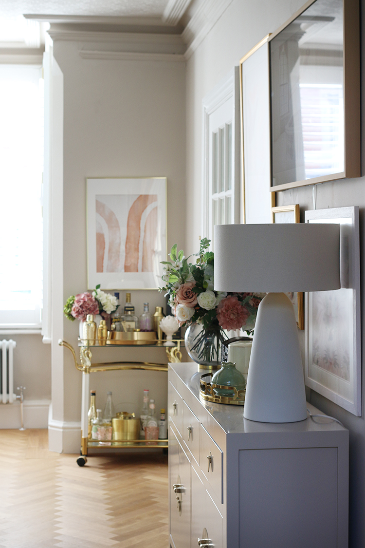
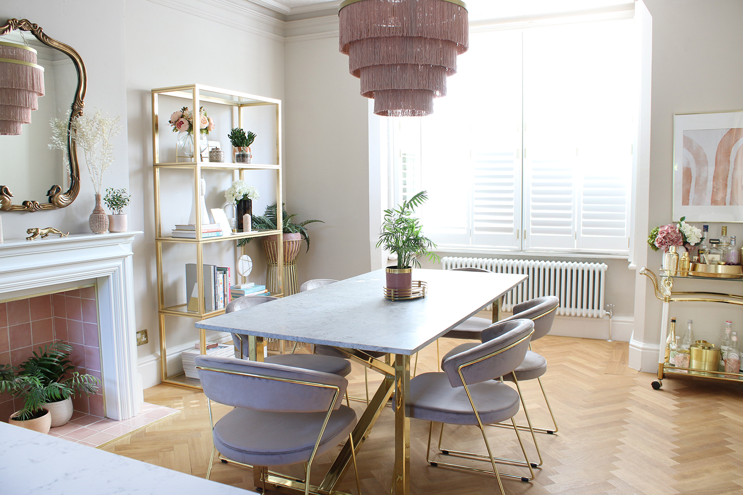
I also included a few of my vintage pieces in here which I adore. The bar cart I’ve had for many years now and the Pierre Vandal shelving unit is another favourite of mine, both found after endless hours of searching on eBay.
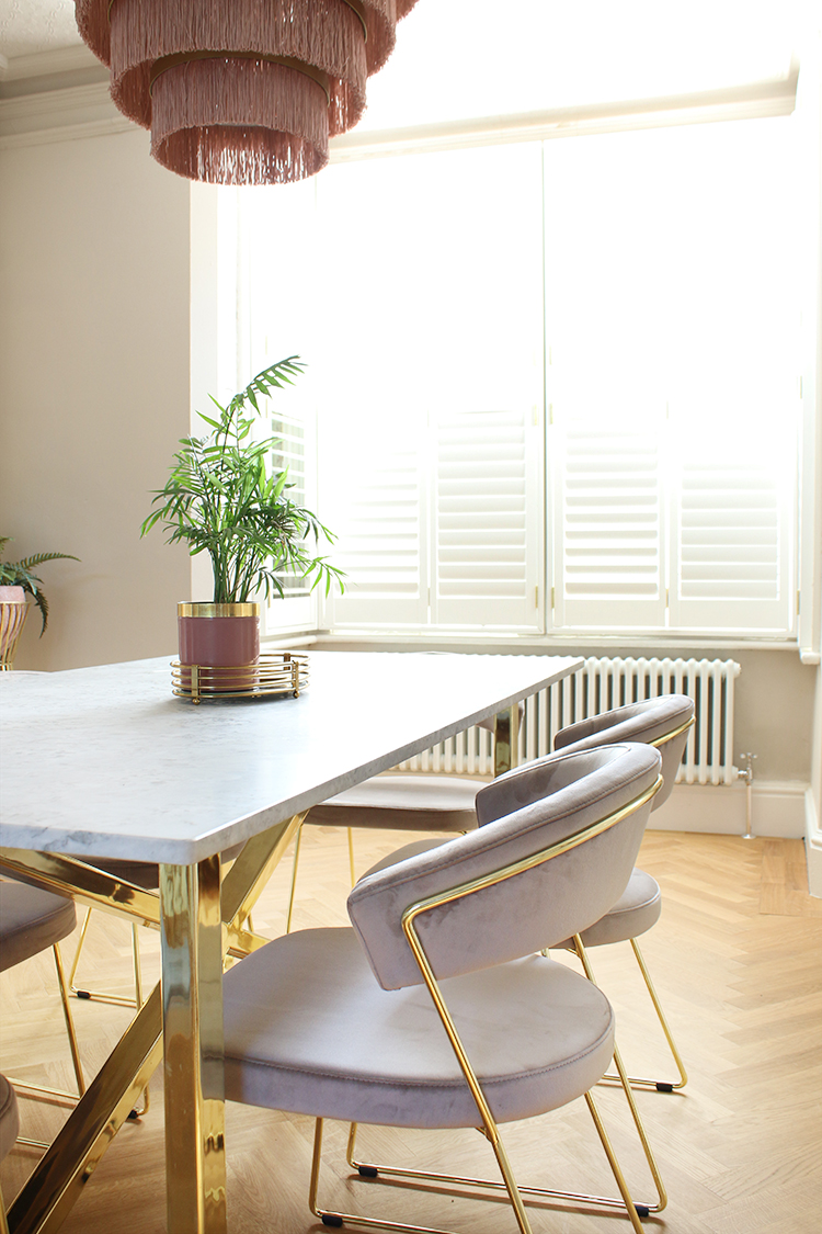
Of course, there are plenty of new items in the room. I sold my vintage Chippendale chairs in anticipation of the redesign and with their sale, was able to replace them with these Calligaris chairs from John Lewis which I love and marry so well with the table. The table I’ve had for a few years now but still love it. It was created bespoke for me which wasn’t as expensive or crazy as it sounds – you can read more about that here.
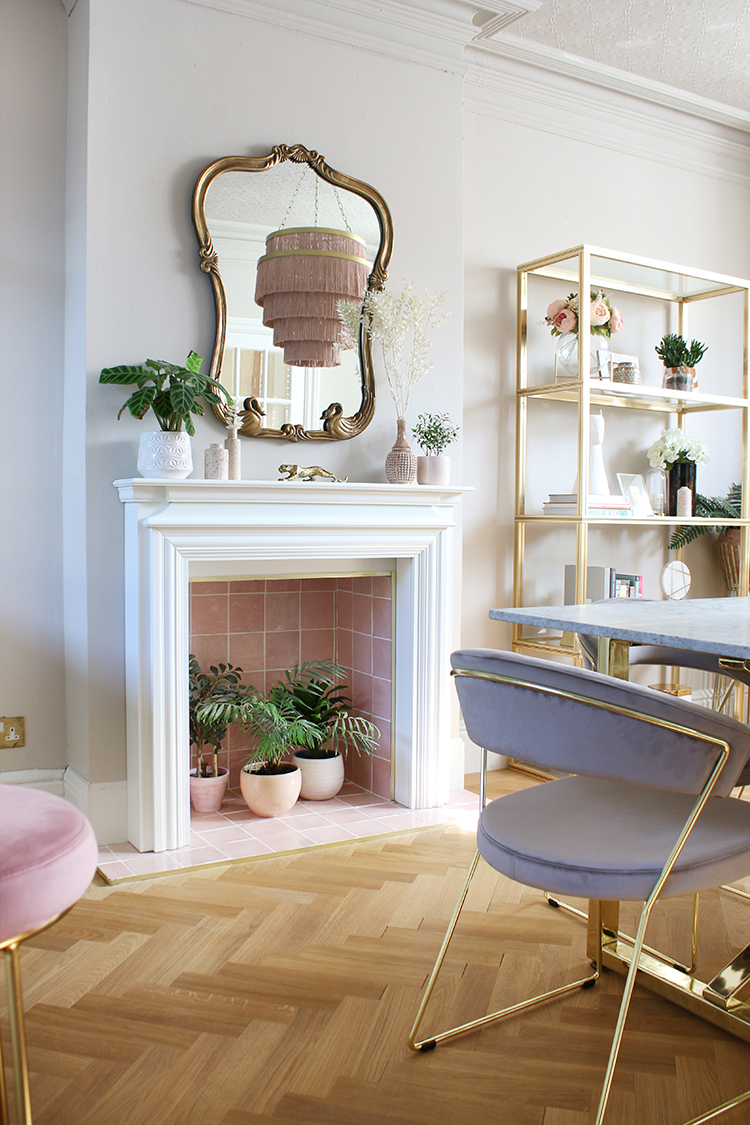
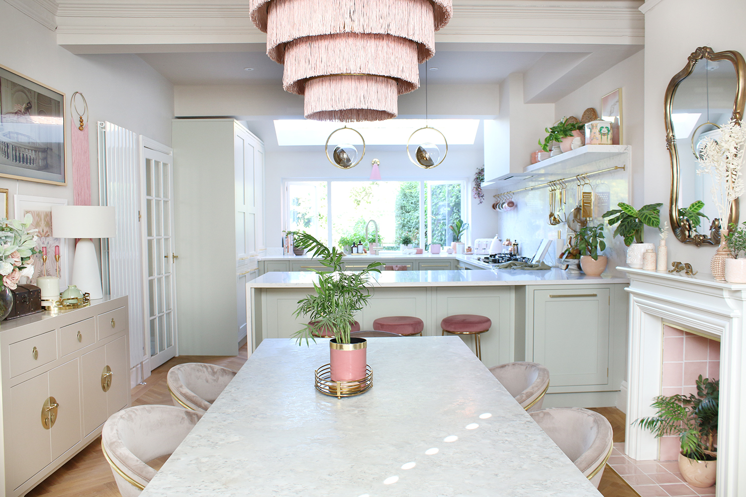
We also created the fireplace which I discussed more in this post. I think the pink tiles (purchased from Walls & Floors) were the perfect addition to this room with its accents of pink and peachy shades which marry well with the kitchen along with a fairly cheap and cheerful fire surround from B&Q.
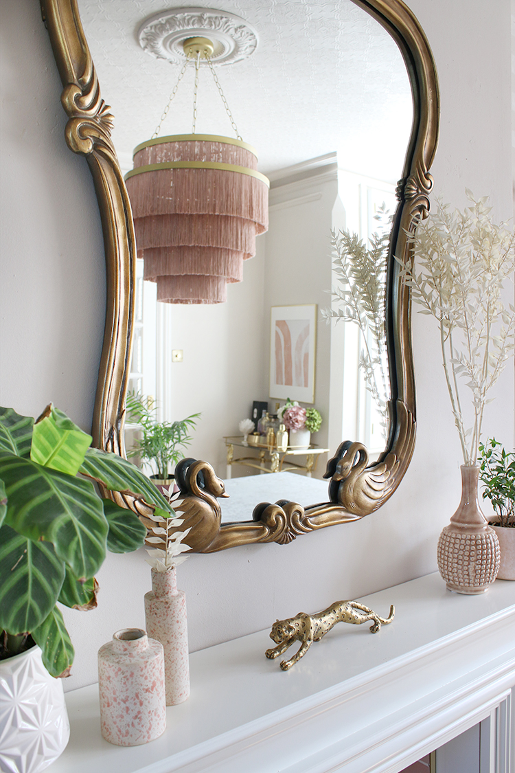
While I tried to find a vintage mirror for above the fireplace, I eventually settled on purchasing this one from Anthropologie. I just fell in love with the shape and I love that the swans on the bottom of the design married so nicely with the swans on my bar cart! I also like that it doesn’t make the room feel too ‘new’ and it definitely has a ‘I just found it at a little brocante in Paris’ kind of vibe! ;)
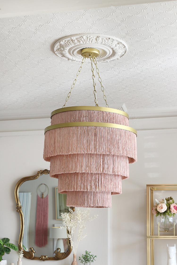
Speaking of Anthropologie, I splurged with the Aloha fringe light fitting, knowing it would be perfect for this space. It’s massive but I think the proportions were perfect for the room with it’s high ceilings. It just provides that bit of ‘boho glam’ that I love!
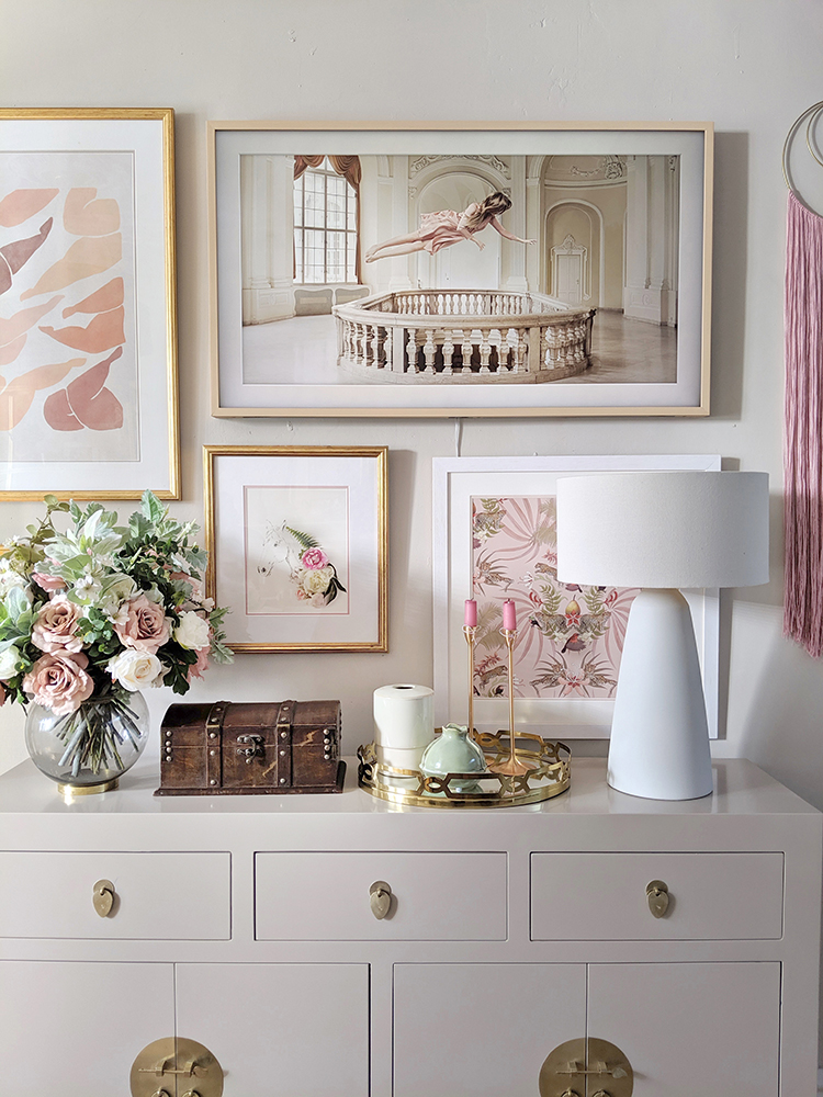
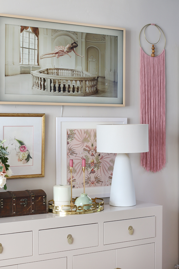
The sideboard was gifted from Nine Schools and as I mentioned in this post, I couldn’t believe what a perfect match it was for the wall colour. Only slightly darker than the walls, it feels as though it recedes into the space without taking up too much room. The Chinese-style handles create a lovely contrast with the other features in the room but the more contemporary shape balances that sense of old and new perfectly.
Above the sideboard, I decided to create a gallery wall with all the warm pink and peach tones to tie into the rest of the room.
I was very lucky to be gifted the Samsung Frame TV from AO for this space because while Wayne really wanted a TV in here for practical reasons, I was deadset against a big black box stuck up on the wall. The Frame TV is meant to blend much better in the space having Art Mode as one of the features (alongside an excellent QLED viewing quality). This means you can choose from a huge gallery of art pieces to display when the TV is off.
I do think that in the video I shared above, it really picked up the ‘digital’ quality of the image – moreso than it does in real life – especially when you are viewing the piece straight on. I think from certain angles, you can see the television has a sort of unnatural ‘glow from within’ that a normal framed piece of artwork wouldn’t but overall, it looks 100 times better than a big black box would look and I’m rather in love with the fact I can change up the art whenever I like!
The pink fringed wall hanging is one I made for this room but I’ve shared the tutorial here – it’s so easy and I’ve enjoyed seeing so many of you try it as well!
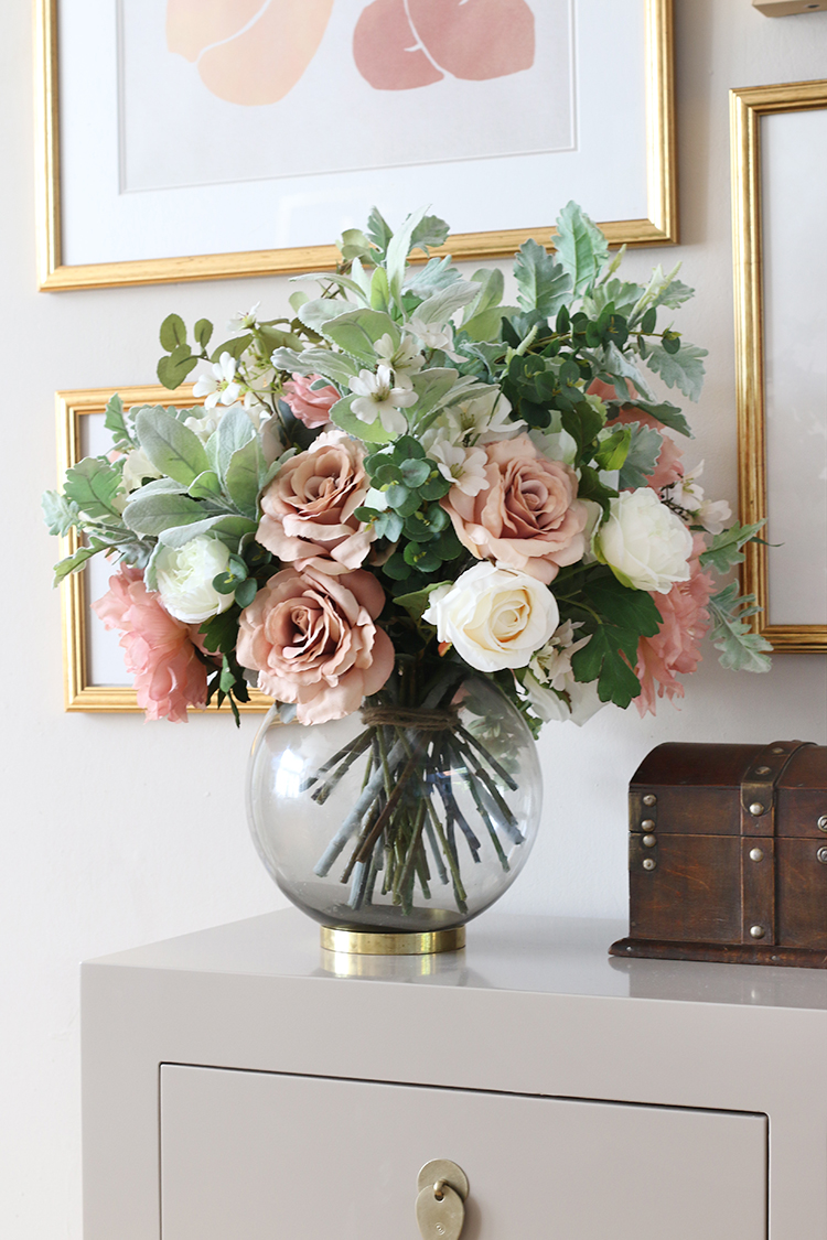
I was also gifted this incredible faux flower arrangement (which many people so far have thought was real!) from Honey & Lily. I am absolutely IN LOVE with this bespoke arrangement she created for me but she has plenty of options on the website or you can speak to her directly to create your own. She included so many of my favourite flowers and all in the colours I knew I would be using in this room. I couldn’t be happier with it!
In the bay window, the gorgeous DIY shutters from The Shutter Store frame the window perfectly. It’s hard taking good pictures of it as it does tend to get a bit blown out but they really do provide a completely adjustable amount of privacy and light for this space. We installed the same ones in our living room and I knew I’d want the same again for this side of the house. You can read more about our DIY Shutters here.
Below that, we replaced the rather boring old radiator with this gorgeous column style radiator from Soak.com. Going back to what I was saying about creating that contrast between old and new, I purposely chose this vintage-style to marry along with the much more contemporary flat-panel radiator on the kitchen side of the space. I may at some point put a bench or a small sofa in that spot, I just haven’t found the perfect piece yet and I need to let our savings account replenish after all this work! Ha!
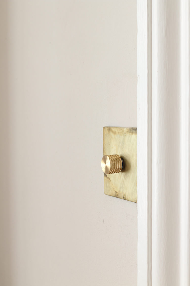
One last detail – and really, it’s the details that make the difference! I was also provided sockets and switches in this space as well as in the kitchen from Dowsing & Reynold’s smoked gold range. They are all such beautiful quality and really give the room its final finishing touch.
I wanted to share this angle as well so you can see how the two rooms open on to one another. I love how the colours flow from one space into the next and really make the two rooms connect to each other visually as well as physically.
Both the kitchen and dining rooms have been a real labour of love and the house works so much better for us having this space. I now make excuses to spend time in these rooms because they feel so lovely and warm and bright to be in. It was an incredible amount of work (and, let’s be real, money!) to get them to this point but as the cliche goes, it was definitely worth it in the end. Massive thanks to my wonderful sponsors and to you too for following along with this journey and for all your words of encouragement along the way! :)
I hope you’ve enjoyed the reveals of both spaces this week! We are going to be taking some time off now for a much-needed break in Tuscany (while our lucky house sitter gets to enjoy these spaces!) so I’ll be a bit quiet on the blog next week but happily, we have another little ‘midi-refresh’ of the living room coming up in October so stay tuned for that! And I’m sure I’ll be unable to resist posting on Instagram Stories whilst we are away so you can always follow me on there!
Disclaimer: I worked with a number of sponsors on this project but of course, I wouldn’t work with any brand that I didn’t love. Special thanks to AO.com, Nine Schools, Dowsing & Reynolds, Earthborn paints, Soak.com, Luxury Flooring, The Shutter Store and Honey & Lily for gifted and discounted products. All words, images and opinions my own as always.














And she does it again!! Ha ha, as if I expected anything less! I absolutely love this space and how it works with the kitchen. Your furniture looks so perfect in there and I love the new dining chairs. The pink tiles and that stunning chandelier are amazing too. But the thing I most cannot get over is the TV! I thought it looked gorgeous on the wall as art, then read it was a TV and noticed the tiny cable! AMAZING! I think we need to investigate this for when we finally do our living room – I absolutely hate how ugly TVs are and this is the perfect solution! xxx
Just as gorgeous as the kitchen reveal. Everything is just stunning the over all photos and video is amazing ( sorry im gushing ) looks this video doing the rounds at work as well. Kimberly its truly beautiful. Xxx
Beautiful!!!
So beautiful! You stayed true to your boho glam style, and this part of the house flows so beautifully with the rest of the house. You chose gorgeous finishes and details ( those floors! those tiles! those moldings!)
Congratulations on creating a feast for the eyes!
It’s gorgeous Kimberly – really inspiring! I love the way you’ve maintained your own style, and also lightened and adapted it to fit the new house. Superb!
It looks really lovely. I’m envious of your tv, I’ve been lusting after those since I first found out about them. I hate having what looks like a big black void in our living room.
I love how all the plants give a nice vibrant pop of green, in the picture looking down towards the kitchen. They really bring the room to life.
I bet you can’t wait to have people round for dinner, if you haven’t already!
Your dining space is the absolute perfect complement to your new kitchen. If these new spaces were mine, I would nearly pee my pants with delight every time I walked in. While my decor style is not the same as yours, you have stayed true to what you love and have even made me (and probably others) see the boho-glam style with completely new eyes – and wondering how we can incorporate at least some of it into our own. Congratulations.
Absolutely stunning!! There are so many beautiful touches ~ the TV, fireplace, mirror, bar cart, gallery wall, etc. The amazing structural design is perfection! I think I would spend hours in this room and the kitchen!
Enjoy your holiday!
Absolutely stunning!
You have blown me away again! Excellent work! Enjoy your time off. After such extreme makeovers you deserve it.
Yes, really enjoying these reveals! It’s wonderful to see it all coming together having watched the bits and pieces in progress – the fire place, the floors, the shutters. I can see why you are drawn to spending time in these spaces. They have a lovely serene quality that I crave!!
Such a pretty happy space that ties in wonderfully with your stunning kitchen! I’ve thoroughly enjoyed looking through both reveals over and over again this morning, can’t get enough of how absolutely beautiful it all is 😍😍😍😍😍. Enjoy your break in Tuscany, so well deserved! Bet you’ll be itching to get back to your beautiful home by the end, haha!
Wowzer!! I’m loving the muted pink. You would think it would be to girly but its very classy!
Another fab room. I can see many parties coming your way.
Love your style Kimberly, & the kitchen and dining room reveals were stunning. Thanks for sharing beauty according to Kimberly!