I debated whether to share the design of our kitchen on the blog. I didn’t want to ruin any ‘surprises’ for when it’s finally installed but at the same time, I do love reading about other people’s journeys in creating spaces they love. So, after doing a poll on Instagram of what people preferred, those who wanted to see the design early far outweighed those who said they’d prefer to wait until the final reveal. Ahh we all love a bit of instant gratification, don’t we? I can’t say I blame you.
The fact is, I’ve always shared the journey of my home here and so finally getting my dream kitchen is a pretty big part of that journey. In fact, this is something we’ve been planning since before we even moved into the house, knowing that if we ended up buying the place (spoiler: we did), that one of the first and biggest projects would be putting in a brand new kitchen. (So hide your eyes now if you don’t want to see!)
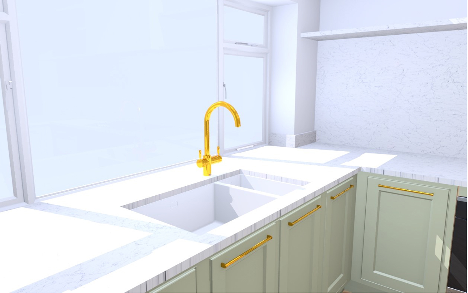
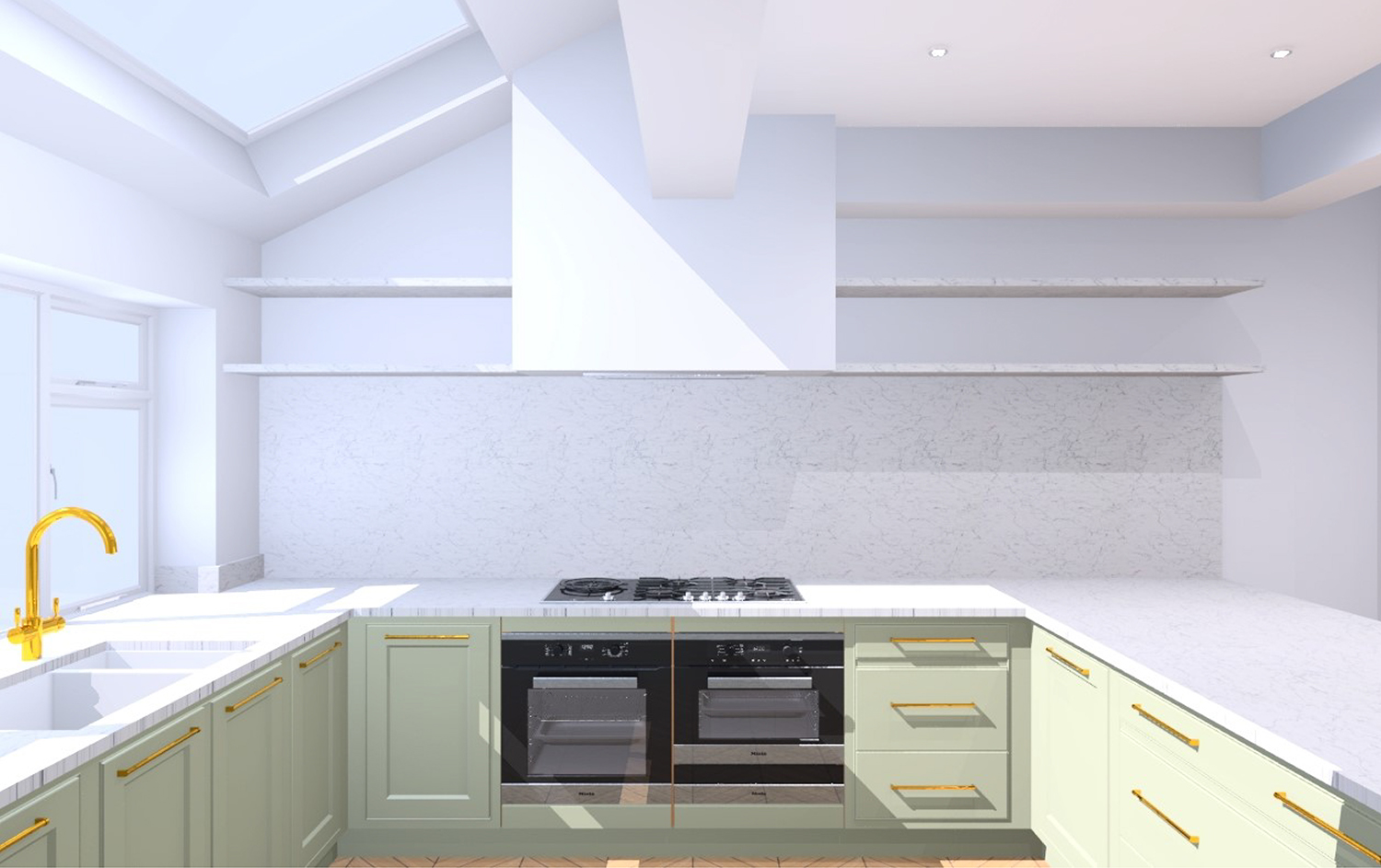
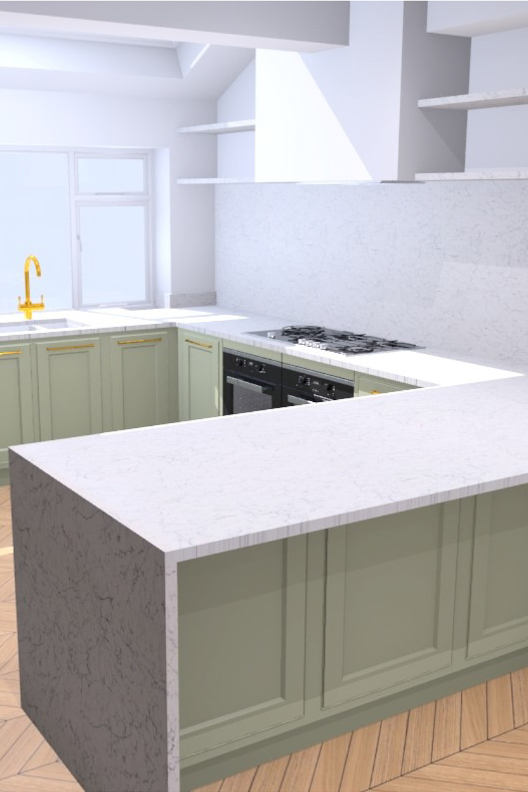
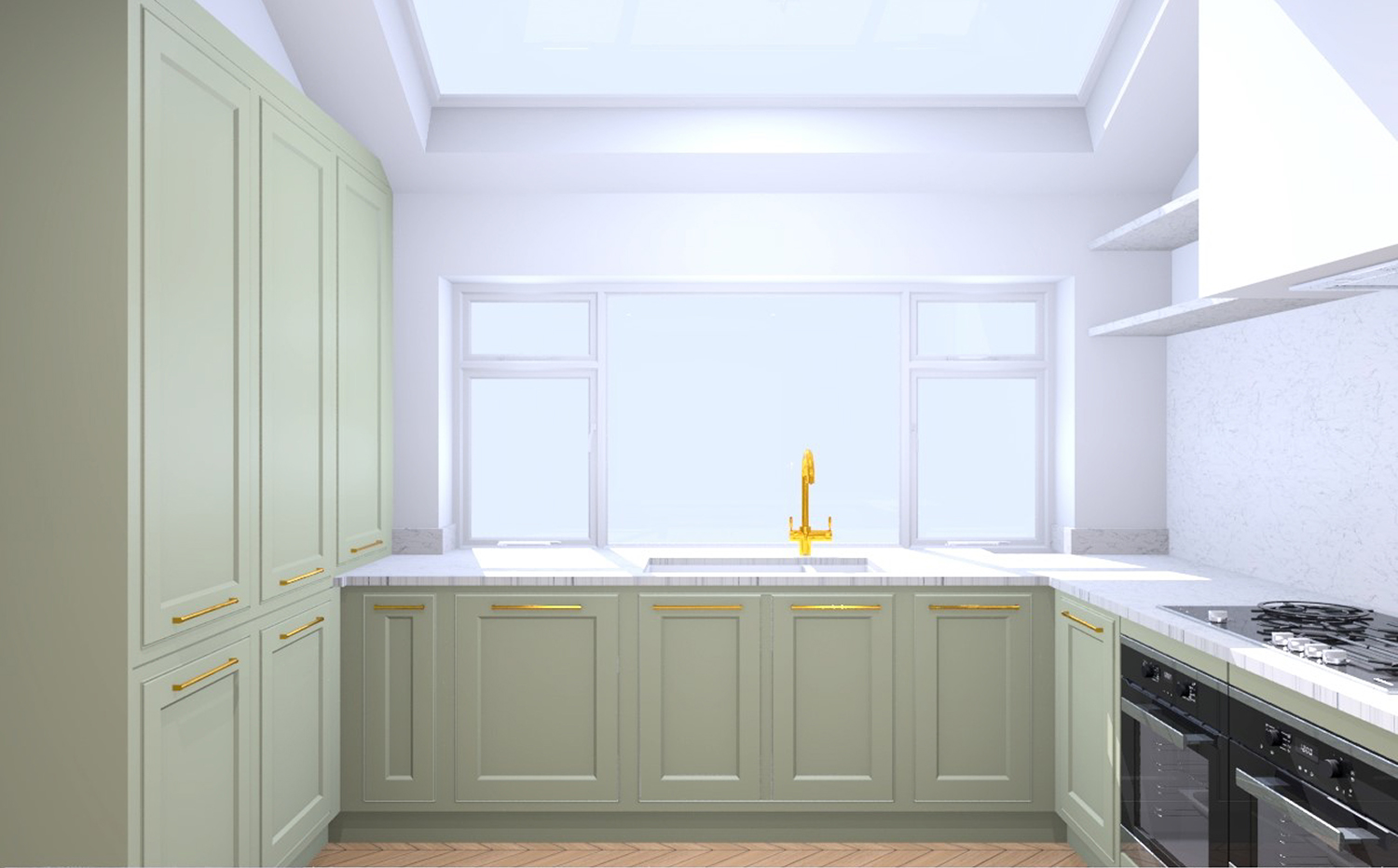
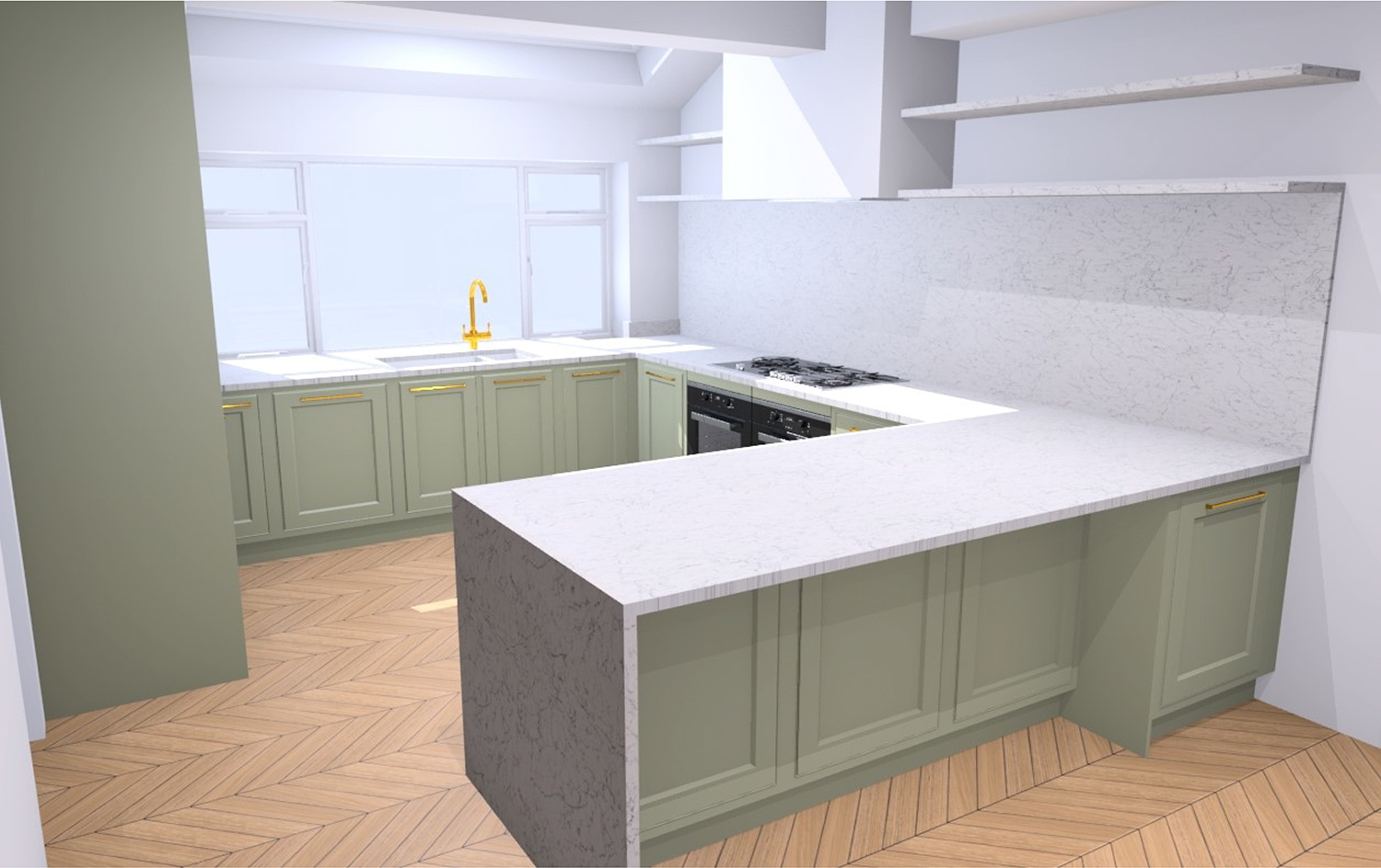
The other reason I decided to share is that these are just computer renderings. Yes, they are created to scale and yes, this is pretty much what the kitchen will look like – but obviously, it isn’t really styled in any way and I will be adding my own personal touch (so like, the walls won’t be white, the flooring isn’t quite the parquet we’re going for, those shelves will gleefully be styled and there’s no lighting shown for a start). So it’s very much just a preview!
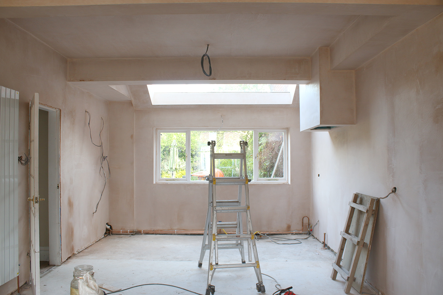
Now, getting to this stage has been a very long process and we’re not quite there yet although we’re damn close now finally getting to install this baby. But I’ve actually been in talks with John Lewis of Hungerford (not to be confused with the retail store) for a long time before the first brick was even removed. They approached me nearly a year ago now (!!) about working together on this project and I couldn’t be more grateful for all their expertise in the very important planning stages as well as their patience as we finally found a builder, had the shell completed and eventually got to the stage where we could start talking properly about the design.
Side note: You might remember their other fantastic kitchen collaborations with Sarah Akwisombe and 2LG Studio!
The truth is, the design has gone through quite a few changes and my John Lewis of Hungerford kitchen designer, Rebecca Nokes, has been endlessly patient with me, bless her cotton socks! My initial plans were to keep to a similar kitchen that we did in our last house. I loved that kitchen but perhaps all that time passing was actually for the best because I ended up changing my mind rather dramatically a few months later, realising I actually wanted something a bit different! The black cupboard doors and brass shelving I’d initially considered were out – the former as I realised I wanted a light, bright space and the latter because the ceiling wouldn’t really allow for the shelving I’d envisioned (something I realised thanks to Rebecca’s detailed CAD drawings!).
I started pulling together a bit of a moodboard, messing about with Photoshop and decided a soft green-grey with pale marble-look stone and brass hardware could be a rather wonderful combination. Shelving on either side of the built-in cooker hood could work as well…. and then as I started getting very excited about the design, I realised I may have been inspired by another kitchen I’d seen (and fallen in love with) that I’d completely forgotten!!
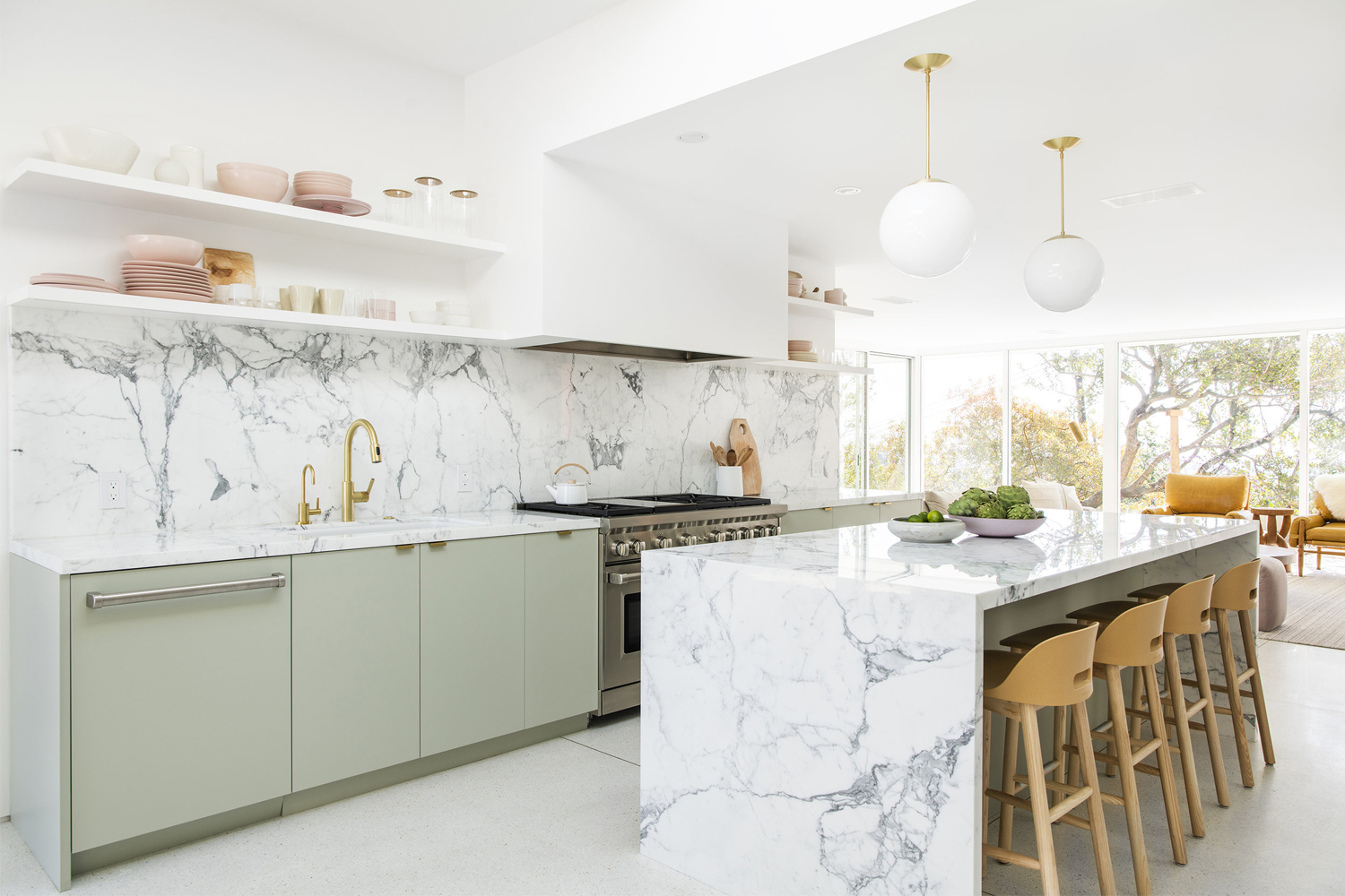
Funny how your brain takes in inspiration without you even realising!! But seeing Sarah Sherman Samuel’s design of Mandy Moore’s kitchen again solidified for me that I was definitely on the right track with the new design. (And yes, of course, I would have loved to have all that insane marble, it just needed to be reinterpreted to a non-celebrity budget!!)
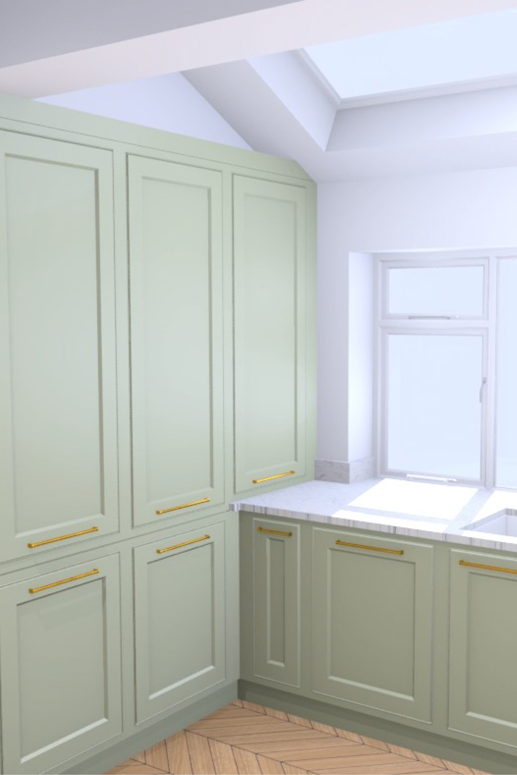
I headed to John Lewis of Hungerford’s gorgeous Fulham showroom in the early stages – it must have been a year ago now! But it was incredible to see their work close up and the attention to detail and craftsmanship were apparent in everything they did. At that time, I fell in love with the in-frame shaker doors. A shaker kitchen may not be as exciting as all the flat-fronted cabinets we see these days but it’s a design classic and knowing it’d be going into a Victorian home, it made sense to incorporate a cabinet style that wouldn’t easily date or go out of style. Plus, well, I just love the detail of a shaker cabinet!
All the appliances are built-in, hidden by John Lewis of Hungerford’s gorgeous painted doors so to the left, we’ll have an integrated fridge-freezer and two larders as well as an integrated dishwasher alongside plenty of under-counter cabinets with sexy built-in racks and deep storage for everything we might need to house.
For display storage, the open shelving will be custom made to the same materials as the worktops in White Attica by Caesarstone which should create a lovely soft pattern throughout the space.
If you squint, you can picture it!!
While John Lewis of Hungerford is graciously supplying and installing the kitchen, worktops and appliances, I’m working with a few other wonderful sponsors for this project including an incredible boiling tap from Zip, a stunning cast iron sink from Kohler, radiators from Soak.com, gorgeous lighting from Houseof, the sexiest sockets and switches from Dowsing & Reynolds, oak parquet flooring from Luxury Flooring and a number of other brands who have been wonderfully supportive of the project.
When I do the ‘grand reveal’, I’ll be shouting about these fabulous brands A LOT because they’ve all been just incredible – and so patient as we’ve been working away at this project for the last 6 months!! I am forever grateful to these brands for allowing me to bring their products to life in my home and sharing them with you and it’s something I will never ever take for granted.
This week we had the cornice restored in the dining room and over the next few weeks, I’ve got someone coming in to do all the painting and then we’ll be laying the flooring! So after a pause on the work over the last month, we’re kicking it back into full gear! The most exciting news? Our kitchen is scheduled for delivery the week of the 5th of August and the installation is scheduled for the week of the 12th August.
I know how many of you are excited to see the new kitchen in place – but no one is as excited as me! I feel like this project has been in the works for such a long time that it almost feels surreal that it will actually happen and I’m finally getting a gorgeous dream kitchen from John Lewis of Hungerford. I have a feeling when it’s finally in, I’ll be pinching myself that I’m allowed to use it! After more than a year of living with a pretty terrible kitchen, I just know how much this is going to impact our lives. Hey, I might actually do more cooking again!! ;)
I’d love to know what you think of the design! Are you excited to see it finally revealed? Hit me up in the comments.
Disclaimer: Our kitchen including cupboards, appliances, worktops and installation are being provided by John Lewis of Hungerford in exchange for coverage on my channels. I am incredibly grateful to be working with such a fantastic brand and wouldn’t have even entered into this partnership if I didn’t love their work and thought you might like it too. As always, all words and opinions are my own. Images are courtesy of John Lewis of Hungerford’s design team. Thanks for supporting the amazing brands that support Swoon Worthy.











Dulux’s Gooseberry Fool (it comes in different gradients, 1-6 I think) is a really nice soft green like this (and really nice quality paint…F&B is hopeless on cabinetry.
It’s all good – John Lewis of Hungerford custom matches the colour so it’s not F&B paints they use, it’s their own custom paints which are utterly beautiful ;) xx
The design is stunning Kimberly! So excited for you!
Thank you Meryl! I can’t wait for installation day! :) xx
I adore John Lewis and have already decided to have them do my kitchen (won’t happen for a little while due to budgeting) so I’m really excited to see the process! And thank goodness it’s not another Railings painted kitchen…Love the colour and the layout, really excited to see it all finished.
Oh it’s such a good choice! Their workmanship is incredible – definitely an investment for a forever home worth making :) I’m so pleased you like the design too! xx
Oh Kimberly, it’s going to be SO BEAUTIFUL!!! Love everything about it, so excited to see this visual come to life! xx
Aww thank you Meera! I’m so excited to see yours take shape too! Whoop! #Renobuddies xxxx
Gorgeous !! Thanks for the sneak peak!
Aww thanks so much Anna! :) xx
I can’t even imagine working in such a beautiful kitchen. You are so fortunate to be able to update your home with such beauty and convenience. I am puzzled about one thing – the open shelving seems to be particularly high on the wall. Is that just due to the fact that they are drawings, or will they actually be that high?
I genuinely almost can’t believe this is going to be our kitchen – still doesn’t even seem real! lol And yes, the shelving is quite high but still fairly reachable in real life – even for a shortie like me ;) It’ll likely be used more for displaying pretty things than anything else – haha! Maybe not the most practical but I liked the aesthetics of it ;) xx
Looks great, Kimberly! Glad to see that my cooker hood idea seems to have made the final cut!
Absolutely it did!! That cooker hood is going to be the first thing you see when you walk into the room – I already love how it looks in real life and there’s not even a kitchen in there yet! Ha! ;) xx
Love a shaker style cabinet myself, it just has a little more personality than a flat front. Not that there’s any personality lacking above! Your moodboard is gorge and can’t wait to see how you bring it to life with accents and colour pops. Pleased you have such fab brands to work with and so nice to read a post that doesn’t sound like an advertorial.
Ahh thanks so much Susan and I agree – the shaker style is a classic for good reason!! :) I’m so incredibly grateful to be working with these brands and I really appreciate your lovely support, it means a lot to me xxx
Looks great, and i’m sure you must be very excited to design your own kitchen/dining space from scratch for the first time. And with such lovely partners’ products. Well deserved.
Oh thank you so much – that’s lovely of you to say! I’m incredibly excited – I’ve never been able to design a room from scratch before as you said so this has been a really fun experience so far! xxx
Wow this is going to look amazing I just love it!!!! Perfect. I’ll never forget my trip to their showrooms in Harrogate and Betty’s afterwards, heaven! Just THE most beautiful kitchens ever, I’m properly swooning! X
I’m so happy for you that I just giggled through your entire post! Love, love, love your choices and am so excited that you have sponsors to help with the cost. Amazing and amazing!
I like your kitchen better than Mandy Moore’s! A big reason being the shaker style cabinets, they look just wonderful and add character. I’ve never been a fan of the minimalist sleek cabinets. You created a really all-around fantastic design that is both visually pleasing as well as well thought through from a practical perspective. You created so much storage but in a way that is not overwhelming to the eye. And having a white kitchen myself I am totally on board with the ‘light and bright’ approach :) Looking at the mood board I am not instantly in love with the paint colour and colour of the hob – BUT it all works together and knowing you, it will all come together and make sense in the end. I can’t wait for the final reveal! x
I work for a design build firm that specializes in kitchens in Boston USA. I am tired of flat panel kitchens – they lack depth and visual impact. The shaker style is classic and timeless for a reason. It’s simple enough to be universally applied to any style while still being visually interesting.
This kitchen you’re building will be relevant 5 years from now. Especially because you’re ignoring the kitchen trends. As always, your design is never what everyone else is doing and you’re never lazy about it (hopping onto a trend instead of forging ahead to your own beat) and for that, I will be an undying fan.
Thanks for posting – you’re literally my favorite <3
Ticks all the Kimberly boxes!! Pitch-perfect and spot on!! So fun that you shared this! Really LOVE seeing the vision!!
Ah man, I absolutely adore this kitchen already and it only exists as a render. I can’t wait to see it installed. It’s going to be life changing!! I’m so happy for you!
Yes, it is beautiful and sleek, and exciting. And, I hope when it’s done and you have added your art and accessories that it will show more of your personality and quirkiness, and your sense of playfulness. The kitchen at your other house was so expressive of you and your design, I hope to see that playfulness in our new kitchen too and can’t wait for the reveal!! :)
….”your” new kitchen too. :)
I absolutely love it but I do just wonder whether instead of cutting off the kitchen space you might have kept it open with an island though I appreciate if you did that there wouldn’t be the same space available for a breakfast bar….I’m sure you’ve thought of every possible configuration…love the pale green and the worktops-look forward to seeing it in “real life”!
Ahh thank you! Yep, we did look at the possibility of an island but the space simply isn’t wide enough to accommodate one and comfortably access the kitchen around both sides of it. So that’s why we went with the breakfast bar instead – it was just a better use of space :) xx
Really enjoyed reading this. Loos really posh design.