I’m always a little nervous when saying something is definitively ‘wrong’ or ‘right’ when decorating. Because, just like everything in interiors, it’s nuanced. There are things that can be more successful and things that can be less so and it’s incredibly subjective so saying something is a ‘mistake’ is probably heavy-handed. However, using colour in your home is always a little bit of a minefield and it’s pretty easy for things to go wrong.
This post is really for those who are just stepping in the world of using colour in their homes. If you are a confident colour-lover and you’ve had years of experimenting, bravely ignoring the rules, then please do just carry on and enjoy. But if you’re someone who really doesn’t know where to start but would love to experiment with a bit of colour, then this one is for you.
My own journey is probably slightly unusual. I started off with safe neutrals and then, just went full-on colour crazy, using a whole bunch of colours and patterns for a while there (my blog circa 2012-2014 is a testament to that fact) and now I still love using colour but just in a more restrained way. Don’t get me wrong – I’m still a big lover of colour and when someone is bold and brave with colour, I will very much rejoice but I’m just more sure of what I enjoy living with these days. Your journey with using colour may look different to mine – in fact, I’m sure everyone’s journey will be different.
But the fact is, when you are just starting to express yourself with colour in your home, it can be difficult to know why something just isn’t working or why something just feels a bit ‘off’. And so I thought today, I’d share a few simple ideas to keep in mind when it comes to using colour in your home. My hope is that this post might just be the perfect base to get you started and get you out of that comfort zone or understand why something may just not have worked well the first time around.
Mistake #1: Choosing Your Wall Paint First
I’ve had so many emails, so many messages from people who have decided on their paint colour and now they are stuck because they can’t figure out what ‘goes’ with it. I think the urge to get some paint on the walls when you are redecorating is such a strong one – and probably rightly so – because there is so much instant gratification when it comes to choosing a shade for your walls. But the problems will arise once you try to find items in your room to perfectly work with your paint colour after the fact.
When you are designing your spaces, you should first look at the items that you want to go into the space – consider the fabrics and accessories that will be used or the artwork you really want on the walls. Start with your favourite item that will be the star of the show – whether that’s a gorgeous cushion you found or a bolt of fabric you picked up from a vintage shop that you’ve fallen in love with or that bold sofa that you just know will look amazing.
There are so many many colours available in terms of paint so don’t start with that. It’s far easier to match a paint colour to an existing piece than it is the other way around.
Mistake #2: Ignoring the Quality and Quantity of Light
Both the amount and quality of light you have in a room will directly affect how that colour looks to your eyes. So, if you have, for instance, a north-facing room, the colour you use will look very different to using that same colour in a bright, south-west facing room.
While the tiny paint swatches you get at your DIY store can be helpful in narrowing down your favourites, it’s important that you get tester pots of each shade you’re considering and testers of varying saturations of each hue as well. Using large white card or thick paper stock, paint 2 coats on a sheet, leaving a 1” border in white. Tack this up to different areas of the room at different times of day and pay attention to how the colour changes depending on the light.
Here’s what to keep in mind:
- A north-facing room’s light will be cool and blue-ish. Bolder colours will show up stronger than muted shades so you may want to embrace and enjoy a stronger colour in these spaces.
- A south-facing room brings out the best of colours – darker colours will appear brighter and more saturated whilst lighter colours will take on a warm glow.
- An east-facing room will tend to get warm yellow light before noon but it’ll turn a bit bluer later in the day so they are great rooms for using warmer shades of the colour wheel (red/orange/yellow).
- A west-facing room enjoys a warm evening light giving your colours a glowy look but morning light will dull your colours, making them look less saturated.
Mistake #3: Ignoring Colour Psychology
Without considering how you want your room to feel, choosing colours can be a minefield. Before you start your decorating process, choose a few words to describe what the finished result will feel like: Calm and peaceful? Warm and relaxing? Energetic and inspiring? Creative and exciting?
Colours have the power to change the mood of any space. Paint a room in vivid red and you may just feel anxious or agitated. You may also feel hungrier (thus the reason why many restaurants use red hues in their décor). Paint it in a calming pale blue or soft green and you may just feel that much more relaxed whenever you’re in the space (thus the reason so many hospitals use these colours).
While there is much research on the psychology of colour, everyone has their own ideas of how specific colours make them feel so if you’ve painted a room but it just doesn’t feel quite right, it may be that the colour you’ve chosen has had a negative psychological effect on you. I realised a long time ago that blue wall colours make me feel down and agitated while I realise that for many, blues make them feel calm. Greys are another interesting one – for some, it feels depressing, for others, it feels comforting. Pay attention to how colour makes you feel because it may be a little different for everyone.
Darker paint colours are another one that I very much enjoy from afar but after a number of years experimenting with different darker shades in my own home (deep indigo blue, warm dark grey, nearly black and deep brown), I know that I need to limit my time in rooms that are painted in the darkest of shades because it affects my mood. I’ve realised I need a home that’s painted in lighter tones but for you, you may find darker hues are enveloping and thoroughly enjoyable. Everyone will be different.
Of course, if your heart is set on using a specific shade but you fear it may be too overpowering for the space or provide a negative effect on the feel of the room, consider bringing in that colour with accents in your accessories, soft furnishings, artwork or lighting instead so you can still enjoy it.
Mistake #4: Ignoring Your Undertones
So, you’ve gone through the trouble of collecting tester pots and you’ve considered how the colours you’ve chosen make you feel but something still isn’t right. You’ve mixed and matched but the colour combinations just aren’t working together and you can’t figure out why.
The likelihood is that you’ve ignored the undertone of the colours you’ve chosen. Neutrals are perhaps the hardest to get right which is why it’s so difficult to choose just the right shade of grey, white or pale pink for your space. Each colour will carry with it a subtle leaning towards warmer or cooler undertone which may not be evident on first glance. What we see immediately is called the ‘mass colour’ but to identify the undertone takes a little more investigation.
The easiest way to determine a colour’s undertone is by comparing it to other colours from the same colour family or comparing it to the colour’s purest primary form. For example, some blues will lean more purple or red, others will look slightly more green or yellow. The technique works well for choosing white shades too – compare your swatch to pure white and suddenly, you’ll see a hint of yellow, pink or another colour.
So, while the quality of the light in your space will make a difference in the way a colour looks, the subtle hint of red, blue or yellow within the variations of shades and tones will need to relate to other items chosen in the space.
Here’s what to keep in mind:
- If you have a cool grey with bluer undertones, you may want to mix that with other colours that are on the cooler side of the spectrum – pale aqua blues, soft lavenders and greeny-blue accents will work nicely.
- If you are using a warm biscuit shade of white with more yellow undertones, then you’ll want to combine that with warmer colours of the spectrum – ochre yellows, rich clarets, or rusty oranges.
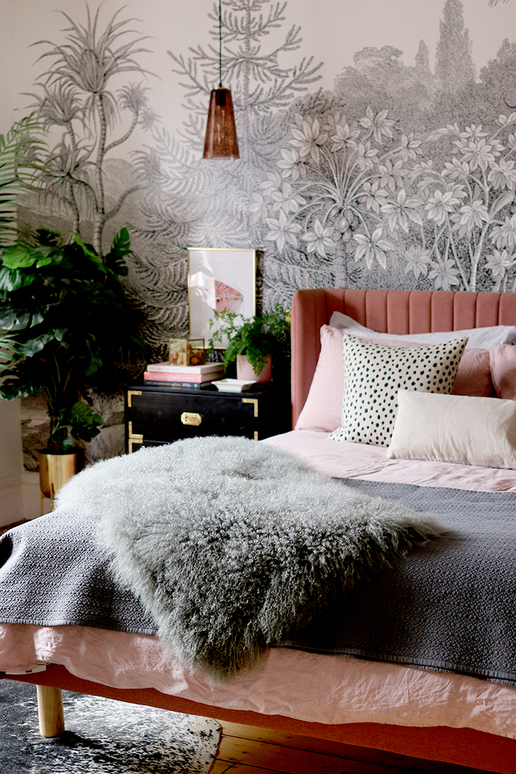
- If you are considering a warmer pink mushroom colour, think of mixing and matching other colours that match that reddish undertone – blush pinks, salmon peach and deep berry shades will all marry nicely.
Of course, once you have a good grasp on identifying those subtle variations, it then becomes easier to mix and match undertones, contrasting them and bringing the undertones to the forefront or playing down the undertones by choosing similar undertones with the rest of your palette. If you’re just starting out, however, matching undertones is an easier way to create a more harmonious space.
Mistake #5: Including Too Many Colours in One Space
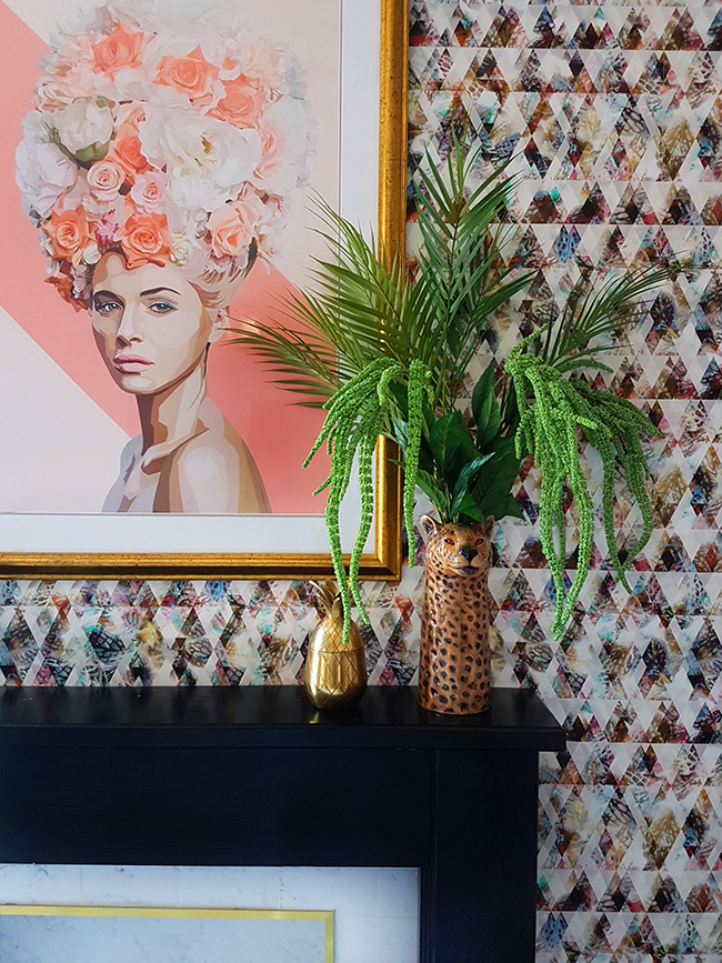
While there is a trend for throwing every colour of the rainbow into a room and calling it ‘maximalist’ styling, this is a look that can be challenging to pull off. Too many colours or too many different saturations of colour can be the difference between a fun and whimsical space and one that overpowers the senses, leaving the resulting look more chaotic than intriguing.
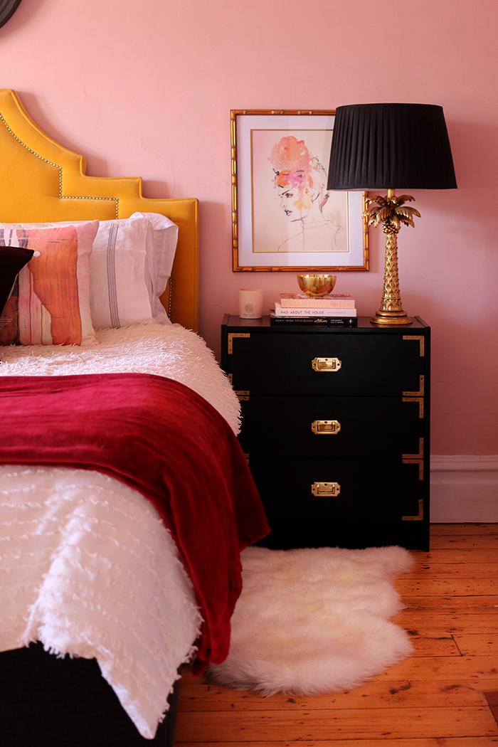
So if you are just starting out, consider a well-used rule of thumb: pare back your main colour palette to 3 and use the 60/30/10 rule. This means that you’ll use one colour for 60% of the space (normally a neutral shade for walls and floors or rugs), 30% a different colour (think larger pieces like curtains, sofas, chairs in a mid-tone shade) and 10% will be your accent colour (smaller accessories, artwork and the like which could be a bolder pop or higher saturated hue).
Of course, there are plenty of ways to very successfully ‘break’ this rule but again, if you are just starting out, then this is a really good place to get started.
Mistake #6: Designing Every Room in Isolation
While every room will have its own function, decorating each room without considering the impact of other rooms in your home could lead to a home that feels disjointed at best, ill-considered at worst.
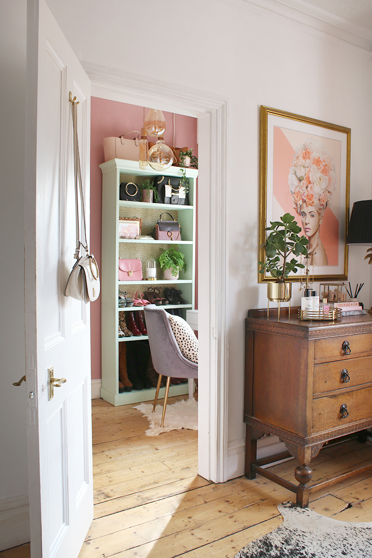
While you certainly don’t have to match the colour palette in every room (and in fact, I’d caution against that extreme), you may want to consider how each room’s palette relates to the rooms around it. I spoke recently about creating a coordinated home but it comes more into play when you are designing rooms that are adjacent to one another.
Using a small selection of accent colours throughout your home will create a unifying effect, allowing each room to seamlessly flow into the next. Or you may just want to ensure that the saturation of your colours complement each other in adjoining rooms so that when doors are open in the hallway, the rooms work together even if they are used for different functions.
Mistake #7: Playing It Too Safe
With so many different considerations when using colour, it may seem a bit overwhelming and so you may just decide to avoid the idea completely, sticking to tried-and-tested neutrals and not using colour at all.
While a neutrally decorated room can indeed be rather beautiful and soothing, sticking to this out of fear when you’d really love to take risks with colour isn’t always the best idea. Like anything else, the more you experiment with using colours in your interiors and the more you try, the more you will learn.
After all, this is not life and death – this is simply a few tins of paint. If you get it wrong, consider what didn’t work out and why (using my tips here as a guide hopefully) and then try again. Most of the best-designed rooms were those where the designer has taken a risk and it paid off.
Playing it too safe can result in a room that’s visually flat or uninspiring. Introduce a few colours to your space by way of accents in your accessories, artwork and cushions and as you get braver, consider bringing in more colour in larger areas of the room to build up your colour confidence.
I hope these tips have been helpful but now it’s your turn: Do you enjoy using colour in your interiors or have you struggled with it? How do you use colour in your own home? Have you taken a risk and it’s paid off? What colours do you love to mix and match? Let me know your colour thoughts in the comments!


It took me many years and many tries at various colors of paint to realize that I am a cool color person. No pinks, reds, yellows, oranges, bright greens or pastels, etc for me. I finally found that grays, taupes, blues, greens, purples, wine reds, etc are the colors that make me happiest and provide me with that cozy factor that I require. However, no pastel shades of these colors, thank you. I like medium to dark versions, then put in furniture, artwork and accessories in shades of white, beige and other neutrals for balance. Probably just backwards from what most people do, but it suits me just fine. Each to their own is my mantra.
Great post Kimberly, thank you for the helpful tips. Colour is something I pay a lot of attention to in my home/garden, but I’m not entirely comfortable with my level of understanding of the colour theory, it’s something I hope to get better at as I decorate my new home. I do a bit of feng shui so colour is an easy way to illustrate energy that I want to represent in different areas of the home, and this can change on a yearly basis sometimes. My personal favourites are whites, blacks, greys, silver, gold, blues, greens, pink as accent colour.
Great post and very useful. I’m planning my extension and I really want to be brave with my design choices and colours this time. Always played safe! I’ll use your tips, thanks
I love this post, Kimberly, it is so informative and well written. I used to be really afraid of using colour. After years of living in magnolia rentals I was paralysed by indecision when I could finally choose to decorate our home however I wanted. I went for dark shades of green and blue in the end. I was petrified as we were painting the walls but I love how these rooms make me feel. I’m definitely more confident with colour now, but I’ve run out of rooms to practice on.
Hi! Fantastic post. I completely agree with the point of designing your rooms in isolation. We’ve found it better to look at the rooms as a whole and then to come up with a theme for all of the rooms as opposed to designing one room and moving onto the next. Within that time frame styles can change and you end up with a collection of quite eclectic rooms.
Thanks for sharing. I look forward to reading your next post.
Emma