About a week and a half ago, I came to the realisation that my dining room had turned into a dumping ground. From fabric, tiles, paint and flooring samples to bits of decor and art I had no place for, the space was littered with the discarded, unloved and disorganised pieces of my life. There was a reason for this, of course. When we’d moved in, the dining room was truly just an afterthought. We had big plans for it, eventually, of course. The wall between this and the current utility room will eventually be knocked down, a small extension created and the result would be a lovely open plan kitchen and dining room – the dream we’ve had for this house since moving in at the end of March.
This post may contain some affiliate links.
That plan, as you may know (and if not, this post will catch you up) has been delayed slightly and things have taken much longer than we’d anticipated. The extension work has been moved out now to early next year (we hope – we still have yet to get all the quotes back from contractors after nearly 8 weeks of chasing) and so we’ll be living with the current configuration a little longer. The longer things went on, the worse the dining room was looking. I’d done a bit of ‘decorating’ (if you can call it that) not long after we moved in, just to make it semi-liveable but the truth was ridiculously and embarrassingly simple: I hated the colour.
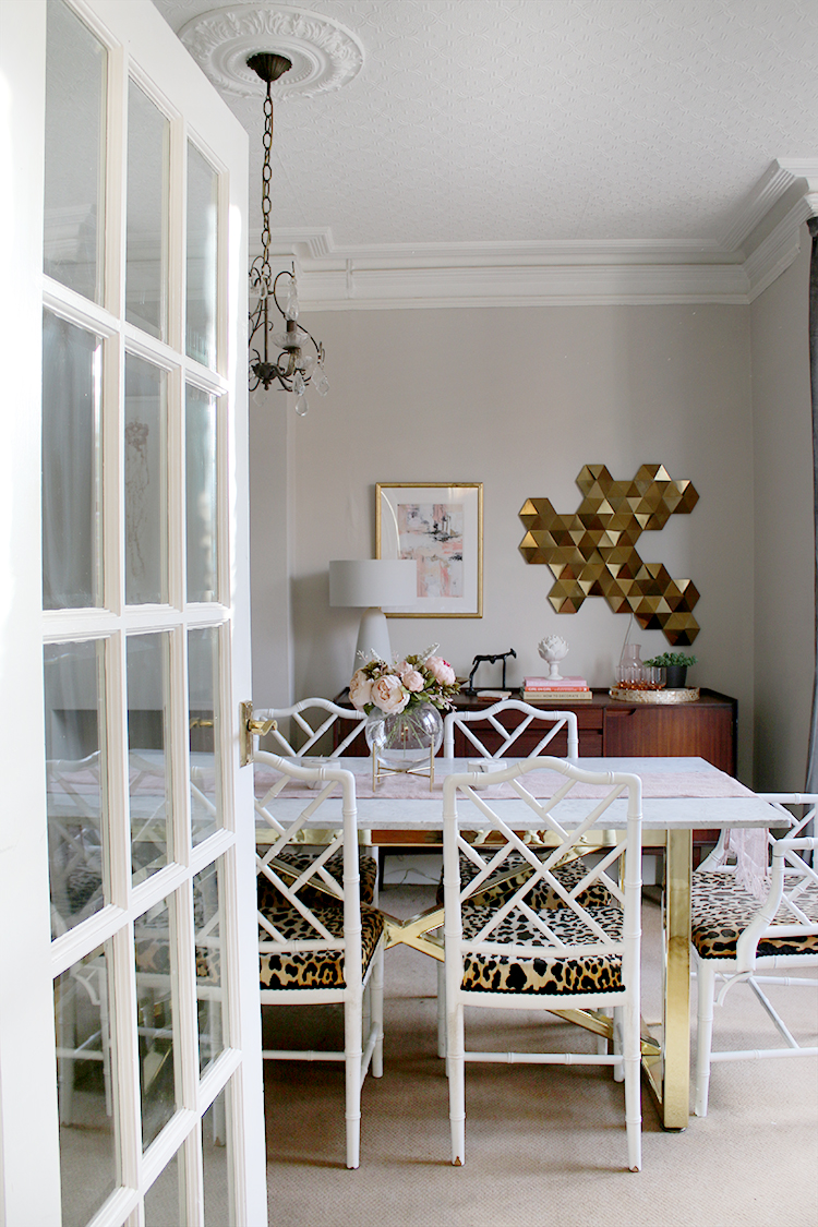
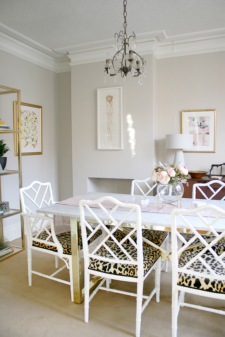
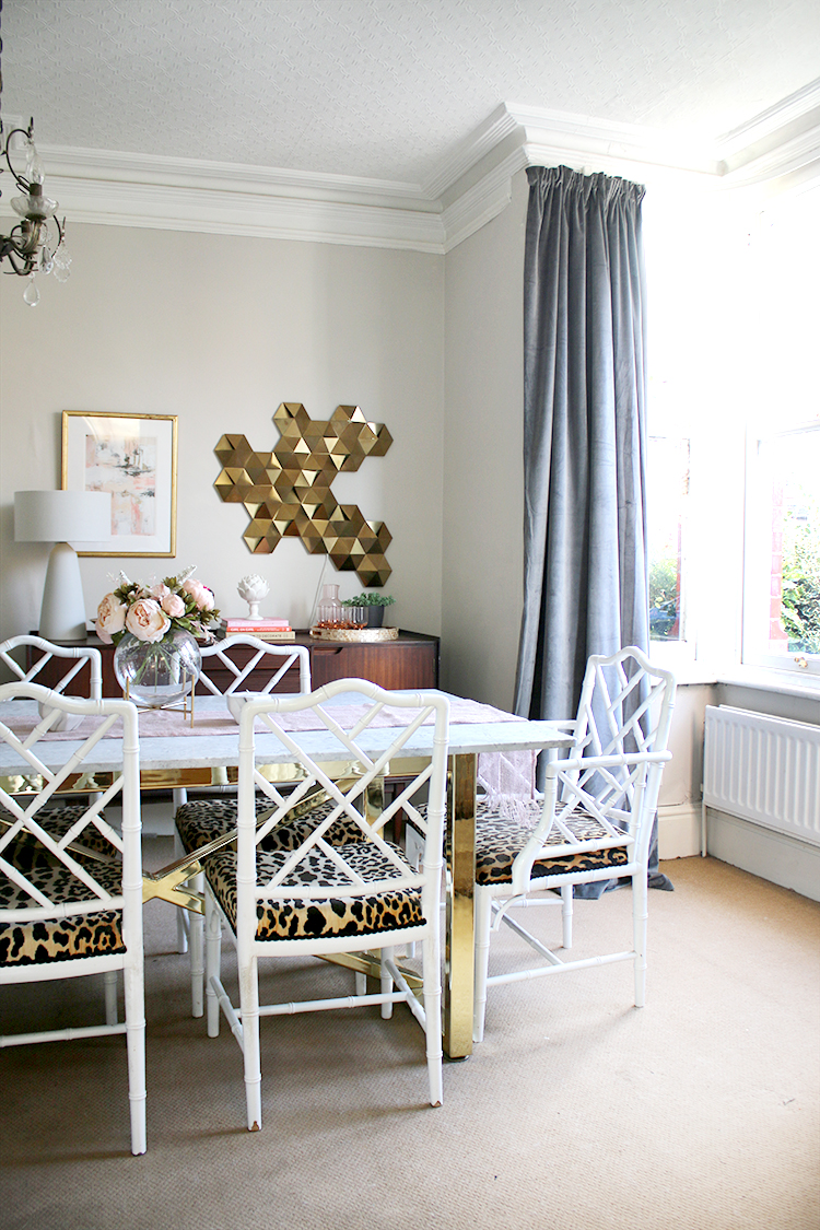
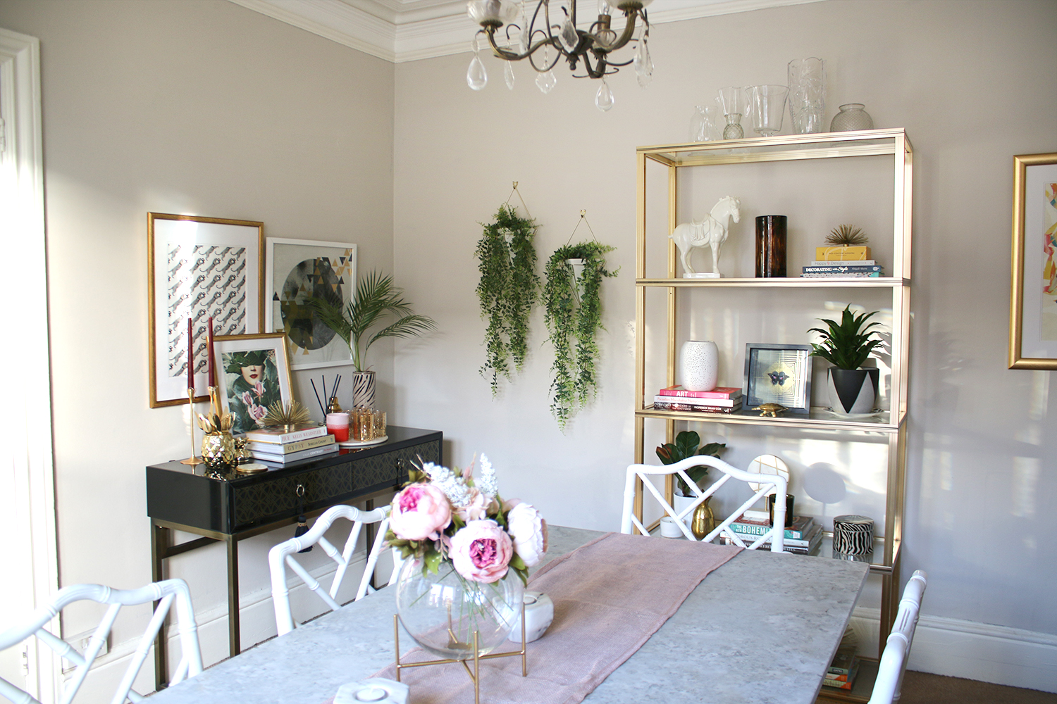
I’ll chat through the details but I figured you’d probably want to see the result of a single weekend of painting and rearranging. Here’s what it’s looking like now…
It’s funny how colour can affect you psychologically. One person’s calm and serene can be another person’s anxiety-inducing nightmare. And many blue paint colours, I have realised, is the latter for me. Of course, I can admire certain shades of blue in other people’s homes and think it looks perfectly lovely. But I struggle to live with it myself. And the previous owners LOVED blue, quite clearly, with no less than 6 different spaces in this house painted or using various shades of the colour. The dining room had been painted in a dreary blue-grey which for me, anyway, sucked the life out of it. It felt claustrophobic to me, depressing and oppressive. I hated being in there and so the room became neglected, unloved and not particularly pleasant to live in.
Knowing that the extension plans are at least a few months away, I decided I couldn’t live with the space as it was any longer. The dreary blue colour on the walls HAD to go. Like, RIGHT NOW THIS INSTANT. Christmas was coming, I wanted to decorate the room for that and plan out my table settings for dinner and I wanted a room that I actually didn’t mind being in.
I decided to call on a paint company I’d been chatting to about working together – Earthborn Paints. I’d approached them, after hearing about their eco-friendly highly-breathable paints (perfect for older properties like our own) and I was delighted when they agreed to help me out on this project. After testing various paint samples, I finally decided on Donkey Ride – a lovely warm beige colour with just a hint of grey. I was actually already aware of the colour, knowing my friend Bianca from French for Pineapple had used it in her bedroom and after testing the colour out, knew it was perfect. Enough pigmentation to give the room warmth but not so much to make it feel like it was overpowering the space.
The clay paint itself went on like a dream – it’s really thick and creamy. Ya know when you paint, you usually end up with little splatters all over your arms, clothing and hair? There were no spatters. None. This stuff goes on thick and covers exceptionally well. I only needed to do ONE COAT. There were a few little areas I ended up going back to retouch but I definitely didn’t need to do two full coats at all – it really does cover that well and almost no discernable odour at all. I was very impressed!
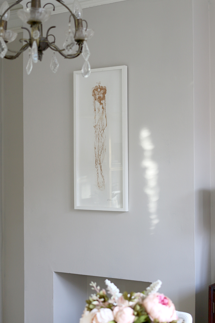
I knew all it really needed was a fresh coat of paint for now and a bit of a rearrange. I had a large mirror on the chimney breast which as soon as it was hung, I realised was a mistake. It was just far too big so it has been replaced with one of my favourite prints – a limited edition from Rosie Emerson that I’ve had for years and have never tired of.
I feel like it really gets to shine in this spot now and it feels so much more serene and less cluttered.
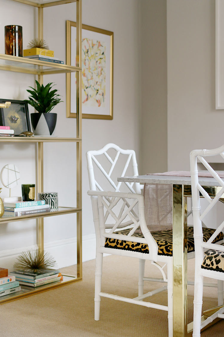
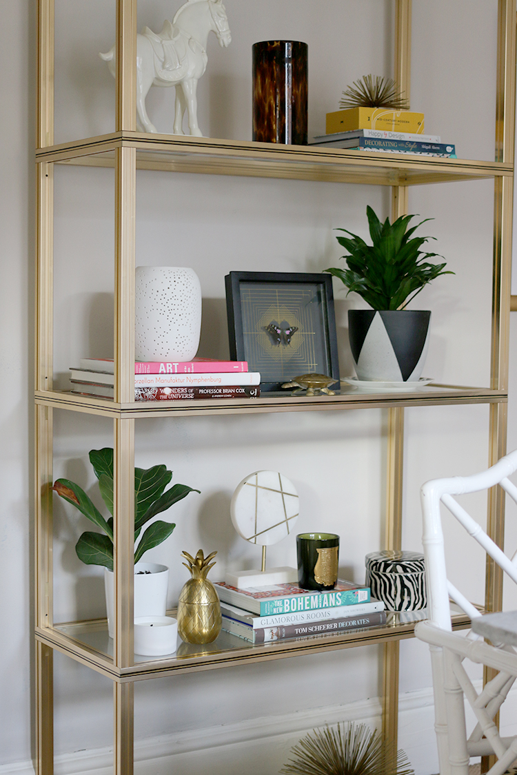
I also moved the vintage brass shelving unit to the far wall and simply styled it with things I’ve had for years. I purchased nothing new for this room and while I admit, with a few new items, I’d probably like the styling more but I didn’t want to spend money and I really just wanted to use what I already had.
I left the curtains as they were and of course, as the ‘decorating domino effect’ is a real thing – they no longer really work for the space. They are that bit too dark and the colour too cool but we’ve ordered new shutters for this window (to match those in the living room) and so I’m simply waiting on those to arrive. Thankfully, I only really need to live with them for a little longer.
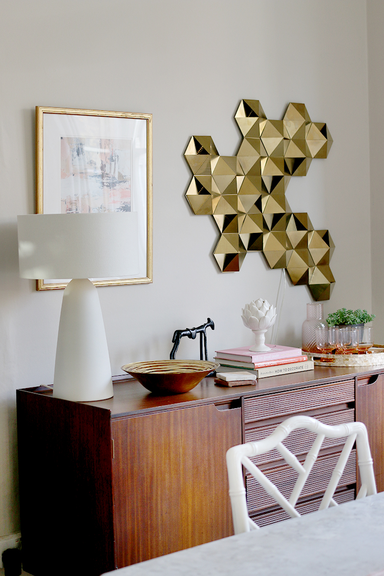
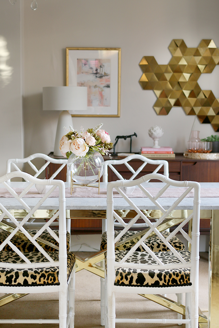
The vintage MCM sideboard got a bit of a refresh as well. I had completely forgotten about that geometric wall light that used to live in the office in our old house – it had been wrapped and stored under the bed in the guest bedroom and I found it as I was rummaging around, trying to find stuff for this room! I quite like how the contemporary lighting (the white one is from MADE) contrasts with the vintage pieces in here and it looks lovely at night too. Eventually, I’ll sell the sideboard, and replacing it with something a bit lighter.
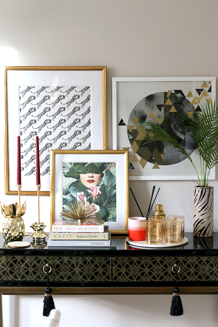
The black console unit was moved to the wall next to the door and while this isn’t the greatest picture in the world, does give you a better idea of the layout. As you can see, this room is bright and light all day long – it’s south-facing and so I had to take these pictures first thing in the morning before the sun came fully into the room!
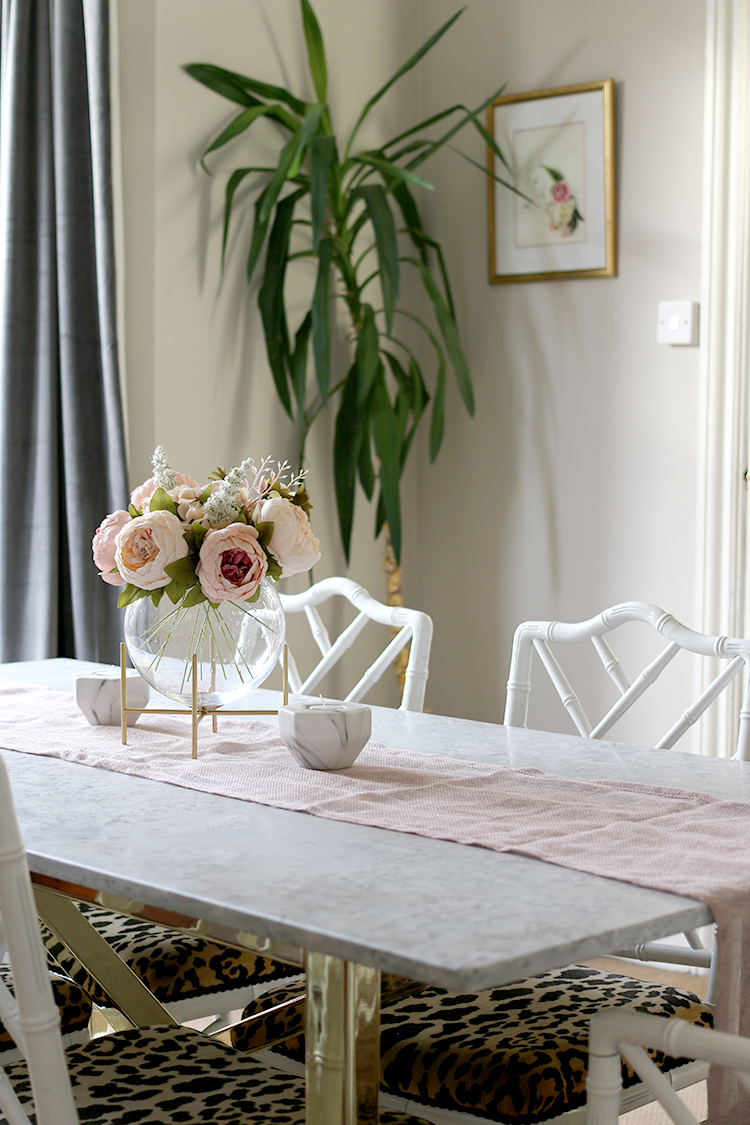
If you’ve been reading my blog for a while, you’ll probably recognise pretty much all the accessories in this room. The top left print is simply wrapping paper from Ikea (no longer available) that I framed, the geometric print in the white frame is from MADE and the smallest print is from Society6. The glasses are the only new purchase here, picked up at a discount at my local QVC outlet store in Shrewsbury for £16 – bargain!
Of course, there are other things in the room that really do need to be addressed in time – and they will be, for sure. Things like that awful stained carpeting will be replaced with beautiful oak parquet, the ceiling lighting (left by the previous owners) replaced with something more fitting for a room of this size and I’ll be replacing some of the furniture too. We’d also love to eventually put a wood burner in the fireplace. There is so much potential for this space. But for now, this was all done in a single weekend. A fresh coat of paint and a bit of a reshuffle makes the world of difference.
The room is now one I actually enjoy spending time in. I want to keep it looking presentable. I’m looking forward to decorating it for Christmas and hosting dinner here. A single 5L tin of paint did that! I often talk about the transformative power of paint but it really is the cheapest and easiest way to get a brand new look, even if you are working with a tiny budget. I’d love to know what you think of the refreshed space!
Disclaimer: Earthborn Paints provided the paint to me for free in exchange for my honest review but I was not compensated for this post.











Donkey Ride? I’d buy it for the name alone! Great job, where do you get the energy? And now I’ve got ceiling rose envy, too, so thanks for that! x
Haha! I don’t think it’s energy, more a deep-seated hatred which propels me to action! LOL! Ahh thanks, I love the ceiling in here – it’s patterned anaglypta and it just sets the ceiling rose off so nicely! I’m sure there are people that would hate the ceiling but I adore it xx
Love the colour! Might look at that for my house. A tin of paint really does make all the difference
The colour is stunning! It’s so warm and bright – absolutely perfect for this room and I’m actually tempted to use it in the living room too! :) xx
Oh! What a transformation indeed! It looks so much better and will look amazing decorated for Christmas now. That blue would have been so hard to decorate with. I have never tried Earthborn paints but I will definitely look into them – the idea of one coat sounds blissful, after recently having to do several on our ceiling thanks to some rogue decorators who actually left our hallway looking worse than it did before – horrific as it was a treat to myself to get someone in rather than doing all the work myself – instead it was stressful beyond belief and I still did twice the amount of work I would have needed to do if doing it all myself in the first place. Argh. You live and learn. xx
I’m so much happier with it! Oh that’s awful about the decorators – you think you are doing yourself a favour hiring things out but honestly, nearly every time we have done that, we’ve regretted it! Definitely try the clay paints from Earthborn – the coverage is crazy good! xxx
It looks good, and will look lovely when you decorate it for Christmas, I can just see it with twinkly lights and some greenery.
I’ve always loved the transformative power of a tin of paint, whether it’s painting a room, or a piece of furniture. It can make a massive difference.
Twinkly lights and greenery is definitely part of the plan! ;) I am always amazed how much paint makes a difference – it’s like a totally different room now! xx
this room could be my dinning room light ,airy and refreshing exactly the way my home looks and feels except for the curtain ,perfect Kimberly I love it .
Ahh thank you Liz, I’m so much happier with it now! xx
Looks fab, fresh and ready for Xmas.
It’s looking lovely hun. The styling is perfect. I’m still trying to work up the energy to re-paint my living room. I think I’ll have to do what you did and just block out a day in the diary.
I love the paint color, and the name is so fun! As with everything you do, it looks gorgeous! Where do you find your picture frames, especially the gold ones? I need to add to my art collection and need some new sources for frames!
Aww thanks Kristen! Most of my gold frames are from https://www.easyframe.co.uk/! They are pretty reasonably priced for custom frames and mounts :) xx
Love the colour, glad you found the right grey and beige balance, it’s so tough. And I so wish I had your energy, you just never stop x
Love it! So glad for you that you like it now and are happy to be in there especially with Christmas coming. As always, accessories look stylish and beautiful. LOVE the dining chair fabric!! And …… and ……. ?,! 😁
This paint sounds brill and I totally get what you mean RE blue shades
It looks so different and so much better. I love the way you have styled it, and the shutters are going to look amazing wjen they go in the window. Xxx
I love a quick and easy makeover 😊 it’s such a nice warm colour
It’s really very interesting how we react to colour. I know what you mean, about feeling unsettled and unable to tolerate certain colours and shades on your walls, I have the same thing, but my aversion is to earthy colours and too much orange/pink. To my eye, the initial blue and your styling looked wonderful, while your current choice would make me head straight to B&Q for an urgent pot of cool toned wall paint, lol. What I don’t like also is how the new colour on the walls brings out all the stains and dinginess of that carpet. So yeah, I totally understand how you feel about colour. I’m glad you like your new dining room and I’m looking forward to seeing it when it’s all done.
Yes!!! looks amazing! It always makes me chuckle that your quick, temporary, compromise jobs look better than my home, which is done how I like it! I also need some of your energy. This looks fab and loving the donkey ride!
This color is dreamy Kimberly! It’s has a great undertone…. the lighter look really makes your design elements pop! Well Done!!!
It looks like a lovely, calming, grown-up glam space now. That hexagon light (thought it was wall art at first) looks amazing.
You’ve styled it up a treat, great job! I agree it’s worth doing some interim decorating – even though it’s a bit of effort, in this case just the cost of the paint, but really makes living in a building site more bearable… especially when timings go out the window, you never know for sure how long until the ‘final’ look will be possible.
Looks fab, love the golden colors and leopard print chairs.
This blog post is certainly inspiring. I think at times we can all be guilty of using one of our rooms as a dumping ground. Sometimes homeowners can invest in lovely furniture and quality flooring only to cover it in bits and bobs. So easy to do! You’ve done a great job of styling your dining room up though.