We had only been in the house for less than a week, but I had a bit of an emergency situation on my hands. Okay, this wasn’t life or death. It was a DECORATING emergency. Ya see, my mother-in-law was planning on visiting the weekend after we moved in. She wanted to see the house for the first time, explore the area and we wanted to assure her that we’d still be seeing her often despite our moving away.
I was looking forward to her visit, of course. I know the cliché is that you aren’t supposed to get on with your mother-in-law, but happily, I do and I wanted it to be a pleasant first visit for her. I had warned her, however, that the room would probably not be very guest-ready and she didn’t mind that, totally aware that we had only just moved in.
In my head, though, I pictured a blow-up bed in a sea of boxes and moving paraphernalia and I just couldn’t bear the thought. I had to do something about creating a decent looking space. I wanted her first impressions of the house to be good, to see beyond the walls that needed painting and the dated décor. I wanted her to see what we saw when we viewed the house for the very first time.
Now, you may be wondering why in the world I’m showing a room that’s technically not even close to what I would ever consider ‘done’. Because, essentially, this is like me sharing a recipe for a meal I created with what was leftover in my fridge. But I think it was a good lesson in how you can actually pull a room together without spending any money in a really quick amount of time. And so, while I won’t be contacting any magazines hoping for them to share the project, I did want to share it with you.
My biggest problem with the room is that I had no furniture for a guest bedroom. In our previous house, we didn’t have a guest bedroom which had always been a bit of an issue and it was high on our priority list when we found a house that it allowed for one.
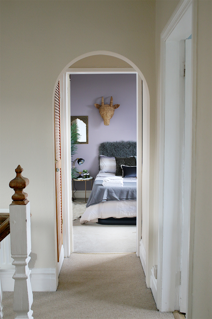
But once we were here, I realised that I literally had NOTHING – only a decent double-height blow-up bed that had served us pretty well for a year or so now. Given that my MIL’s visit was on Friday and it was Wednesday afternoon and I had a million other things to get on with, I had to make do with what I had around the house and what I thought might work well with the mauve feature wall courtesy of the previous owners.
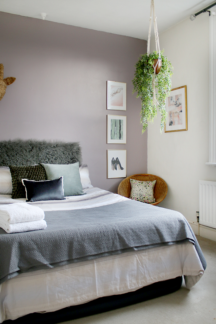
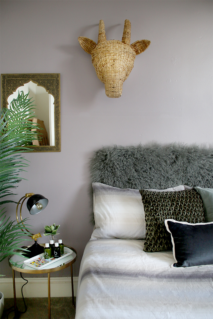
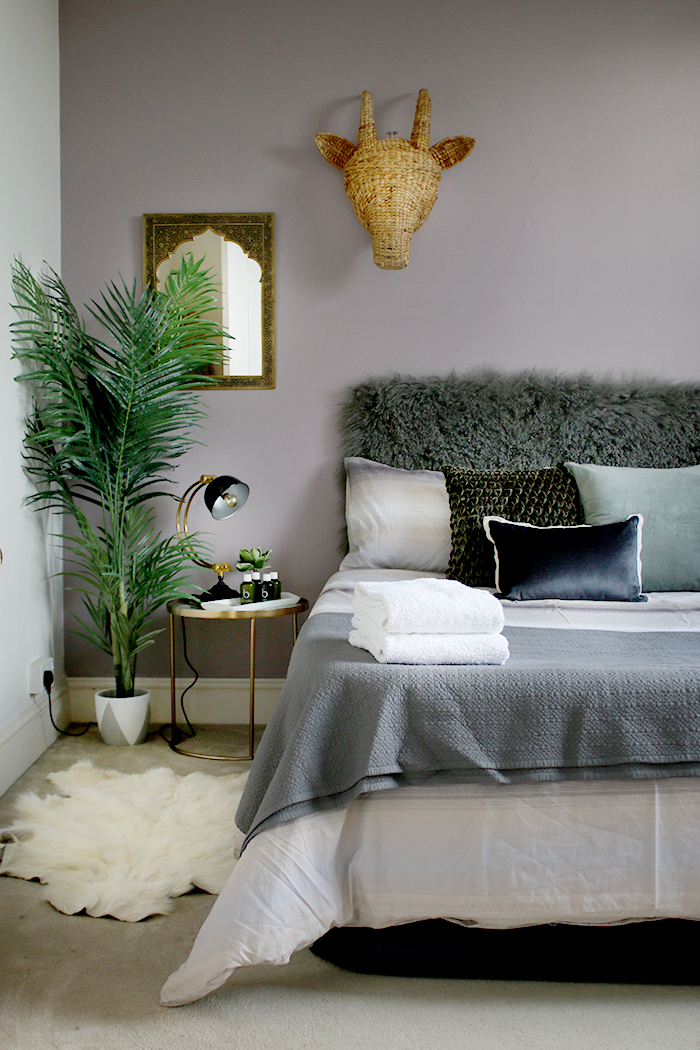
And so the blow-up bed is still there although looking remarkably more presentable with some nice bedding from my collaboration with Christy last year. I thought the grey tones worked rather nicely with that mauve-y/ lilac-y shade on the walls and so I thought I’d run with a grey/green colour scheme. I found the dark green velvet-effect cushion when I was clearing the loft space in the old house and had washed it and stuck it into my stash. The pale greenish-grey velvet cushion had been gifted to me in a care package from IKEA over Christmas.
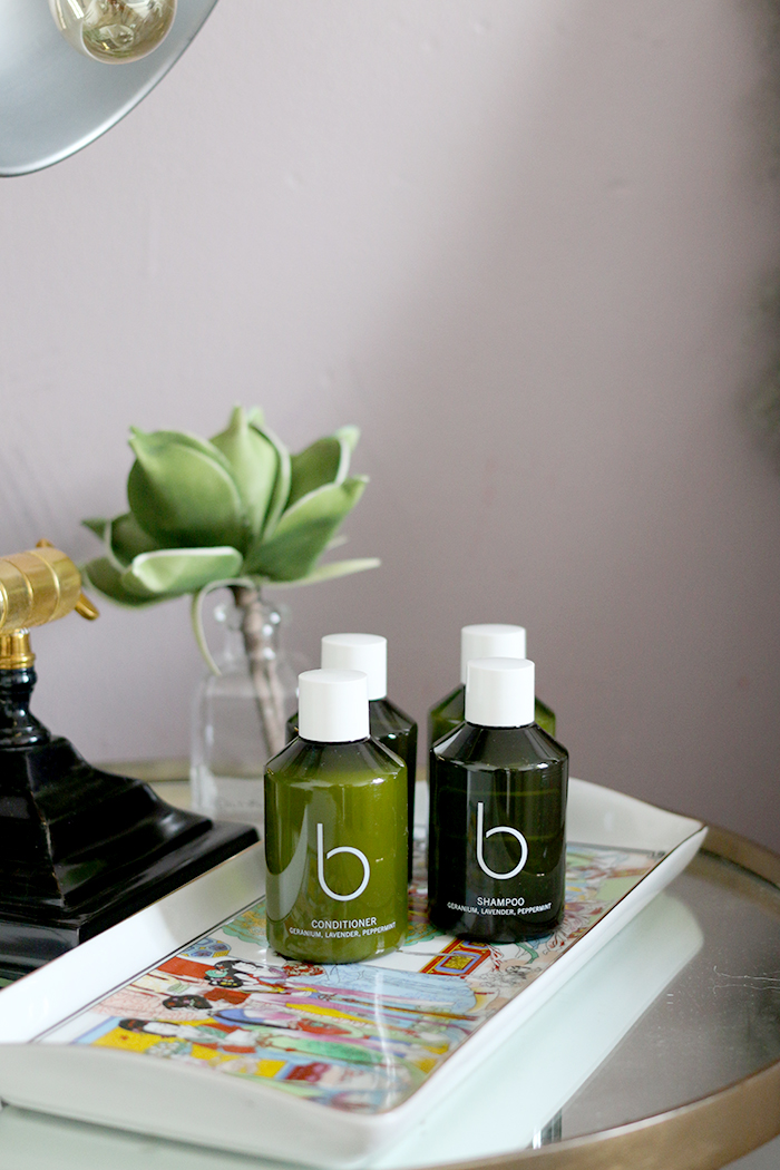
I knew I needed a small side table and a lamp and so I used the largest of the nest of gold tables I had for years from Zara Home and on top, my old desk lamp, originally from Audenza. I added a small tray to the table and found a stash of toiletries from my stay at Cuckooz London’s apartments in the bathroom to try and create a bit of a hotel vibe.
Now, greenery always adds SO much to a space. While it doesn’t have any real function per se in a guest bedroom, it does add life. However, I knew I’d be awful with remembering to water any plants in a room I won’t be spending much time in so I decided to use some of my faux plants in here instead.
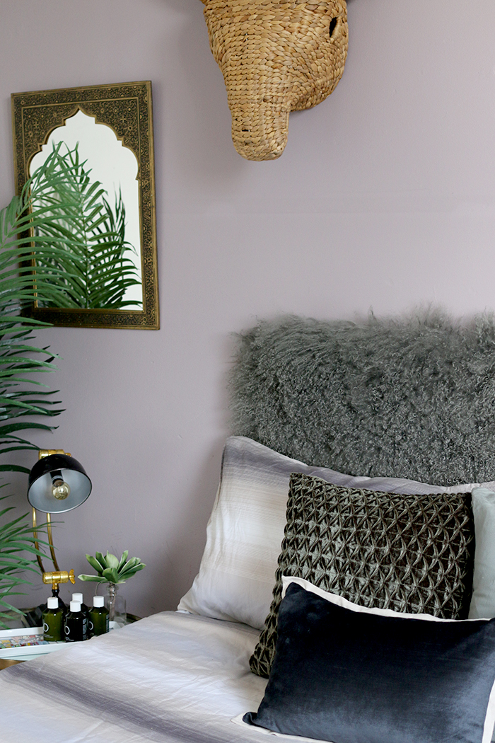
The tall palm in the corner immediately created some visual height. I think this particular faux from Audenza has graced quite a few rooms in my home (I even had it outside over the summer) so if you are looking to invest in a large faux plant, I would highly recommend this one. It just works everywhere. I could easily buy two or three of these and find homes for all of them!
I knew the room also needed a mirror – there’s just nothing worse than staying in someone’s home and not being able to check if your bird’s nest morning hair is presentable enough to sneak into the bathroom to brush your teeth. You may remember seeing this Moroccan one in our old bathroom. I think it adds a dash of boho chic to the room, don’t you?
It’s also light enough to hang with picture hangers – the last thing I wanted to do was start pulling out the drill here – this makeover had to be fast, remember – so it was really easy to just pop this one up.
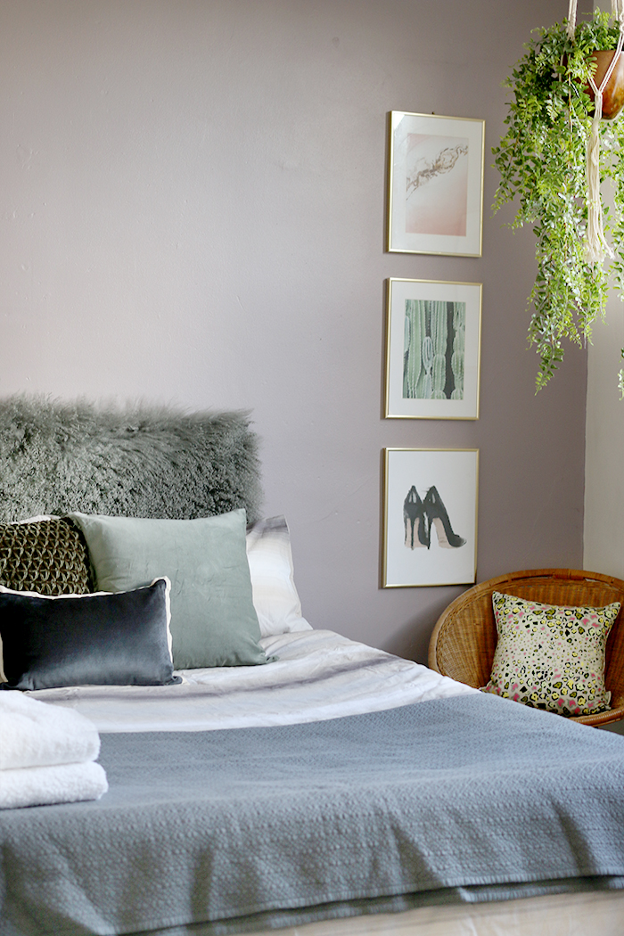
There was already a large wall hook on the wall above this that had been painted over. I decided to just use it to hang my woven bullhead on it (from HomeSense a few years ago) to add a bit of texture and I found I quite liked that it was off-centre. I added one of my vintage hoop chairs in the corner as well – just so there was somewhere else in the room to sit aside from the bed – but it tied in so nicely with the bullhead, allowing them to reference each other and pull your eye across the room. In fact, I think when styling any space, one of the most important things you can do to make it look more interesting is to make sure you have a variety of textures going on in the room.
Speaking of texture, that fetching “headboard” is just a Mongolian throw that I used a couple of pins to attach to the wall. It was the last thing I added to the space and it really just tied everything together. So, think outside the box when it comes to headboards – pretty much anything can be used and while I wish it were just a few inches longer for this particular spot, it does give you something interesting to look at and creates the illusion of something much more substantial than just a blow-up mattress on the floor!
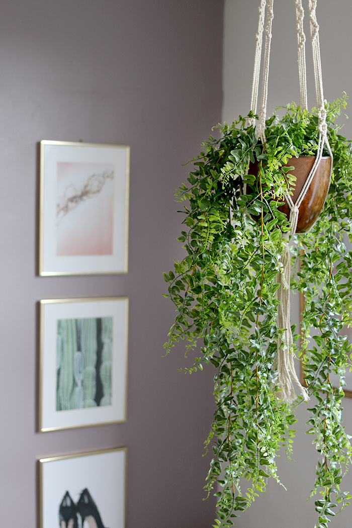
Now, that I had the height of the palm on the left side of the room, I wanted to balance it out with something tall on the right. But what do I use? I went through my stash of smaller pieces of art and hung them vertically to create some balance. They don’t really ‘go’ together but the fact that they were all in the same kind of frame and they kept to my colour theme, they worked just fine for now.
Finally, there were already 4 little hooks on the ceiling (no idea why). I decided to hang a plant pot from one of them and filled it with two of my faux trailing ferns (another Audenza find!). The room suddenly became so much more balanced – so we have greenery on each side of the room, we have woven textures on each side of the room and touches of gold on each side. Everything references everything else. And despite the fact, I went with a very asymmetrical set up here, because of all these disparate items referencing one another, it still feels somehow balanced.
The finishing touches were some fluffy white towels on the bed, a goat’s hair throw on the floor next to the bed (again, texture!) and a little glass bottle with a single stem in it.
So, while this was in no way any kind of a planned space, I’m actually pretty happy with how it came out considering. Of course, it needs more. I’d had loved to put a small chest of drawers in here and a small hanging rail and I’ll be putting a proper bed in here soon, painting walls and all of that good stuff. But for a quick makeover, it was just what was needed for my Mother-in-Law’s stay. And happily, she loved it (even if I didn’t get a chance to iron the bed linens!) ;)
What do you think of my cobbled together room? Have you ever had to pull together a room with just what you had lying around the house?











The room looks fantastic. I love the colours and textures. xx
I love a good decoration emergency! You are so resourceful the room looks inviting and cosy. Now your relative is going to have high expectations for the finished job!
Wow what a great way to quickly make a change! Love it!
I shop in my house all the time! Interior decorating is an expensive hobby, so thankfully I have enough of a lifetime’s collecting to move things around and pretend they’re new. They take on new life. The guest room is darling but for me it’s that “headboard” that makes the grand statement. Good thinking out of the box. So glad MIL liked it!
I love it. Your cobbled together decoration emergency is more stylish than most people’s finished spaces! It looks incredibly chic and comfy and your guests are very lucky. I hope the MIL was helpful with unpacking! :-) x
God lord woman! You certainly know how to work miracles. I can’t believe that your cobbled together guest room is more inviting, cosy and appealing than my actual bedroom. You are so resourceful.
SO great! I love the creativity with using your own stuff and creating a new space so quickly! Very inspiring…
Love the headboard!
Again your 2 hours cobbled together is better than my 2 months planned efforts 😎
Looks lovely 😊 and I really enjoyed this post and how you explained your thought processes for the makeover.
I really love how this came out – it looks so inviting!! I echo what Anna International said: “Your cobbled together decoration emergency is more stylish than most people’s finished spaces!”
I think it’s amazing what you can create out of nothing – it really does look lovely. And I know that blow-up bed is comfortable from my stay at your old house!
It’s a really good idea to show this, even though you’ve not actually done what you want with the room yet, as it just shows what you can do without breaking the bank – in this case not spending anything! If only I had your eye for putting everything together!! xx
It looks so welcoming, you’d never know it was quickly put together with existing bits and bobs. I love those faux plants, I think I might get one for our guest room (we would also forget to water a real one in there!).
Kim – it looks fabulous! And I loved my MIL, too – we had so much fun together and I miss her!
Anyway, I’m sure she loved the room and spending time with you and Wayne – that is always what is most important but I think a really good looking get-it-ready-fast is so welcoming. I’m sure she appreciated your thoughtfulness.
BTW: I would set this aside for now but I can see at least one post a month on throwing a room of almost any sort together quickly by “Shopping My House” – you’ve got a title so run with it! The shopping part is an invaluable skill (I do it all the time) and more people need to learn it!
Keep up the great work!
WOW Kimberly you move fast!
I’m in total admiration of your speediness! What a fantastic job!
Hey…fridge leftover recipes are awesome :) and you bedroom is even better. These types of posts are my favorite and the bedroom looks amazing
Wow! Just Wow!!👏👏👏
This doesn’t in any way look like a decorating emergency but a well thought out beautiful bedroom design! My goodness, so gorgeous! I’m really loving the purple/mauve/lilac walls in your home, they go so beautifully with your gorgeous things!
Nice one it looks really well put together you wouldn’t have thought you’d done it in 2 hours xxx
Kimberly, this post just made my day. Loved the color combination, what a nice job! xxx
A wonderful daughter in law you are.
What a beautiful welcome to your new home. Love it
If you don’t mind me asking, how comfy is the bed?
Aww bless, thank you Margaret! As blow up beds go, it’s not too bad! See Maria’s comment above – she’s actually slept on it! Ha! I think the fact that it’s raised up makes a difference in that you don’t feel like you are sleeping on the floor ;) It’s fairly comfy but it does make that awful rubbery-squeeky sound when you move around on it… I probably wouldn’t want to sleep on it for a week but for an overnight stay, it’s totally fine xx
You’re incredible!! This space looks very welcoming for you MIL
You are amazing. I’d be very happy to stay in this room (hint, hint). And you put me to shame. My guest bedroom still looks pretty forlorn even after 4 years. I might have to hang some pictures up soon. x