Okay so I’m aware this particular makeover has dragged on for months. One of the main reasons is that a piece of furniture I’d purchased for it had a 4 month lead time and while I had considered sharing the finished room sans this piece, I decided against it because it really just finished everything off so nicely. So finally – after a very very long wait – I’m ready to share the completed Man Cave, affectionately renamed the GLAM Cave.

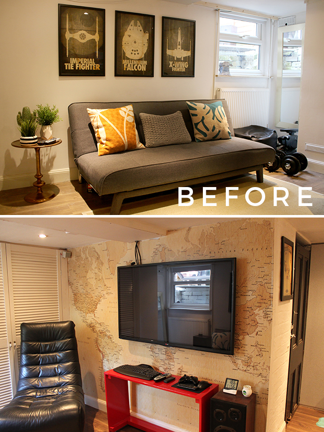
While I realise many of you will just scroll down to see the finished pictures (hey, I get it, I’d do that too), I wanted to first start off by showing what we were starting with. This space had actually been (mostly) completed a number of years ago. Because it was a space Wayne used almost exclusively for watching the football or playing video games, I allowed him to decorate it how he liked (and I use the word ‘decorate’ loosely here. Ahem.) The room was worked on in fits and starts over the years and little things that needed to be finished off took months because I kept interrupting him to work on other parts of the house.
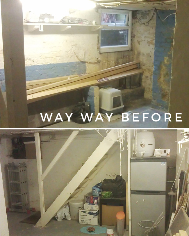
Although if you want to go WAY back, when we first moved in 7 years ago, it actually looked like this… a typical spider-ridden damp horrible hole in the ground. You can read about the process of making it livable here.
Anyway, with the kitchen finally completed last year, Wayne admitted that the room really never looked as nice as the rest of our home and that if I wanted to decorate it in a way that complimented the rest of the house, that he was happy for me to do so. Hurrah! So, excitedly I started my planning. You can see the initial ideas for the room here and then when we realised that there was a good likelihood we’d be moving in the near-ish future, I updated the design plans for a more glamorous look. The pieces I chose down there needed to fit seamlessly into the rest of the style of the house so that when we do move, everything could easily live in other areas of a future house. This meant choosing a few high-quality items that I knew we would love for years, rather than something that was just temporary or ‘good enough for now’.
One thing Wayne told me during the design process was that he was keen on it being a room that we both wanted to spend time in. The TV down there is a 50″ and while it makes for great film or TV watching, I was never keen on hanging out there. It had been painted white which just looked a bit grimy with the lack of natural lighting and everything always looked a bit half-finished (that’s probably because it was) and it felt really boring and tired. Well, it’s not boring or tired anymore. Here’s our new look Glam Cave. Allow me to show you around…
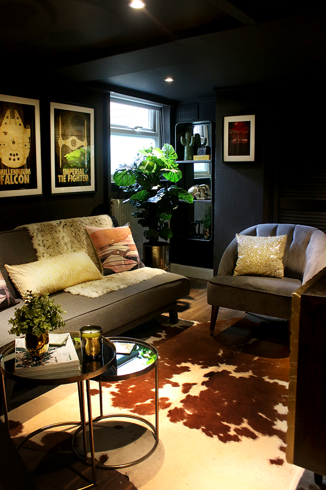
That delicious dark colour on the walls, ceilings and doors is from one of my sponsors on the project, Farrow & Ball. I was a sceptic about their paints until I used it in our dining room last year and fell rather in love with the quality. For the glam cave, we decided to go very dark for all the walls and the ceilings, choosing Tanner’s Brown – a wonderfully warm deep shade which borders on almost plum. For a room with low ceilings and very little natural light that we would almost exclusively use in the evenings, it was the perfect choice to go dark.
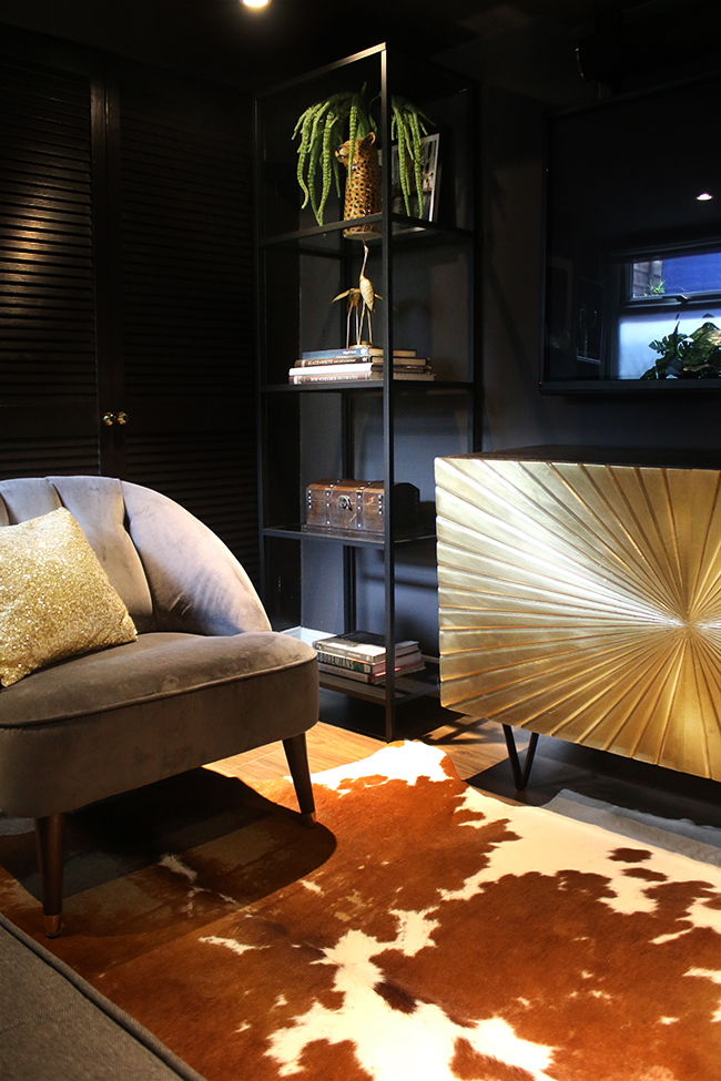
It’s a stunning colour and whilst I would never have considered dark brown for a room before, there are so many nuances to this colour, that I feel calling it a ‘brown’ is almost short-changing it. It has really warmed up the room, giving it a cocoon-like cosy feel.You can read more painting the space here. We used the Estate Emulsion on the walls and Estate Eggshell for the louvre doors and trim work.
I’ll just say at this point that I knew it was going to be a challenge photographing this space. The room is quite dark being mostly subterranean and gets very little in the way of natural light as I mentioned. I’m used to shooting in natural light so the spotlights being very bright and the walls being very dark along with the fact the room is actually really tiny made for an interesting photo shoot, to say the least! Anyway, I did my best! ;)
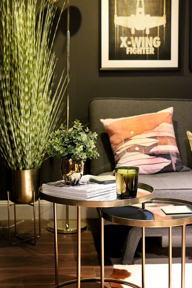
Along with Farrow & Ball, I was also supplied some amazing faux greenery for the glam cave. The room is really just too dark to have any real plants in it so I decided to go entirely faux here. While I would always recommend layering your faux with real plants, in this case, I called on Mia Fleur to help me fill the space with a bit of life. Their fauxs are exceptional and really good quality.
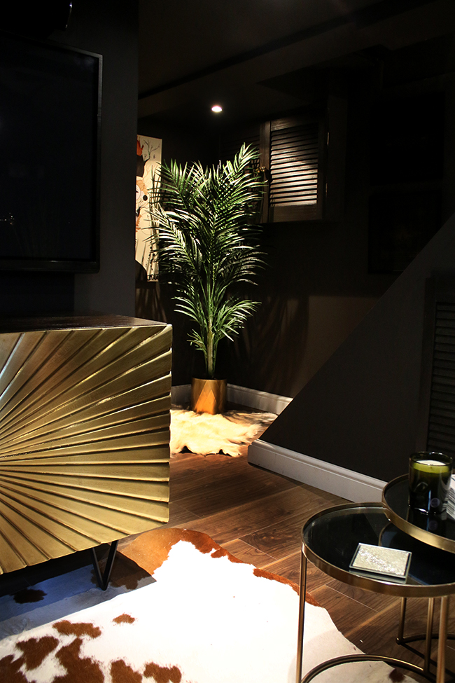
I used the Faux Areca Palm Tree in the corner which you might remember from my garden makeover, along with a Faux Zebra Grass House Plant on the left side of the sofa. There’s also Faux Green Amaranthus Sprays on the shelving unit in a cute Leopard vase.
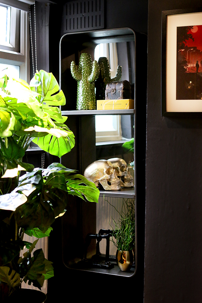
I also received that amazing mirror shelf from a company called Mirror Deco. I had wanted a mirror for this corner to bounce around the bit of light you do get from the sole window down here and the Loft Rectangular Wall Mirror with Shelves fit perfectly. The industrial design works beautifully in this space and blends seamlessly against the paint colour whilst the mirror backing adds some depth to this small room. They have such a huge variety of mirrors on their site (check out the window pane wall mirror – I wish I’d had room for it!) and they are really excellent quality and very heavy!
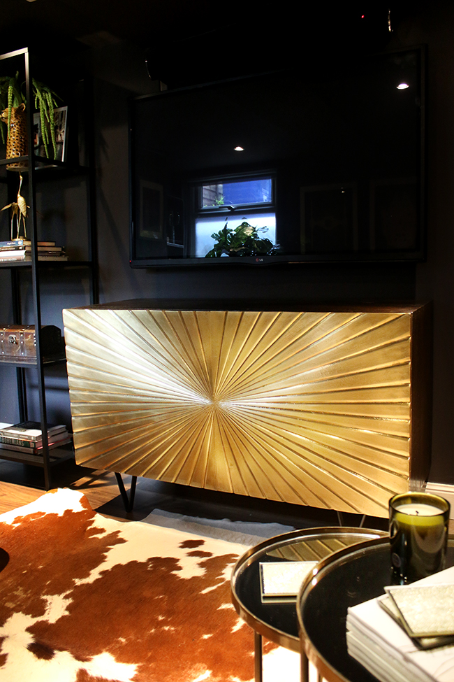
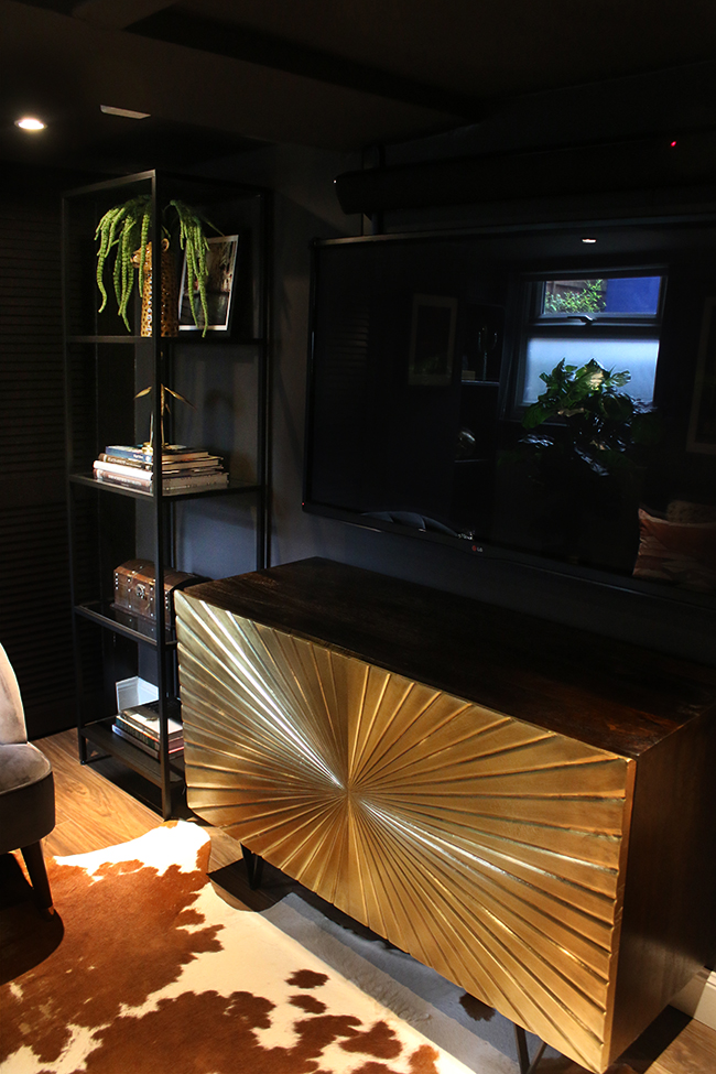
Of course, I can’t talk about this room without talking about the couple of splurges that I made for it. The amazing Ziggy sideboard from Swoon Editions was pricey and it was the one thing that took the longest in terms of lead time but oh my goodness, so worth it. It’s such a stunning design and the gold doors reflect the light so beautifully. It’s a glamorous piece that I know will fit in no matter where we end up in the future. It also hides a multitude of sins behind its large doors!
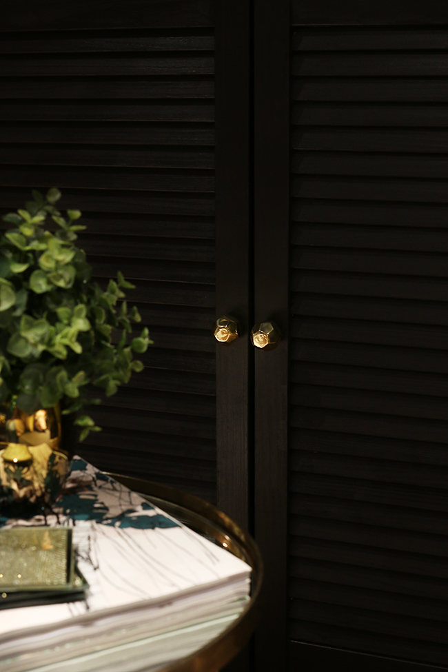
Something we were really keen on was incorporating not just display areas but storage where we could hide the not so pretty things like game consoles and random paraphernalia. You’ll see we used louvred doors pretty much everywhere. The pretty little Faceted Octagonal Knobs were provided by Bombay Duck and I love how they look against the soft sheen of dark paint everywhere, like little stars twinkling against the night sky.
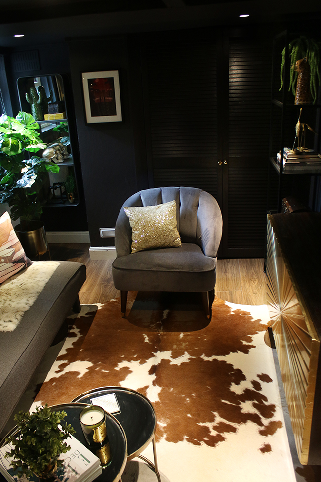
The grey velvet armchair was also a new purchase for the room from Made.com. It lived in my living room for quite some time before the glam cave was finally complete and whilst I would have loved to have kept it in there, it really does work so beautifully down here as well. I love its curvy shape and it’s incredibly comfortable as well. We also purchased the cheap and cheerful Vittsjö shelving unit from Ikea for beside the sideboard. I had originally intended to spray it gold but it worked so well in black here that we decided to leave it as it came.
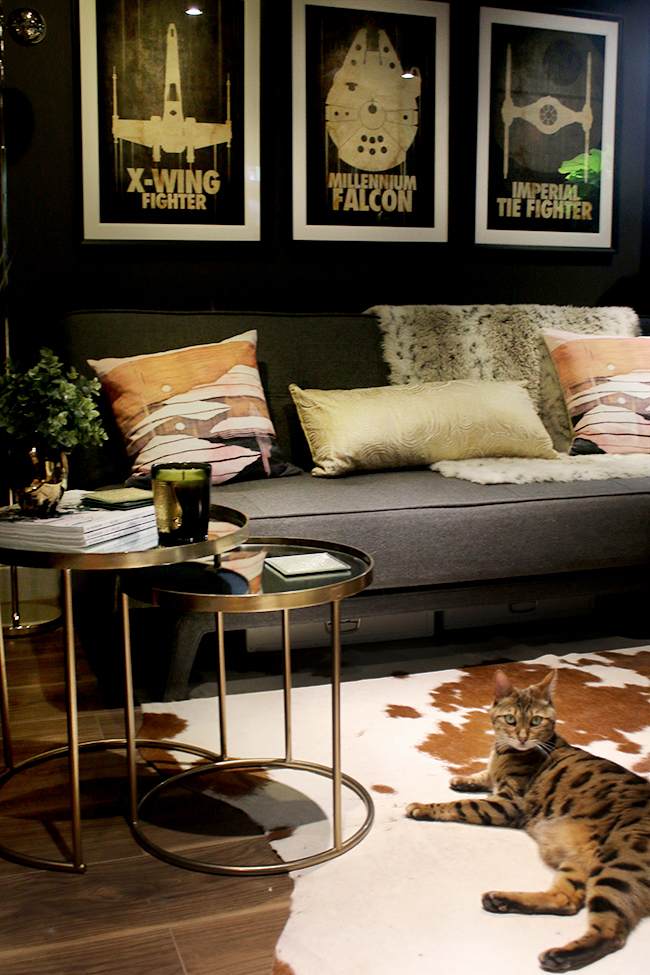
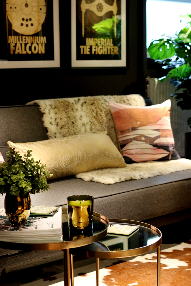
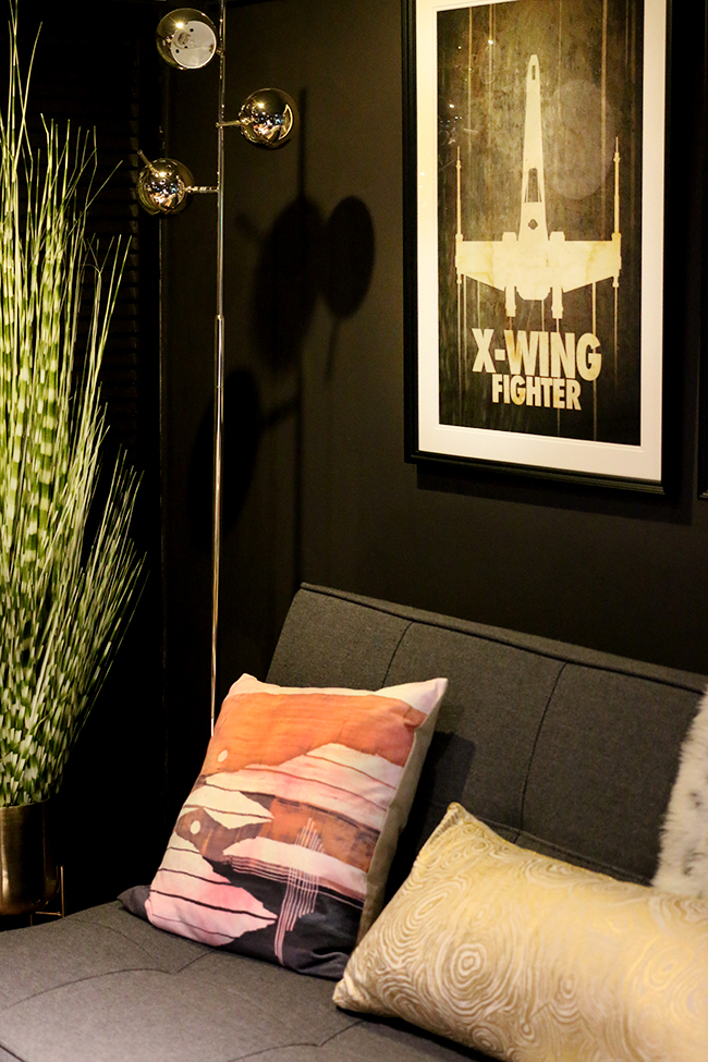
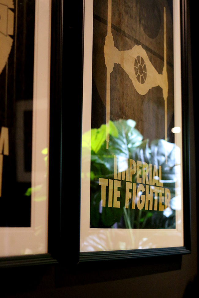
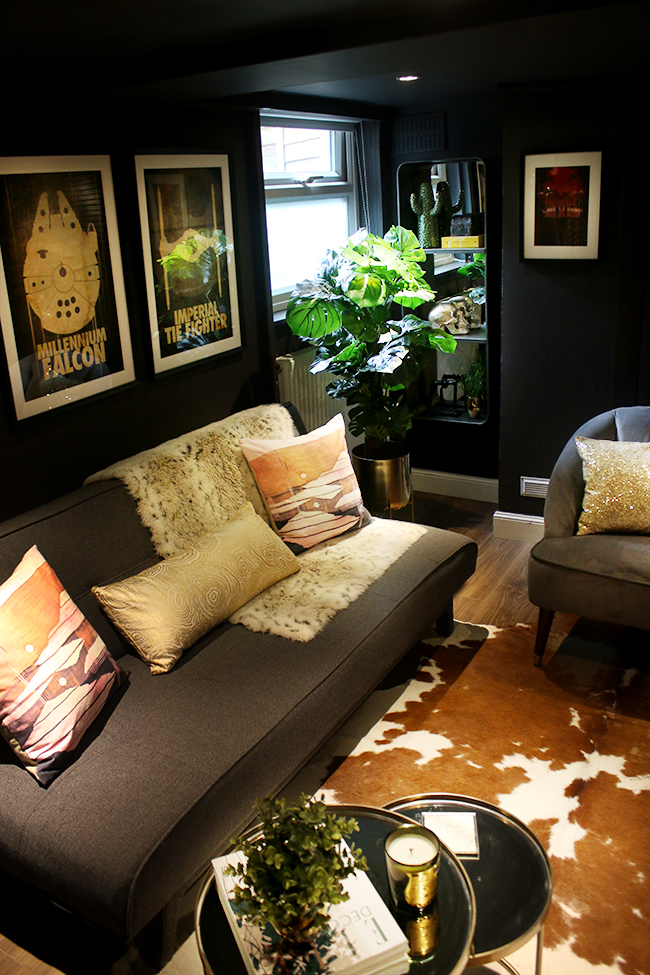
Here’s Meisha posing in our new space. You’ll notice there is an awful lot that I already had but reused from around the house. The little gold tables are from Zara, purchased years ago. The Yoko Sofa from Made.com is also years old now but still doing a pretty good job down here. The rug was originally in my dressing room. The Star Wars prints (from Etsy but sadly no longer available) were simply reframed with white mats.
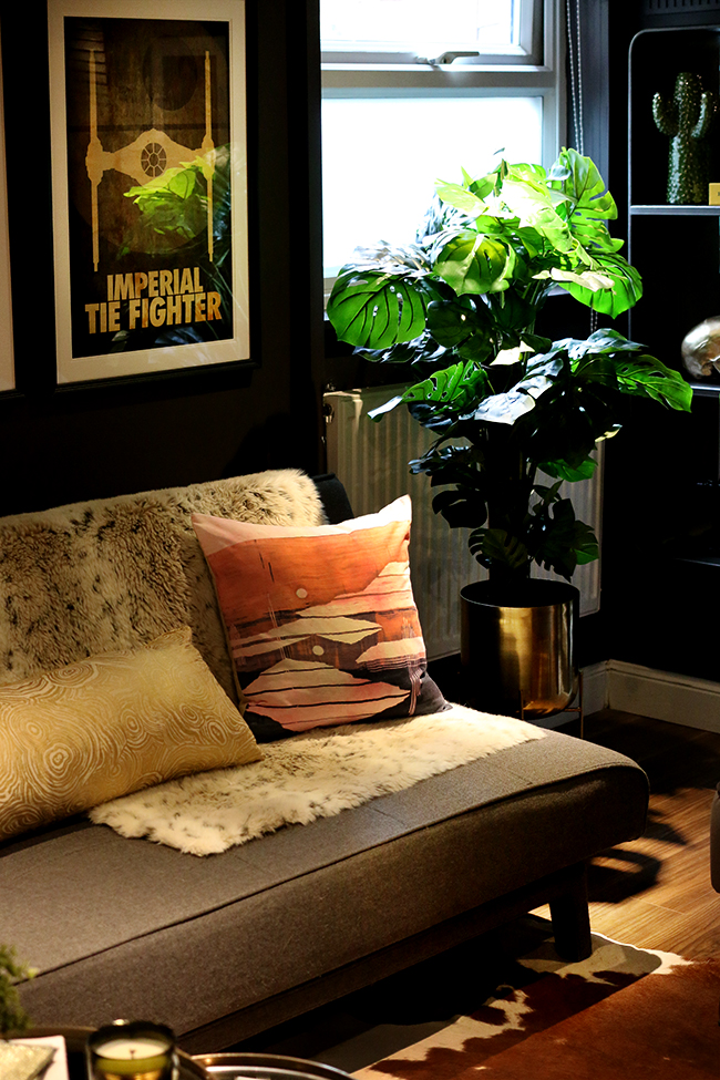
The cushions are from West Elm and the throw is one I’ve had for years. The gold cushion is old as well from Anthropologie (similar here). Pretty much all the accessories in the room are ones I already owned – in fact, I don’t think any of the accessories in the space are new, just repurposed and given a little bit of new life in a different space.
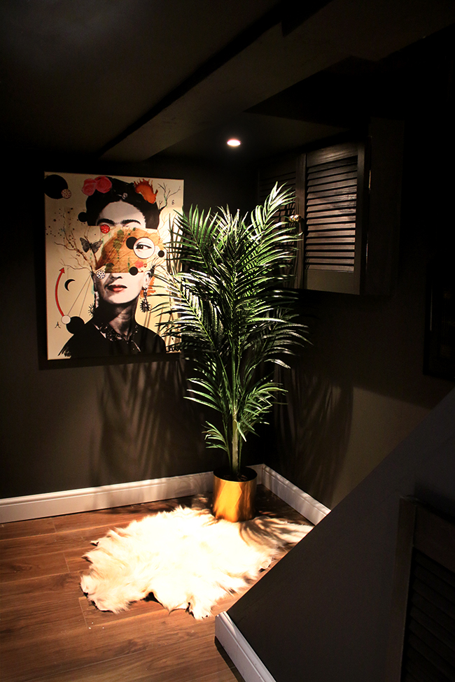
I did purchase this amazing canvas is by Loui Jover and called Deconstructed Frida which ties all the colours of the room together perfectly. I wanted something really big and eye-catching as you walked down the stairs from the dining room.
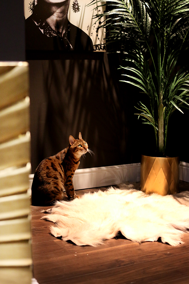
The cowhide rug adds a bit of softness but in the interests of full disclosure: that usually doesn’t live down here. In this corner, we normally have the kitty litter tray and cat food. This is why Meisha was following me around while I did my shoot as she wanted to know where her food went! Ha! I just figured you probably didn’t want to see some half-eaten cat food and a litter tray so I dressed up the corner a little more than normal. You’re welcome.
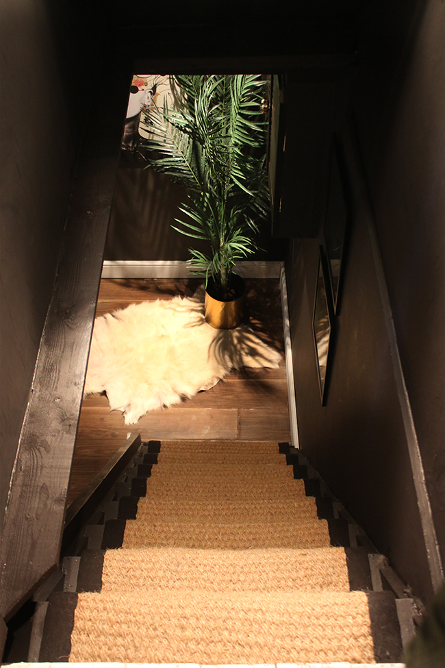
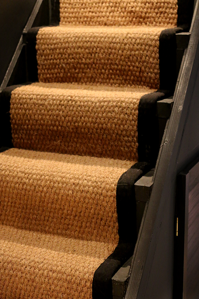
Oh, yes, the stairs – we got a new runner as well – just a simple coir one with black banding we purchased from eBay.
So yeah, that’s the finished space!
Needless to say, we both really love the way it’s come out. It may be a little more glam than usual for a ‘man cave’ but even Wayne said it looks wonderful and really loves it. So we now have a space we’re both able to enjoy. Hope it was worth the wait! What do you think of the glam cave reveal? I’d love to know what you think!
Disclaimer: I was not compensated for any portion of this post. Some of the items used in our cellar remodel were provided free for my honest review but as always, all images, words and opinions are my own. I only work with companies I really like and think you’ll like too! Thanks for supporting the brands that support Swoon Worthy!













Brilliant!! I bet you’re both super chuffed, like you’ve got a whole new floor to hang out in. Love that Meisha was playing “assistant” for the day. I bet the cats are partial to that Coir runner eh??
Love how you’ve used lots of pieces from around the house and mixed them in with newer finds. The Swoon cabinet is indeed delicious and that new canvas looks tip top!x
It looks amazing! A good move to go dark. You really know how to pull a room together.
Oh I lurve it….. of course the sideboard is amazing but I really love that mirror shelf, what a sexy shape and having a mirror in that corner gives the impression of another window. the plants really do add to the space, especially on those stands. You’ve managed to fit an awful lot in without it looking cluttered, each piece really has been considered. What a transformation from 7 years ago. You should be so proud of yourselves, and it will definitely add value to your house – always a bonus when you want to sell :-)
Looks wicked Kimberly, such a good makeover!
Love this. Shows how in a small space it’s best to go dark rather than white. Also loved how you have only purchased a couple of new items but created an amazing new look by using items in the rest of the house. Brilliant work as usual!! X
It’s only bloody gorgeous. I love the new cabinets and I still can’t get over how warm the wall colour is – to think it’s *brown* of all colours! It’s such a rich, dark chocolate brown and really makes the place feel like somewhere you’d like to hide away from it all.
I’ll have to come over and sleep down there again to get a real feel for it though. Especially to see your new sideboard. We need a reunion tour alone just to drink that baby all in!
Wow !! I am so impressed with the result. It’s super glam but not girly at all !
Maybe it’s because it’s restrained in details, but it’s very, very inspiring to see so many items that I love, and totally see it working for women and men. Not only that but it feels extra luxe by it’s “simplicity” in a way, it’s purposeful design. I feel like this is what the word “minimalism” should refer to in a perfect world hehe (like this is the minimum of restraint I can possibly have – screw scandi!)
I usually go overboard with colors or accessories because I can’t stop myself, but this feel very balanced.
In all seriousness though you’ve given me a lot to think about…
Bravo to both of you :)
Love everything about your glam cave! And, such a great idea to buy the carpet from ebay :) X
What a triumph. So inspiring. Since my mum and I found your blog, we’ve definitely pushed ourselves more with decor. We always think ‘what would Kimberley do??’
I adore your makeover , it looks fabulous , we have a smalll study downstairs and I am wanting to do that out , ……would love to use some dark colours and you have inspired me , looks fabulous darling xx
Wow. What an amazingly glam transformation. This is going to be a huge selling point when it comes time to move on. That dark wall colour is perfect down there, it makes for such a cosy atmosphere. You’ve really excelled yourself…again!
That Frida art is to die for! Really great space, seems like a perfect mix for the both of you. But how do you watch TV when you have that stunning gold cabinet to stare at? These are the real questions.
Love everything. You knocked it out of the park!
It turned out beautifully. And I love that even though it’s glam, it still has some masculine touches. The sideboard is stunning – totally worth the wait!
Looks amazing Kimberly. Love the deconstructed Frida canvas. That’s my fave. x
So beautiful. I love it! x
Looks fab Kimberly, I love it! 👍👏
Amazing WOW…….
Absolutely stunning, Kimberly! The colours, furniture, art, accessories… all so beautiful! This is definitely the sexiest man cave in the world!
Great makeover! I think the dark works perfectly and the sideboard is a real win :) looks fabulous. Well done !!!
Gosh it looks absolutely incredible! I’m totally in love with it.
Kimberly I ❤️❤️❤️It!!! The bold dark walls and ceiling are just gorgeous. It looks like a little peaceful escape just to veg away with a good book or movie! You have done it again Girlfriend! 🙌 I dig it 😘. ❤️ From across the pond xo
I remember reading with much interest last year that you were redoing the man cave, and having started a similar project myself at that time looked forward to compering the results! I finished mine shortly before Christmas and absolutely love my dark space.
It has has been well worth the wait and i have loved checking through all of the images and piecing the room together (need a floor plan next time, haha geek that i am) It’s amazing how just changing to the dark side totally transforms and enlivens a space and existing possessions. Love it!!
The colour is tooooo good and that sideboard was definitely worth waiting for. Awesome job :)
I love everything you’ve done with this space. We’re in the process of re-decorating our small basement and I’m glad to have seen that awesome runner for the stairs! Thanks for sharing this stunning makeover.
You’ve made it look incredible! I’ll definitely be taking some inspiration from this with my new house
Absolutely stunning love the gold sideboard the dark colour creates so much drama!
Wow, this is lovely! I agree that a man cave can look a little bare sometimes: men don’t really care for plants, artwork or ornaments, funnily enough. But you’ve really brought the space to life. I especially love the plant by the sofa, I really thought it was real!
And I love the use of dark colours. I bet it’s the perfect space for a movie night with popcorn. You’ve given me plenty of ideas for my home. Thanks!
Absolutely love it! Glad you were able to keep and rearrange things for such a fresh look. A home run!
Adore. You’ve possibly created the most stylish basement I’ve ever seen! I really love what you’ve done. And that sideboard…..mwah! Totally worth the wait!
It looks brilliant, a job more than well done xxx
It looks so much bigger and welcoming now. I still can’t believe that’s a cellar! I’m glad the gamer chair is gone 😆… and I was wondering “where’s the Xbox? you can’t get rid of the Xbox” until I scrolled down to reveal that gorgeous cabinet with gold doors.
Ah it looks so good!! A+++
Love, love, love – I want one just like it!
Also very happy to see Meisha playing a starring role. She’s so pretty too 😎
A-mazing! It’s taken me so long to come and catch up on your blog. But I already knew it would be totally fab, and so very you! Xx
THAT SIDEBOARD THOUGH! Oh my gosh in love with this whole room. You are a genius at finishing things epicly well. Off to go spy some bombay duck handles for my utility room now… xx
This room looks amazing. Now I wish my partner had a man cave that I could turn into a glam cave. And I love the colour on the walls (which I never thought I would say about brown!)