So I told you on Monday that I finally replaced the light fixture in my dressing room. This is actually the 3rd or 4th light I’ve had in here (I can’t even remember anymore!) and while I liked the sputnik style one I’d had in here before, more than a year ago the light decided to die on me. A bulb blew and after replacing the bulb and poking around a bit in the electrics (the technical term for whatever it was that Wayne looked at at the time), we couldn’t figure out what was wrong. And so, I have been living without an overhead light in here for a very very long time. I have had a couple of lamps in here to pick up the slack but I really needed a ‘big light’ to well… see.
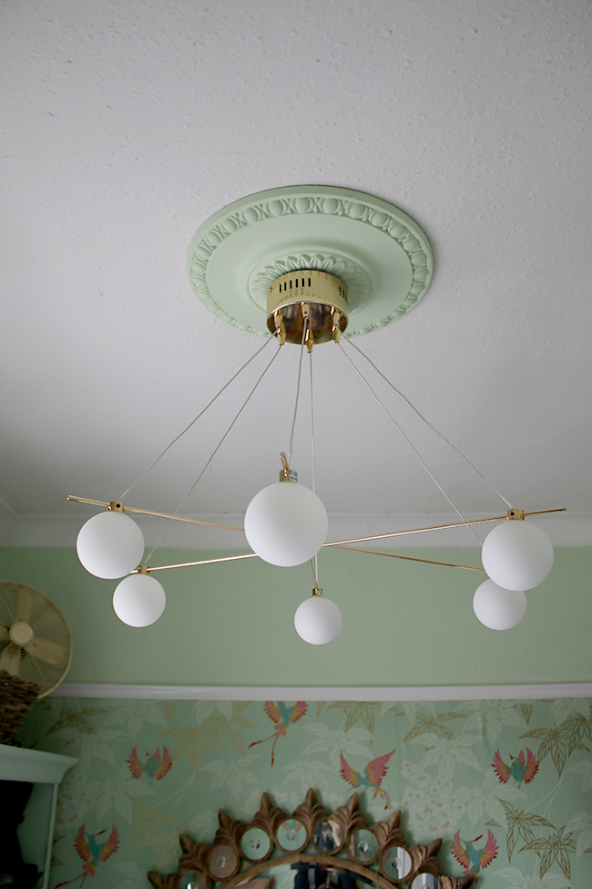
I’ve been keeping my eye out for something simple and pretty but there wasn’t anything that had really turned me on (geddit? turned me on? like a light?!) so I was dragging my heels on replacing it. That is until I saw Karen from Making Spaces’ post on Next. Eureka! I didn’t want to spend a lot of money but I did want something attractive and their Spheres 6 bulb light just ticked all the boxes.
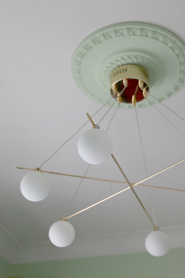
Installing the light wasn’t too difficult. The electrics part of it – well, for Wayne who has experience in these things – was straight forward. The only small complaint was that those wires are fully adjustable and they don’t come all nice and evenly spaced for it to hang properly so we had to mess about for a bit to get it to hang straight the way we wanted to. I suppose it would be handy if you don’t have very high ceilings and still wanted the effect with shorter wires dangling down. Or adjust it to change it from a symmetrical light to an asymmetrical one. So yeah, you have options. It didn’t really take very long to do but I just thought I’d mention it!
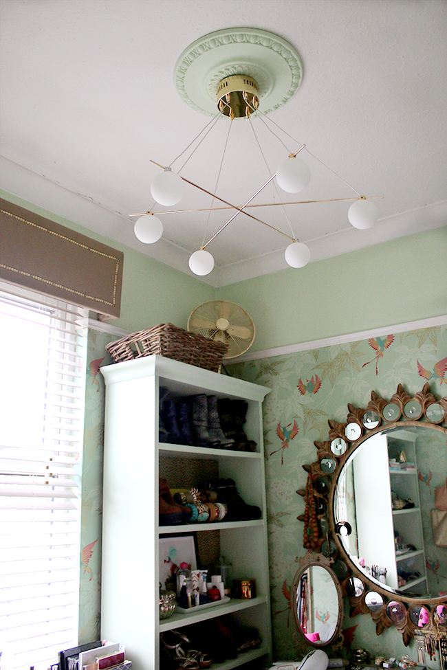
It’s really lovely and bright now in my room and I couldn’t be happier with the look. It’s sexy and simple but looks far more than it’s £130 price tag. It’s incredibly reasonable considering how difficult it is to find great looking lighting in this sort of price range so well done, Next!
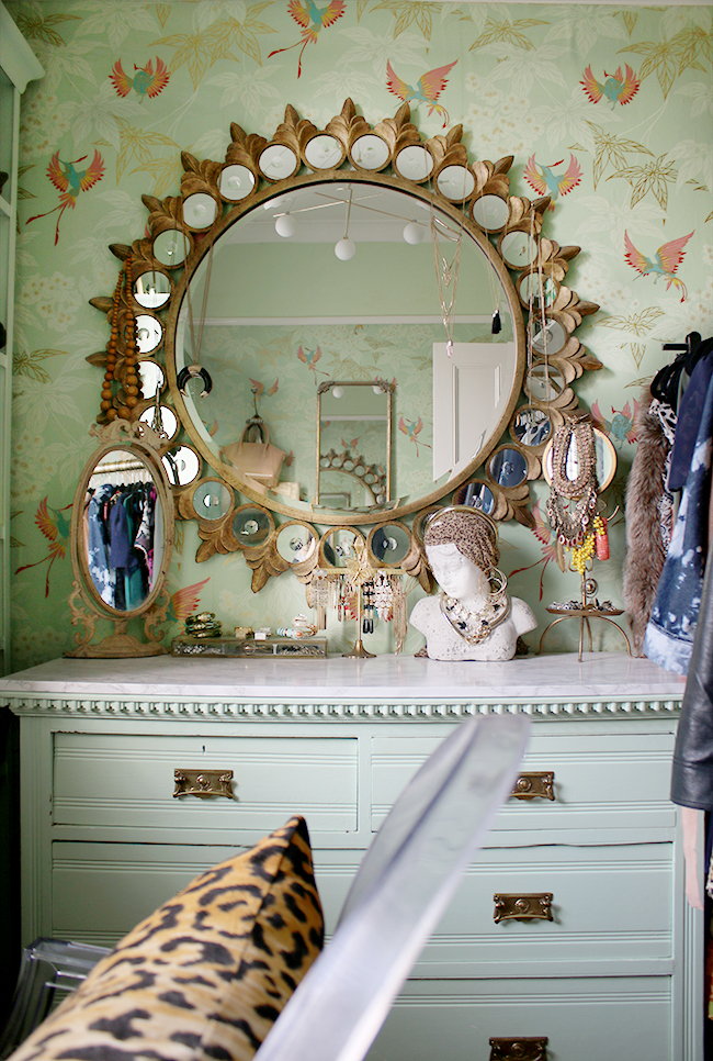
On Friday, I’m going to be sharing a little bit about how I organise my makeup but for now I thought I’d share a few extra shots of what the room is looking like at the moment. I’d love to do another complete rehaul in this space as it’s been nearly 5 years since I wallpapered it. At the time, I was really into bright pinks and turquoise and a couple of years ago, I decided to give it a bit of an upgrade so toned down the pink/turquoise accents and just carried on with the mints and gold instead.
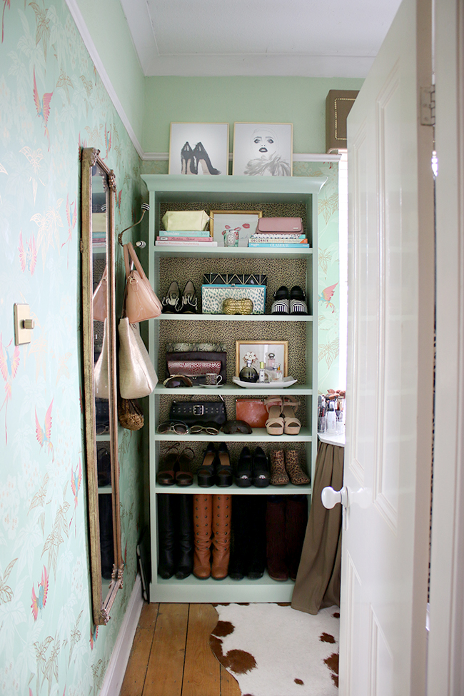
The small prints at the top of that bookcase (you can see the DIY on those here) are fairly new from Desenio. I figured they were sufficiently ‘fashiony’ for the room.
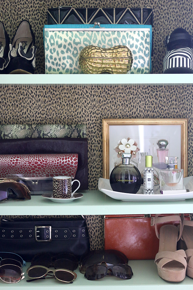
Of course, me being me, after 5 years of living with this wallpaper (which I think is pretty good going considering how often I change my mind!) I’d love to change it… but I really want to finish the rest of the house before even considering that so let’s just leave that one on the back burner, shall we?
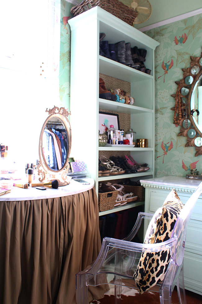
One thing you should know just in case you aren’t familiar with this room is that it’s TINY – it’s our ‘box room’ and so only measures 2.13M x 2.83M (or 7ft x 9ft3″) and getting pictures in here is a bit difficult.
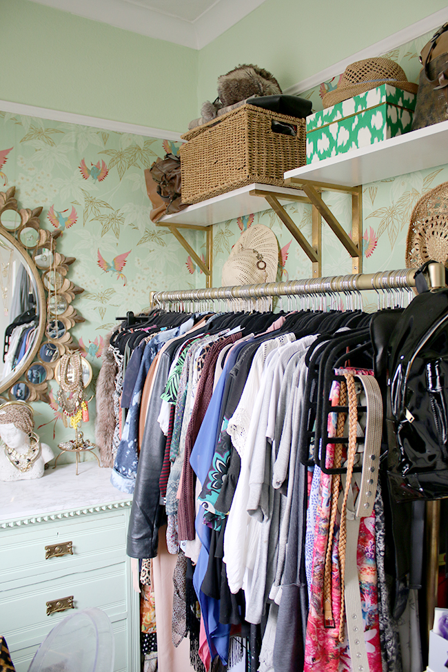
Still, despite it’s more bijou size, I know how lucky I am that I get a room all to myself. I lived with tiny wardrobes for years and I don’t think I could ever go back to it!
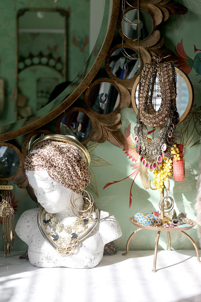
So that’s a little overview of what it’s currently looking like – no big huge changes or anything but I’m not exactly a ‘fashionista’ so it works for me. As I said, on Friday, I’ll be sharing some of my storage tips for makeup so stay tuned for that! In the meantime, what do you think of the new light in here?













I was really surprised when I saw that light is from Next! Well done them! It looks amazing, as does the whole of your dreamy dressing room!
Love the pun! The new light is awesome. Your home tours have inspired me to change up my home to my true style (after feeling stuck and scared for years). I like your dressing room, but obviously can’t wait to see what you do with it next.
i really like that mint ceiling medallion. it is a very nice way to bring attention to the light fixture without overwhelming it.
the fixture is so delicate (feminine even?) that it would probably get lost on the white ceiling.
i’m going to have to find a way to use the idea somewhere in my house too!
…i just went back to view your previous versions of this room and saw that you’ve always had that mint medallion.
i need to pay more attention!
I love this room so much, and that mirror! where is that from?
Ahh thank you Grace! It’s from Forever Interiors: http://www.foreverinteriors.co.uk/shabby-chic-mirrors/HTML/Em7.html
Hope that helps! xxx
Thanks so much! i was half hoping you would say its old because I am tres skint! I love it with your jewellery hanging off it.
Hahaha! It IS old – I bought it nearly 5 years ago but they still sell it ;) #sorrynotsorry hahaha xxx
It’s stunning! Such a gorgeous piece! I need it in my life!
I love this mint colour scheme! I am also obsessed with that light. I want my own dressing room now! You did brilliantly! Ah and that ceiling rose <3
That light looks perfect for the room! And I never grow tired of your beautiful dressing room – it’s no surprise that I love that wallpaper! The colours and pattern are just lovely! I can totally understand that you’d be itching for a change, though, and it would be exciting to see what you’d do in there now! I guess we’ll have to wait, though! xx
The light really suits the room, and for the price I agree that it looks a lot more expensive, it’s a bargain but still full of style.
Haha you are one talented lady, it won’t be long till you get going in there, and it will be beautiful xxx
Love, love, love the new light and that whole space. I’d love to have something so beautiful to get ready in each day. xo
I love the space Kimberly, especially the wallpaper! What is it?
Hi Andrea, the wallpaper is Osborne & Little Grove Garden! Hope that helps :) xx
http://www.osborneandlittle.com/products-and-collections/wallcoverings/spring-2011/wallpaper-album-5/grove-garden
Wow, I’m really impressed with your mint tone wallpaper. It’s so so so fresh! Seems that I were in a bohemian princess’s dressing room! lol
What a gorgeous room design, thanks for sharing! The new light installation is a perfect edition to the fun and antique feel of the room. All the beautiful old and intricate ceiling cornices are great to still have in tact!