*actually it’s 4 ways but I’ll get to that in a bit…
As I work from home these days, I decided one of the things I wanted to do more was take advantage of the rare days of sunshine in the winter for shooting blog posts. If you are a blogger and you work full time away from home, I’m sure you know how difficult it is to get decent shots when you go to work in the dark and come home in the dark – your weekends are your only real time for photography and even then, if it’s bucketing down with rain (as it does so often here in Manchester), the light is abysmal regardless of the fact that it’s actually the daytime.
So when I saw it was going to be a lovely sunny day on Tuesday, I figured it was time to get the camera out and do a fun styling session. Actually, I’m not even sure if I can call it ‘styling’ – it’s really just ‘faffing’, messing around with vignettes and creating some new looks.
I was determined to shoot on manual settings and I’m sure that every single time I do, I learn something new about my camera. I had the camera on a tripod and for some reason, the autofocus (which yes, I tend to rely on) just looked terrible. So, as much as I abhor reading directions, I dug out the user manual and well, I discovered a bucketload of features that I had yet to untap in my little Canon 500D – including how to manually focus in ‘Live Mode’. So that was fun.
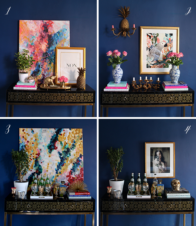
What was also fun was creating 3 different looks (plus a bonus look!) for the same console table in my dining room. So a few hours of styling/faffing (ie, ripping my house to shreds for ‘props’), these are the looks that transpired.
Look #1 – Feminine Glam
This is the one that’s the most ‘me’ so I figured I’d start with this one first (although who am I kidding, really, they are all ME). It’s colourful and feminine with touches of pink and gold but I think that dark blue wall that is the backdrop for all of the looks grounds the space and keeps it from looking too ‘frou-frou’.
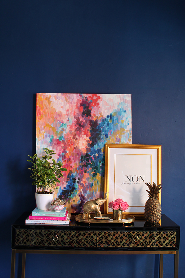
Layering artwork – (especially something as colourful the large abstract painting) creates an engaging backdrop when you are creating vignettes. Just be sure to have items at different levels to keep the eye moving across the surface – if everything was at the same height, the result would be much less interesting. Notice also that I choose those specific books for their spines – the colours of the covers really pick up the colours in the painting and that pink is carried through again in the little vase of roses.
Look #2 – Elegant (but not stuffy)
Now this is a more elegant look with a bit of symmetry in the book stacks and vases of roses, creating visual height on both sides with the candelabra centred between them. I wanted to throw that symmetry off ever so slightly so hung a pineapple sconce and a colourful print at different heights which makes it looks less uptight (which symmetrical design can sometimes have a tendancy to do) and a little more relaxed. Again the books were chosen for their spines in this vignette because they picked up the colours in the print.
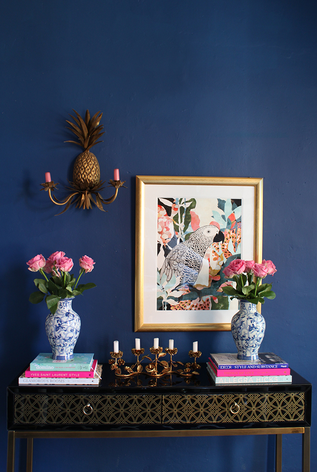
I can see this look working in a rather more elegant home – it’s pretty and it’s a bit posh but it’s still a ‘young’ look due to the colour palette of navy and cerise and that cute parrot looking over the proceedings.
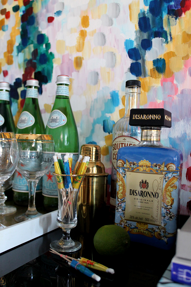
Look #3 – Party Time! Excellent!
I wanted to create a bit of a ‘bar’ area in this one so of course, glasses, sparkling and alcoholic beverages, a cocktail shaker and fun cocktail umbrellas have all made an appearance. A tray is always a great way to corral groups of items and it’s one of those must-have’s that you honestly just can’t have enough of in your home – they always come in handy to really finish off a vignette.

I wanted this look to be a bit of fun so I used my painting (called ‘Confetti Rising’ – see? party atomosphere!) to provide the palette and with a painting this large, you really don’t even need anything else. Another book stack picks up the reds and dark blues in the painting with a sculptural accessory sat on top.
Oooh but wait! There’s one more!
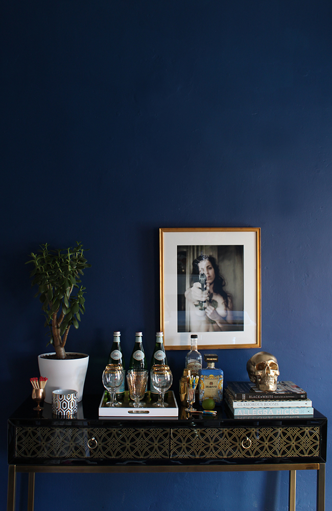
Bonus Look – Rock ‘N Roll After Party
This was actually originally the start of Look #3 which had much more of a rock ‘n roll edge – it was like while the party at Look #3 were playing Pictionary, the Party at Look #4 were playing strip poker and getting trashed on Jagermeister and flaming Sambucas. You’ll see most of the accessories are the same – the only things that were changed were the art, the books and the accessory sat on top of the books. And that is how easy it is to change the entire mood of a vignette just by changing a few accessories.
So… first tell me – which one do you prefer?
And secondly, do you like posts like this? Would you want me to do more ‘pseudo styling’ posts? Because I really enjoyed doing this but maybe it’s not very entertaining or maybe it’s not very helpful because it’s all the same sort of style… I dunno! Let me know in the comments what’s going on in that big sexy brain of yours…
P.S. And yes, I realise that Emily Henderson is currently doing posts like this but I SWEAR I had already planned this post for the last month, I was just waiting for a sunny free day to shoot it. But of course she’s kind of stolen my thunder. Considering that we’re like totally BFFs and stuff, I forgive her for totally stealing my totally original idea. (cough)


Party Time! Excellent! Hahahaha, it’s been ages since I watched Wayne’s World, thanks for the reminder! ;-)
Anyway, love what you’ve done here! Of course number 4 is my favourite, but I really like the different feels of each and how you’ve explained the thoughts behind them.
I’m of course totally shocked that Emily would have stolen your idea, though it is a big compliment for you, hehehe :-D
xo
I really like option 1 and 4, although I don’t know if I’d be brave enough to pull off that gorgeous and disturbing picture … Thanks anyway for the inspiration!
PS, next time you have drinks with Emily, could you please tell her how much I love her ? (ha !)
LOL! Of course, as her BFF, I always pass on well wishes from her fans ;) xxx
Great styling and I love the idea – helps you to figure ways to recreate your favorites – Loving #1 with a piece of statement art!
I like yours way better than Emily’s. :) And I think I’m with you, #1 is my favorite.
Haha! Oh you flatter me dear Elizabeth ;) xxx
Love all of them! And yesss, do more posts like this. I love styling ideas and trying them out in my home. Plus you make me giggle :)
I’m stuck between 1 and 2, but I think i’m going to say 1. Maybe 2 is a bit too symmetrical and the last 2 a tad too busy. Consoles are fab additions and can make great features, but they can become cluttered and then you are drawn to the mess as opposed to the beautiful furniture. I like posts like this as it explores ways to be creative and offers great ideas. I’m not always great at thinking outside the box :O)
2 & 4 are my faves!
I love all four! Love your fearless style & how you can create so many moods with just a few switches. Posts like this are fun & surely inspiring…but then I think all of your posts are! Smiles, K
Aww thanks Kathleen! *blush* xx
Yep I’ve also seen Emily’s series and following madly, as I like her style! Love no. 1, 3 and maybe no. 4 even I’m not so keen on that photo..no 2 seems a bit off for me… although I know you’re working the symmetry here, but if you take away the roses from under the painting, and add the gold elephant facing inwards, it would work better for me…like your paintings by the way!
Hi Kimberly! Like them all, but I think my favorite looks are #’s 1 and 3. The whole look, accessories,etc… seem to work the best. Have an awesome day! Amanda
Number 1 is my favourite! It looks so warm, bright and exotic- beautiful!! I love posts like this, it’s great to see how you can style one piece so differently :)
1 is definitely my favourite – it’s perfect! I like 3 a lot too, though. Your paintings are a great backdrop for the styling. I also love seeing that gorgeous Disaronno bottle – I was going to get one before Christmas, but ended up with a cheap Lidl amaretto instead! Think I might have to splash out, though (then when it’s finished I can keep the bottle and decant my cheap stuff in!!) – I’m a classy bird!
I like this post, it’s fun to look at the different ideas – do more! This also brings back happy memories of the orgasmic fun I had styling my console table!!! ;)
Maria x
Isn’t that bottle just fab?! Oh yes, definitely keep and decant baby, that’s the way I roll too ;) xxx
i love them all but number 4 has to be my favourite! Think it’s the print and the skull combo!!!
i love them all but number 4 has to be my favourite! Think it’s the print and the skull combo xx
I love doing posts like this too because you can work with what you have. And I’m totally the party or after party kinda girl.
Like the bottom left the best – lovely – makes you want to have a party just to use the bar cart.
love 1 and 3 – very balanced and appealing ; inspired me to do some styling as well!
can i ask where you got the brass accessory in image 3 – the brass corral like thingy? I bet its vintage, if so, any ideas what search terms I might use to find one on ebay ?thanks!!
It’s actually from Joss & Main (it came in a set of 3) – I think they are called ‘Wall Urchins’ (because you can hang them on the wall as well) if you want to try searching Google for them :) xxx
I like all of yours more than hers, especially #3
Aww bless ya Margaret you sweet thing you ;) xxx
Definitely love these sort of posts. More, please! My favourite look is number four. I like that it’s a bit edgy and it talks more to me.
:)
BOOBS, SKULLS AND ALCOHOL FTW!
^Possibly a new slogan for April too? LOL. I loved all 4 of them but the last held a little special place in my heart ;) xx
I definitely think you should create some wall art with that slogan! LOL! xxx
#4 for the win FOR SURE
Swoon indeed! You have some crazy talent lady! They all are amazing, I’d be happy with any of these. You are killing it! xoxo
I LOVE the painting in picture #1! Are you currently selling your paintings?
Hey Katharine,
I’m yet, so sorry! When I will, I promise I’ll announce it on the blog :) xx
Love #1 going to recreate that set up for my nightstand. Did you make that canvas? I’m trying to find something similar
Hi Chloe,
I did yes! I may start selling my art in the future as I’ve had so much interest so stay tuned for more on that :) xx
Love#1 the best. The canvas art is gorgeous as well. Any chance to acquire it or you can show some tips on DIY it? Thanks!!
Hi Carole,
I am actually going to be selling the prints soon so stay tuned for that ;) xxx
Would you mind sharing the color of the wall? I just have to know! :)
Not at all! It’s Dulux Wild Water 1 :) Hope that helps! xx
Hello! I stumbled upon this post and saw that in the past you were going to start selling your artwork! I was wondering if you were still doing so because I am very interested in the painting in the first set up! It is exactly what I am looking for while furnishing my home! Thank you! -Emily
Hello, I’ve just come across your blog and lobe this one about using contrasting artwork as a backdrop to a dark wall. Firstly, can you tell me the colour of paint you used please? I’ve got a few tester paint pots but they aren’t quite the right shade of blue I’ve been looking for. Also, where did you get the multi layered canvas painting in the first example? It’s beautiful. Hope you can help and reply to my email. Thank you so much, Julie Watt
Hi Julie, thanks so much! Sure, the paint colour is Dulux Wild Water 1 and the painting is one I did myself! ;) Hope that helps! x