I’m pretty sure it’ll come as no big surprise that I’m a fan of the ever popular gallery wall and the more eclectic, the better. With one quite large and in charge one in my dining room, I have to hold myself back from not creating more and more gallery walls all over the house. I figure it took me 2 years to complete the one in the dining room so creating much smaller ones elsewhere seems like a sensible solution.
One of the areas I wanted to create one of these mini gallery walls was in the bedroom. So when I was contacted recently by Habitat to see if I’d like to try out a couple of their new picture frames, I naturally agreed. One of them was the rather lovely Bacall white floating frame from the Habitat picture frames collection. Luckily, I already had the print that would complete the look.
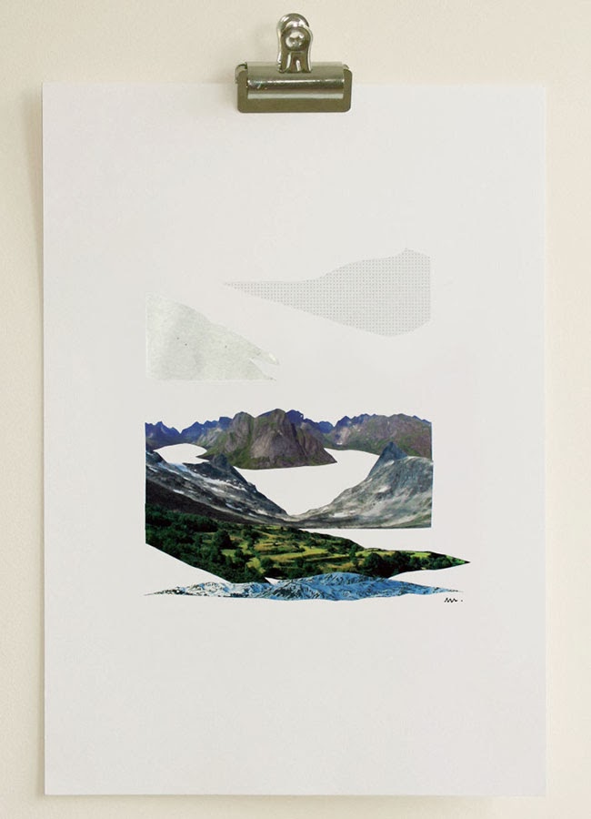
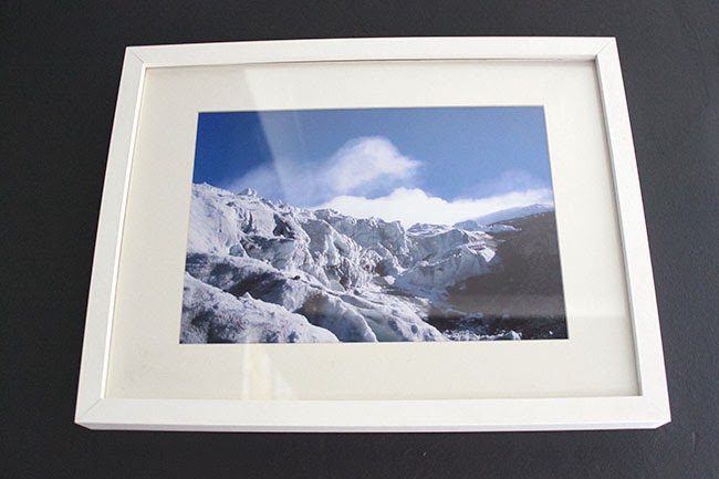
I had fallen in love with the work of Raúl Lázaro when I discovered him on Emily Henderson’s blog earlier this summer. He uses paper to create the most beautiful collages and I snapped one up before I even knew where it was going. Here’s a picture of it from his Etsy shop – it’s called The long winter trip.
Initially, I’d simply placed in one of the Ikea Ribba frames above one of my bedside tables but it never felt quite right… it just wasn’t doing this lovely little print justice. I knew it needed something special.
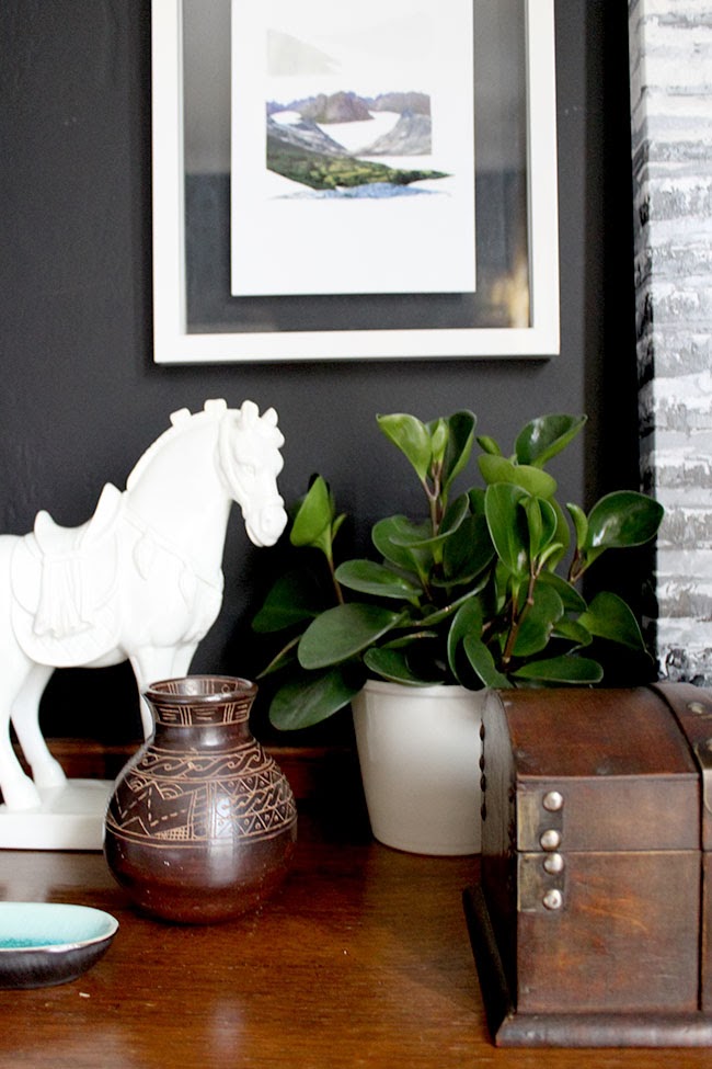
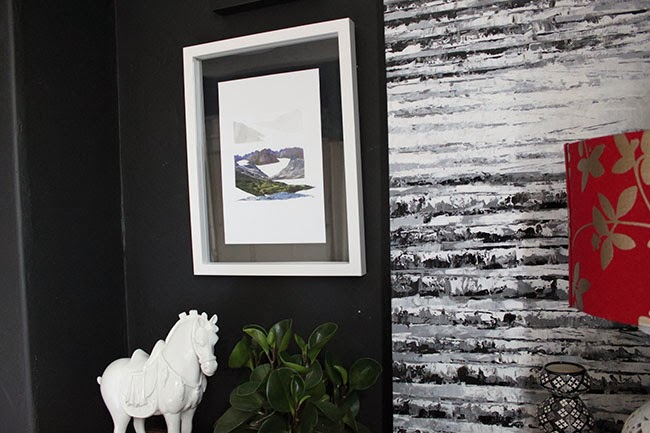
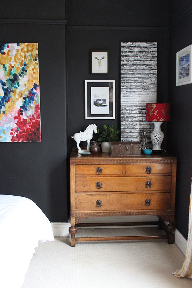
Enter the Bacall frame. I really loved the floating frame effect against the black wall and for £25, it’s something I would have happily paid for because the quality is that of a much more expensive frame. In fact, I’m considering purchasing a couple more, I love it that much.
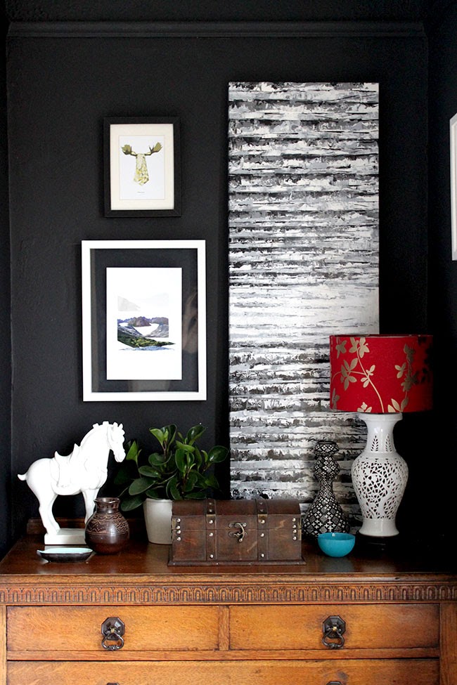
It’s given this space a little something extra with the wall creating a kind of mat around the print. I’ve tried to temper all the angles with a few feminine curves including a plant that Wayne says looks like it’s growing ears (let’s not think too hard on that, okay?). That tall canvas is from Ikea that I got ages ago – I think it’s meant to be hung horizontally but I quite like leaning vertically – I know, showing my rebellious side there.
I feel like the space still needs a pop of colour somewhere (yellow?) to tie it with the rest of the scheme but then I’m a bit of a colour-oholic so I’m not rushing any decisions here although I probably should put something into that vase.
You may also notice that I hung the photograph that Wayne took of Cotopaxi when he was travelling in South America along side the chest of drawers. I love that it ties into the print with the mountain scene and I weirdly like how it’s hanging out on the side all billy-no-mates like he just don’t care. You go, mountain scene, stand tall and proud. You don’t need them. You’re okay on your own.
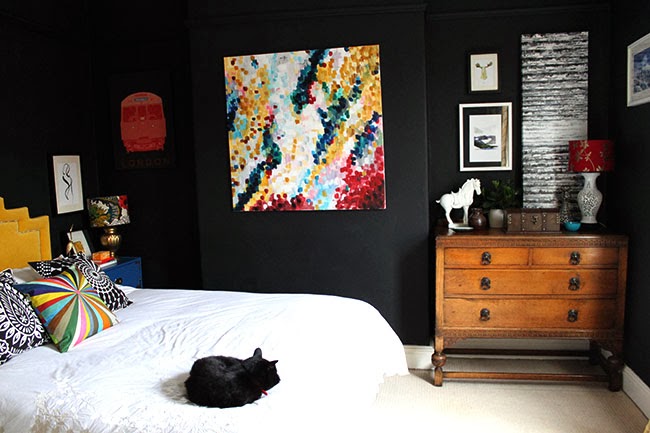
So with my recent additions/changes, I think my little corner is shaping up.
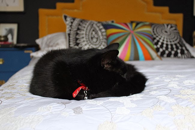
Not sure if Pablo is quite as impressed.
So, back to the lovely people of Habitat, I’m on the hunt for a print to compliment the other frame I was supplied for review which I’ll share with you in a future post as well as something a little different for the left alcove… no real decisions made there yet although I’m leaning towards an oval mirror of sorts. Maybe.
So what do you think of the changes? Find any interesting art lately? Fell in love with a picture frame? Maybe you have a cat who doesn’t appreciate being woken from his nap by a camera shoved in his face? I’d love to hear…
Disclaimer: I was provided the Bacall frame from Habitat for free in exchange for my review but all images, opinions, poor attempts at humour and general randomness are always my very own.











your bedroom is fantastic. The frames are just perfect. They balance out the canvas well :)
oh it looks awesome, red! i am on the hunt for vintage very ornate frames to spray paint black for some book cover collages.<br /><br />smiles.<br /><br />michele
Considering the walls are dark, this room is so bright and full of colour! It's gorgeous :) x
I love the change. I'm like you, the more gallery walls, the better! :)
Love it Kimberly, such a well put together vignette – I'm very envious actually, I need to get my butt in gear and tackle the art situation in our place but have been putting it off… That floating frame is gorgeous I agree, looks amazing against the dark wall!
Hello<br />I've just discovered your blog and am so enjoying reading through your archive of posts! Great fun and inspiring! I have to ask… the plant that your boyfriends describes as 'growing ears!' – where did you get it? Do you know it's name – I love it!
Haha! I got it in Homebase – I think this is the one! It's called a Peperomia Plant :) http://www.homebase.co.uk/webapp/wcs/stores/servlet/ProductDisplay?langId=110&storeId=10151&partNumber=106111<br /><br />xx