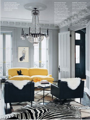
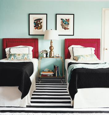
I have a bit of a thing for a strong black and white geometic pattern in a room and there is something terribly elegant and confident about the use of monotone stripes that doesn’t seem to date.
I think the love affair started with Domino because it seemed that every other room they featured had a spot of it somewhere.
 |
| Domino Magazine image via |
 |
| Jenny Lyon’s swoon worthy living room shot by Domino via |
 |
| via |
 |
| Domino Editor-in-Chief Michele Adam’s bedroom via Flickr |
 |
| via |
 |
| via Lonny mag |
 |
| via |
 |
| Unknown |
 |
| Gina Kate’s children’s bedroom featured in Domino via |
Not every single one of those images are from Domino Magazine but you get the idea. Black and white in whatever form it takes adds a certain impact that most other colour combinations can’t compete with.
So when I purchased a fabulously simple black and white striped fabric recently and threw it on my table just to check the length in order to fashion a table runner from the material, I changed my mind instantly. I knew it would perfect as a table cloth instead.
Creating this was the simplest thing I’ve ever sewn in my life. I literally just hemmed the edges and ironed it and the job was done.
I think it makes a great impact in the room, especially with the addition of brightly coloured roses which I couldn’t resist buying again this week. Who says you can’t buy yourself flowers anyway?
Considering it was just £12 for the fabric off eBay (no surprise there), it’s an inexpensive and easy way to add a little somethin’ extra to a room.
I do realise using black and white to such strong effect is not to everyone’s taste so I’m curious to know what you think: Have you used any bold geometric prints in your home lately to add some impact? Or do you find black and white a bit too strong for your personal space? Do tell in the comments…
Images not indicated otherwise are my own.


I love your dining room. I think it's coolcoolcool….and the table cloth looks brilliant. I like it because there's very little other pattern in the room. Gorgeous.<br /><br />And ebay! Oh, what would I do without it?!!<br /><br />Sarahx
it looks FABULOUS. love this idea and may steal it for my dining room! i've got the same black and cream toile on it that i've had for years. i need an update! girl, you're good.<br /><br />michele
You made your case with all those gorgeous images and then again with your photos! B&W stripe IS incredibly bold, but in the right space it's gorgeous, and in your dining room, it is absolutely fabulous! <br /><br />Meera xx
loving the second image from domino mag and also loving ur new purchase xx
Oh, I just love these photos so much! You've got me thinking, however, that I have absolutely NO black and white stripes anywhere in my house. Hmmm…I'll need to do some shopping.
Thank you so much for visiting my blog, which led me to yours! You have such a great style. And you are very entertaining! I enjoyed reading this post and learning more about you. Your makeovers are amazing.