So things are a little different around here, eh? As I spoke about in this post, I decided my old design just wasn’t working practically for me anymore and I figured while I was updating the site, why not give my entire brand a fresh look! So here she is… my brand spankin’ new site!
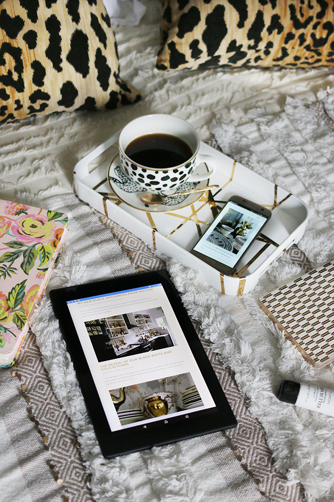
So what’s new? Aside from all the pretty new packaging (black, white and gold FTW), all the posts and pages you’re used to are still here – they’ve just been freshened up a bit! I know a lot of my readers don’t come to my blog via the home page. You might be a subscriber so come through via your email or you might have followed a pin from Pinterest, a link on social media or via a search on Google. However, for those that do enter via the homepage, you’ll notice that there’s now a great big beautiful carousel with the latest posts. This is a design feature I’ve wanted for such a long time and I’m so excited that I finally have it!
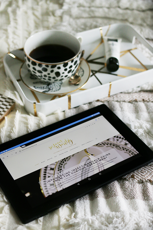
You’ll also see it’s really easy to find my house tour and my About Me page from both the home page and via the top navigation. Unsurprisingly, they are two of the most popular pages on Swoon Worthy so if you’ve never seen them before, have a little look!
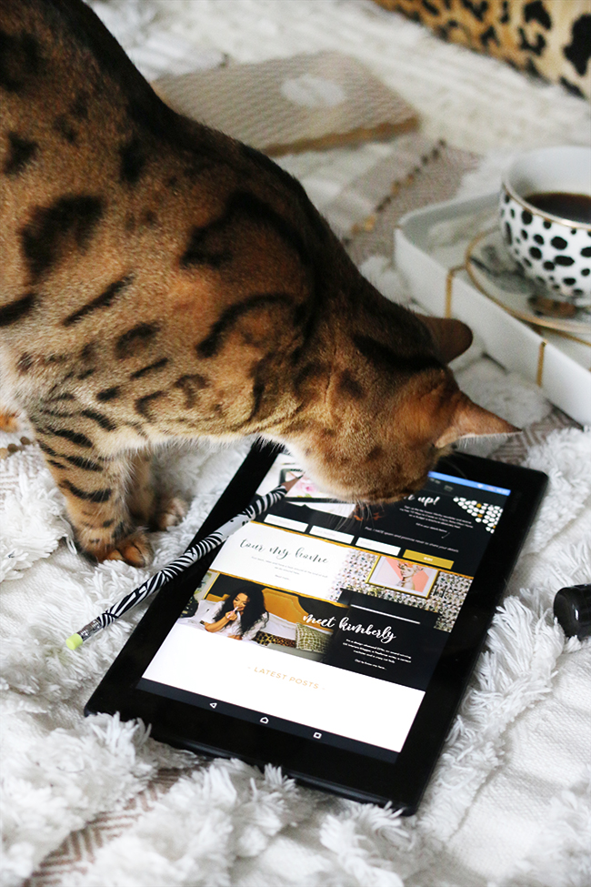
There’s also an easier way to sign up to my newsletter. You can fill in your details right on the page rather than being redirected off the page which is what used to happen (oops). Scroll down to the bottom of the post and try it if you haven’t already – you’ll get some of my top decorating tips as a bonus (which has also been updated)!
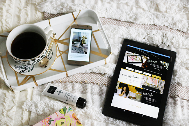
The site is also fully responsive. I hated my mobile site with the white hot heat of a thousand suns before so having a site that’s easy to view whether you are using a laptop, a tablet or a mobile was absolutely paramount for me and one of the reasons I was so unhappy with the previous design. So if you are viewing this on a mobile, for instance, it should look pretty much the same as the desktop site and you won’t be missing out! Hurrah!
One thing I did last week (just in case you hadn’t seen it) was change all my social media handles to @swoonworthyblog. I used to be @redlilocks everywhere but I knew it was confusing for people who were trying to find me and so I finally pulled my finger out with this whole redesign and got those changed – hurrah! If you click those little icons in my sidebar and in my top navigation, you can give me a follow if you aren’t already.
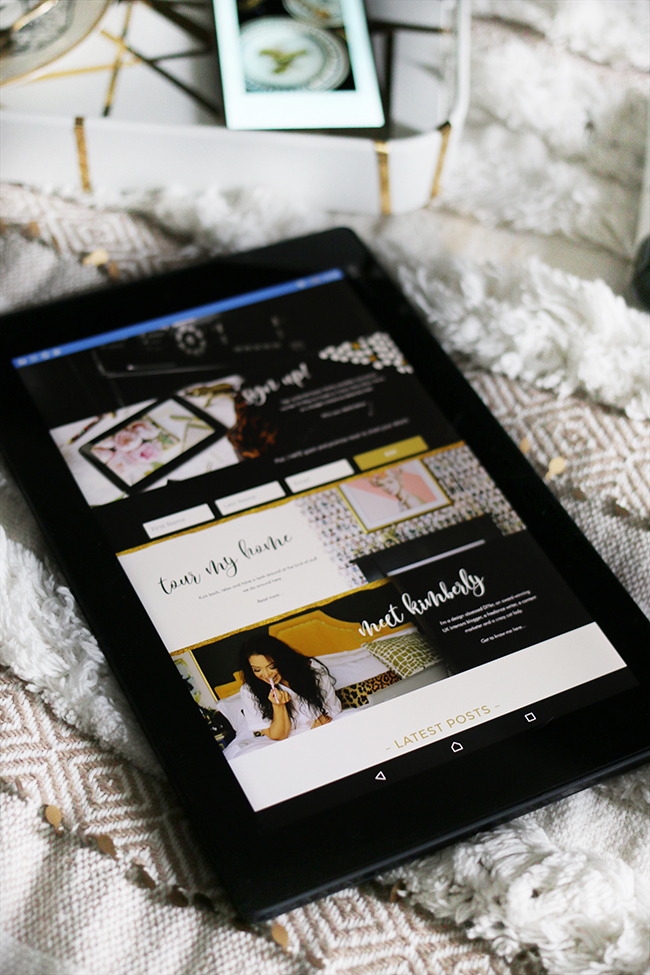
There’s plenty here to see so please do click around and see what you think! There are also a few minor tweaks still being made but if you see anything that’s really blatantly, obviously wrong, hit me up in the comments or send me a message on the contact form and let me know!
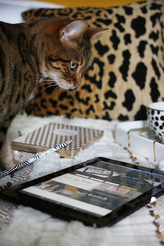
Thanks so much for your patience as the new look was being created and huge thanks to the wonderful Becky Lord for my pretty new branding and design! Hope you like it! Do let me know what you think in the comments below!









Ahhh…..lovely new shiny site…. looks very professional, glamorous and enticing….and an easy to find search button. Yay! xx (easily pleased)
Thanks so much Kath! I’m so happy you like it! And yes, that was one thing that was definitely missing – an easy to find search button! Ha! Hey it’s the little things, right?! xxx
The new site looks fabulous !! That home page is crazy impressive :D
Love it, congratulations !
Thank you so much Marie! So pleased you like it – the home page is my favourite bit! Haha! xx
It looks really good Kimberly, I love the new site. It looks very rich and glitzy. Between the both of you, you’ve done an excellent job, everything is still there, but wrapped in a glamorous package. xxx
Thanks so much lovely!! So happy to hear you like it <3 xxx
I love the new site. It is vibrant and glam.
xx
Thanks so much hun, I’m so pleased you like it! xxx
To be honest, I think this home page is somewhat blah, esp. compared to your very unique and colorful prior one. I LOVED the display of the china patterns, with the odd objects you interspersed with the china…showing us all that you actually can mix and match whatever patterns you like, no matter the style. Don’t care for the plain-ness of your new home page cuz it doesn’t draw me in at all. I pay a lot of attention to details like that when browsing a new-to-me blog. As a subscriber, I already knew how fabulous your designs are, but if I didn’t, I’m not sure this new home page would make me want to look further into your blog. More color please! That is one of your signatures and it’s missing with the new home page. It’s misssing “you” and looks very much like many other blogger’s home pages. Btw, I love the changes you’ve made in your dining room, bedroom and kitchen. Stunning!
Thanks for your feedback Fran and I’m sorry your not crazy about the changes! Boo! Just so you understand my reasoning, I’m hoping the changing images in the carousel and the bold design of the Home Tour and About Me sections would hopefully give readers an indication of my style and give them reason to have a closer look! Your comment will certainly drive me to ensure the first image is a real attention grabber so I’ll keep that in mind when I’m shooting blog posts :) Thanks so much for your comments on the recent changes in my home – pleased to hear you like them! xxx
Such a beautiful website, Kimberly! Glam, sophisticated and very very you, and really easy to navigate (so important)! You must be so pleased! xxx
Thank you Meera! It does feel very ‘me’! Ha! And yes, that was one thing I really found was lacking in the old design – it was so hard to just find the latest posts!! Thanks darling ;) xx
I loved your last look- it was fabulous but this is just as fab! Either way – i’m all swooned with you.. now let’s talk about that fabulous tray! :-)
Thank you so much, Jamala! The last design *did* look pretty, I admit (which is why I initially really liked it – ha!) but hopefully, this will be easier to get around ;) As for that tray – it’s a DIY! http://www.swoonworthy.co.uk/2016/09/diy-kelly-wearstler-channels-inspired-gold-tray.html/ ;) xxx
LOVE LOVE LOVE!!! I think it;s much easier now to navigate to your new visitors. I was a bit confused for the first time and all newbie bloggers, and also people who doesn’t blog just look for inspiration, can somehow get confused but this one is easier to navigate and much clearer, and girl…. your FONT! LOVE the swirls!!… ( apologise for the childish capital letters but it was pretty impossible not to haha )
I love it! It looks so glamorous!! The branding is gorgeous, and so perfect for you! Very exciting! xx
Love, love your new website…..and your cat!!! Both are totally swoon worthy :)
The new website design looks gorgeous I love it!
Mel ★ http://www.meleaglestone.co.uk