So as I mentioned recently, Wayne has finally allowed me to get my hands on his ‘man cave’ – which is essentially the cellar of our home. At the moment, while it’s certainly habitable, there are a lot of unfinished bits and pieces that need to be sorted out. You can see what it currently looks like in this post and get all caught up.
Today, I wanted to share my plans for the design of the space. One of things I really wanted to do was work with the fact that it’s a small cosy space. This is not a huge airy room with large windows or any eye-catching original features. It sits away from the rest of the house too. For these reasons, I knew it didn’t have to really ‘match’ the rest of the decor – it could have a bit of it’s own personality. While I do want it to carry some of the qualities of the rest of our home, it really needed to be a little more masculine in style and reflect the fact that well, it’s mostly a guy who spends time down here. Although once it’s all done, I can guarantee that I’ll be enjoying it as well for movie nights!
So this is basically what I’ve come up with so far. As is always the case with my initial designs, things are likely to change because I have the attention span of a gnat… but well, here’s where we are at the moment…
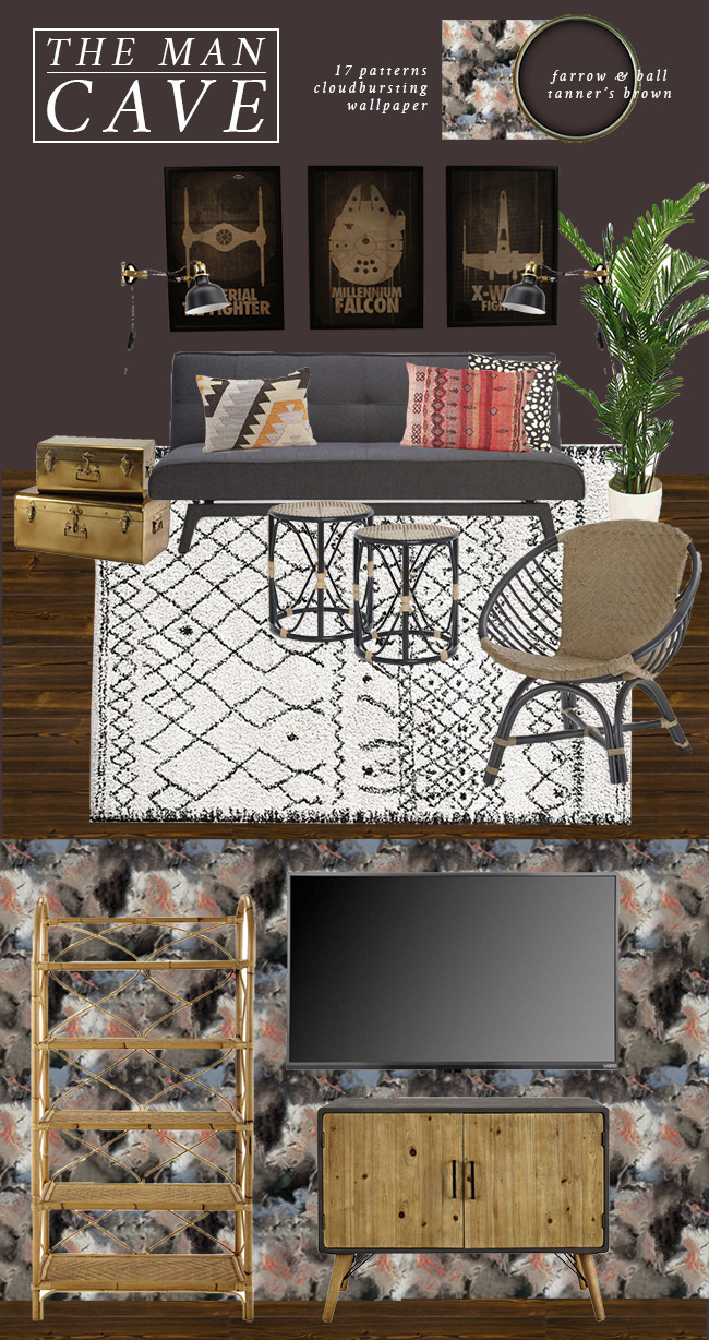
The one thing that was really important of course was that it stayed within a reasonable budget. Wayne is not the type of person who would be more than happy to spend £30 on a cushion (never mind £50+) and would balk at using his hard-earned cash for trinkets and the like – unlike me who is happy to splurge on the odd special piece if I can swing it. So I tried to keep things at a reasonable level without sacrificing too much in terms of the final look and feel.
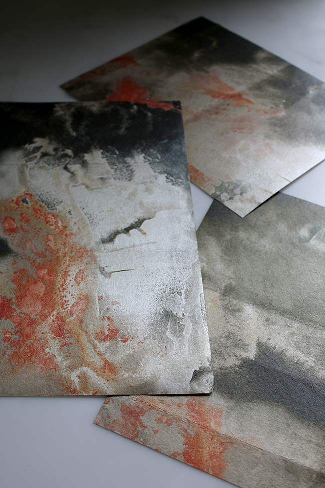
As I mentioned previously, the colour is Tanner’s Brown by Farrow and Ball which I just love and the wallpaper is 17 Patterns CloudBursting in Peach. I received a sample of the wallpaper in the post and it has a beautiful gold metallic sheen – it’s just stunning in person. And that metallic finish will be great for bouncing what little light the room does get around the space.
The sofa and the Star Wars prints are obviously staying and he has a few other pieces of art that aren’t shown here but one is orange and the other has a lot of red so I wanted to stick with some warmer colours to tie in with the wallpaper. You’ll notice the cushions shown on the moodboard keep to the same colourway, adding that additional texture and warmth. They are a little bit more expensive so I may have to ‘gift’ those to him! ;)
My design veers a little more towards boho than in the rest of my house as well. First off, because, well, I love it and secondly, because I wanted to create a space that begs to be chilled out in. I didn’t want to go too glam (that’s really more me than Wayne, let’s be honest here) but I did want to have a few smaller elements of gold finishes to compliment the textures of everything else. I may add in a few more glam bits because I can’t help myself but we’ll see how that goes over as time goes on.
I’m rather in love with the rattan shelf. I’ve always wanted a shelf like this and Wayne needs something to display his collectables so why not, right? The rattan/woven look is a reoccurring theme here with the addition of the chair and the two smaller side tables. I love all the texture they add to the space.
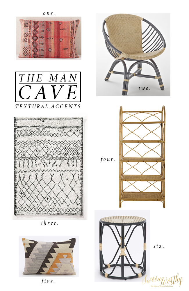
one. / two. / three. / four. / five. / six.
One of the things I’m not 100% convinced about is the rug. I originally had my eye on this lovely by LeRedoute in a cream colourway but they seem to have gone and discontinued it so I’m now looking at the one you see above instead. I really love the shaggy look but not sure how my cats will get on with it (are they going to pull it to shreds?) or if we should be looking for something low pile and a little less high-maintenance. So that might change. I also have my eye on this patterned jute rug as an alternative.
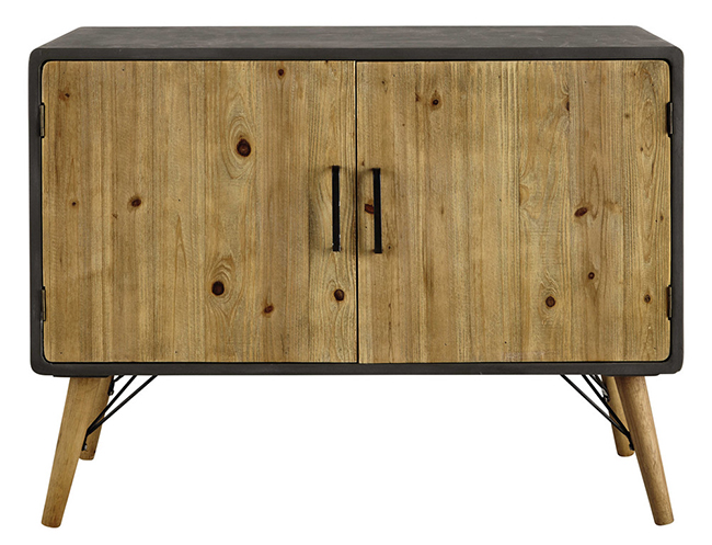
The console is the other thing I’m struggling with. While this one from Maisons Du Monde would work perfectly in that (tiny) space and the wood marries well with the shelf unit, there’s one problem: I don’t love it. (sigh) It has a concrete surround which certainly has a more masculine/industrial feel to it and I like the splayed mid-century style legs and the size is perfect… but at the price (£270), I feel like I could find a vintage piece that I do love.
So far, my searches on eBay have proven fruitless so I’m still keeping an eye out. Nothing else works quite as well so far and I’ve looked at hundreds of different ones so far – all failing for some reason or another. The ones I really like are just well out of budget and the ones within budget just don’t seem to blend well with the rattan furniture or aren’t the right size or finish so yeah… we’ll see. We’ve got time to sort those things out though so I’m not panicking. As I always say, slow decorating is really best!
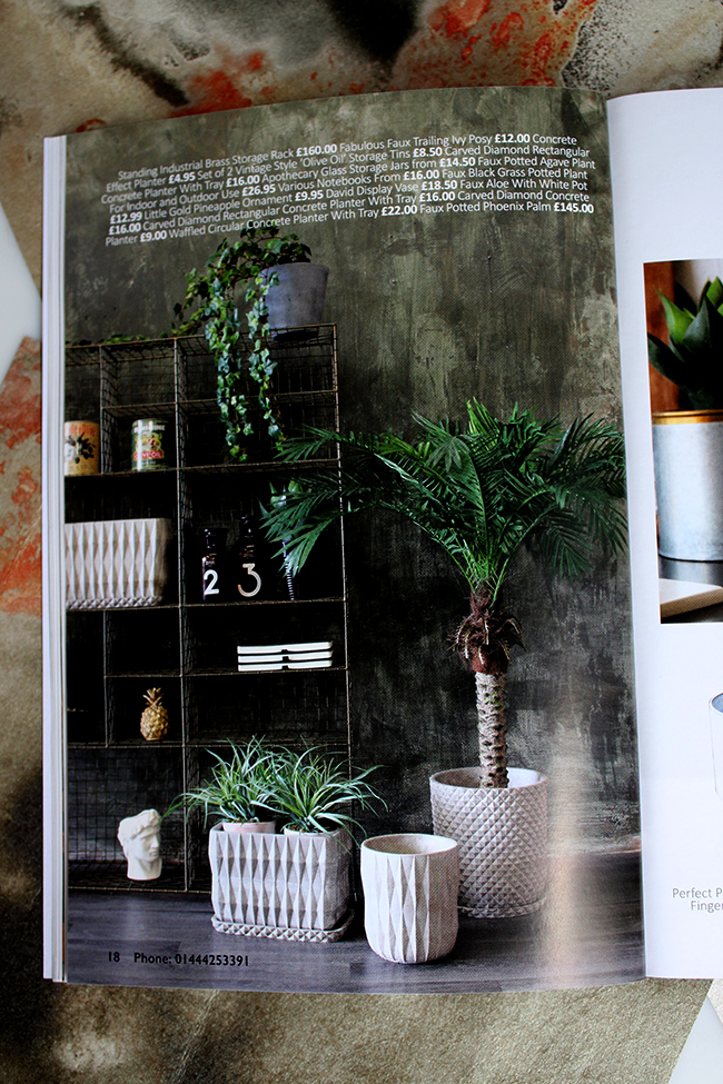
From the new Rockett St George catalogue – so many beautiful things!!
I do want to get him a few faux plants for down here as well. The room does get some light when the sun comes around the house for about a half hour a day but it’s not really enough to keep plants alive so faux it is. That one you see in the moodboard is just a stand-in but I’ve been looking at Rockett St George recently and they seem to have some great ones.
So it’s all a bit of a departure from my normal glam style but at least I’m feeling fairly confident about the direction. The space is TINY so there’s not a lot of room for ’embellishment’ if you know what I mean but hopefully as things progress, we can make a few very definite decisions on those pieces that are going in.
In the meantime, what do you think of the design so far? Does your other half also balk when it comes to spending on non-essential decorative accents?
















Your plans for the man cave are looking very promising. I agree with you the chosen rug may not be ideal with the pets. Yes, my hubby tend to ‘balk’ with my essential luxuries…
Take care & have a good week.
xx
Love the moodboard, the basement going to look so amazing!! The wallpaper is gorgeous and really sets the tone for the room and all the gorgeous items you want in the room. That sideboard is pretty good for this scheme but if you’re not loving it then definitely keep hunting for something you do really like or can upcycle because, knowing you, it’ll keep bugging you till you can’t take it anymore and you’ll have to buy another one ?. xx
I love that rug! seriously considering it for my bedroom. Your first choice seems to be available again though.
And i just bought those concrete planters from rockett st george, you’re so naughty showing us them lol.
The design is great – love all the Boho elements! That paint color is so deep and warm, and this is such a geeky thing to say, but I love how the wallpaper has almost a space nebula look so it thematically matches with the Star Wars prints.
Gah that wallpaper is so different and gorgeous. I also still have faux plants on my list for the basement. I need to find some good ones.