So let’s just be clear from the off. I have made PLENTY of design mistakes. Loads. And guess what? Because I’m a blogger and have been for the last 6 years, you can go trawling through my archives and you can see just how many I’ve made. Oh yeah. Loads. Stuff I look back on and wonder WHAT WERE YOU THINKING? But well, this is how we learn, right? If there’s one thing I’m a huge advocate of, it’s taking risks and learning from your mistakes.
There are however a few things that drive me bonkers because I see them made all the time and they are so easy to correct. I mean, why should you waste time making these design mistakes? I’m here as your Fairy Design Mother to help you out. You’re welcome.
Also, this is an opinion piece which means just that – it’s my opinion. If you have committed these design atrocities and you are completely happy with them, well, I’m not going to tell you you shouldn’t have them in your home. Okay, well, I might secretly cringe inside myself, but live and let live right? It’s your home and you can do what you like with it. Also, there are always exceptions to every rule but generally speaking, these are pretty universal. In my opinion. Ahem.
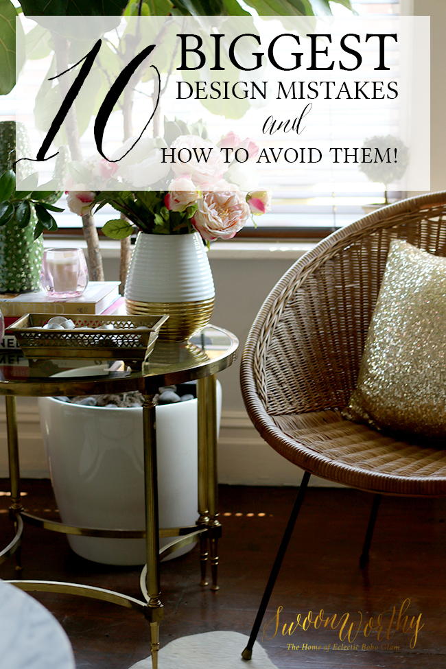
Right, on with the list..
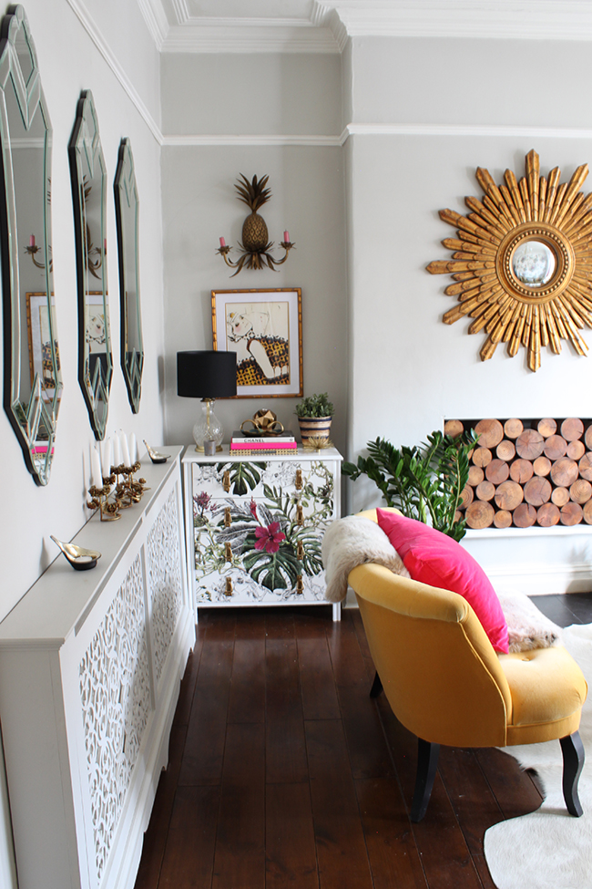
Curtains that don’t go all the way to the floor
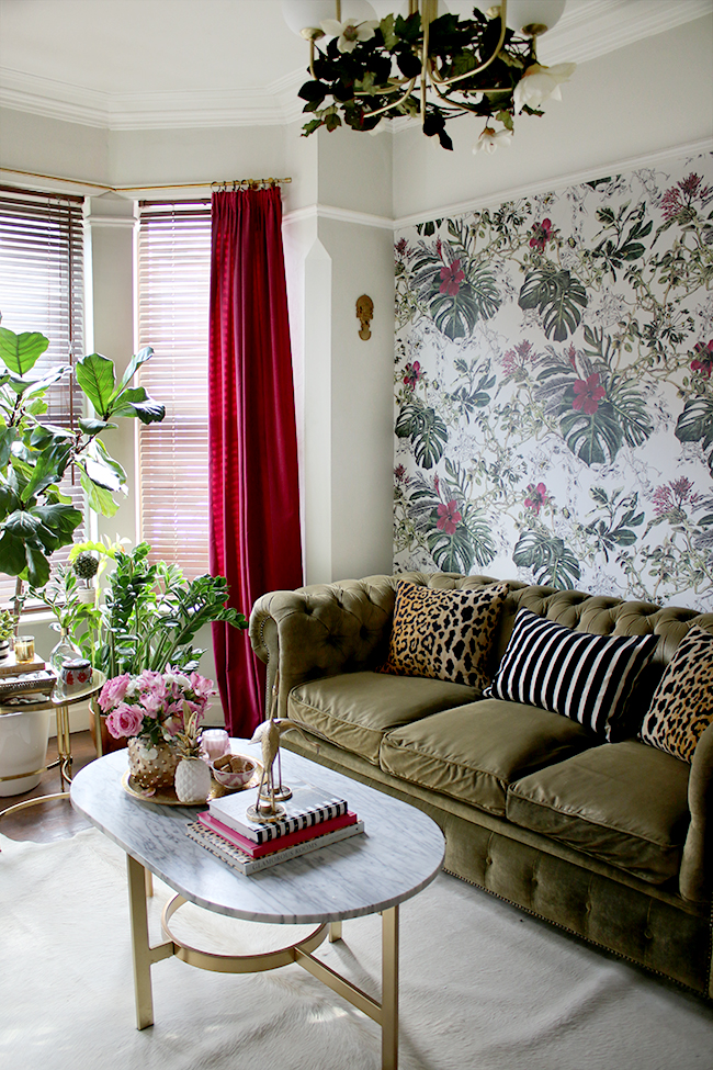
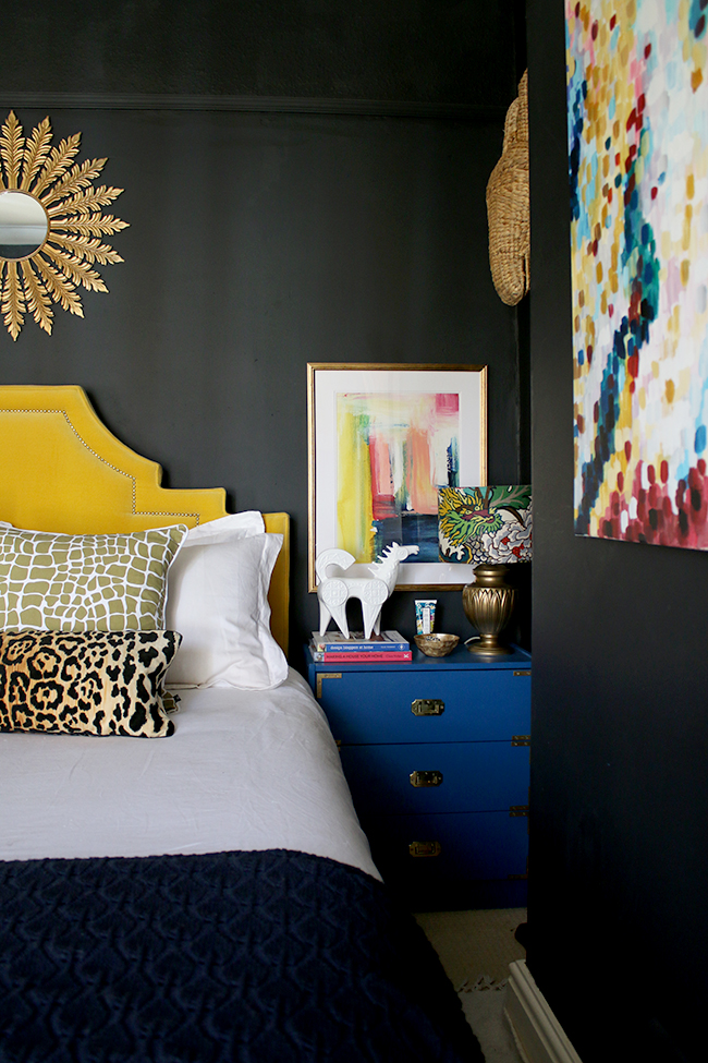
Oh man, Britain, I’m looking at you right now. The amount of homes I’ve been to with short-arse curtains that stop at the windowsill are too many to count. It’s not a good look and I’ll tell you why. Short curtains make rooms look short. It merely emphasises the window and not the room.
Your curtains should elongate your space, draw the eye to the ceiling and all the way to the floor. So your curtain rod should be hung as high as possible to the top of the ceiling and should merely “kiss” the floor (and yes, my curtains should be higher above! Told you I make mistakes! And yes, it drives me mad!). If you want, you can have a 1″ break on the floor but nothing more. Pooling curtains are for big stately homes so if you have one of them, then go for it. But if not, pooling curtains merely collect dust and get grotty quickly (believe me, I’ve had ’em).
If you have a window situation where long curtains aren’t possible (ie, a radiator, a bay window) then roman blinds will add some softness or you should consider shutters which look beautiful and provide privacy.
Art that’s hung way too high
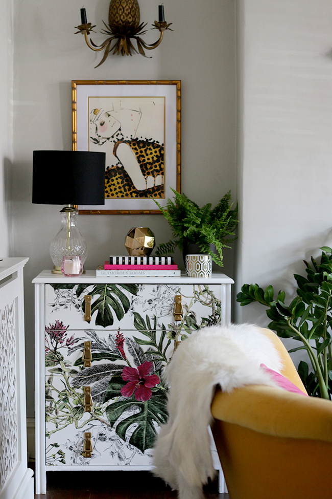
If I’m sat on your sofa in the living room and I’ve got to crane my neck to see your lovely prints you’ve been collecting for years, we’ve got a problem. Your artwork should be at eye level and in a space like the living room, when you’re sat down, it means the art should be a bit lower still. I’ve seen so many homes where they have a great big wall and they have a piece of artwork that’s hung in the MIDDLE of the wall or about 3 feet above the sofa. Noooooo! Don’t do it!
Your artwork should relate to the pieces around it, allowing the larger pieces to anchor the artwork. So for a sofa, you’re probably looking at around 8-10″ from the back of the sofa to the bottom of the frame. For art hung above consoles or sideboards, they can go a little higher as long as you have something that creates height on the furniture that anchors the art to the piece of furniture. For everything else, the general rule of thumb is 58″ or 1.5 metres from the floor.
Everything matches
There was a time when buying a fully matching set of furniture was thought to be aspirational. Because obviously these people walked into a showroom with a big fat wad of cash, cast their eyes over a bedroom or living room set up and said, ‘Yep, I’ll take the whole thing!’ and the salespeople gathered around them and cheered. Today? Errr. Not so much. If you buy a fully matching set of furniture, it’s not going to look like you are loaded – it’s going to look like you lack any kind of creativity or individualism. You don’t want your home to look like a catalogue, okay? You want it to reflect you. So mix and match your pieces and avoid the 3 piece suite. Wants some tips on creating an eclectic look in your home? Read my post here.
The Doctor’s Waiting Room Look
Speaking of furniture, we have pretty small room sizes here in the UK and so lots of people feel like in order to create the illusion of space, they need to shove all their furniture up against each wall to leave a big blank area in the centre. The problem with this? It looks like your GP or Doctor’s waiting room and that’s never a good look.
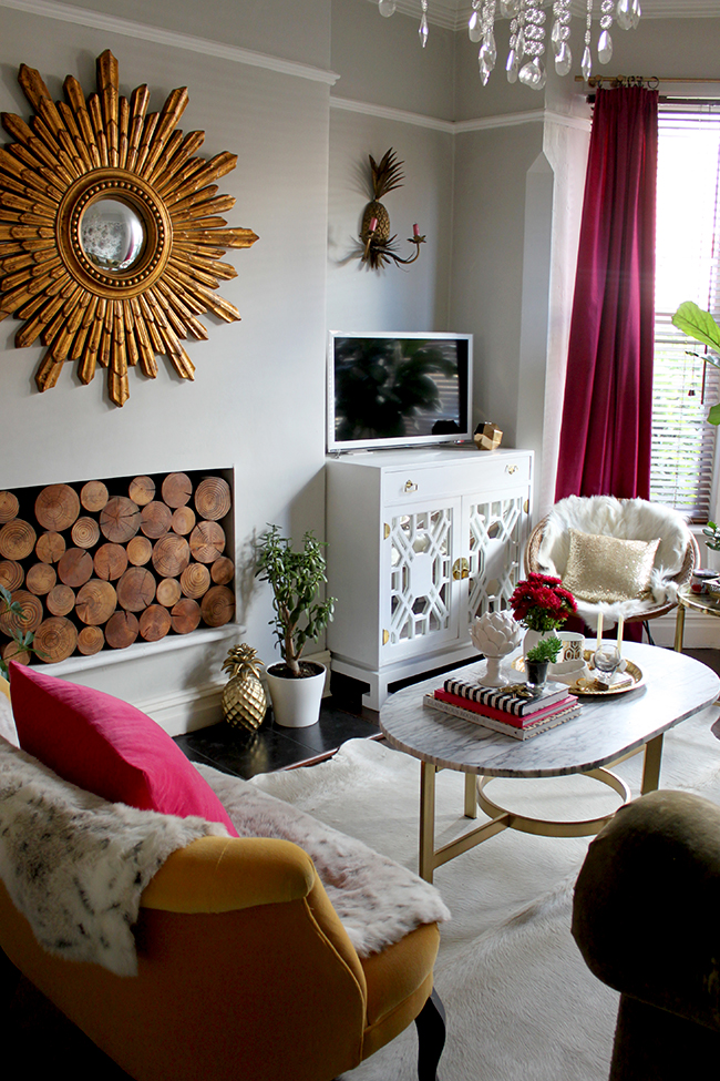
Always float some pieces in the centre of your space. I have a tiny settee in my living room that creates a more intimate seating area and the hoop chairs sit away from the bay window. It’s a small room, yes, but this gives a cosy effect and far better for encouraging conversation than having to shout across a room to be heard. One way to make your furniture look anchored is using some smaller side tables in between or a large rug. Which leads to my next pet peeve…
The Postage-Stamp Rug
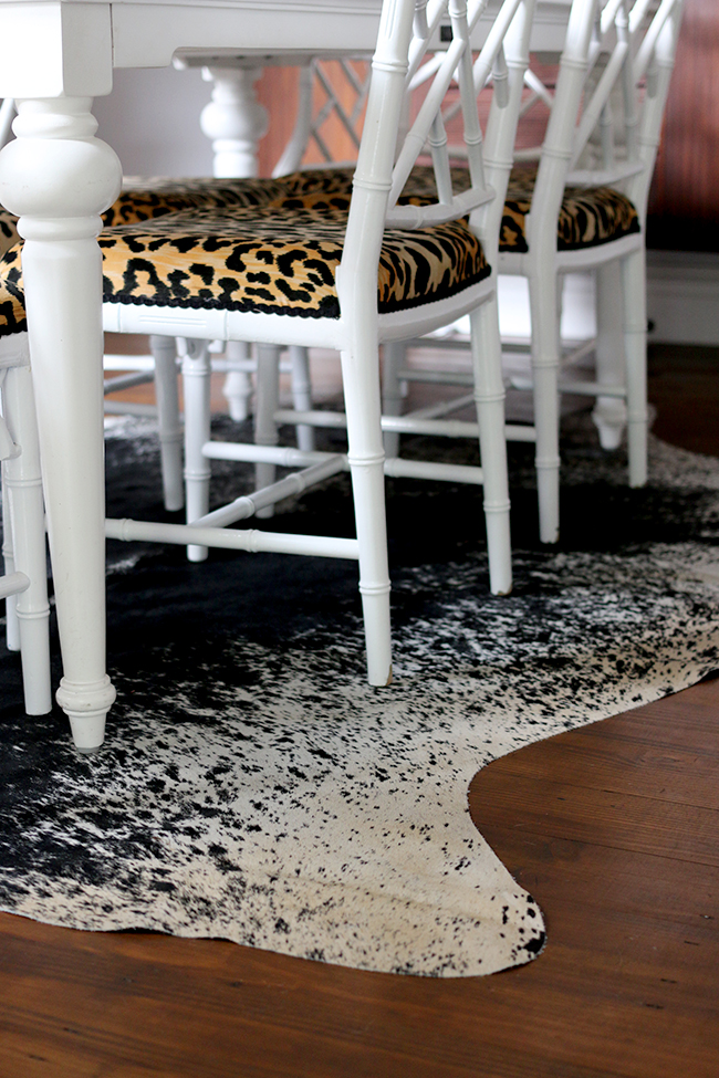
I get it. Big rugs are expensive. Like eye-wateringly expensive in some cases. But I promise you that buying a teeny tiny rug that just about fits under the coffee table is a false economy because it just looks bad and makes your room look small. Your rug should be big enough so that the front legs of whatever furniture is on its perimeter is on the rug. In the case of a dining table, it should be big enough so that if you pull a chair out, it’s still on the rug. The only instance where this rule doesn’t apply is in the case of an organic shape like a cowhide rug (and even then, buy the biggest one you can find).
Lack of Storage Planning
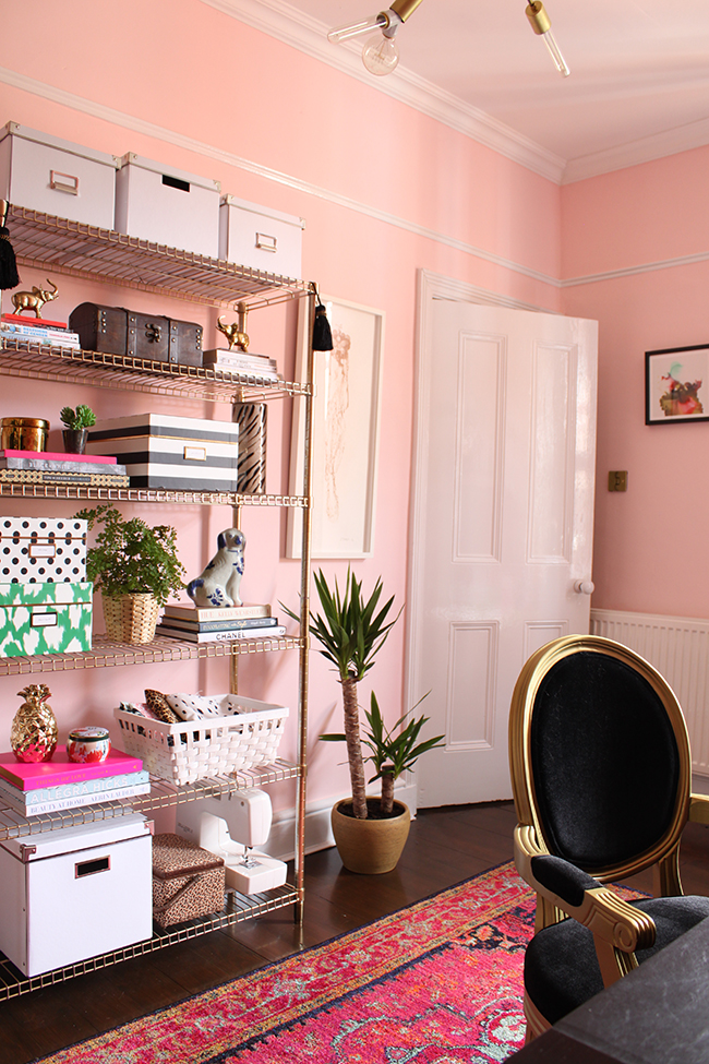
If you are looking to redecorate a room and you have a lot of stuff, don’t ignore it. Edit it, donate it, sell it and try to bring your collection down to a reasonable level. Once that’s done, then don’t pretend it’s not there. Plan for it. Ensure you’ve included hard-working pieces in your design like shelves, nice looking boxes, baskets, double-duty furniture that contains hidden storage, display areas and the like. While I am a total maximalist and I like what I consider to be ‘artfully arranged clutter’, simple clutter of random stuff on every surface is never a good look. You’re going to feel suffocated by it and it’s going to impact your design.
The Big Light
There’s nothing worse than walking into a room in the evening and feeling like you are under interrogation because there’s one huge light in the centre of the room blazing overhead. While you will need what is affectionately known in this country as “the big light” if you require it (say, if you are cooking and handling knives and hot pans), for the most part, the rooms you spend time in at night can do without them being on all the time. First, put your main ambient light on a dimmer switch so you can control just how much light your room requires. And then bring in at least 2-4 other light sources like table lamps, wall lights and floor lamps to create lovely little pools of light that add to the ambience of your surroundings.
Your furniture is not to scale
A huge armchair behind a petite settee, a tiny piece of art hung above a huge corner sofa, a bedside table that’s higher than your mattress – all these things are going to just look ‘off’. The pieces you choose to fill a room should not only relate to the size of your space but they should also relate to the other furniture that’s around it. This means tiny pieces won’t look like they are floating in the middle of an ocean in a large space and you won’t have to climb over furniture just to find a place to sit. Know the measurements of your space and the pieces you already have before making your purchases to ensure it fits the space.
You’ve failed to accessorise
Every room takes time to achieve it’s full potential and I am all about slow decorating. When you take your time with a space, you’ll end up with something that works for the way you live your life and you’ll be surrounded by things you love rather than rushed or ill-planned purchases. But please don’t forget to add those final finishing touches that really polish off a room.
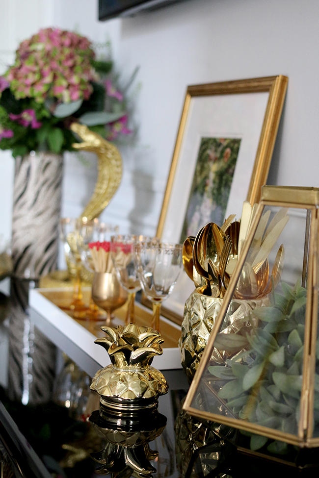
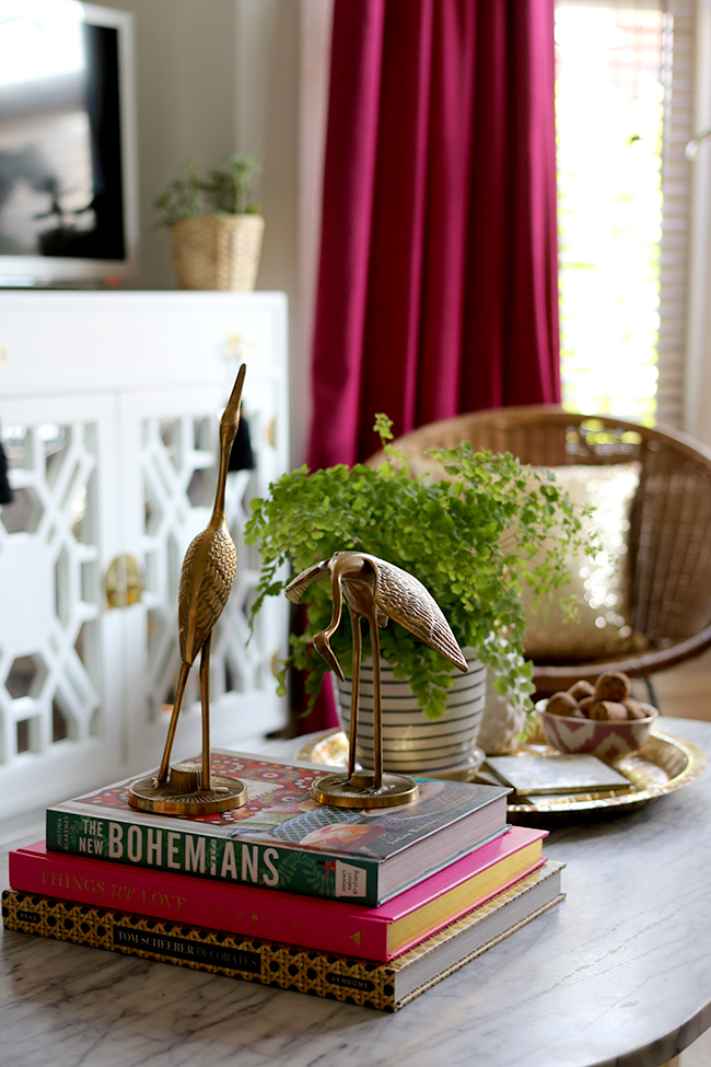
Cushions, artwork, pieces from your travels, candles, books and the like all go a long way to making a room look lived in and loved. While you may have all your major pieces of furniture, without these things a room will still look unfinished. So be sure to add elements that reflect you to your space before calling it done.
The TV is a shrine
Listen, I know television can be great. We’ve been watching Mr. Robot on Amazon and oh my god, I am loving every second of it. However, that doesn’t mean your entire living room should be set up like a shrine to the big black box. If every single piece of furniture points in the direction of the television, guess what your eyes will fall on first when you walk into the room. Yep, your telly. And I know for sure that the television is not the prettiest thing in your room. Find a more appropriate focal point. It can be a gorgeous fireplace, a lovely console table surrounded by your favourite artwork, or a beautiful big window with a stunning view. I’m not saying you have to hide your television, just don’t make it the focus of all your seating.
So those are 10 different design mistakes I see repeated far more often than I want to. Are you guilty of any of these? Perhaps you have your own pet peeves in design? Go on, I’d love to hear from you.


hiya, great tips as always… i agree with them all except maybe the one about scale… sometimes you can get the sweetest of surprises by mixing up unexpected sizings… the teeny tiny piece of artwork off centred can look captivating & charming over a bed or a sofa & i love it when pieces make you lean in to get a better look… similarly, a huge ass lamp or light or mirror or piece of artwork can take a room to the next level of unexpectedness… like you, i’m sure i’ve made all of these mistakes at one point or another! here’s to continual improvement (and any old excuse to buy more stuff!) :)
Thanks for your comment and totally agree with you Sue! Re: scale, I was really talking more about furniture than accessories. I think you can and should have fun with scale when it comes to things like lighting (I LOVE a good oversized light fixture) or a huge piece of art etc. But I feel furniture should be to scale for the room it’s in :) As for the tiny picture off centred, agree, I’ve seen it done really well but that’s normally by people who already know the rules to learn how to break them, understand how to use negative space and have learned how to do it well – which is rare in the general public ;) But yes, there are always exceptions to every rule!! And I’m constantly having to check myself ;) It’s a total continual process xx
I don’t know why but I have a huge issue with curtains. I never seem to be able to get it right. I know you say they should reach the floor but then in winter, when you close them, you cover the radiator and block all the heat out of the room. Id hate that. How do you get around that?
Stacey, you reminded me that I wanted to add a line to the post about that and forgot!! I’ve updated it now but generally speaking, for a radiator or a bay window or a place where it’s difficult to have full length curtains, I’d always recommend either roman blinds to add a bit of softness or shutters which always look very chic and add privacy :) Hope that helps! xx
TV is a shrine…. So why on earth do you have a massive television hung on your dining room wall, of all places?????? I was really hoping that it would disappear after the makeover. It just looks sooooo tacky. It really spoils the whole house. Why would anyone have a television in the dining room? Totally beyond me. Otherwise, I find your blog interesting.
I disagree that the TV is a ‘shrine’ in my dining room considering you can’t actually see it at all unless you are standing facing it due to it’s position on a side wall and the fact that it’s in no way the focal point of the room. I know it’s not for everyone and you are welcome to your opinion but I’ve explained our reasons for having it multiple times on the blog so don’t feel the need to do that again. I think it’s sad that you feel it ‘spoils the whole house’. Considering my home has graciously been featured across a number of magazines, all over the web and interior design books, I’m grateful not everyone shares that view.
I now what you mean about the curtains, theres nothing worse than curtains that look half mast, and i done the rug booboo,ah well we live and learn xxx
Like I said, we’ve ALL made mistakes Pauline, myself included! ;) Design is a continual learning process and making mistakes is definitely part of that! xx
Oh man, I agree with all of these so hard!It totally is a learning process though, and it’s kind of a “once you see, you can’t un-see kind of thing”!
Oh totally a learning process!! As I said, I’ve made plenty myself over the years and I’m still constantly learning ;) xx
Oh my word, you must have picked this post out of my head. I so agree with everything. I also don’t like the american model home look. Drives me nuts! With matching sets. “oh I bought a matching set” at the furniture store…eyeroll.
Postage-stamp rug made me laugh.
Hahaha! Glad I’m not the only one!! I think design mistakes are pretty universal no matter where you live ;) xx
I feel like we have the exact same mind!! I agree with ALL of these points so very much but the absolute worst for me are short curtains – whether at the window sill or hanging in the middle of nowhere; they never look good and SO MANY people have them, ugh.
Ahh it’s good to know I’m not the only one for whom short curtains make me want to scream! Haha! xx
So glad to get a review on this product. We had corian at my old office and I absolutely hated it. It stained horribly, like if I put hand lotion on and touched it, it left a stain that had to be scrubbed off, and I mean SCRUBBED. They spent a ton of money on that nightmare too!
My counter tops at home are over 20 years old, they are hideous, and I’ll probably have to paint them for now (ugh) but I love the option of this surface as opposed to granite (which I can’t afford).
I just love your blog! I enjoyed your youtube videos too. Please post more! You have a very unique and beautiful style!!! Thanks for sharing and posting all that you do.
Ahh the Minerva worktops are incredible – I did SO much research before deciding on these and agree, there are a lot of great products out there but were so far out of my budget or were really high maintenance. These are more reasonably priced but also really super hard-wearing which I love! I’m so glad you found it helpful! And that is so sweet of you to say – thank you! I’m really overdue on making another video (it’s more because I so don’t know what I’m doing – ha!) xxx
Hi Kim, I love this post. Some of the mistakes you mention really made me giggle as I was reading through, especially the curtain and Dr’s waiting room situations. As soon as we moved into our home, those 70’s half length curtains went straight into the skip!
I do find it hard with finding the best position for a tv though as my instinct is to always hang the tv above a fireplace or centre of a wall (but I know this is interior designer suicide haha!)xx
http://anniebucks.com/