I thought I’d create a fun little post today with 26 different design tips to making your home a little more special – yup, a total A-Z guide of a bunch of little things I’ve learned along the way in decorating my own home to get a really unique space! Ready to go back to your primary school days? Oh, go on then…
A is for Art
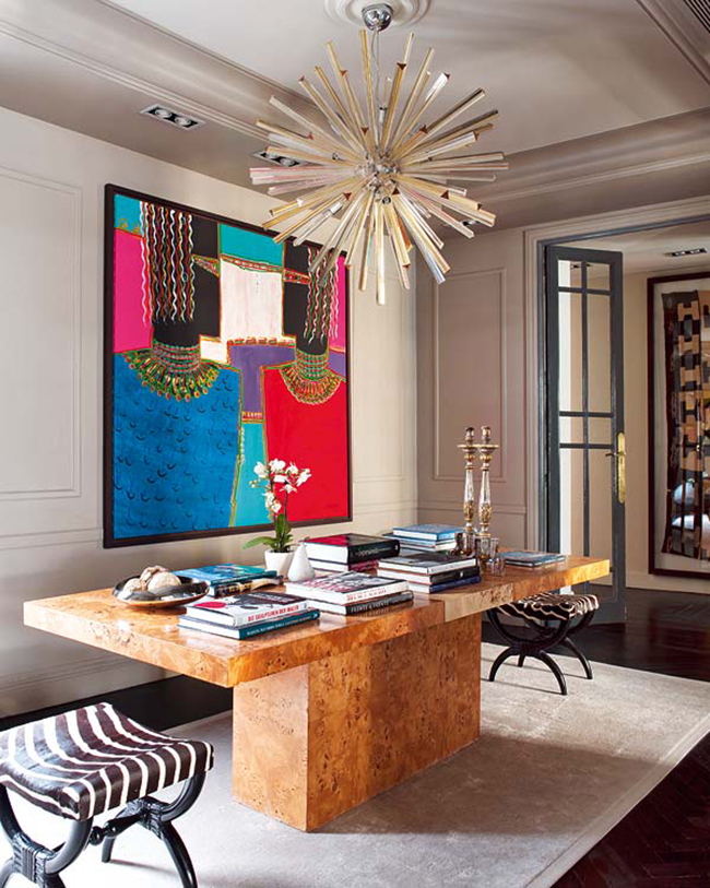
Art can transform a space so easily. Lately, I’ve been loving really large pieces that command attention. Consider tying your existing colour theme with the pieces you choose or contrast the styles completely for a bit of tension in your space. Whatever you do, only buy the pieces you feel some kind of an emotional connection to!
Looking for more tips? Check out Choosing Statement Art
B is for Black
I believe that every single grown-up space needs a splash of black somewhere to ground it and to make it look more sophisticated. Combine it with pastels for grown-up glam or with moody colours to ramp up the sexy factor.
C is for Colour
I’m a total colour lover obviously but even in a neutrally decorated space, having various tones in varying saturations is the best thing you can do for a layered, more interesting look. Whether used sparingly or full on, use the colours that make you happy (not sure which ones do? Check your wardrobe).
Looking for more tips? Check out How to Add Colour to a Room
D is for Details!
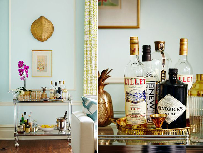
D is for Details
Don’t miss out on those all important accessories in a space. They bring life to any surface and create a history of the person you are. Mix old and new, vintage with items picked up on your travels and display them with care around your home.
Looking for more tips? Check out 8 Tips for Creating the Perfect Coffee Table Vignette
E is for Eclectic
Nothing dates a room faster than everything being of the same era. Contrast styles within a space for timeless appeal. Even better, you won’t have to redecorate each year because it no longer looks trendy. For best results, stick with a limited palette of colours (no more than 3-4) so things don’t get too overwhelming and crazy!
Looking for more tips? Check out How to Create Eclectic Style in Your Home
F is for Failure
If you haven’t failed, you haven’t learned! Sometimes the best results come from knowing what doesn’t work. Learning from my own design mistakes has made me so much better in understanding what I love and want to live with and has made me better at design over the years.
G is for Gold!
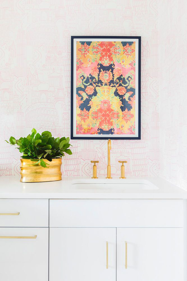
G is for Gold
Warm metallics reflect light, add warmth to a space and create glamour. Stick with brushed or antique finishes for a more timeless look (no one wants that cheap shiny 80’s metal look!). Small touches go a long way so edit carefully for a sophisticated look and don’t be afraid to mix it with other metals too.
H is for House Plants
Nothing brings life, texture and an organic contrast into a home better than plants and flowers. Afraid you have a black thumb? There are some great fauxs out there now that will fool even the most skilled botanists! For maximum impact, go large with a potted tree or cluster smaller pots with different leaves in groups for great contrast.
Looking for More Tips? Check out How to Make Cheap Faux Plants Look More Expensive!
I is for (first) Impressions
Don’t ignore the front of your home whether you have a lovely large garden or just a door to your flat. Make sure it makes the right first impression to guests and visitors. A welcoming door colour with brightly polished hardware, a fresh welcome matt and a few pots of flowers will go a long way in making people interested in what lies ahead in your home and it will make you feel happy to turn the key at the end of a long day.
Looking for More Tips? Check out my post on Giving My Front Door the Final Trimmings
J is for Jewellery!
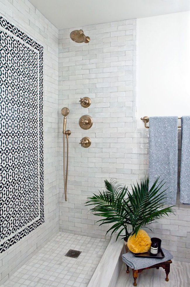
J is for Jewellery
Nope, not the stuff you wear around your neck or wrists. I’m talking about hardware – the jewellery for your home! Don’t ignore the detail that the right hardware can bring to a space. A chest of drawers, your kitchen cupboards or your bathroom sink can all be elevated by the right choice of hardware. Using a posh set of pulls on an inexpensive piece will make the whole thing look more expensive and bespoke.
Looking for More Tips? Check out my Art Deco Inspired Glam Desk Makeover.
K is for Keepsakes
One of the nicest ways to bring more personality to your space is using mementoes and displaying these things with pride. These are the items that have a history, act as talking points and may be a link to our past. If you have a collection, displaying them en-mass will make a more interesting display than dotting them around your home. Show them off with pride and they’ll always make you smile.
Looking for More Tips? Check out Framing Postcards As Art.
L is for Lighting
Nothing ruins the atmosphere in a space faster than having one big blazing overhead light. Put your main light on a dimmer switch and then utilise other types of lighting in the room (table lamps, floor lamps, wall sconces) to create little pools of light for interest. If you’ve got an area where you read or work, make sure you use the correct task lighting to illuminate the area too. Layering lighting is almost as important as layering accessories to make a space more interesting.
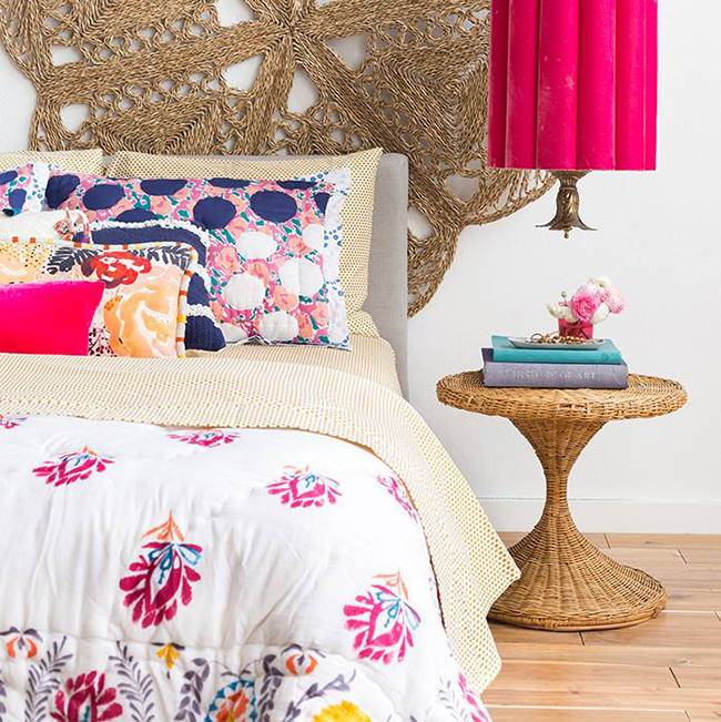
M is for Mixing!
M is for Mixing
Don’t be afraid to mix patterns in your room! Stick to a tight colour palette or pick up the colours in one of the fabrics in your others. The easiest way to mix patterns is to use one large scale, one medium scale and one small scale and perhaps a neutral solid to ground everything else. This way none of your patterns are fighting for attention.
N is for Natural Light
Maximise whatever natural light you have in a space by hanging your curtains high and wide so that they can be pulled back to let the light shine in. If you don’t have a lot of natural light, try not to fight it and consider creating a cosy space with darker paint colours instead.
Looking for more tips? Check out my handy flowchart: Should I paint my room a dark colour?
O is for Organise
Clutter will only make you feel agitated and suffocated. Be sure you have the right kinds of storage for your needs and if space is tight, then consider multi-tasking furniture like trunks as coffee tables, bookshelves with baskets and beds with hidden drawers. If you haven’t used it in the last year, be ruthless! Either give it away to a charity or sell it to purchase the items you really love.
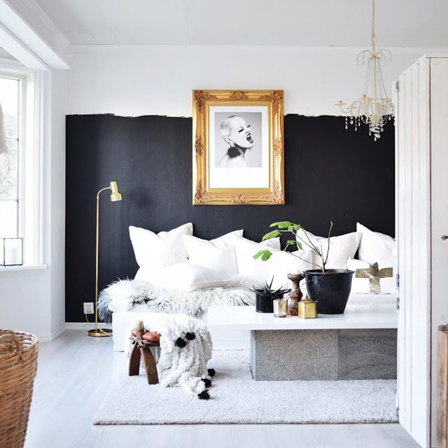
P is for Paint!
P is for Paint
Nothing transforms a room faster or cheaper than a new colour on the walls. If you are nervous about making a change, try taking a risk in a room you don’t use as often like a small bathroom or hallway or consider painting just the ceiling in a bright hue for a quick and fun update. And remember – it’s just paint! If you hate it, just paint over it!
Looking for More Tips? Check out my post on Farrow and Ball Paint and whether it’s worth it here.
Q is for Quirk
Every room needs it’s weird! It creates whimsy, proves you don’t take yourself too seriously and can make a stuffy room look more relaxed. It also can be a great conversation piece. We are all weird in our own little ways so find something quirky that reflects your personality and don’t be afraid to show it off in your home.
R is for Reflections
Mirrors can be a great choice in any room because they do two things really well: bounce any available light around a room making it look brighter and they create depth, essentially doubling the size of your space. Use their magical powers to your advantage!
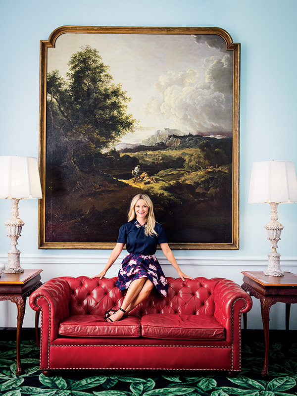
S is for Statement!
S is for Statement
Every room needs a statement-making SOMETHING. Whether you choose bold wallpaper, a fabulous oversized light fixture, big artwork, a huge mirror or an amazing paint colour – make sure your room has a little wow factor. And yes, I mean every room – even the bathroom!
T is for Texture
The best-designed rooms are the ones you want to stay for a while, relax, put your feet up and take it all in. Introducing plenty of textural elements that play off one another is a great way to do this. Consider mixing a faux fur with worn leather, a concrete planter with a soft whispery fern, a high-pile Moroccan rug with a metal table – the beauty and joy is in the juxtaposition and contrasts of textures and materials so be sure to layer lots of different elements in a space for a wonderfully layered look.
U is for Unusual
If you can swing it, consider going bespoke on certain pieces like built-in units, sofas and headboards. Sometimes the right piece just isn’t out there and many times, commissioning someone to make something exactly for your requirements is no more expensive than buying a mass-produced item – plus, no one else out there will have it!
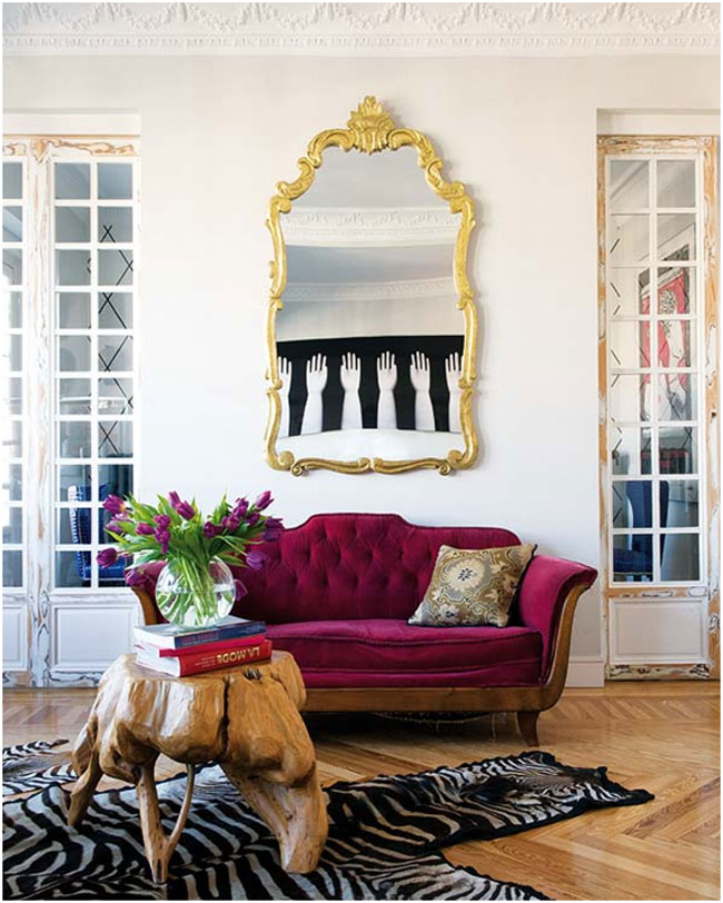
V is for Vintage!
V is for Vintage
Consider your ecological footprint before making a large purchase – can you find the same or better second-hand? Save items from landfills by purchasing from antique stores, thrift shops, online auctions and selling websites and from your local car boot sales, flea markets and estate sales. Bonus? They make a room look timeless (see E above).
Looking for more tips? Check out How to Become an eBay Ninja
W is for White
Never underestimate the power of white in a space. It provides the perfect backdrop for your décor, brightens a space and accessories in white pop against darker walls and patterns. It also matches every colour of the rainbow and never ever goes out of fashion.
X is for eXperiment!
I honestly couldn’t think of anything in terms of design that starts with an X so fine, this is a bit of a stretch! Ha! However, it bears saying not to be afraid to experiment to find out what works well in a space. Move furniture around to see if it’s better placed somewhere else in your home, swap your curtains, rugs, cushions and accessories from one room to another. Basically, before you spend money, SHOP YOUR HOME. It doesn’t have to be expensive but you might just find an exciting combination by thinking outside the box.
Looking for more tips? Check out How to Quickly Update a Room Without Spending Money
Y is for You!
Y is for You
Your home? Your way. Trends can be fun but they are quickly replaced so figure out what you really love and surround yourself with those things. Sure your friends may question a bright yellow striped wall or installing wallpaper on the ceiling but if you love it and you’re the one living with it, then who cares what they think?
Looking for more tips? Check out How to Decorate Fearlessly Parts 1 and 2
Z is for Zebra Print
A touch of animal print (this goes for all of them really, not just zebra) can go a very long way in creating a bit of glamour! The secret? Use it sparingly within a space for maximum impact.
Looking for more tips? Check out How to Introduce Leopard Print as a Neutral
So that’s my A-Z guide – literally! – and a whole bunch of tips to get a great interior that reflects you as an individual. Hope you enjoyed it (and if so, why not share it or pin it? Big smooches if you do)! I’d love to know what you think or if you can think of any design tips starting with an X (I really struggled with that one)! Ha! The comment box awaits!
Image sources: My own / Ashley Gieseking / Domino / Domino / Emily Henderson / Diana Ousdal / Garden & Gun / Nuevo Estilo / Sukio








Fantastic! I love this guide and the fact that it really goes from A-Z! So much I agree with, I apply in my home and all very useful advice :-) x
Aww thanks darling! Glad you liked it and I really think most of this stuff applies to any style :) xx
I raced to X. I can’t believe you missed out Xyster (A bone scraper). All of my room designs are based around one. Pffft.
Haha :)
A most wonderful A-Z. Another one for the bookmark list me thinks!xx
Hahahaha!! Oh man, I’m totally going to have to revise it now ;) Thanks darling! xx
Love it Kimberly – what a fantastic idea for a post! Totally bookmarked for next time I need inspiration :)
Wonderful ideas and images to compliment them, that painting and sofa combo in Miss Witherspoons home is gorgeous!
Girl, you are on fire! This was a great way to share design tips….and you certainly know your stuff!
Love this piece Kimberly! Great to have it as a reminder. x
Ooh thank you for so many tips! I’m hoping to fully decorate at least one room in our house this year so have bookmarked this for current and future reference!
Gosh you are a freakin genius!
I enjoyed reading that post, it was full of some really good tips, thanks Kimberly xxx
Very informative and great tips. I’m sure putting some to good use. Many thanks.xo
Great advice Kimberly. I agree with everything you say :-) Even Z! x
Love this post ! Absolutely agree with you on the F for failure, its important to learn from your mistakes. Obviously, it goes without saying that i also totally agree with you on the W for white too !
Wow, what a brilliant list, love that you’ve used the alphabet. Bookmarking for next time I do a redecoration project and need some help and inspiration! x
X is for xylophone. Every room needs a xylophone!
When I saw ‘A-Z’ I wondered what you’d got for X, haha! Great alphabet of design tips with gorgeous images, love it!
Brilliant way to put this info across, I feel like I ned to print it out and keep it safe. Great tips!
Great tips! I’ll be taking a step back and having a look at these again the next time I’m in the middle of a re-design and feel like I’ve totally missed what I was going for, which happens more than I’d like! ;)
Such a cute concept :) Love this! xo
I absolutely love this post, Kimberly! Such a darling post idea and then such wonderful tips – you’ve inspired me to put together an Alphabet of Thrifting post (although we’ll have to see how I actually do on the follow-through) ;)
What a meaty blogpost! Love it! This is one that should be bookmarked!
Wow, what a list Kimberly! Love that you included F is for Failure – I’ve had so many in my kitchen in recent years, just can’t get it right. Time for an overhaul and a retry I think! x
Such a fab post hun and mazing tips…. I also enjoy seeing pictures of your home – just so glam! Axxx