I had another post scheduled for today and I decided to scrap it because it bored ME writing it and so god knows how you would have felt reading it. The reason I’d written it, however, was because I wasn’t able to share with you the new design of the dining room but I still wanted to talk about the dining room. You can say I’m slightly (understatement) obsessed with this space at the moment.
The problem was I couldn’t reveal the full design until I had one last piece of the puzzle – the wallpaper I’d chosen. I had been waiting on samples for a bit and of course, without the sample, I wasn’t 100% sure it was going on the walls and because it was such a big part of the design, I needed to be sure of it before I could reveal all.
Well, I’m happy to say, the wallpaper sample arrived just yesterday and you can say, I’m pretty freakin’ enamoured by it. In fact, I’m pretty freakin’ enamoured with the whole design.
Now, I know full well some of you will still be a little disappointed because those glorious dark blue walls are going. I know, I know, me too. But genuinely, it was time to freshen up this room and it’s given me the chance to really think through what I wanted from the space and well, I’m the one who’s living here so yeah, I love you guys and all but well, I gotta think of me here – ha!
So… let’s get this all out of the way by looking at the design first, shall we?
*drumroll please*
*cymbals crash*
This is the main wall as you walk into the room…

As you can see, the walls will be a pale grey colour – I’m still deciding exactly which grey but there’s so much to do before we get to paint that I’m not in a huge rush.
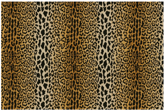
The table and chairs are staying but I’m having the chairs reupholstered in my favourite Braemore Jamil Natural Animal Velvet fabric. Honestly, I would cover my entire body in this fabric if I didn’t think my cat Meisha would get jealous.
The flooring will be completely replaced with like-for-like pine stained in a dark colour – the same as we did in both the office and the living room (eventually the whole house will have matching floors once we get around to it! More projects to add to the to-do list). As much as I’d love to keep the flooring in here and restore it, there are just too many boards that are a complete mess and it’s like a patchwork quilt of where boards have already been replaced (and subsequently trashed) – it’s not pretty.
The fireplace mantle will be repainted black and we’ll be tiling inside with marble tiles. I am still waiting for some tile samples at the moment before I make a decision but that’s the plan.
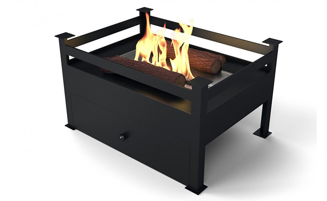
The existing hearth will be removed and a new one put in. We’re also looking at getting a little biofuel fireplace for in here as well to add some extra warmth to the space. I love how simple this design is but more on that later!
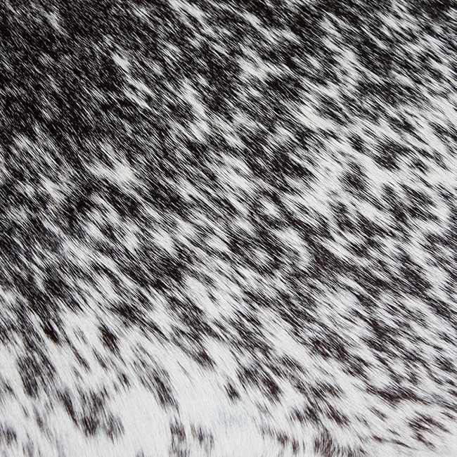
The rug will be a cowhide from Hide & Seek London – I adore my cowhides because they are so indestructible – I have one in the living room and one in my dressing room and I adore them both and with 3 mental animals running around our house, I need something that can withstand a bit more than the previous one in here!
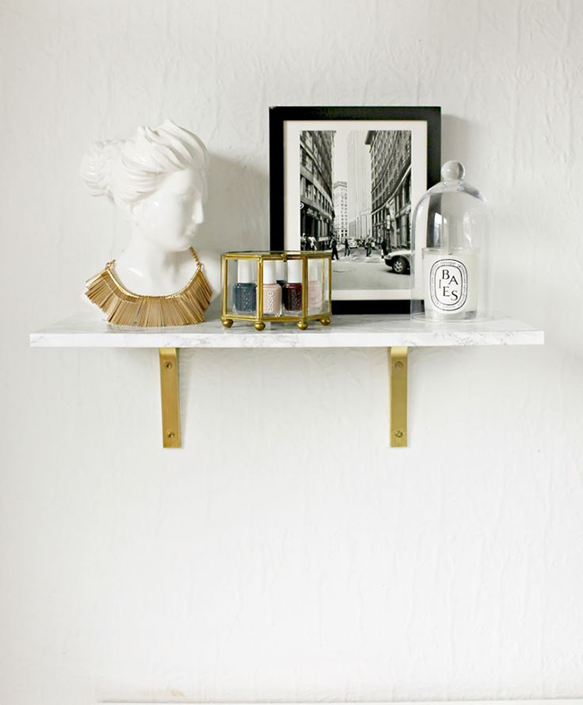
A bit of shelving will be going in as well – probably a DIY for that one seeing how amazing this one from my style sista Shannon’s came out above!
We’re going to be panelling the walls as I discussed in this post and the artwork was discussed in this post. As you can see, Marie by Gina Julian has got pride of place naturally.
The light fixture is staying too – gotta make the most of what I already have, right?
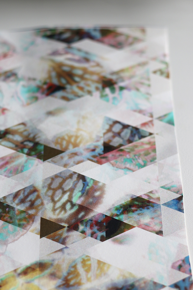
And finally the wallpaper – a really graphic brand spankin’ new pattern from Eades Bespoke. It has just the most beautiful colours with what appears to be digital prints of butterfly wings. Oh my god.
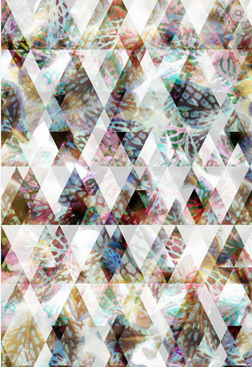
Again, more on this later but it picks up the other colours in the space and the splash of animal print so well and I’m absolutely thrilled that I loved the sample in person as much as I did on the screen!
For the other walls… This is the wall where the TV is currently (the real wall is not as long as my mockup but you get the idea anyway).
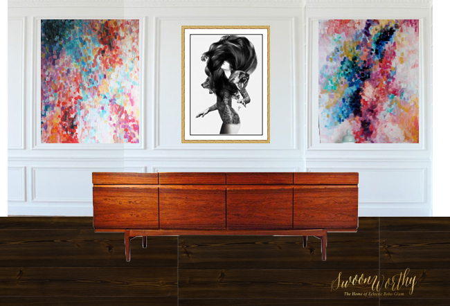
The artwork will be the star here but I want a mid-century low-lying sideboard in a really simple design like this one. I haven’t found the magic ‘beautiful but within my budget’ sideboard just yet but it’s on the list so the one you see here is just a stand in.
And for the 3rd wall where the black console is currently between the two doors on that wall…
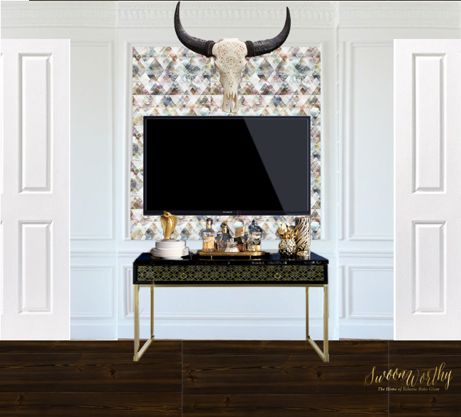
I’m considering using the same wallpaper in the panel that will be directly behind the TV – I’m not sure of this one yet and I may not include it so we’ll see. The console table is staying as well but I think my cow skull will go above it. Again, this isn’t necessarily to scale and the ceiling is actually a bit higher than what it looks like here but hopefully you get the idea.
Again, I’ll be going into a little more detail as the project unfolds on all of this – super exciting and I can’t wait!!
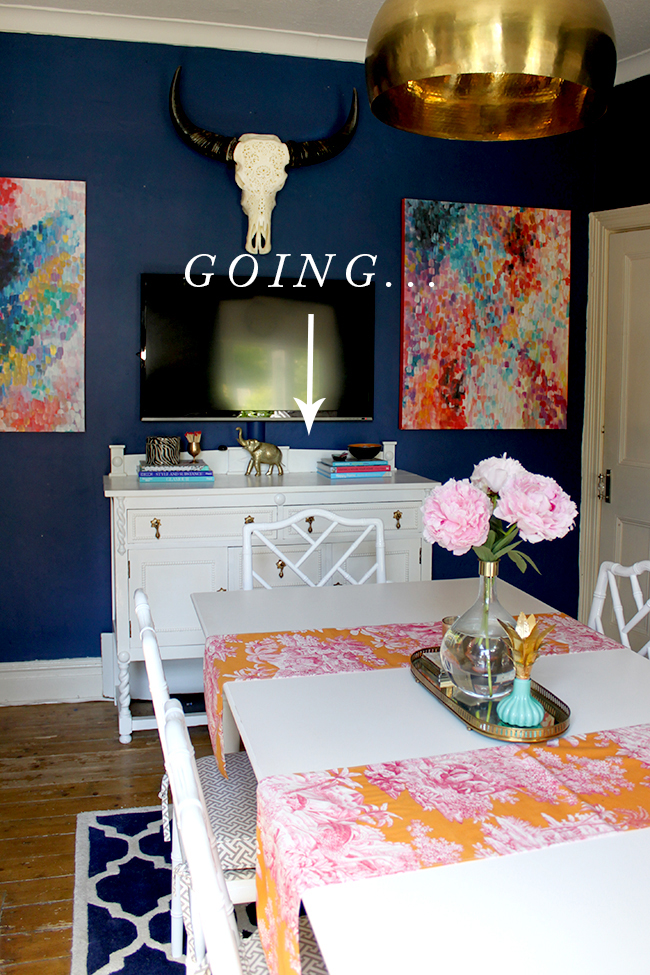
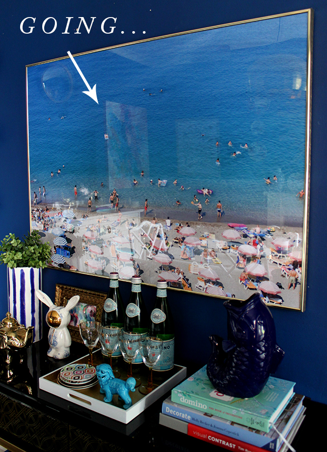
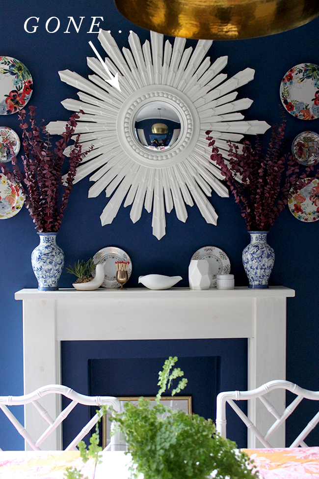
Soooooo… that means that the current white sideboard is going, my beautiful white sunburst mirror is going (I have no where else in my home to put it!) and I’m letting go of the beach print too. If you are local to me and want to make me an offer on any one of these, leave a comment below! Otherwise, they’ll be listed soon on eBay.
We will be starting work the first week in February – it’s my birthday next week and my MIL’s birthday 2 days before that and we’ll be going out for dinner and also seeing a show later that week so it’ll be too busy to be ripping up flooring! But the week after is the week the chaos shall begin! HAPPY BIRTHDAY TO ME!!
I’ll be dropping the chairs at the upholsterer’s as soon as I get the fabric in and we need to order the floorboards soon. It’s going to be CAH-RAY-ZEE because this is the middle room in our home and basically connects the living room with the kitchen and not being able to use the floors in here for a bit should be fun! Wish me luck!
Anyway, what do you think of the new look? Ready to join me for a big ol’ remodel? I’m almost afraid to hear your responses!! I shall sit here now with my hands over my eyes waiting for your comments.

















So, so YOU!!! You know me, I could never in a million years live with decor like that, but I totally love it in your house and it so suits your personality. And big ‘yay’ for lighter colours!!! I’ll have to come back up for a visit once it’s all done ;-) x
Yay! Thanks darling!! Mwah xxx
It’s beautiful!!! It’s fresh and light and sparkly, and still so the style we all love from you. What a treat to see the same space interpreted 2 different ways. I can’t wait to see the finished product!
Aww thank you so much Shannon! So happy you think it still looks like me! Ha! xxx
that wallpaper is FREAKING AMAZING!!! Fact.
Love it!
Haha! It’s pretty fabulous, so excited to use it! xxx
WHOOP!! Yes, yes yes, you’ve absolutely SMASHED it! I just love it – it’s going to be amaaaaazing!
XXX
P.S I really really want a biofuel fire in our living room too!
Awww thank you darling!! Yay Biaca Approved ™!! Whoop! The little fireplace was a bit of an afterthought but thought it might be nice to warm up the place :D xx
Omg it’s going to be amazing! I never comment on blogs I know I should but this design is worth huge praise, I also can’t bear thought of you sitting waiting for someone to post a positive. I adore that wallpaper simply stunning but subtle shades, so unique it’s hard to find wallpaper that hasn’t already been done to death. Love animal print especially leopard and all the glam factor that’s happening in this room. The wallpaper behind the tv I say go for it. The art is going to make the room. I’m intrigued about the fire and fireplace tile choices.. I cannot wait to see this all together, thank you for sharing and good luck with the whole process, I will be following along for sure…
Awww CJ, THANK YOU for deciding to comment – you are such a star and your comment made me smile! So pleased you’re coming along for the ride ;) xxx
Blimey missus, it’s gorgeous.
A hot tip here – I know where to get really good low mid century sideboards in Manchester at a decent price? Can I add to comments here? Not sure if I can advertise? It’s not my business by the way!
If you wanna know – let me know. I love it, really different but still boho and definitely glam.
Thanks darling! Ooooh!! Yes please if you’ve got an insider scoop, I’d love to know! Post away! ;) xx
Oh no, not the beach print … *cries*
Hahaha! I know, I know, I just have no where to put it and I have so much stuff, something has to go ;) xxx
Was so overwhelmed by the beach print tragedy, I forgot to say how great everything is going to look, ESPECIALLY THE WALLPAPER WHICH IS AMAZING!
Hahahaha!! I was thinking, ‘Oh dear, she hates it!’ LOL! Aww thanks lovely – I know that wallpaper is INTENSE. Can’t wait. xxx
Love love love it!
Yay!! Thank you Nadine! Mwah! xxx
I love the design it’s beautiful, that wallpaper is fab :) also I live local ( well Warrington so not too far lol) and would love the mirror I’ve been trying to get one for a long time but most have been out of my price range, how much would you like for it? x
Aww thanks Gemma! I will drop you an email! xxx
Okay thank you :) xxx
God that wallpaper is stunning! And I of course am a big fan of the diy marble shelves ;)
Whoop! Sticky back plastic to the rescue! Ha! xxx
I totally love it! Great selection of artwork and pattern. But that framed beach scene..going? I’d give it a good home!!!!
http://www.sophierobinson.co.uk/
Aww thanks so much Sophie! It’s still available if you are interested! Let me know, I’ll just need to get a cost for shipping for you! ;) xx
Noooo!!! The blue walls ?. Lol. I adore your dining room as is, but your design is spot on you! Love the new artwork and the wallpaper is amazeballs! Can’t wait to see the room at the end. :)
Hahaha! I know, I know!! I’m so sorry ;) So pleased you like the design anyway! Yay! xx
Ooh, I love it! It is so different but equally wonderful. That wallpaper is officially the most beautiful wallpaper ever.
How do you do these amazing room mockups? Are you just superawesome with photoshop or is there another programme you use?
Also, was totally after the mirror and I’m just over the Pennines in Huddersfield, but Gemma has saved me from myself (and my fiance’s wrath at me buying more home decor!) :-) (But seriously, if she decides not to take it, me me me please!)x
Aww thank you Anna! So pleased you like it! Oh it’s just Photoshop and believe me, it’s not all that great – ha! Aww I’m so sorry but the mirror is now sold – Gemma has scooped it up! xxx
STUNNING! Can’t wait to see it all come together x
Yay! Thank you Rebecca, so happy you like it! Mwah! xxx
Oh Kimberly it is just beautiful, every single bit. I can see why you couldn’t wait to share (and don’t think we could really forgive you for holding off showing your fabulous plans anyway!). Best of luck with all the work, and HAPPY BIRTHDAY!! xx
Aww thanks Molly! So pleased you like it and thank you so much for the birthday wishes! Mwah! xxx
Oh my, WOW! I am so excited. Your room vision boards look great and the change looks refreshing…this is a new direction for you but yet, it is very much cohesive with what you already have going on in the rest of your home.
Yay! Thanks Jessica – that’s really what I was hoping for and you said it so nicely. I want it to be different but also still look cohesive to the rest of the house so it’s great you feel it does! Rah! xxx
Its gonna look SO good friend. Im dying overnall the millwork youre adding to the walls and that wallpaper is gonna be bananas good!
Yay! Thank you lovely lady! I’m so excited to get started on it and yes, that wallpaper is just so crazy gorgeous, isn’t it? Whoop!xxx
One word – fabulous! Can’t wait to follow this transformation.
LOVE. IT. Cannot wait to watch it unfold! You have created a very different space with some of the same pieces, and yet still a very bold space. Wish I was not across the pond…would love to have the sideboard and mirror. Oh, well, some other lucky soul will get them! Happy early birthday. You rock woman!
Wow, I *love* that wallpaper! Your dark walls are nice, but the new scheme looks fab. Good luck with all the work.
Woohoo! This is gonna be good! I can’t wait!!!
It’s going to look fabulous Kimberly. I LOVE the wallpaper! And I love that you are so unafraid of change. Go Girl! x
Oh my. It’s going to be a stunner. But we already knew that, of course ;) I am in LOVE with that cow hide and am now on a mission to find somewhere I can shoehorn one into my teeny victorian terrace home. The artwork is spot on and will work amazingly well with the wallpaper. So excited to see this come to fruition!
Looks wonderful Kimberly. Love the old look too xx
Hi Kimberley, l’m really keen to buy your mirror and I live in Cheadle Heath.
I realise there’s someone else interested too but please keep me in mind as your ‘fallback’.
I can pop round immediately with the cash.
Will be closely looking out for your dining room reveal.
You are such an inspiration!
Hi Yvonne, I’m so sorry but Gemma has already snapped it up! Thanks so much though, you are too lovely!! Mwah! xxx
Hi Kimberley, thanks for getting back to me. I hope Gemma loves her new mirror. X
What an amazing room it will be. I love it all. Have fun doing it and Happy Birthday!
Loving your work darling!! So cohesive and luxurious. Would love the beach print but have noticed the legend that is Sophie Robinson has beaten me to it….!
Aww thank you my dear! At this point, nothing is confirmed with Sophie so I can put you on my list of interested peeps if you like? xxx
Please do! xxx
Will do!! :D xx
I total agree with what as aready been said, its going to look stunning. Happy birthday for next week Kimberly xxx
It’s ok I guess…. IT’S GOWJUS!!!
Aren’t you clever with all those mock ups. You can totally see how it all works. Oh and I hope you find your perfect sideboard ;)
So… if you’re starting first week in Feb…. are you postponing your trip tut Leeds? Have I been dumped for bloomin wallpaper?? Ha xx
Aww thanks so much my dear!! THANK YOU for the shoutout for the perfect sideboard – I can’t wait to get it now ;) As for the visit, no plans on postponing it if you’re still up for it! We’ll be doing most of the heavy work at the weekend so there’s probably not much I need to plan on ;) I’ll drop you a message! Mwah! xx
Good lord woman, you are amazing!! I absolutely love this. I was disappointed to learn that the blue was going but I knew you would be replacing it with something equally fantastical and your new design does not disappoint! You are so talented and those mock ups are very clever.
How bizarre! I LOVE your existing dining room but after viewing your new design and scrolling down to current photos I practically sighed and thought ‘Urgh’!! So I’d say that’s a big fat YES to the new room!! Love the wall paper and how the prints work together :-)
Kimbo – I am so excited about this!! Can’t wait to see it all develop before our eyes! I do love the blue, but you’ve gotta have a change every now and then – all part of the fun, and this is going to be aaaamazing! xx
Kimberly, I think the room is going to be amazing!!! However,I am still trying to figure out which one of us loves animal print the most. lol!
My motto “Every room needs a little animal print”. I can’t wait to see the reveal, and yes I am ready to join you for “a big ole remodel”. Have a GREAT weekend!
Oh YAAAASSSSS! So freakin good
Yes. Yes. Yes to all of it – bravo lady, it’s going to look perfect – and who doesn’t look a good refresh every now and again?!
who doesn’t *like* obvs… :)
OMG I love it! The wallpaper is so cool and it’s fantastic to actually visualise the design in the way you’ve put it together. I can’t wait to see the progress on this, it’s going to be fabaroony!
Been a bit slow on the uptake here, but just to say that I LOVE the wallpaper you’ve gone for. Totally smashing! And big yes to the cowhide from Hide and Seek London. it’s gonna be fab x
The wallpaper, the panelling, the artwork, the fireplace, the FLOOR (I adore the flooring upstairs) and them shelves … Oh Kimberly. I’m having rather inappropriate feelings towards your dining room. I just can’t. Oh I cannot wait to see it in progress!!!!! HURRY UP ALREADY!!!! ;)
So sad the blue walls are going too but my God I love everything about this look, Kim! The simple fireplace, the marble shelves, the wallpaper… Wow. I’m literally wishing my life to hurry up so I can see the finished result.
Love your style xx
Hi, do you remember where you bought your beach print from or the photographer? Thanks