You may recall my recent post with regard the changes I wanted to make to the kitchen and the subsequent dilemma I was facing with related changes in the dining room. At that point, I genuinely had no clue which way I was going to go. I adored all the comments I received on the post with everyone weighing in with their thoughts and it was so fantastic that so many of you had an opinion – I genuinely love it when you guys pipe up about stuff because it always gives me things to think about and I had to laugh at all the comments that shared your own crazy thoughts when decorating! #thestruggleisreal
You can still catch up here on that dilemma.
There were loads of you who felt I should go with the deep emerald green although many others said the berry was more your jam (heh – jam/berry – GET IT) and still a few others who felt I should leave it as it was – in the deep blue I had originally painted it.
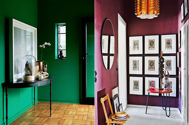
Here’s one thing at that time I’d not yet considered – the opinion of the man I live with. Hmm. Oh yeah, that would probably help, right? And so I asked Wayne to read my post (yes, he tends to only look at the pictures, cheeky thing that he is) and give me his thoughts. And guess what he said? He didn’t like the emerald at all. He felt it would be way too much green and he would get tired of it. On the other hand, he actually quite liked the berry colour. Well, that does help sway things in a very certain direction, doesn’t it?
See, here’s the thing: If I really wanted it and I really pressed it, I know he probably would relent and let me go with emerald even if he didn’t really like it. He might have even learned to like it in time but I know from experience that going with something he REALLY doesn’t like in a room he spends a lot of time in is just a recipe for a lot of moaning in the future. He lives in this house too so I want to make him happy and I want him to feel like he has some say in the way I decorate our home.
So, that said, emerald is officially out and berry is in. Once this decision was made, I at least had a bit of a direction to go, although I wasn’t entirely certain what changes I wanted to make. Cut to us going to Edinburgh this past weekend (more about that on Friday)… The funny thing is, I forget at times that when I am away from the distractions of regular life, I become a lot more susceptible to creativity. I learn to pay attention to my surroundings, to let the sights and sounds of a new location influence and inspire me. Travel is always one thing that people say inspires them and I’m no different in saying the same. It really is such an amazing way to allow yourself to breathe mentally and emotionally and I think when it came to this room, I needed that.
I woke up in the very early hours of Sunday morning in our hotel room and suddenly I thought, ‘What if Kelly Wearstler designed a British pub?’
I know, my mind works in strange ways when it’s half asleep. But at that point, it all sort of came together. Inspiration really can come from anywhere.
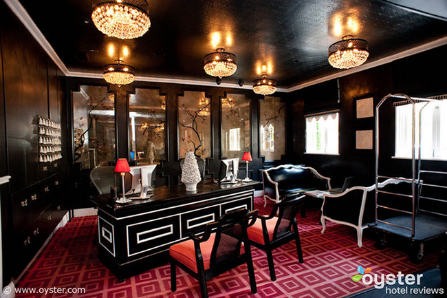
Kelly Wearstler design via Oyster
Now if you’ve been reading me for any length of time, you’ll know I’m a big Kelly Wearstler fan. She’s bold and glam and isn’t afraid to take some chances. Loud patterns, black, gold, luxurious fabrics and dramatic finishes is her thing and well, I love that look. (She does use a lot of green but let’s ignore that fact just for now.)
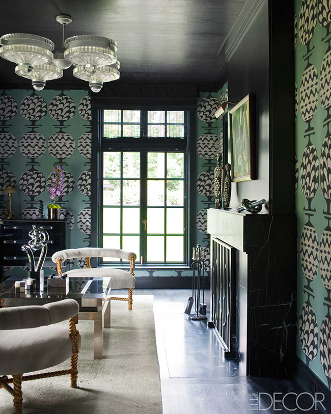
Kelly Wearstler design via asid
At the same time, I wanted it to be a cosy space. One that we felt nestled in and secure and not ostentatiously grand, something that felt intimate on dark nights. Like the cosy pubs we’d visited when we were in Edinburgh with dark wall colours and flickering candle light that just made you want to sit around, sipping whisky cocktails and laughing all night.
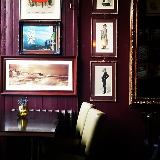
Whiski Rooms Edinburgh via my Instagram
Here’s the colour palette I came up with.
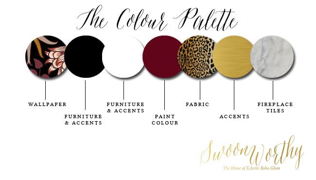
Let’s talk about the fabric choice first. One thing I knew I wanted to do was to recover the side chairs on my dining table. They hadn’t been done since I’d first got the chairs over 3 years ago and the existing fabric is worn and looking rather sad now and it doesn’t really go very well with anything. Even before I decided to change the wall colour, I’ve been considering reupholstering them in Jamil fabric – the fabulous velvety leopard print that I love so much.
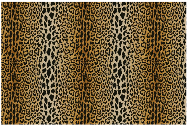
I figured, while I was at it, I might as well do the end chairs as well to work better with the final design. Upholstering them all will probably cost me around £150-£175 (I know a guy in Stockport who is brilliant and really reasonably priced) and I know I can get the fabric for around £30/yard direct from the US so it won’t be cheap but won’t cost the earth either.
The rug will need replacing anyway (Quito has destroyed my blue one) and so I’m considering getting a hard-wearing seagrass or jute rug to add texture and then layer a black cowhide rug on top – I have two cowhides already and I know they are practically indestructible and the glossy sheen on top of that seagrass will be practical as well as give a bit of a luxury look.
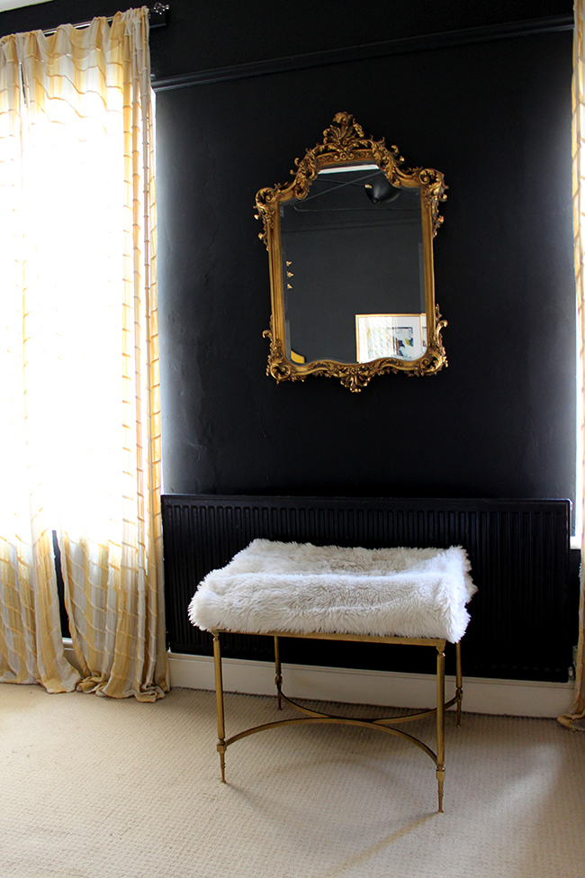
I’m also considering swapping the mirror as well. I know I get a lot of love for my sunburst mirrors so I’m thinking about moving the sunburst elsewhere (or doing a straight swap) and moving the French Rococo-inspired gold mirror from my bedroom (seen below) above the fireplace. I’ll then be painting the fireplace mantle from white to black.
Speaking of the fireplace, I also would like to tile the inside with marble – giving that little bit of luxury to that spot in the room. That black and white will set off the white table and chairs nicely as well as bring in the black and gold console table that I already have. And if I end up using the marble tiles in the kitchen, it’ll pull in the marble look there as well.
Now you know how much I love wallpaper and I fell hard for House of Hackney’s new William Morris collaboration. The Hyacinth Wallpaper could be just the thing to add a touch of WOW in a floral pattern to the scheme on one of the walls. I’m considering papering the wall where the TV will move to (where the black console table is now) or I may do the wall where the TV is now or I might do the chimney breast. I’m not 100% sure yet but I do know that I would like a wallpaper somewhere and I like that this one has a bit of that ‘British pub’ vibe to it but a little more of a glam take on it.
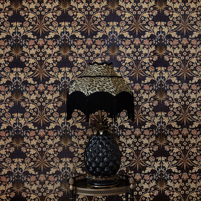
(If I had a ‘no holds barred’ kind of budget, I’d opt for this instead – alas, my budget will not stretch that far but seriously, folks, this is crazy good.)
As for artwork, I’m undecided at this point. I would love something dramatic and eye catching and I ADORE Angel 4 by Zena Holloway but $775 (Canadian) plus shipping, it’ll likely be wayyyyy too much. But one can dream. This is the sort of look I’d like however so I included it in my moodboard anyway. Citizen Atelier, you are killing me for reals.

And finally, I would like to replace our sideboard with something antique, in wood, possibly curvy and possibly French. No decisions really made on that one yet so I’ve not included it on the moodboard below.
So anyway, this is basically what the very rough draft of the moodboard is looking like for now!
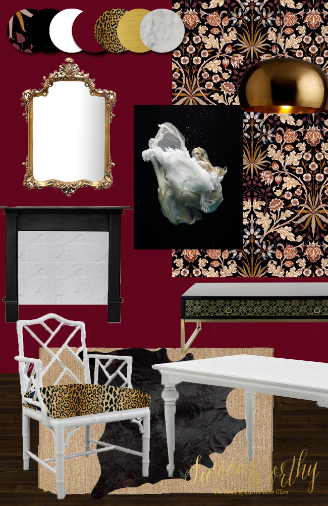
I’m obviously going to try to work with what I have the best I can to keep costs down and all these changes will take some time to execute. I’m taking comfort in the fact that I was able to completely transform the look of the living room simply by making some incremental small changes and my hope is that I’ll be able to do something similar in here.
So that’s basically my take on if Kelly Wearstler designed a British pub (with a tiny budget)! Ha!
As for the plans for the kitchen, well, at least the dining room has a direction so that will help to make things a little easier but I’m only at the point right now of getting some pricing on different tile and worktop options that I’m considering so it’s all very early days at this point. I may now end up going with black lower cabinets instead of berry ones – no real decisions have been made yet! I’ll let you know what I come up with when I’ve got all that in order!
What do you think of the dining room plans so far? Are you disappointed I’m not using the emerald? Ever have your other half thwart your plans and have to take a different direction? Ever think about what a British pub would look like if Kelly Wearstler got her hands on it? I’d love to hear your thoughts!












Oooooohhh love this. I must admit it only really came together for me when I saw the mood board, which is amazing. I didn’t know whether to plump for the emerald or the berry, as I liked them both. Good job you asked Wayne though (I sometimes forget to do that too…). Now you’ve pulled it together it’s gorgeous!
My best trick re the other half is usually only show him things I already like, and give him a choice of 2 or 3 things. Then I go for the one I like anyway and say it’s cheaper…usually works. Thinking about it, he has vetoed a few things and put his foot down (like the Habitat lamp) but for the most part, I don’t think he cares?
Aww thanks! Yes sometimes it takes a moodboard for ME to visualise what it’s going to look like (kinda) but I’m happy you like it! And yeah, Wayne doesn’t *really* care but if he puts his foot down, I sort of tend to listen ;) xxx
I love the look you have put together – very glam/burlesque. I like the sense you have of wanting that intimacy and bit of “olde” world decadence. I particularly love the paint colour – so warm and over the top.And of course I could leopard skin fabric/prints etc everywhere – design classics, I think.
The only practical thing I would add is the cowhide under the table on top of another rug – table wobble? Also although the sheen of the hide is great, I find they lose hair – and at a table people tend to rub their feet while talking and dining, thus stripping your hide and making a mess. I use my hides only in low traffic areas. Or for picnics – they can get wet, work really well.
Aww cheers Natalie! Hell to the yeah with the leopard print – it’s a neutral right? ;) Not sure about the cowhide, they tend to be quite thin so I guess I will see when I get it if it means things might wobble – this is really just a rough draft so things may change but if it’s an issue, I’ll do something different :) I never thought of using a cowhide for a picnic blanket – such a good idea! xxx
I do think the leopard print is a neutral – if you have ever been to a game reserve a leopard disappears into the foliage – too weird. So it never clashes with anything, but rather blends really well. It also creates depth and texture and richness. I love it. x
Oh I agree completely! It marries up well with pretty much anything – that’s probably why it’s all over my home! ;) I love it too :D xxx
It’s a little spooky as I meant to come back and ask if you had seen cameron Diaz’ kitchen which I think was designed by the designer you mentioned – had no idea you liked but it isn’t a suprise either because of the glam look. I preferred the emerald but now I like the berry more, the way you’ve got different layers of pattern. I think black cabinets would look great (not a fan of blue and berry but that’s just a personal thing unless there were intermediary colours to bridge like purple). It sounds like it will have a nice feel to it a la pub. Love the idea of a big striking photo.
Ahh yes Cameron Diaz’ kitchen is AMAZING and yep, that’s a Kelly Wearstler design as well – she’s just so good. So pleased you were swayed by the berry tones! I considered black for the cabinets before but didn’t think they would work – so they are back in the running now with this design. Could happen, I’ll just have to see ;) xx
I absolutely love it and I am so very glad you are going with the berry instead of emerald. I like green, but I like it best in accents. The berry will be gorgeous and that wallpaper is wonderful.
Yay! Thanks Sheran, happy you like it! xxx
Ha! Loving the train of thought here with Kelly Wearstler designing a British pub. Perhaps she will get wind of this and accept the challenge. But I do love your glam twist on a pub. The berry/jam color will definitely cozy up the space a little more than emerald, I think. Can’t wait to see the end result!
Thanks so much Michelle – weird where inspiration can come from ;) xxx
I really love your moodboard. It’ll be so good…. can’t wait.
I’m a big fan of Kelly Weartler as well and I’m trying to inject some of her magic at my end, but husband is very opinionated – walls must be white. What can I do? He is paying the bills..
Love your work.
xoxo
Hahaha! Hubbies have a tendency to put a bit of a spanner in the works, eh? And white walls could be great – I actually considered it in here for a bit but realised the white table/chairs would just get lost! Thanks so much lovely! xxx
Wow! Some fabulous choices.. loving your mood board. Very glam, very maximalist – totally my style too and I’m sure Kelly would most definitely approve. Must mention the wallpaper, how inspired of House of Hackney to collaborate with William Morris? I’m going to check that out now. Genius! I love your choice, it’s a statement, but beautiful.
In terms of the green / berry debate, have to admit, my preference would be green, but berry is lovely too and will look fab with the wallpaper.
Julia xx
Aww thanks so much Julia! I know I was sort of bending towards green but well, I have to work with what I’ve got – in this case, a partner who hates green lol Nevermind, I’m pretty excited about the design! xxx
Some pretty amazing choice’s there, and i love what you have put together. I do really like the sound of black lower units and with all hour god pieces it will blend in beautifully. I can’t believe i’m getting giddy over somebody else’s decorating lol xxx
Hahaha! Your comments ALWAYS make me smile, Pauline! Thanks hun, I’m pretty giddy myself here! ;) xxx
Ohhh … I’m excited about this! The berry, black, gold, marble, leopard … yum. And I think WWKWD (What would Kelly Wearstler do?) should be a common mantra in decorating.
Hell yeah!! We should all get wristbands with WWKWD on them I think… xxx
As usual, you came up with the winning combination! I love that you have an idea but then aren’t stuck in it, so that you can let it flow into what you eventually decide. I think too often many of us, myself included, get so set on an idea that we argue for it and don’t let ourselves see the other possibilities. Keeping Wayne in mind is a definite requirement. I like to tell my other half what I’m thinking once I have a solid idea, that way it percolates in his brain awhile. That’s always better than just springing it on him when I’m ready to do it. He needs time to adjust :) But I would never do anything he hated, no matter what. Can’t wait to see how this all comes together. Oh, and I think black bottom cabinets would look awesome!
Thanks so much Lynne and yeah, I’ve been hinting around the different ideas with Wayne for a while but it’s always good to know if he hates something. I’d be repainting it AGAIN if I’d gone with the emerald sadly ;) So hopefully if he likes it too, I can keep it this way for a bit… until inspiration strikes again! Ha! xxx
Wow. That art is a killer! Love your colour palette. Can’t wait to see the result!!xxx
Thanks darling! I’m quite excited to get started on this one! xxx
Sorry me again. I pressed the submit button too early! Anyway. Regarding the art have you heard of Lucie Drlikova? I wrote about her artwork http://karolinabarnes.co.uk/blog/fine-art-photography-as-colour-source/ and she sells prints as well. She’s based in Miami but originally from Czech Republic (we, Czechs, are so talented!!- haha, only kidding!!). Might be cheaper.xx
Oh she’s amazing!! Love her work – THANK YOU! Do you know where she sells her work? I clicked on ‘prints’ but nothing comes up! This one could work well! http://www.luciedrlikova.com/photography-underwater-women-669/
Eeek! Going to look through her site now and get lost in it – you’re a star ;) xxx
It seems like we share the same taste for art!! I discovered her in a bookshop in Prague where they were selling her posters (which I used in my bedroom project over there) and her calendar. It was back in August and her site had some prints for sale so I don’t know why she hasn’t got any now. I’m going to Prague at the end of October so I can go back and check whether they have the black one you like. xx
Oh that would be AMAZING. I would need a large size and that scares me of course because I just think £££££ but perhaps her prints aren’t that dear? That would be fabulous, thank you, hun!! xx
This is going to be amazing! I love how your colour palette looks – I am so excited to see this come together! I do really love the current blue, but seeing this change happening is going to be great!! Eeeek, can hardly wait! Our Alex is going to go crazy over it!!!!
xx
Aww thank you my dear! I can’t wait to get started on it – damn you budget!! I need to save a few quid before I can do anything! xx
I am so happy you chose the berry! I wonder how hard it will be to select the right ‘berry’ shade? The Whiskie Room has a delightful shade. I actually like the Hyacinth paper over the Primavera. So yay! Can’t wait to see the transformation.
Yay! And I know, I have a feeling I’m going to be going through a million swatches and paint pots to find the right colour *groan* But I’m itching to get started ;) xxx
I am sad about the emerald but then it is not my house and I don’t get a say! But I am loving the mood board.
Hahaha! I knew I’d disappoint by not going with the emerald (I was actually swaying towards it myself) but bless him, Wayne doesn’t often have a strong opinion so when he does, I tend to listen ;) xxx
I love it, glad to find so many other Kelly W fans in one place! And I just love layered rugs, you can’t beat some layered textures . i have 2 cowhide Ottomans at home and they’ve survived hot tea spillages, red wine and as many soggy biscuits as 3 small children can mash into them! They always come up as good as new with a damp cloth, so I think cowhide’s perfect for under a dining table. But then I would say that, wouldn’t I!?
Ha!! My cowhides have taken a serious beating (especially the white one in the living room) and it ALWAYS comes up looking like new! I love them (as you know) so hoping it’ll work in a dining room too ;) xxx
It’s gonna be fab Kimberly! I too, make all sorts of plans in my head and forget to consult my husband, who does trust me, but also has an opinion and has possibly stopped me from making some dreadful mistakes in the past. Not that emerald would have been a mistake, I was quite looking forward to seeing it, but you both need live in and love it. Queue seventy-thousand tester pots to find the perfect berry shade! Is that the Ilsa Crawford for Ikea seagrass rug? I have just bought it for my living room – it’s great value for the size and I’m also planning to layer something softer on top, just haven’t found ‘the one’ yet! X
Hahaha! At least I’m not the only one! I think the thing is, my mind is 10 steps ahead of his and so he feels like I’m ‘springing’ stuff on him when really I’ve been ruminating for months!! But yep, I am kind of dreading all the tester pots and swatches I’m going to have to do *sob* but I can’t wait to get started on this one. And yes it is the Ikea one! That’s great that you like it – I need to check sizes and get the cowhide first so we’ll see if I end up springing for it ;) xx
That moodboard is flipping epic, such skills :). I thought I was leaning towards the emerald green but bringing in the pub vibe with the berry red has me sold! Look forward to reading about the developments x
Yay! So pleased I was able to change your mind Lucy! Can’t wait to get started on it ;) xxx
It’s so unfair we have to consider the people we live with! Haha…joking sort of…hee hee. Ok, I have to say I think you worked it out beautifully! I adore the berry and the entire plan!!!! And I am so glad you are going with the Jamil on the chairs, that fabric is the end all be all right there and is neutral so it plays with all the colors. Seriously stunning! I also don’t think it’s weird to think what would KW do…that is a common question. Not sure what floor tile to pick WWKWD? Need to make up your mind on a bold color WWKWD? Also, I always think about how I would look in a room…weird right? Is that a tad too vain? Well, berry is your color and your beautifu face will looking radiant in that space :) You are going to SMASH IT!! XOXO
Ahh thank you! And thank you for the idea of the Jamil fabric – because I just think it’ll work SO well with this scheme :) And yes that’s weird that you think about how you would look in a room!! Hahaha! Although I admit to thinking the green cast of the walls may make one look a little ill – I notice that in my dressing room sometimes (or maybe it’s just me! LOL!) ;) You sweet thing you! So happy you like it! xxx
I was in the emerald camp, but I must say your mood boards are swaying me :) Love the leopard with the paint colour!
Yay! Happy to hear I just may have changed your mind, Linda ;) Leopard print is just EVERYTHING. xxx
Hi Kimberly, I’m afraid I’m going to throw a spanner in the works…sorry I love the William Morris wallpaper, he was a pioneer of the arts and crafts movement here in the England, love it! Love the colour of the walls, think it’s better than green, but one thing is slightly not right, and that’s the white table with the white bamboo chairs, which are very palm springs, Miami summer time…perhaps if they were painted a charcoal…the white stands out a little too much, and doesn’t work for me in your glam/intimate British pub inspired look, especially if you want to replace the sideboard with a more antique looking wooden one. Hope I’m not upsetting anyone with my opinion! Sharon x
Hahaha! You are allowed an opinion, it’s absolutely fine! ;) I am a big believer in eclectic design however and I do think that pretty much any piece can look right if you have the right accessories and accents around it so just because it’s a very Hollywood Regency look, it can work if there are other glam pieces around it and things in a similar colour way (which there will be). Obviously this mood board is just a tiny portion of the finished look so hopefully by the end, you’ll see the ‘pub’ part of the inspiration is just a tiny part of the whole design ;) xx
YESSSSS!!!!! I’m so excited to see this unfold! I was 100% on the green side of things, but then you shared your genius “Kelly Wearstler Pub” idea and I’m 100% on board with that! It’s going to be incredible!
Whoop!! So happy to hear that! I was genuinely leaning more towards emerald myself but well, things don’t always go to plan. But I’m excited to start this one now :D xx
Your moodboard looks amazing! I can’t wait for the result:)