I’ve been thinking about my bedside tables recently. I know that’s a bit of a weird thing to think about but sometimes I feel like little areas of my home need a bit of a shakeup. As I’ve said a million times before, the best way to give your space a bit of a refresh is just by swapping accessories from one room to another. It’s effortless and it’s easy and it doesn’t have to cost you a precious penny. So this week, I figured I’d have a bit of a play and create some different looks. You can call it ‘styling’ if you want – for me, I just call it faffing for fun.
Disclaimer: Please excuse our skanky rug in this room – it’s on the list of things we need to sort out and we’ll be completely removing it and refinishing the floors in here at some point. So until then, ugly skanky carpet remains. Sigh.
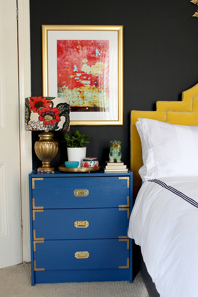
I created 3 different looks. Now obviously my bedside tables are pretty bold. They are bright blue and I have a bright yellow headboard and so that will dictate a bit in terms of what colours look right in the space. However, even if you have more subtle furniture than I do, I hope you can still take a few things from this post!

Look #1 – Boho Brights
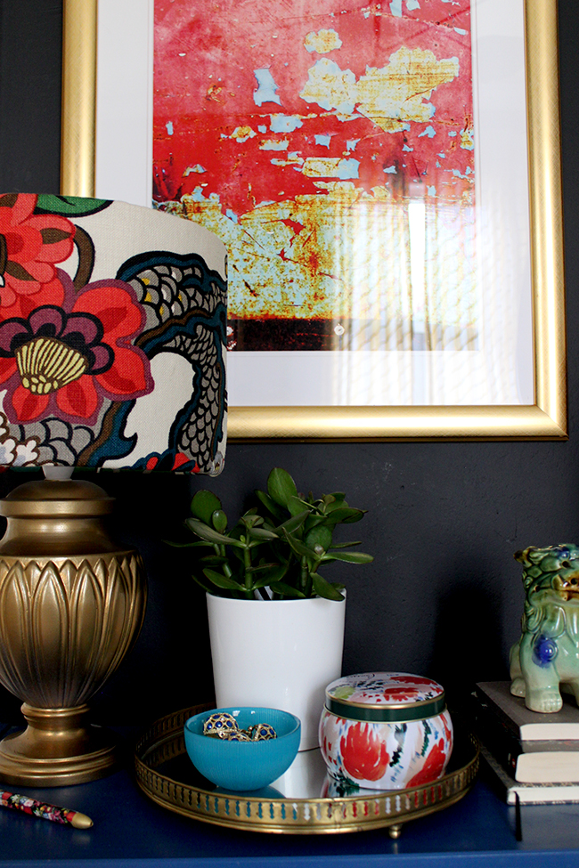
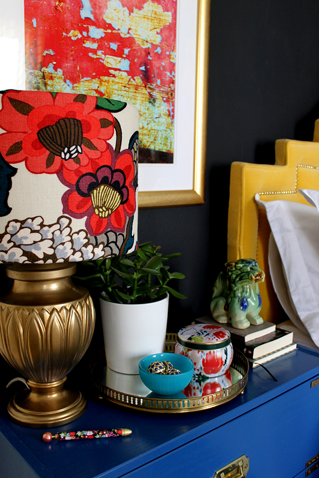
I have such colourful furniture in here so I figured for the first look, I’d just go with a bright bohemian look. My existing lampshades are covered with Chiang Mai Dragon fabric in Alabaster and I still love this pattern a good few years after I first spotted it. It just seems to tie in every bold colour scheme I can come up with!
I think every vignette needs a bit of plantlife so I chose this really cute succulent in a plain pot to add some life. A candle is also a must – I mean a bedroom can get pretty stuffy so it’s nice to have nice smelling things in here right? #keepingitreal
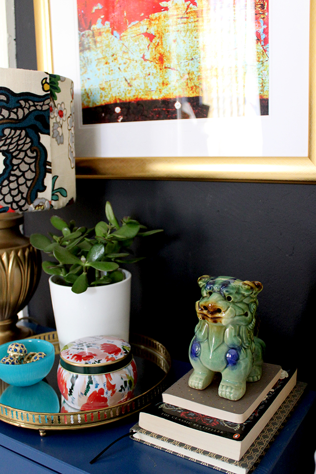
Also, I like to read when I get the chance so leaving some books on the bedside table always encourages me to switch off the phone or laptop and engross myself in a book. A notepad and pen is also handy to jot down your thoughts keep them from swimming around in your head when you’re trying to get to sleep!
I also really love that artwork in this space. I ‘stole’ it from the office but I’m now considering that I need some bigger artwork above my bedside tables because it just worked really well with the scale of the bed.
Look #2 – Natural Organic
For this one, I tried to keep things really free flowing, really organic. I love organic shapes – from the softness of that Maidenhair fern to the artwork to the curve of my vintage bowl, it all echoes the shapes we see in nature.
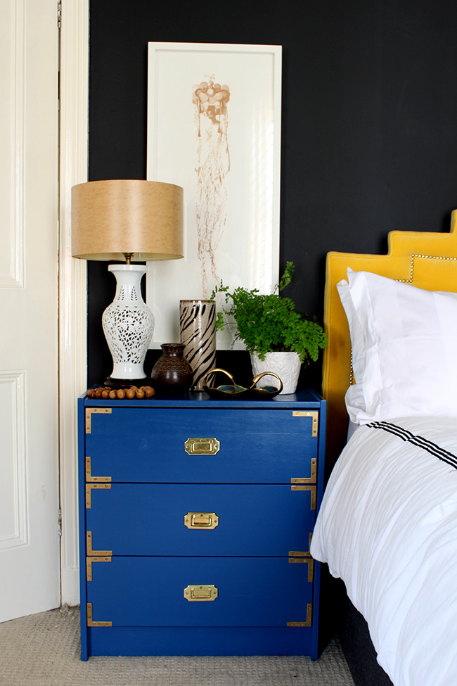
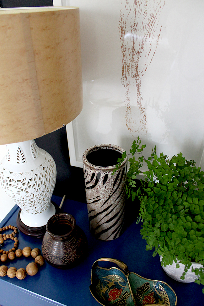
I resisted adding any colour in here – instead I played with pattern. I think layering patterns when they all fall into the same tight palette really pulls everything together and using neutrals makes it so much easier to do.
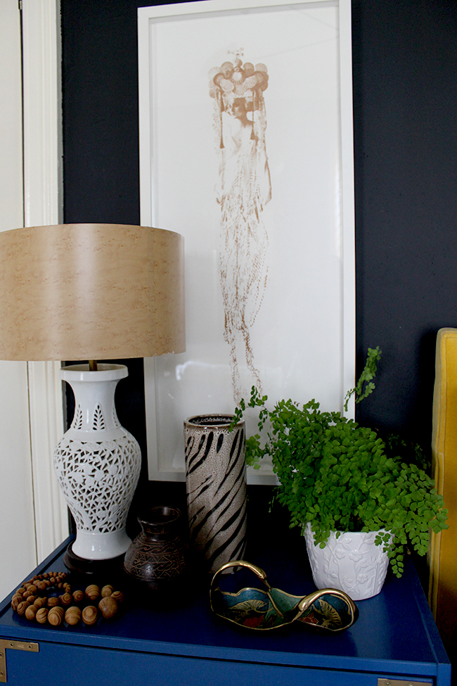
I think just much any bedside table vignette should have some kind of pretty bowl to leave your rings or earrings or everyday jewellery – it’s just convenient and looks cute.

Look #3 – Glamorous Vixen
Now of course, this final look is probably my favourite. It’s sexy with lots of black and gold and animal print – I mean, what is there not to like?
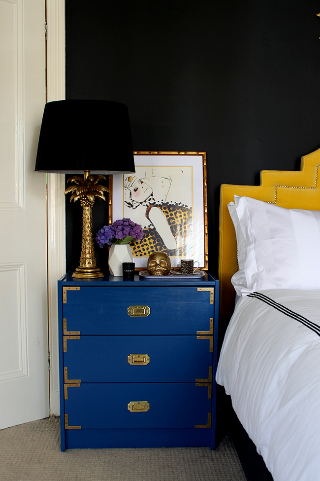
That sexy illustration really sets the mood here and so I decided to go with the black and gold theme by tying in a gold skull candle and that fabulous palm tree lamp. Glamtastic.
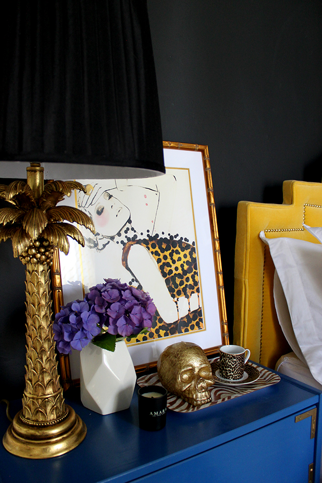
A pop of flowers is always welcome however to soften the scheme and a pretty espresso cup is always a nice reminder that your other half should probably greet you with a cup of coffee first thing in the morning before trying to talk to you (hint hint).
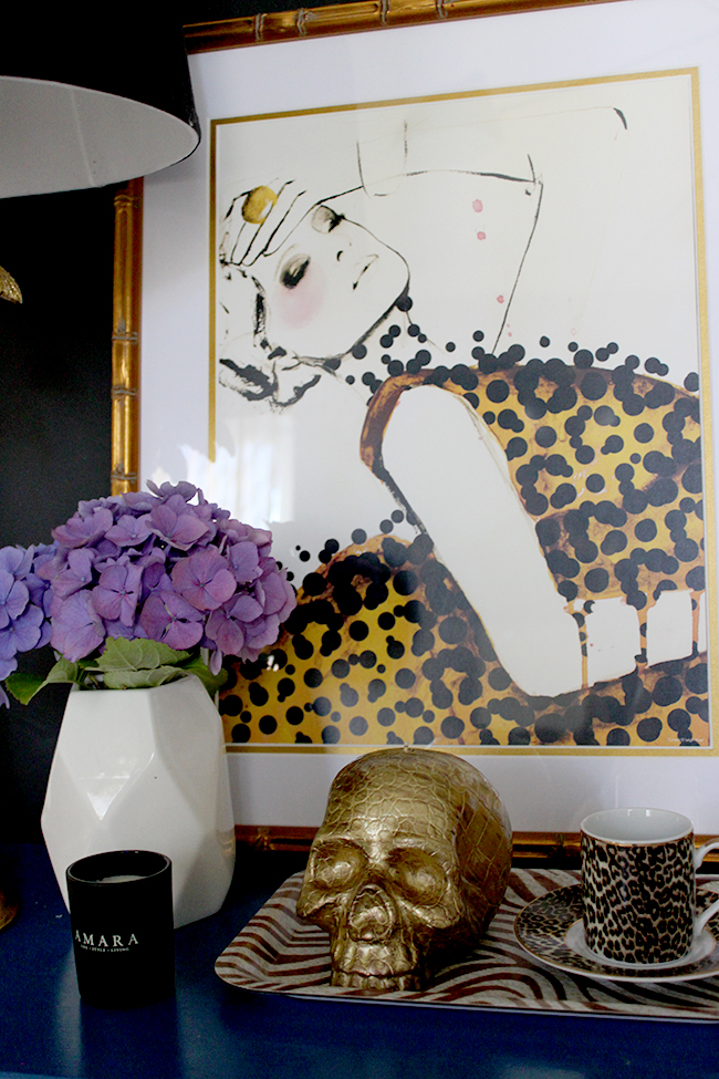
Again on the topic of mixing patterns, note the three different scales here – the largest scale in the artwork, then the medium scale in the tray and finally the small scale in the cup. If all the patterns were the same size, they’d be fighting each other – and fighting in the bedroom? Well, bedrooms should be for making up as far as I’m concerned! ;)
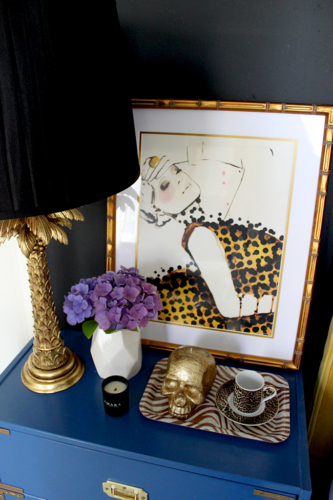
After that little exercise, I’m now thinking of moving the palm tree lamps in here, getting some bigger art for each side and throwing in a little animal print! Of course, once I decide for sure, I’ll let you know because it’ll probably be a combination of all three looks!
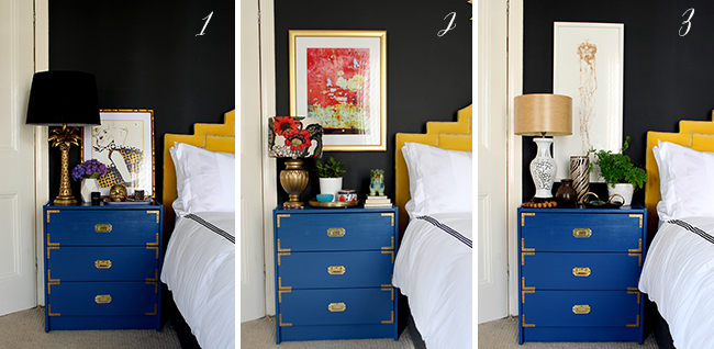
So those are my three different looks – tell me, which do you like best? The sexy vampy look? The bohemian bright look? Or the organic and natural look? I’d love to hear your thoughts!
Also, make sure you come back on Wednesday because there’s gonna be a fun little colourful challenge that you can take part in and I’d love for you to join me!













I like the last look best but even though I’m not a neutral type, the second look works very well.
Good morning, I think all three looks are amazing, but I love love love the last vignette. My motto “every room could use a little animal print”. Have a GREAT week!
Love them all, you are so good at this. My mood today says number 3 though.
Gorgeous vignettes, love them all! Can’t choose :-)
Glamorous vixen for me! I love the palm tree lamp! I have to have room on my bedside cabinet though for my glasses, alarm clock (getting up at 5.30am isn’t easy!)and a glass of water. x
OH! OH! It’s GOT to be the sexy vampy look for me. Skulls, hydrangeas, bold and black. Hell yes. It’s orglasmic. There’s a new one for the books! Hahahhaa ;)
xx
Has to be no. 2…that’s the one that resonates best with me and that I think echoes the mood you already have going on in that room. Love the bigger artwork above the bedside tables too.
Tough one. I like the subject matter in the art of #3 and the long rectangle over the chunky dresser I like the color of #2.
Hmmmm. And love the little swan dish too. Have fun with this. Your good at it!
Overall the natural/organic look is my favorite, just cos I like the shapes and the way the heights of the objects and the art all work together. I particularly love that tall thin art there. But that palm tree lamp, oh my…….
Love them all, but if i had to pick one then it would have to be glamorous vixen ,xxx
I too am torn. Love the palm tree lamp but I also love the tray in the bohemian look. Although I’m not fond of animal print (blasphemy, I know, sorry) I do dig a good foo lion/dog. So the bohemian look had more elements that I like. A combo sounds like a good idea, can’t wait to see!
Boho brights for me – gorgeous! (And I always get excited when I see that notebook – haha, I’m a loser!) Although, of course I love all the looks!
xx
Hahaha! It’s SUCH a good little styling prop that notebook! :D xxx
You my dear are a styling goddess. They are all fab, but #3 the art and scale totally win me over. xo
LOve your bedside drawers, where can I find similar.
Hi Hayley, thanks so much! It’s actually a DIY using the Ikea RAST chest of drawers. You can see more details here: http://www.swoonworthy.co.uk/2013/05/ikea-rast-hack-campaign-style-in-bedroom.html/
I actually resprayed them recently in black: http://www.swoonworthy.co.uk/2016/11/bedroom-reveal-transition-room-summer-winter.html/
Hope that helps! xx
All three designs are lovely. But placement of the lamps on the far side of the table doesn’t seem to make them practical for reading in bed. The light is too far from the bed. I’d have to reverse the arrangement.