One of my initial fears of having a white kitchen and then deciding against going for wood worktops (lots of discussion about my reasons for this in this post) was that the kitchen would end up lacking warmth. White cupboards, dark slate flooring and white walls could turn a kitchen very clinical very quickly and I was acutely aware of avoiding that situation.
One thing I did to counter this was adding a bit my favourite warm metal to the mix: brass and gold. The touches I have added (like the new cupboard handles and the sprayed utensil rails as well as all the touches of gold on my shelving) have gone a long way in getting some of that warmth back into the room and I really believe once the currently stainless steel lighting is changed out, it’ll help a lot.
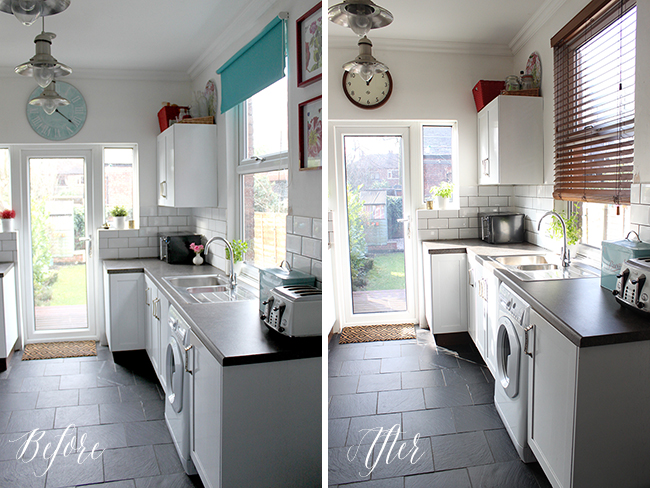
However, adding little touches of wood will do the same thing and this was my intention. As I’ve said in my previous posts about the kitchen, I was kind of ‘over’ all the turquoise in this room which I’d added about 3 years ago now and I wanted to bring different colours in to tie in with both the wallpaper in the shelving as well as the dining room.
That meant the pale turquoise clock and the blind had to go. So it was actually quite impressive timing that within days of making the decision to go with wood for both of those items, Newgate Clocks got in touch to see if I wanted to check out their famous wall clocks.
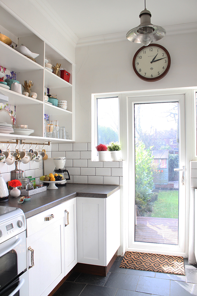
They have loads of different styles available from vintage to contemporary and everything in between and I dizzied myself for a while with all the considerations. But then I found this one – the Wimbledon wall clock which has a simple but slightly retro feel in a size that I knew would be perfect for the space.
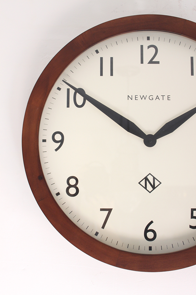
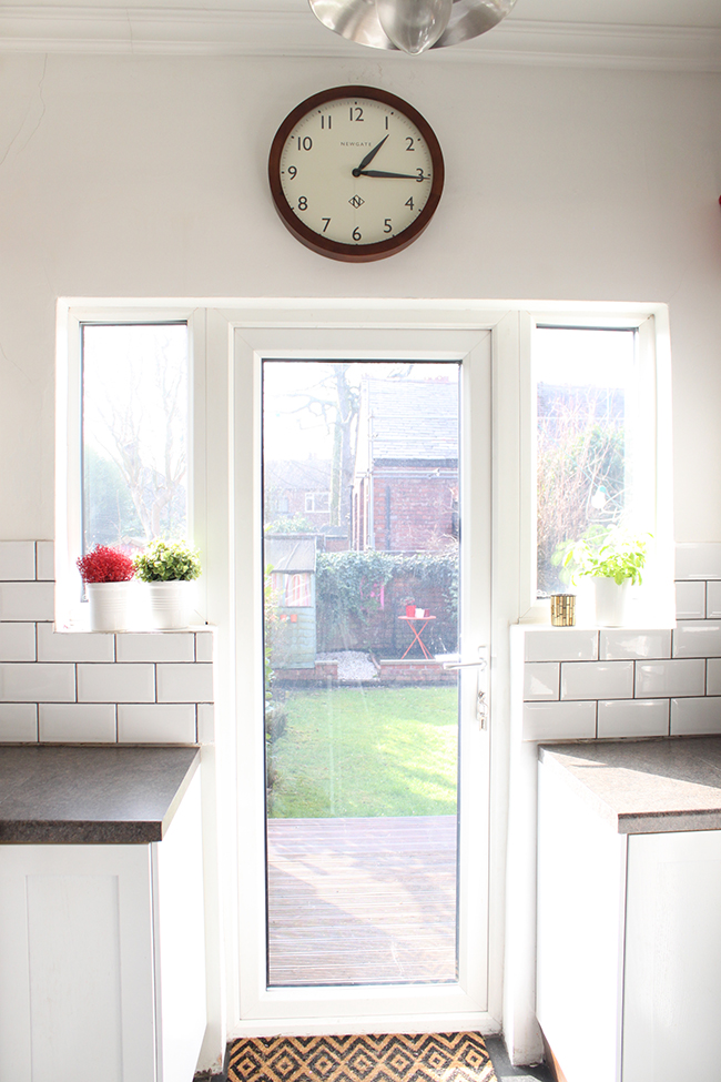
I really like the dark wood and the simple design as I think it adds to but doesn’t fight with anything else in the space. I imagine the clock will look even better combined with the brass lighting I hope to be getting in here at some point soon(ish)! I think the scale is better as well – I liked the old oversized one when I first got it but after a while I felt like it was looming too much into the space. This one just works so much better – it’s quieter stylistically but classically good looking as well. It’s the Cate Blanchette of clocks.
Now, the turquoise blind had always meant to be temporary (I think we paid £16 for it!) so I thought I would continue that dark wood theme in a set of custom wood blinds as well. We have them in our living room and in the dining room so it made sense to be consistent with my choices and go with the same in our kitchen.
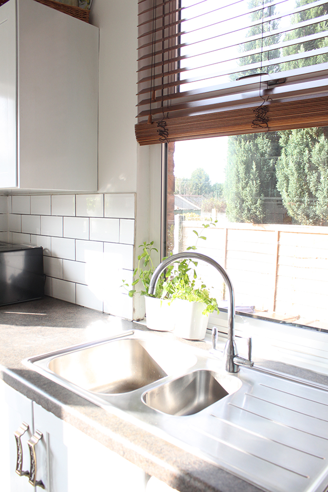
I had been waiting for Wayne to find some time in his busy DIY schedule to hang it and then one day last week, I just thought to myself, ‘Ya know, you used to do all this stuff on your own before Wayne came along – just hang it yourself, ya lazy cow!’ (I know, I can be quite harsh with myself at times) So I got the drill out and the level and some rawplugs and went to work hanging it myself. I was pretty damn proud after it was hung and Wayne was thrilled I’d knocked something off his list!

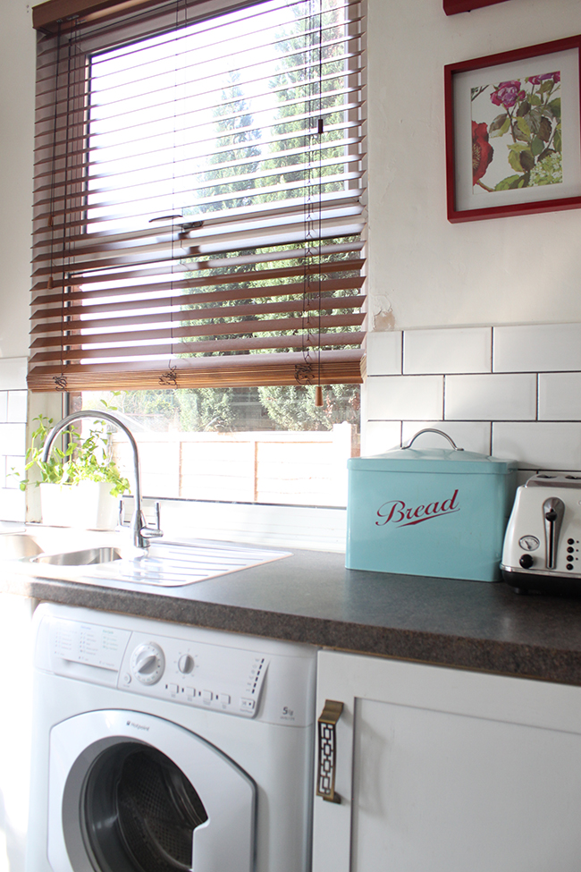
Excuse the peeling paint – it’s on the list to sort out!
I’m really pleased how much the clock and the blind make a difference in terms of warming up the space.
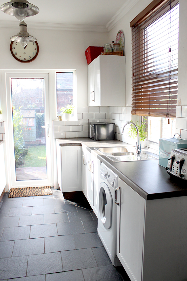 Just as a little before and after…
What I would love to do now is add a fabric pelmet (again, more warmth!) similar to what I did in the dressing room but use Designer Guild’s Alexandria fabric in magenta – it’s the same line as the wallpaper I used to back the shelving and I am in LOVE with it. The only issue is the price tag – around £80/metre and really, I’ll only need half a metre but it doesn’t appear anyone sells it in half metre lengths!

(If anyone out there is UK based and fancies splitting a metre with me, just let me know – I would be totally open to going this route to save us both a few pennies!)
But in the meantime, I’m pretty happy with just this little bit of progress!
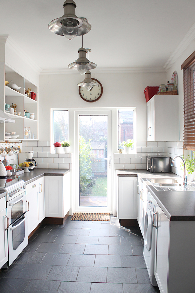
I know it’s only baby steps but every little bit helps right? What do you think of the changes?
Disclaimer: I received the wall clock free from Newgate Clocks in exchange for my review but as always, all words, images and opinions are my very own. Thanks for supporting the businesses that support Swoon Worthy.






I have been craving more wood too and I love your changes
Thanks Julia, there’s something so wonderfully inviting about it isn’t there? :) xx
It’s amazing how just changing two pieces gives as impact like that! Those dark woods really compliment the gold accents too. And I really need those blinds. I like ’em big and thick. Take from that whatever you like.
I wish we had those in stead of the monstrosity of blinds we have in our dining room. Just wait. You’ll see. #RentersWoes
LOL! Big and thick wood – yep, I know EXACTLY what you mean. *snigger* xxx
much better! looks cozier and more sophisticated.
I think so too! For some reason, it looked a bit cheap before! lol Thanks Jill! xxx
Looks great; definitely warmer and more sophisticated. Love how your designs are always evolving. I’m similarly changing my kitchen up a bit but instead of wood accents, I’m adding a touch or marble; trying to make it less country and a little bit more luxe.
Oh I do love me some marble!! It’s a fine balance I think with wood – it could go very country very quickly but I think you’re right – adding the right luxe touches balances everything nicely :) xxx
I really love the additions of the wood clock and blinds, in theory I thought I would prefer the turquoise but this does add a lot of warmth and somehow look more modern.
Kristina does the Internets
Aww thanks Kristina – I’m surprised how much more I like this look too! ;) xxx
I really like the touches of wood in there! It completely canges the feel! It feels more breezy and relaxed now, if that makes any sense :) And more sophisticated. So pretty!
It makes such a difference! A good difference obviously! x
You picked the best clock. It’s classic. I’ve been looking for a perfect clock recently and that is probably my favourite wall clock so far. A keep it forever type of item too.