So as I revealed back in October, we are in the process of working with Original Style to completely renew the awful paving at the front of the house and install Victorian Floor Tiles in a gorgeous pattern instead.
Now, let me assure you of something. I can be a TOTAL pain in the behind. I’m so particular about things and about what I do to my home (naturally, I mean you guys get this right?) that I can’t imagine how badly I’ve stretched Sarah from Original Style’s patience in getting this design down.
However, she has been wonderful and patient and helpful through the whole process. So I just need to mention that first.
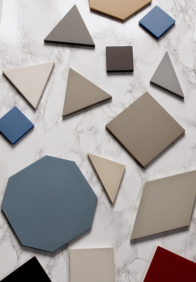
How did I actually finally get to the point where I was happy with the design? Well, we started off quite simply by Sarah sending me a bunch of tiles in the post to understand the scale and colours of the tiles they had available along with a few of their brochures showcasing real life examples of work they’d done in the past.
I took my time deciding on colours and chose four I rather liked. The thing that weighed on me most heavily was that not only did we need to like the design but I had to be conscious of the owners of this home once we left. This is not a tin of paint that can be easily painted over, this was something much more permanent than that. It would probably stay with the house for many many years and while I wanted something that looked contemporary, it was important that it had roots in a more traditional design to go with the house.
No pressure then.
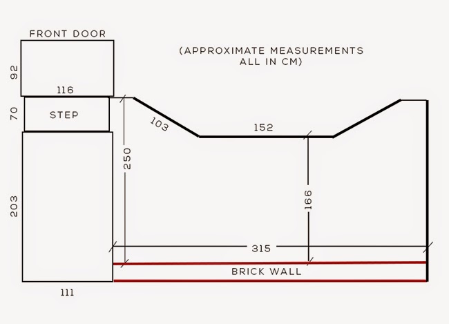
Once I’d had an idea of the colours I was happy with, I measured out the area out front and sent this drawing through to Sarah apologising for it not being to scale and just being rough (I later found out this was way more than what was required by them but I like to be thorough, what can I say)…
We then started looking at designs. Oh there are so many to choose from! It can be quite overwhelming because there is so much choice but Original Style were really helpful in helping me talk through what might work in my little patch of space.
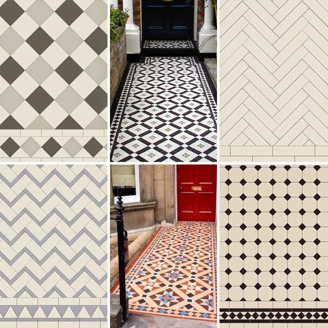
She asked me first to identify colours and patterns I liked, combinations of colours that appealed to me, which patterns I preferred with which borders.
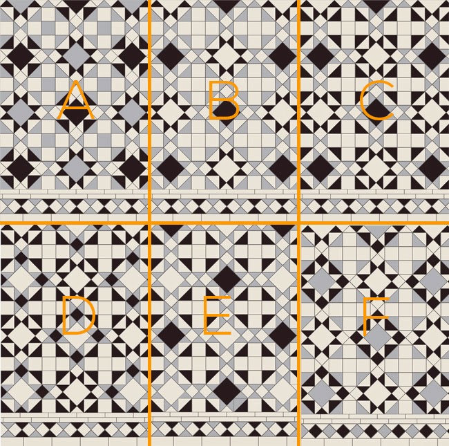
Here’s just a selection of styles that Sarah & I talked through…
Finally, after about 5 emails discussing various different patterns, Sarah sent this style to me which I really liked – but how would it look in my colour scheme?
Well, this is where their designer, Scott, came into play and he created this…
And also this one to give me a better idea of what it would look like installed – pretty nifty, no?
But something wasn’t sitting right with me. I felt even though I liked the pattern, there were too many variations of colour going on. So Scott whipped up a few more designs.
Ok, to be fair he whipped up like 10 different designs… is your head spinning yet? My head was spinning. I have no idea how Scott’s head wasn’t spinning creating these (this again is just a selection).
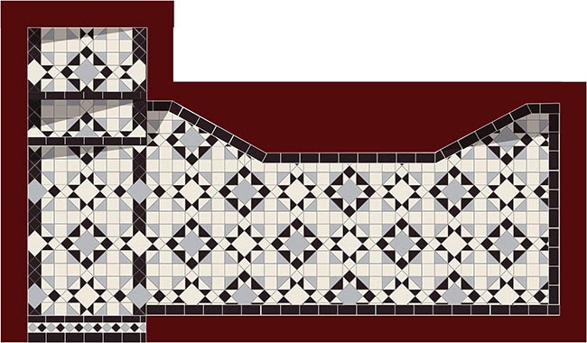
But finally, after much debate and talking it over with Wayne, we decided our favourite was pattern F above. Time for some renderings…
Scott amended the design to make it fit the sizes I had provided. We wanted the path to be slightly different so he worked his magic and created this version for us.
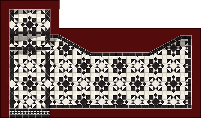
Now, at this point, I don’t actually know why Sarah didn’t tell me to just sod off and go bug someone else about tiles but something was still niggling me. I asked if we could lose the grey completely and take it back to monochrome. I know, after all that work, right? Thankfully, Sarah, with the patience of a saint, never once gave me any indication that I was inconveniencing them – they were just ridiculously accommodating.
So being the lovely, accommodating people that they are, Scott then came back with this…
Ohhhh yes. Okay, yes. I think that’s it!! Call off the search, we found our pattern!!
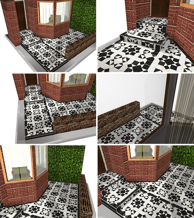
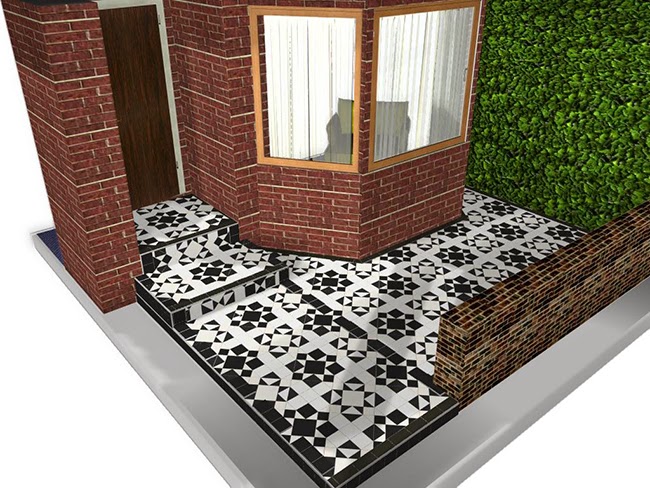
But it wasn’t it… oh no. To make it even easier, Scott created a scaled 3D rendering so I could visualise exactly what it might look like.
The property style shown is not an exact replica of my own house but viewing it like this made it so much easier and allowed me to see that the flooring won’t actually be viewed from above as we’ve been looking at it – only parts of the design would be visible at any given time of course. It made me realise that going for a graphic black and white pattern would be striking but not overwhelming.
So, this is what we decided to go for in the end! Whew!
I have to say that through all of this, Original Style have been ridiculously patient. They really do work with you and really want you to be happy with the final design. This was evident at every single stage. And I know I sound like a walking advertisement at the moment but I can’t stress enough how much easier they made the whole decision-making process.
The work will start early next year, weather permitting but we’re all quite excited to get started!
What do you think of the design? Is this something you would consider for your own home? Any of the discussed designs catch your eye? I’d love to hear what you think!
*Please note that Original Style does not supply directly to the public but works with carefully selected and incredibly talented retailers to bring the same kind of personal service that I’ve received straight to you locally. To find your nearest retailer, please visit Original Style.
I am working with Original Style on this latest project but as always, all words and opinions are completely my own. Thank you for supporting the businesses that allow me to bring you new content here on Swoon Worthy. That said, I only work with companies I really like and think you might like too.














It looks beautiful, I cannot wait to see the finished project. I would love something like this for my house but I don't think the budget will stretch to this for a long time. I will just have to gaze lovingly at yours! I think you were right to go with just black and white.
Thanks Claire, it feels like it took forever to just get to this point! But I'm excited to start the work now and yep, agree, I think simple black & white is always classic :) xx
YAY! Finally! I've been waiting for this for so long! Well, since you posted about it in October. I can't wait to see what it looks like when you're done :) <br /><br />In other news, I may be WAY too invested in other peoples' lives and houses.
Hahaha! I can't wait to see it done too!! lol xxx
Absolutely Beautiful! I'd do this in a heartbeat
Thanks for the vote of confidence Aneke! When you start looking at so many different designs, your head starts to go a little screwy lol xx
I love the monochrome design! But white tiles are quite hard to maintain outdoors. They sort of weather over time.
Yep, I know they'll get dirty etc but whenever I see old white tiles, I kind of like that weathered patina they get – I don't really mind it :) xx
Ooh lovely, but yes white will be hard to keep "white" would love to know the costs of this also, as you said you may move in the future, I'm guessing it's not costing thousands? Good luck, Kelly
Hi Kelly – yep, they will definitely weather over time but I don't really mind that look (I've seen lots of old white tiles in person) – I quite like the patina they develop :) I don't have all the costs right now because I'm working with Original Style on this one but when the project is completed, I'll hopefully have that all for you guys xxx
Wahoo!!! That is going to look amazing. I'm too excited – get it done so I can swoon already. :)
Hahaha! Thanks darling! I'm too excited as well – hopefully it'll be done early in the New Year as long as the weather doesn't get too terrible and I'll be able to share – I'm feeling very impatient myself ;) xxx
Oh god. I can't even! The black and white monochrome*! Oh this gets me right in the feels! It's gorgeous, Kimberly! Fair play for going back and tweaking out the grey. It looks so beautiful! And for real, timeless. That's honestly some classic shit right there. I'm packing my bags and I'm on my way xx<br /><br />*I once got a troll commenting on a load of my posts where I