I was looking through some old photographs today of our house and realised how far I’ve come in terms of being a bit brave when it comes to adding colour to my home. So I thought I’d talk a little bit about how I’ve evolved my home to introduce those vibrant hues in case you were considering doing the same.
I think that there are a lot of people out there who are petrified of bringing colour into their homes. I see so many “tasteful neutrals”, homes done in entirely colourless greys and beiges and just not enough zing, ya know? But it could be a bit scary to bring colour to a fairly neutral space. What if it looks like a rainbow has just thrown up in your house? What if it looks like a children’s television show??
Even worse, what if it ends up looking like the set of C4’s Sunday Brunch?! Perish the thought!!
Here’s the thing… it’s been great to see a move into more brights recently after the last few years of what appeared to be a neutral haze. I know that if you really want to get down to it, trends in interiors are dictated by economic conditions so when people are purchasing larger, more expensive pieces, they tend to go for something that will last a long time and something they won’t tire of easily because they won’t be able to afford to replace it quickly. So neutrals are more popular during these times. When the recession starts lifting, people are more likely to go for items which are more colourful, because even though they are less timeless, people are feeling that bit more flush and assume they can replace it if they tire of it. Makes sense, doesn’t it?
Now, I’m not going to tell you to chuck out your perfectly good neutral base items – not at all. But I’m going to show you that even though I like to dress my home in colour, the base items I use are still pretty neutral – it’s just the accessories that really add the vibrancy.
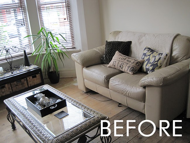
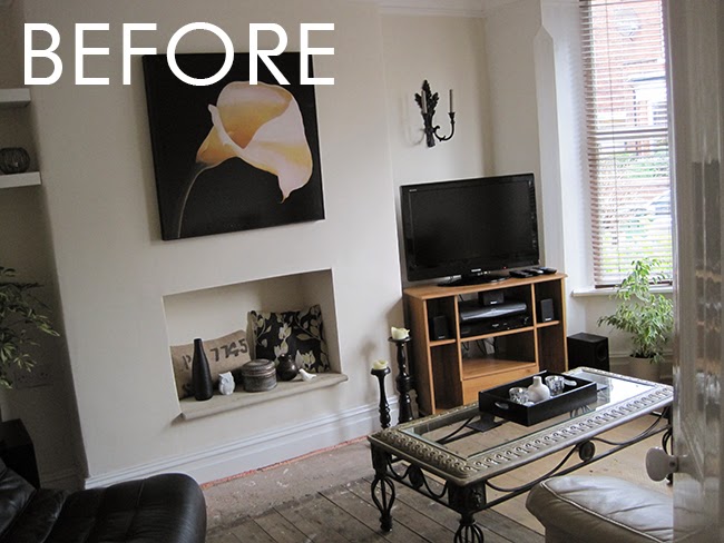
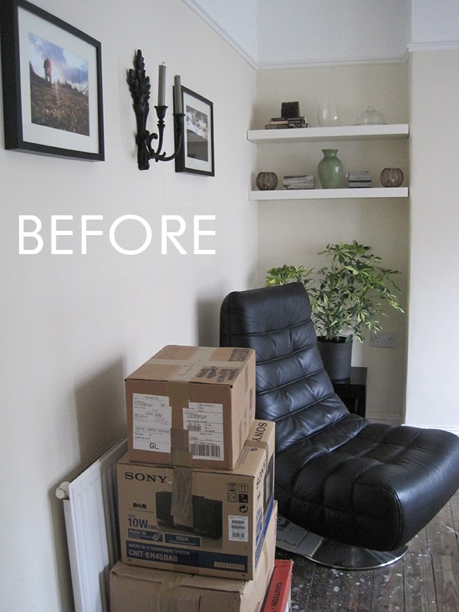
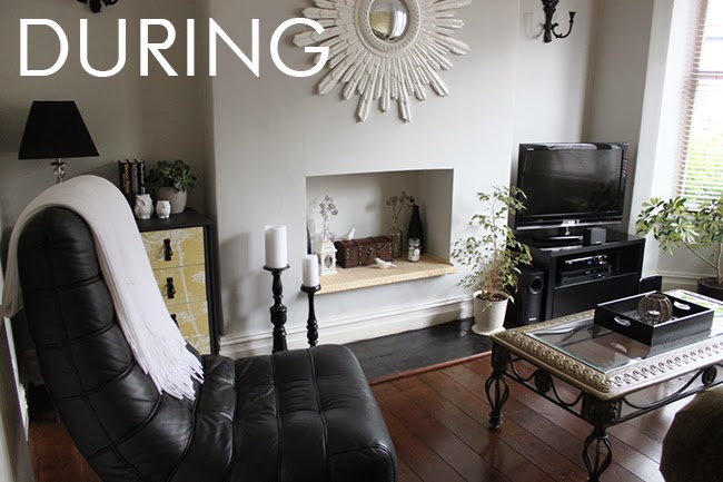
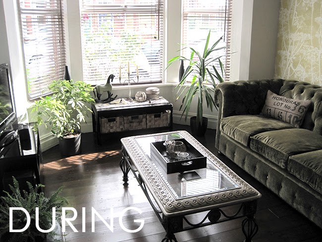
When we first moved in, we simply moved what had been in our old living room into our new one. The floors were unfinished and the paint colour was already on the walls.
We painted the room in a pale grey, finished the flooring, replaced that sad sofa with an olive green velvet chesterfield and added a maize yellow wallpaper. The colours were more muted, however – there were no zingy brights – and they acting like neutrals in themselves. The room certainly looked a lot better for these changes but the overall effect was still a mostly neutral room.
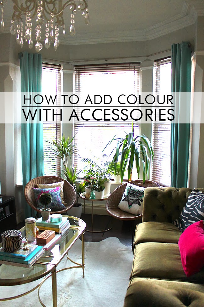
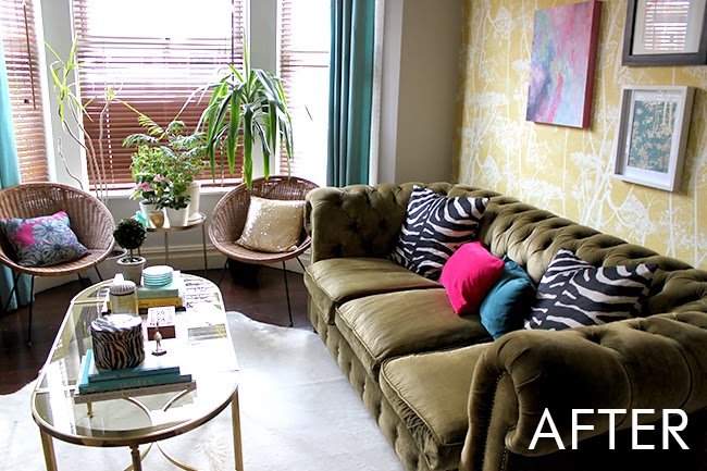
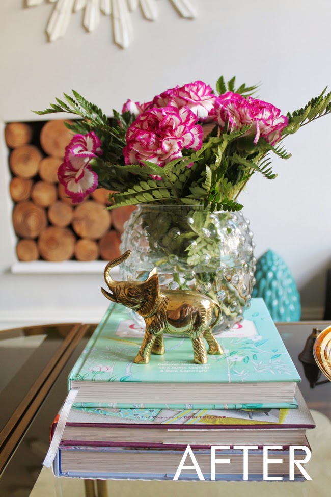
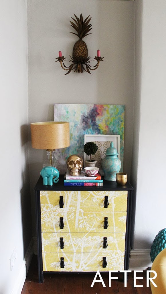
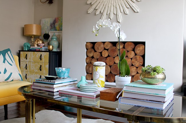
Over the last couple of years, I changed a few things, added seating, a different coffee table, a white cowhide rug. But these things never veered far from that palette that you see in the ‘During’ images. The biggest changes came in the accessories. This was by far the biggest hit of colour that I added. (My photography has improved a bit as well, but you get the idea hopefully!)
If you look around, even though it looks like I’ve chucked every colour of the rainbow in there – I really haven’t. The palette revolves around 3 main colours – turquoise, yellow and pink. The sofa acts as a neutral although it’s an olive green because it’s more muted and it’s not really picked up anywhere else in the room. The painting above groups all those colours together and are picked up throughout the rest of the space, right down to choosing which books to display.
So, if you are considering adding colour to your room, my advice is this:
1. Start with a neutral base – your walls, sofa, rug can be soft muted colours but try to stick with timeless colours that don’t easily date.
2. Find one main piece with multiple colours within it – this can be a painting, print or a colourful fabric. Use that as the basis for your palette and pull colours that match this piece into the rest of the space by means of accessories – your cushions, objet d’art, books with colourful spines, vases, etc.
3. Keep your colour palette TIGHT. This means no more than 3 or 4 colours maximum within the space. If you are nervous about trying it, stick with 2 and then add one other colour in just 10% of the space.
4. Repeat these colours throughout the space to reference and play off of one another.
5. If you are starting with a blank space and wondering which colours work with which, check out my post over on Oak Furnitureland’s blog where I talked about choosing the right colours in your space.
And finally, 6. Have fun!! Accessories are fairly inexpensive relative to your larger pieces. If you tire of the colours you’ve used, it makes it a lot easier (and cheaper!) to buy a couple of new cushions rather than have to reupholster an entire sofa.
So tell me, have you been more brave with colour recently? And if so, how have you introduced it to your home? Any tips to add?











Your room looks so much better and cheerier now it has some colour. I don't think you want any tips from me, though- my house is definitely of the rainbow vomit variety :p xxx
I love seeing the evolution of that fab room. It just keeps getting better and better. :)
It's good to be back and getting my daily dose of colour from your blog. I'm more of a neutrals girl (I am far too frenetic and knee-jerk to be surrounded by colour, I like my soothing calm neutrals). But I LOVE colour and I love seeing how it is used in other people's homes. Yours is one of my favourites. I thought the evolution of your living room was really interesting… it had me
you have truly breathed life into the space introducing such happy color!<br /><br />michele
Oh man, yep, this is awesome and hits the nail on the head. I like how we share the same level of OCD when it comes to co-ordinating the colour of the books to certain sections of your living space. Been there. <br /><br />And what a transformation between the 'during' and 'after' picture. They're not that dissimilar, but at the same time, completely different. If that makes
Thanks to blogs like yours, it seems so alien now to me to consider decorating a room in a neutral palette. When you see something like your living room, how can you ever go back?! I still feel a little unsure and reticent about how to use colour though so I found your tips – especially number 3 – REALLY useful. Thank you!