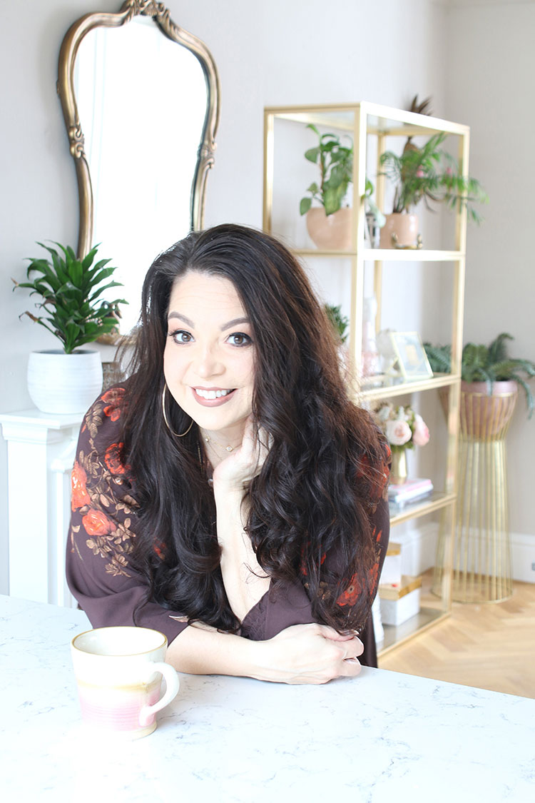
Well folks, as you probably already know if you’ve been reading Swoon Worthy for any length of time is that for my ‘day job’, I’m also the Editor of another blog called AO at Home. It’s like my foster child, much like Swoon Worthy is my baby so I hope you’ll indulge me in talking a little bit about it today.
 |
| Hmmm that picture looks STRANGELY familiar… |
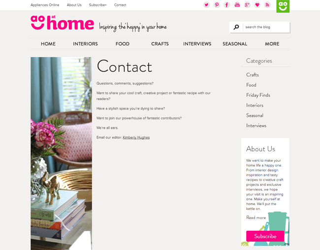
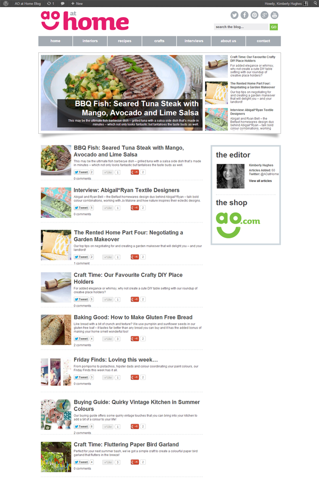
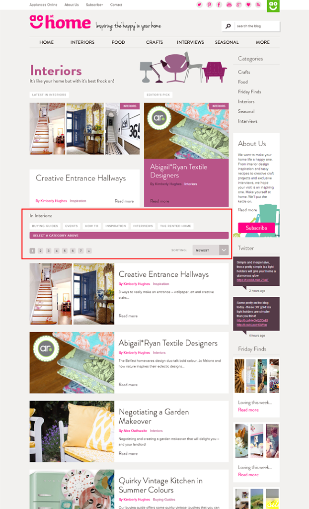
See, I inherited a blog design which wasn’t really all that great when I took the job in November of last year. It was a bit clunky looking and not too user friendly. It was hard to find what you were looking for and it was even harder on the eyes with tiny pictures and too much text. This wasn’t a design that great content could comfortably sit on. It would be like Kate Middleton being asked to sit elegantly on a crusty bus stop bench. It just doesn’t seem RIGHT, does it?
(Yes, I just compared our blog content to Kate Middleton’s bum. I may need to rethink my analogies.)
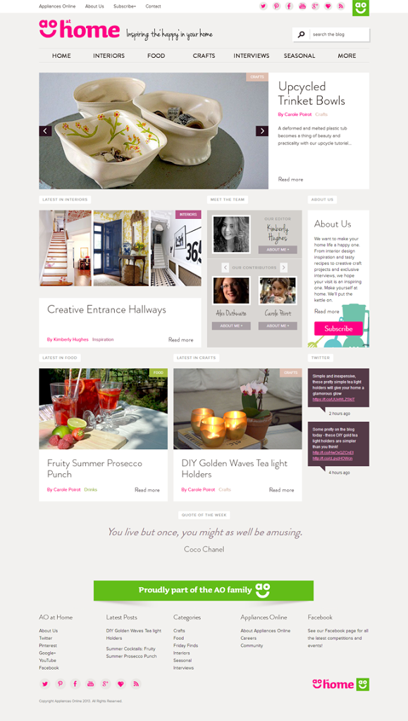
That’s better no?
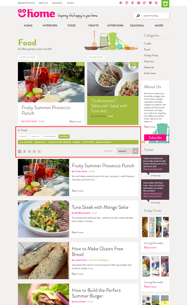
The recipes section and interiors sections are so much better laid out now too with subcategories for everything.
In Interiors you have Buying Guides, Event coverage, How To, Inspiration, Interviews and a new section called The Rented Home.
In Food, we have all the recipes broken down to Breakfast, Desserts and Baking, Drinks, Lite Bites and Main Courses as well as Events, Interviews and How To.
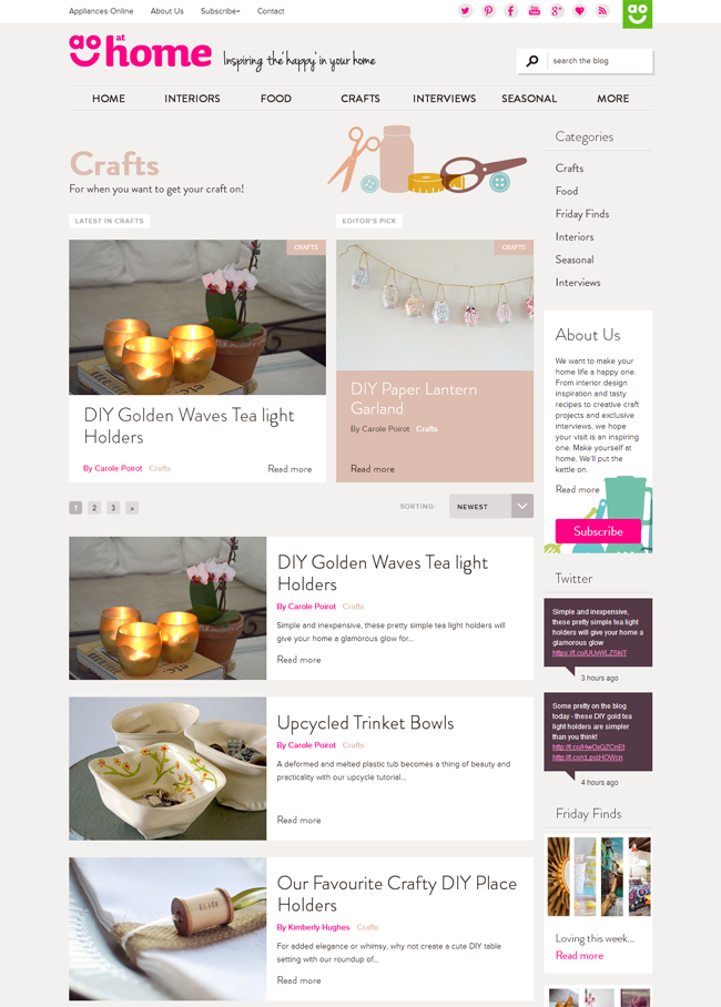
We have a whole lovely Craft section too… not twee old-fashioned crafts but cute ones you’ll actually want to (and CAN) make.
I’m pretty damn proud of this site. Ok, there are still a few little bugs knocking about that we’re sorting. But I love it all the same.
Now I want your feedback – what do you think? What would you like to see more of? What’s not working for you? I can’t promise we’ll make changes this week and there’s actually more to come (like at-a-glance boxes for recipes and crafts, a few tweaks on the section headers, the subscription email is being worked on now so that it’s a lot prettier, etc) but I trust you guys to give me honest feedback.
So I implore you – go and check it out. Let me know what you think. You can subscribe too for email notifications when we post new content. Of course, if you feel so inclined, leave comments on the posts (I moderate those too of course and will respond!) or share with those little cute buttons on every post. We’re on Bloglovin’ too.
And of course, if you love it, please do talk to me about that too. After the week or two that I’ve had, I can use the encouragement. Also, if you want to tell people about our redesign on your own site and help me spread the word a little about our lovely new home, that’d be cool too and you’d be my BFFAE (Best friend forever and ever) :)
Ok, I’ll shuttup now – Go! Fly fly my pretties!!









it already looks like a huge improvement from the screen captures. will definitely check it out when i have more time and let you know if i have any suggestions. congrats on the new design!<br />– jackie @ <a href="http://www.jadeoak.com" rel="nofollow">jade and oak</a>
It looks great! I especially love the cute little category graphics, stuff like that always makes me happy. Thanks for sharing so many screen shots, I didn't realise that the blog had soooo much on it. Yay, new things to read! :)
Looks so good! Congratulations xx
It looks so good my friend! I was a web development project manager in my last life, so I know all too well how long and hard that process is. All of your hard work was worth it! AO is lucky to have you!!
Kimberly I LOVE it!! Fantastic job my dear, you've absolutely transformed it, think I might have to stop by for a closer look… Enjoy the weekend xx
it looks beautiful!!! when i get a moment, i'll hop over and taste some more.<br /><br />smiles to you.<br /><br />michele
So much better! You're doing great things over there!
Love the new look :)