If you’ve read Sarah’s excellent advice on Modern Country Style, you’ll know that when making decisions on your kitchen, you should make sure your kitchen inspiration pics are rated no less than a 9 in your mind and scratch everything you don’t feel is absolutely swoon worthy.
Well, I think that’s pretty fabulous advice so I’m going to show you some of the images that have been floating around in my ‘Kitchen Inspiration’ folder for a while that I find myself coming back to again and again (even before I had a kitchen to work on!). Because I’ve had many of them long before I had a blog, I don’t know where the majority of them are from so if you know, just let me know in the comments and I’ll be sure to give credit where credit is due!
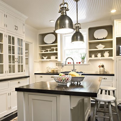
I’m going to start with my absolute all time favourite. Every time I revisit this photo in my folder, I swoon just a little. I love the dark wood counter tops, the pendant lighting, the pops of white china against that greeny-grey in the open shelving, the pull handles, the shaker style cabinets, the dark flooring… just everything. No idea where this is from unfortunately! If anyone knows, please share because I would love to see more of the kitchen or the house if possible!
Here are some others that make my favourites list…
I love the contrast here between the dark wood floors and the white of the cabinets. The glass fronted shelving and the windows are fab too. And of course, more pendant lighting.
Shaker style cabinets here too plus the dark wood contrasted with white subway tile. Gorgeous.
Here’s where you’ll start to see a pattern emerging… Pendant lighting, white shaker cabinets, open shelving…
On this one we have again that dark flooring against the beautiful white cabinets. I adore the dark grey, it just looks incredibly sophisticated. It’s the home of Christopher Peacock, the kitchen designer. Go figure he’d have a fabulous space (and how cute is that pup?!). The image was found on Traditional Home.
This kitchen is from the home of the multi-talented Mrs. Limestone and I think it’s been in my inspiration folder for well over a year. It’s got most of the elements I love with pendant lighting, shaker cabinets and natural elements.
Small can be beautiful. I’m working with a considerably smaller space than most of these images but this appealed to me because the kitchen is ‘UK sized’! I love the open shelving, the pendant lighting, the shaker cabinets and that amazing wood floor… I don’t know where it’s from unfortunately.
This one I found on desire to inspire. It’s by Helen Green, a London-based designer. Definitely Best of British going on here. The dark butcher block counter tops are fabulous.
These pendants are just gorgeous. They have a bit of an industrial feel. The white subway tiles with dark grout are fab too.
So as you can see, there is little doubt which way I’ll be going here!
Here is my list of hopes and dreams…
Now, I am a woman so I can’t guarantee that once we start the project I won’t change my mind at least 20 times. But at least, with this little exercise, I can see what I’m drawn to and what elements are must-haves.
What’s on your must have list?
Edit…
For all you lovelies who have come from Modern Country Style, welcome to my little blog! Come on in, pull up a comfy seat and have a cuppa. Sarah is just a complete sweetheart isn’t she?? If you want to see how the kitchen progresses, click on that little ‘FOLLOW’ button on the side there so you don’t miss a post! ;) So nice to have you here!


















Stunning – i like the last picture best. We had those subway tiles in the old kitchen in our flat and we're going to do put them in again when we get round to doing the kitchen, I just love them! Also loving the industrial pendant light – so styish!! Fab ideas!<br />Rachie xo
Hi lovely,<br /><br />I REALLY like your images here. I've linked right back to you in my new post. I'm really looking forward to seeing how you get on….especially because I'm totally swooning after your style. <br /><br />Sarahx
You process and think like a designer! Loving your style, especially the industrial twist of the pendants with the white shaker style. Fabulous taste! <br /><br />Have a great weekend! <br /><br />Meera x
@Rachie – Thanks sweetie!! Lovin the subway tiles too, can't wait to get rid of what we have! x<br /><br />@Sarah – Awww you sweet thing you! Was wondering why I had more than 3 visitors today ;) Thanks for the mutual linking appreciation society! :) x<br /><br />@Meera – Oooh what a compliment!! Glad you liked the piccies, hope I can do my kitchen 1/4 of the justice of these ones :) x
I am crazy for the dark worn woods. I've never been one for Shaker, but totally digging photo number 4. Found you via MCS :) XOL
Hi Laura, welcome to my little corner of the bloggosphere! I didn't know I was into Shaker style cupboards until I did this little exercise and realised how many images showed them. I am lucky in the fact that we already have them so we don't have to replace them! I love an easy solution, don't you? ;)
I'm with you on all of those elements!<br />I've left you a little present on Dear Designers Blog today. Pop by and pick it up.<br />Carole. x
The present Carole left has inspired me to become a follower!<br />Love those kitchens….will follow the progress.
Hi! <br />I'm new here, so I stopped to leave you a comment as you asked: I'm such a good girl, aren't I? I loved the pictures you chose and some will go in my "Kitchen Inspiration file" if you don't mind.
@Carole, I'm ridiculously honoured! Thank you! I will give you proper thanks in an upcoming post ;) x<br /><br />@Concrete Jungle, welcome and so nice to have you along for the ride!<br />x<br /><br />@Magali, a woman after my own heart! Of course I don't mind, that's what they are there for – share and share alike :) x
I love the combination of white cabinets and dark (blue color)woods. Even I have also refurbished my kitchen with white cabinets and red woods. It looks like gorgeous.
I've always loved white to cream coloured kitchens. Your style is inspiring. I love the pendant lighting – where did you find these and how much did the cost?
Thank you Anonymous :) The pendant lighting in the kitchen came from Castlegate Lights but sadly, they no longer carry it! However, if you do a search for 'Fisherman Pendant' on Google, it should lead you to some other sources. :) x
This comment has been removed by a blog administrator.
Hi Kimberly, I am stalking you today! Were we separated at birth? I finally did a post on my kitchen, I think you'll see some remarkable similarities between your kitchen & mine.