Update April 2013… Want to see the final dining room and what I went with? Click here.
My dining room has a quite unusual feature. That quite unusual feature is a 37″ wall-mounted lcd television. I know it sounds horrid and I’m sure that it’s not the ‘done’ thing in the design world. However, I feel the need to explain. You see, me and W like to sit at the dining table – it’s where we spend most of our time. The chairs are comfy and as it’s right near the kitchen, we can have the news on in the morning while we’re eating our breakfast or have it on while we’re cooking dinner. We can put music on during the day and as the dining room is in the centre of the house, it’s easy to hear from pretty much anywhere in the house. We sit at the table with our laptops with the television providing background noise to our tapping away and chit chat. We LIKE television, I’m not too posh to acknowledge that fact. It is what it is.
| The before picture. No, it’s not supposed to be nice, that’s the point. |
And so while aesthetically, most would agree a television is not the most pleasing thing to look at, it does serve a sort of social purpose in our home in that it actually allows us to use the dining room so much more than we ever would if the television was not there.
As such, a challenge presented itself. Do I ‘cover’ the television and try in some way to hide it? Or do I incorporate it in my design and allow it to become what it really is, a fixture that is a part of the room as a whole?
I’ve decided to buck the trend and incorporate it as part of the design. And part of that design is to make it a feature wall. (I know, I know, stay with me here…)
Now, I am terrible with wallpaper. No, not in the hanging it (of which W does a rather fantastic job – it’s lovely to have a handyman in the house) but in the choosing it. I tend to decide on my colour scheme along with the look and feel of the room first and then hope that I find a wallpaper that fits the scheme. What you probably SHOULD do is start with a fabric or a wallpaper that rocks your boat and then take the colours and patterns as your cue to how the rest of the room unfolds.
Yes, I am backwards, I acknowledge that.
So after choosing my colour palette I set about looking for the perfect wallpaper. I wanted to go for something very dark so that the television would not be the dominant feature in the room.What I was looking for was something with touches of mustard (to pull in the scheme from the living room) and possibly olive green and red to bring in the colours of the kitchen. Going about trying to find this magical combination of colours turned out to be pretty near on impossible.
I probably ordered about 10-15 different wallpaper samples to no avail.
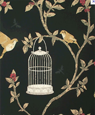
I was, however, very near to ordering this one:
 |
| Nina Campbell – Birdcage Walk |
Notice the black background, touches of gold, red and olive green. It has birds on it! And birdcages! How cool! But I was still unsure.
And then I found a picture of it on line in a full room setting (albeit a bathroom).
 |
| Image courtesy of gmtoday |
And I knew that no, it wasn’t right. It wasn’t THE ONE.
You see, when I bought the wallpaper for my living room, I was completely and utterly in love. I wanted that feeling again. I wanted to know my decision was absolutely perfect. It wasn’t happening.
I kept swaying back and forth about my decision and as much as I’d like to start redecorating this room, like, NOW, this one big decision has been holding everything up.
Now I’m not sure if you are familiar with ACHICA, a ‘members only’ website. They hold private sales for very limited amounts of time on all manner of products at exceptionally good discounts. All you really need to do is register with them to become a member and you don’t even need to learn a special handshake or wear a nifty hat like this:
 |
| It’s okay, there are no funny hats required for ACHICA memberships although that also means I can not claim to be Grand Puba. |
Anyway, I received an email from them which I do near enough every day to let me know of the promotions they had for the day.
Well, they had sales on Graham & Brown wallpapers. Excellent.
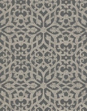
I love the fact that the sales only last for 2 or 3 days and often the really good stuff sells out rather quickly so the pressure is on to purchase NOW. I had a look and saw this:
 |
| Wack a television on that wall and it’s practically my dining room. Definitely a sign. |
And my heart skipped a little beat. The lovely lattice design, a little bit geometrical, a little bit ornate. It’s grey which I wanted to do in the dining room anyway. Ok, so it wasn’t very dark and it didn’t have mustard or olive green or even black in it. I didn’t care. It’s normally £30 a roll and it was on sale on ACHICA for £13. That was enough for me and I clicked that beloved ‘BUY NOW’ button.
Purchasing this wallpaper was a complete impulse decision but I believe that sometimes the best decisions are based upon gut instinct. I have bought, not what I thought I should get, but what I really liked.
So do you think it’s mad to have a great big television in the dining room? Have I broken every single design rule in the book? Do you ever debate for months over something and then find yourself working completely on impulse? Are you the Grand Puba of a secret organisation? Let me know in the comments…
Image credits: Happy Days image courtesy of stitchsusan.


I so wish I wasn't living in the barracks, those wallpaper prints have inspired me!! Thanks for sharing!<br /><br /><a href="http://www.glameyeam.blogspot.com" rel="nofollow">GlamEyeAm</a>
I'm obsessed with wallpaper! ;) You can always try wallpapering a panel of mdf and hanging that? Have a look here for some really fab basic ideas that anyone can do: http://ishandchi.blogspot.com/2010/07/5-ideas-for-decorating-rental.html<br /><br />Hope that helps x